Designing an unconventional approach for a unique aperitif concept that finds a very specific niche inside a new category.
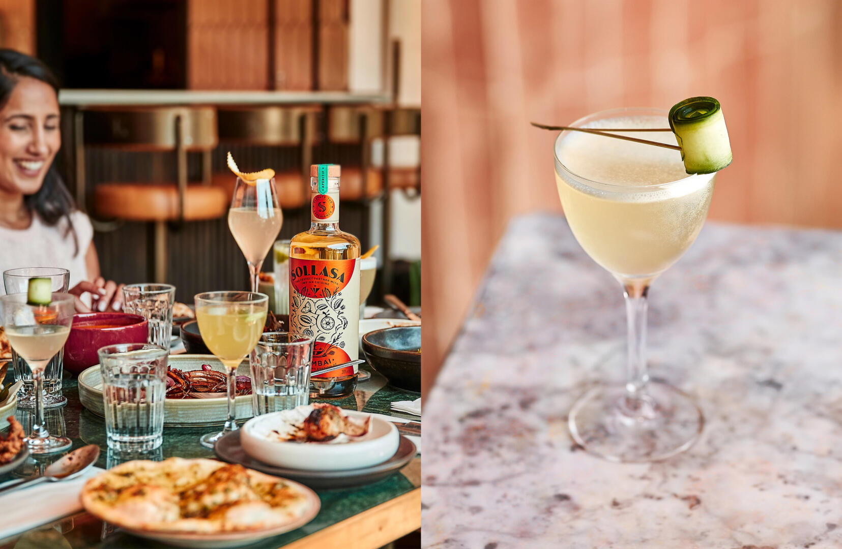
Sollasa burst on to the UK drinks scene in July 2021 and has caused much excitement with its unique proposition: it is the first spirit designed specifically to complement Indian cuisine.
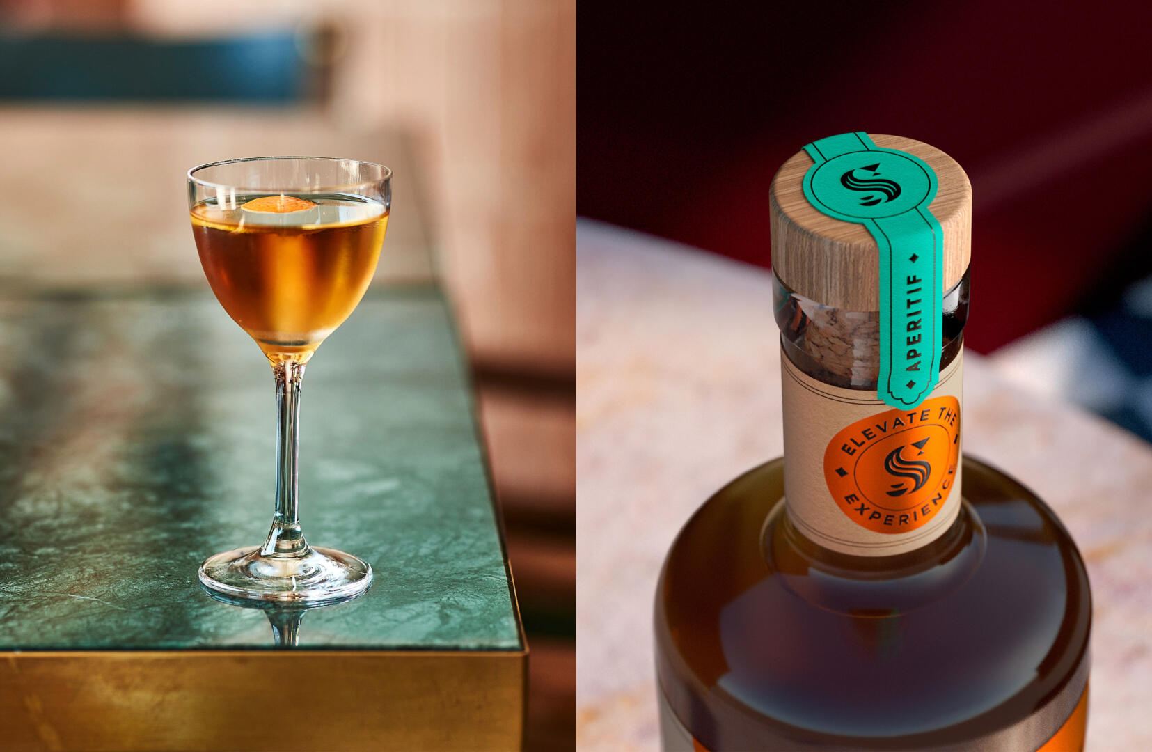
We were asked to position this product as a modern aperitif that elevates the experience of drinking and eating in modern Indian restaurants. Every aspect of Sollasa has been designed by leading chefs, mixologists, and food scientists to truly pair the unique flavours of Indian cuisine, from ingredients and flavour to length and serve. We have collaborated with Sollasa’s team to develop a label design that represents the flavourful Indian culture in a contemporary way, to appeal to modern drinkers, who are looking for new and alternative drinks.
This Modern aperitif is more than a just pre-meal tipple; Sollasa has been perfected to enjoy with food. No simply to accompany it, but to enhance it. It’s made from all natural ingredients, bringing together orange zest, lime, lychee, mint, basil, coriander seeds, cardamom, and a pinch of sea salt. And with its low alcohol content, and refreshing flavour, it’s delectable well after the last naan’s gone.
Such is Sollasa’s deep partnership with food, that its name was inspired by “Manasollasa”, an encyclopedic 12th century Sanskrit text that is considered the first Indian recipe book. The text expounds the importance of taste and flavour in food and drink; and the power of their ingredients, preparation and styling to bring joy.
Sollasa’s concept was approached with the idea of giving the brand the license to behave differently and create a strong visual language that self-expresses to communicate harder than others that just follow category cues.
Illustrations play an important role in the design, representing the botanical origin of the liquid, inspired by the concept of “tree of life”, which represents the uniqueness of nature and the individual beauty of every element. The unique visual language is inspired by traditional block-printed Indian motifs to build an ownable world of inspiring modern botanics that create an intriguing look while reflecting the flavour experience in advance.
The logo typography takes the character from the illustration style, and the icon evolves from the letter “S” of the brand name and plays with the food and drink concept, changing the ends of the letter for a cocktail cup and serving dishes to create a link to the pairing aperitif idea.
Materials and finishes were carefully chosen to create a layered design that seeks the contrast between a natural textured paper and an iconic use of foil, that gives the design an exuberant Indian character while expressing the deep and fresh flavour profile.