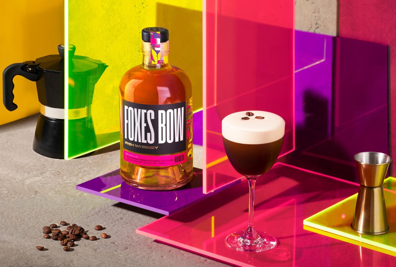
Not your run-of-the-mill granddad sipper.
Foxes Bow wanted to be different from every other Irish Whiskey out there. With the ambitious founders we set out to be disruptive at every opportunity. Colour, name, bottle shape, typography, illustration—every choice was about creating a dynamic, authentic brand that reflects and celebrates the spirit of Limerick City’s creativity and vibrance. Sharp tongued and charmingly brassy, Limerick has never been a fussy place, but this is an ambitious city on the rise—and Foxes Bow is part of the regeneration. Taking the name of a beloved back street we created a brand inspired by the colour and grit of Limerick’s creativity. Working with Limerick artist John Slade we created a brand illustration that collages the city’s quirks and corners in unexpected technicolour.
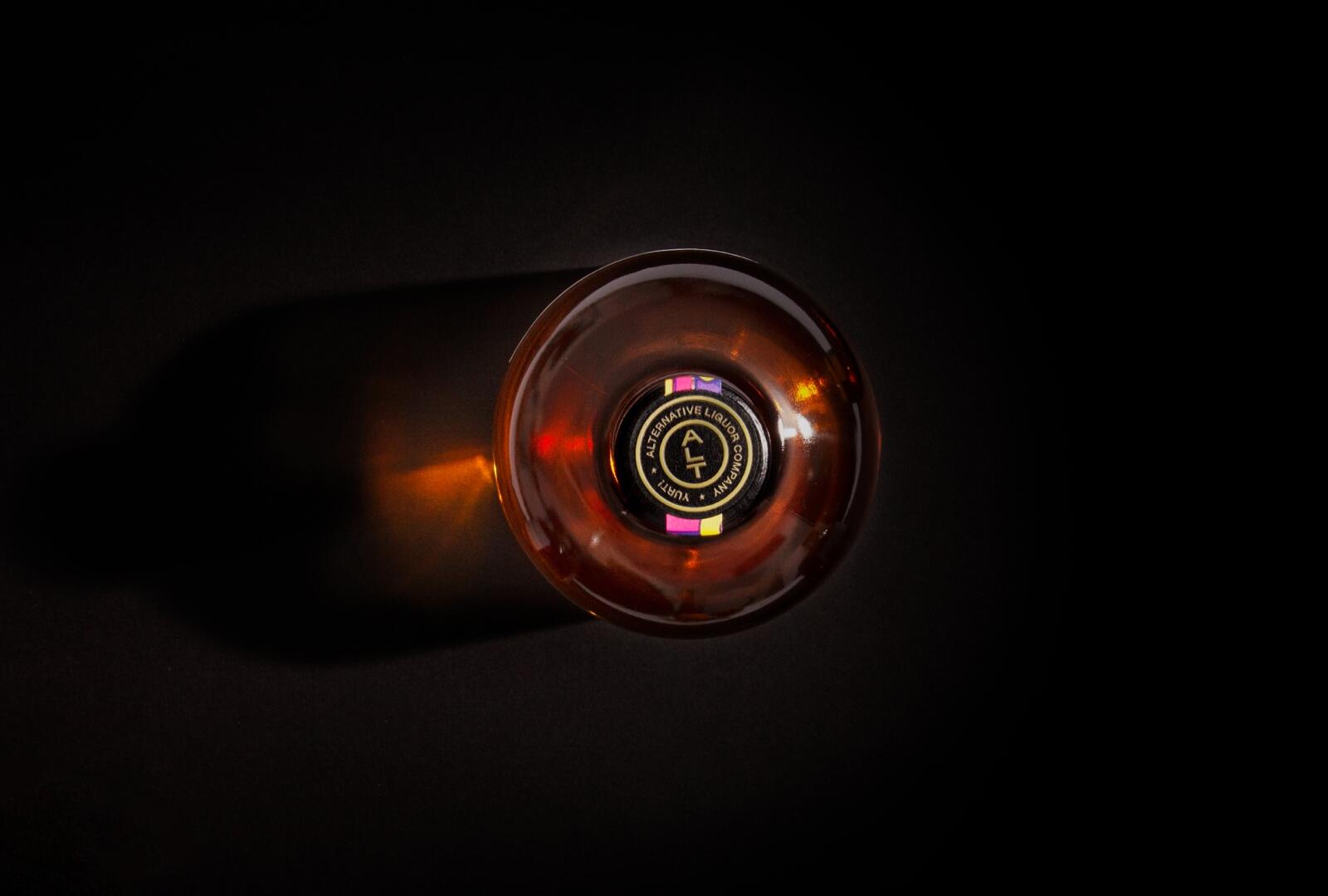
The bottle and print finishes create an eye-catchingly different tone on the whiskey shelf at a competitive price point that required us to do a lot with as little as possible.
So how’s it going? Well bottles are flying off shelves, it’s one of the top 3 most successful launches Irish Malts has ever seen, the brand is getting lots of love in Limerick (sold out in 2 days in O’Briens Limerick), and the bottle is testing off-the-scale in Europe and the US. Yurt!