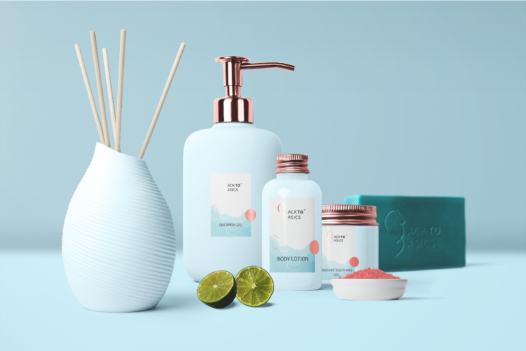
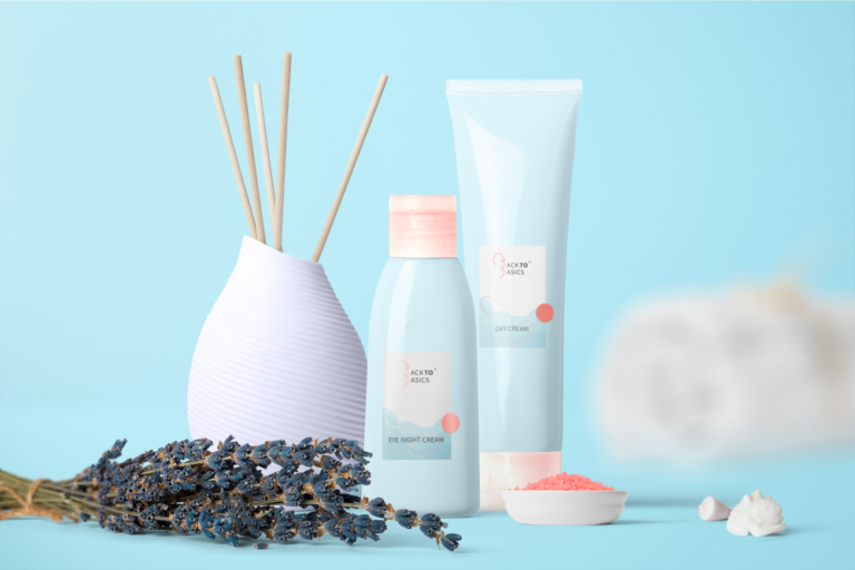
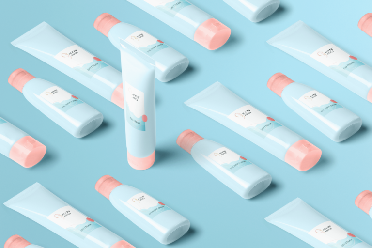
This is a fun project for a cosmetics and skincare company called “Back To Basics”.
Why the seahorse?
Not just that this neat creature is a symbol of nature, it’s also a symbol of strength and power, giving the logo a sense of boldness, uniqueness and establishment.
I chose to go with rose gold to give a feel of value and elegance. I also chose a combination of fresh calming colors to give a fresh look and relaxing feel to the brand and boost a sense of self care.


