Butterfly Cannon brings cool London luxe to their packaging redesign & campaign for Twinings tea ranges
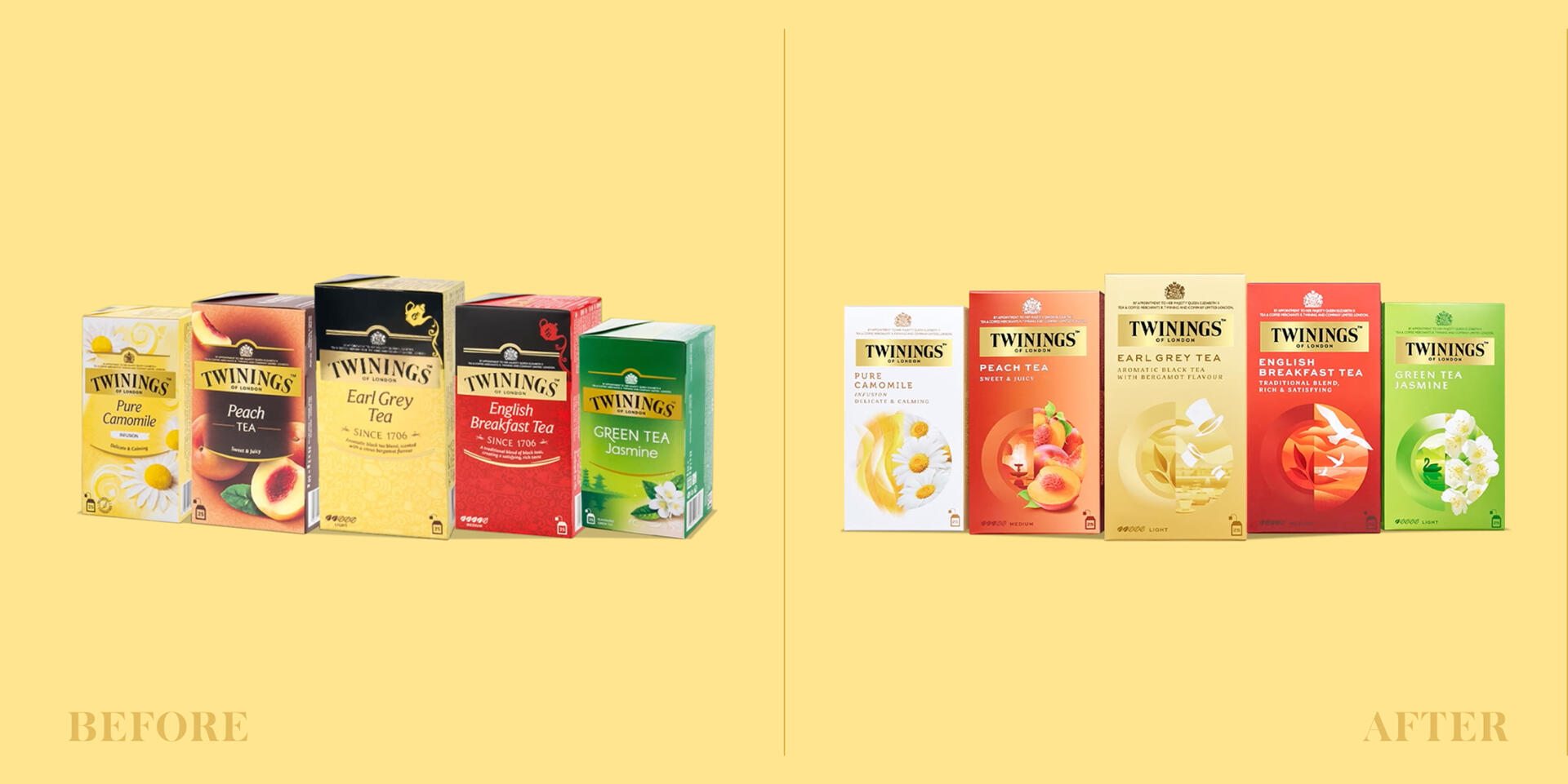
Twinings is one of the world’s longest-running brand marks, with a home in London since 1706. Creators of the English Breakfast blend, Earl Grey and Lady Grey, it has been the go-to brand for consumers in China and South-East Asia seeking a taste of old-world western luxury. However, to a younger generation of more worldly and discerning experience seekers, this proud history and provenance was translating to a pack design that felt more ‘souvenir of old London’ than ‘cool new London luxe’. Not only that, the brand wasn’t cutting through on shelf or online. And it was hard to navigate the large number of flavours and blends within the Twinings range of Black Teas, Green Teas, Flavoured Black Teas and Infusions.
We saw the opportunity to make Twinings more relevant and distinctive to the target audience by basing our creative approach on the insight that travelling and expanding their horizons were an important part of these discerning experience seekers’ identity, with a desire for talking points to express their sophistication and knowledge.
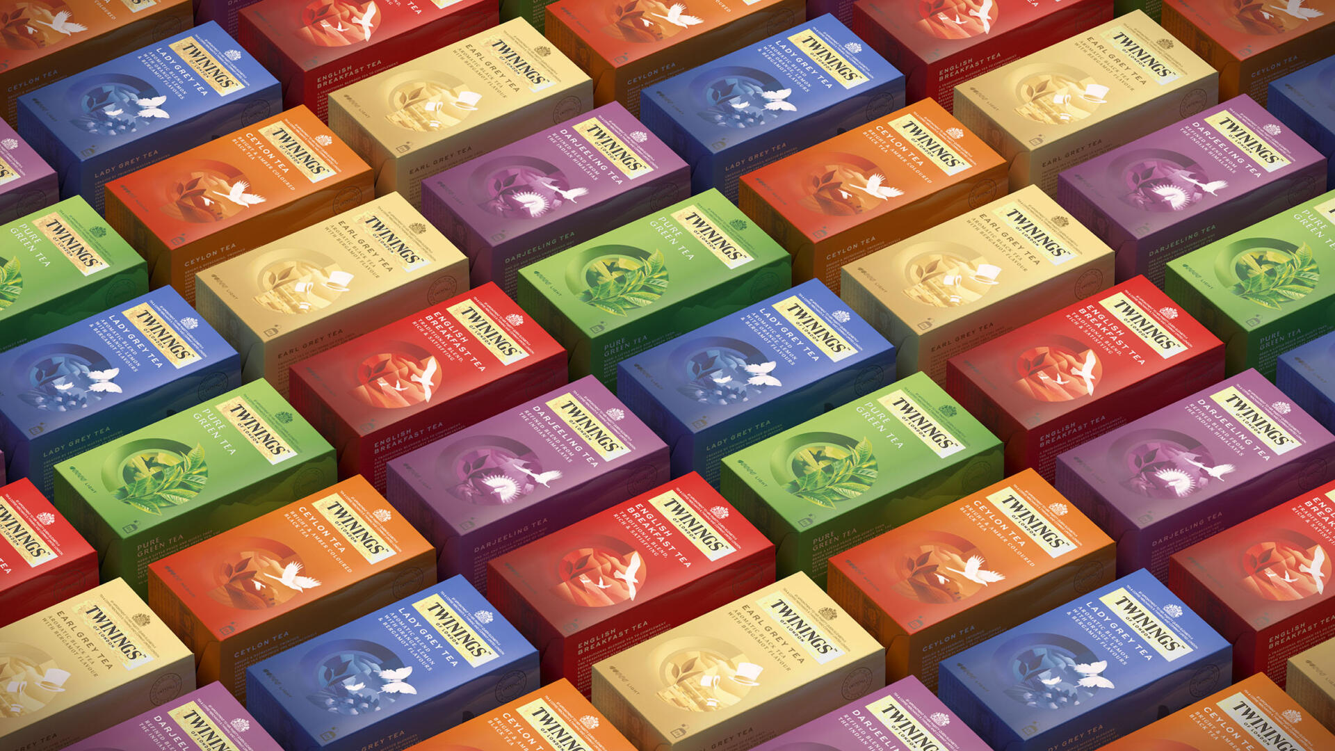
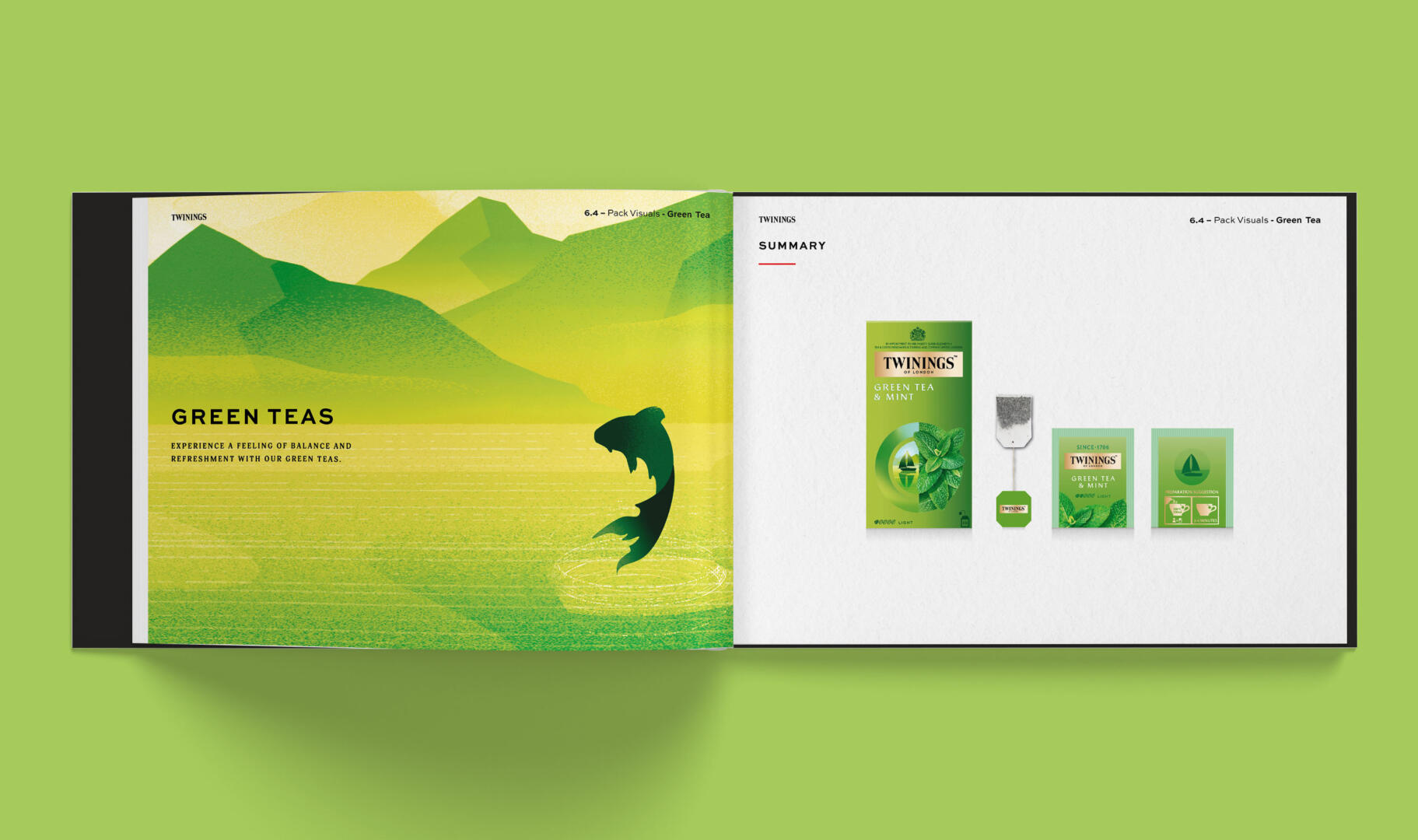
On pack this is manifested by a roundel that acts as a unifying device across the range and a window into the world of Twinings. The window is split in two and uses hand-crafted graphical illustrations to balance modernity and tradition. On the left of the Black Tea range are the prized 3 uppermost tea leaves, that are hand-picked to ensure the quality of Twinings’ teas, whilst on the right, a provenance-based scene layered with uplifting iconography – such as top hats on Earl Grey that nod to the Earl that inspired this classic blend, as they are tossed in the air at a garden tea party.
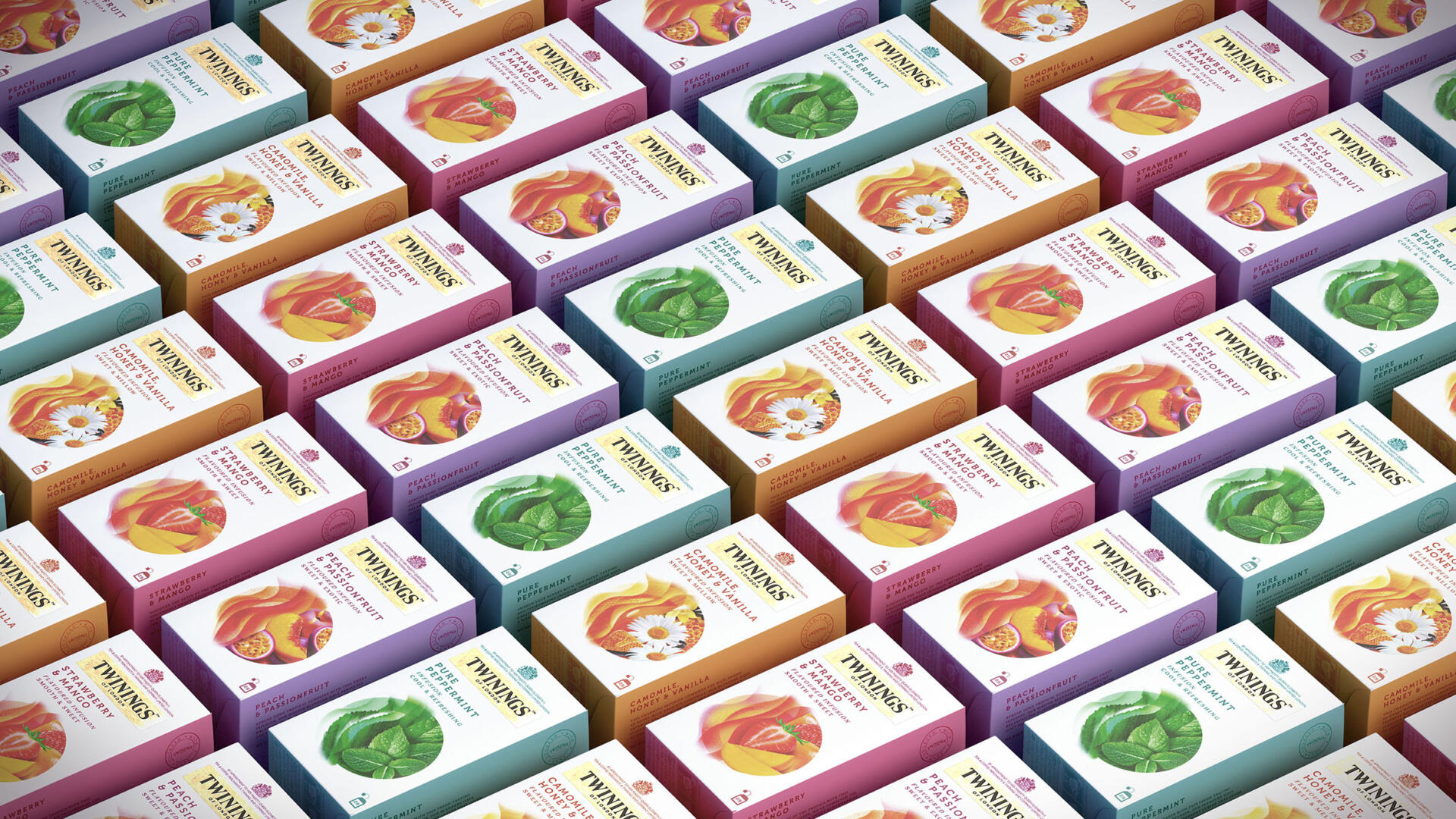
The Green Teas and Flavoured Black Teas echo the same balance of modernity and tradition, with the roundel device showing an evocative sensorial illustration on the left and a clear visual representation of the ingredients on the right. Each communicate the flavour immediately and visually, without the need for local market translations. The infusions range uses the same split window to double down on the flavour cues with both abstract flavour sensations and vibrant, literal depictions of the ingredients.
With the pack graphics, we selected the new straight Twinings International wordmark, making the branding feel more contemporary and premium; allowing the logo to be larger and have more standout on pack. Blend names and body copy were left-aligned to create pace against the centralised assets to add modernity.
Colour played a crucial role in ensuring both impact on shelf and range navigation. We specified a complementary two-tone palette for each pack, executed in a unique gradient for each sub-range, to ensure each blend or flavour feels both coherent within its range and easy to differentiate not only on shelf but also in e-commerce – responsible for 50% of Twinings’ sales in China.
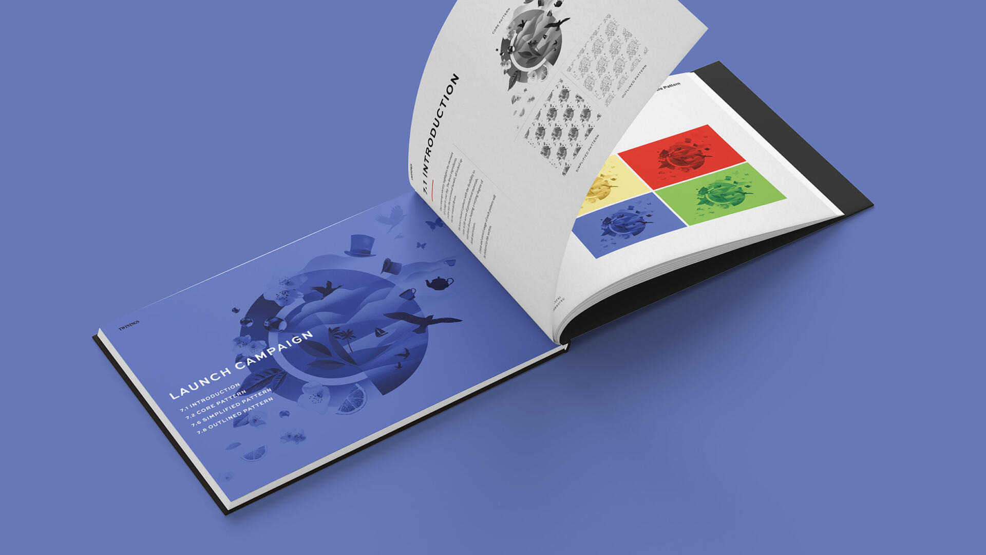
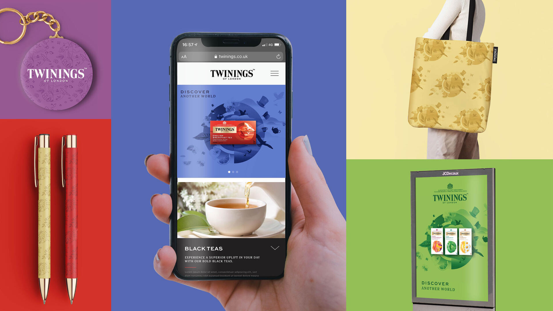
Our packaging redesign was so well received within the Twinings’ team that we were asked to create the launch campaign. Centred around our roundel device, the campaign highlights the moment of change that Twinings brings to your day, with ingredients and flavour cues passing through the roundel and transforming into uplifting iconography to convey the emotional benefit.
“We set Butterfly Cannon a triple target of improving Twinings’ recognition, shelf standout and range navigation. Their exceptional packaging redesign achieved all three, whilst making our rich heritage more relevant to our evolving consumer base. It will stand Twinings in good stead for our future growth and innovations.”
Twinings brand team, South East Asia