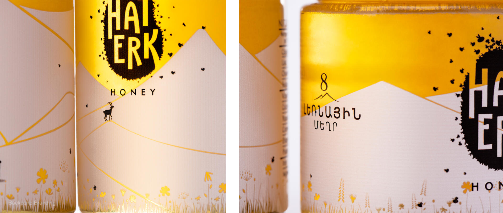
We have had a creative task to portray a product of sentiment and adventure in an arrangement of designs, and to express the brand identity through various products of the brand (9 varieties of nature’s pure honey, juice, pomegranate molasses).
“Haterk” is a village where many of the products were first produced. From Haterk, many paths have been laid in search of ecologically pure, fresh, produce far from industrial development.
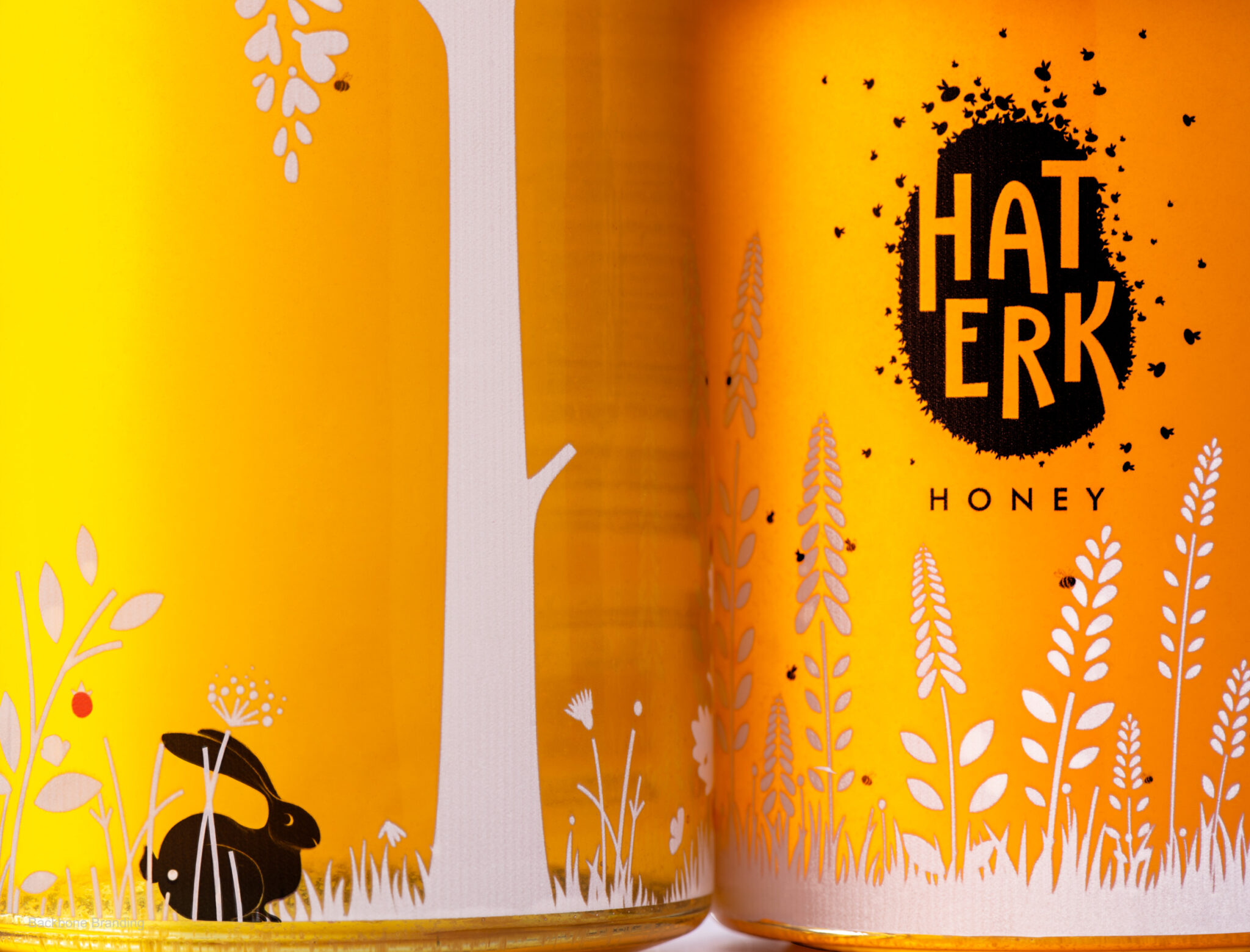
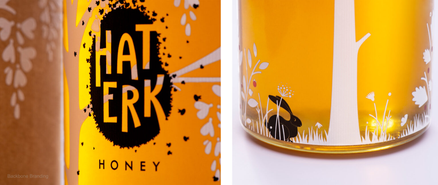
It was important to convey the brand’s promise of “a healthy and energetic life”, along with preserving its distinct character of following the paths to nature’s bounties.
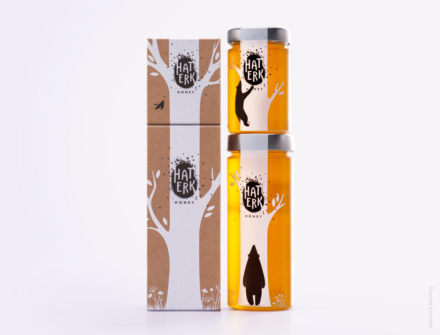
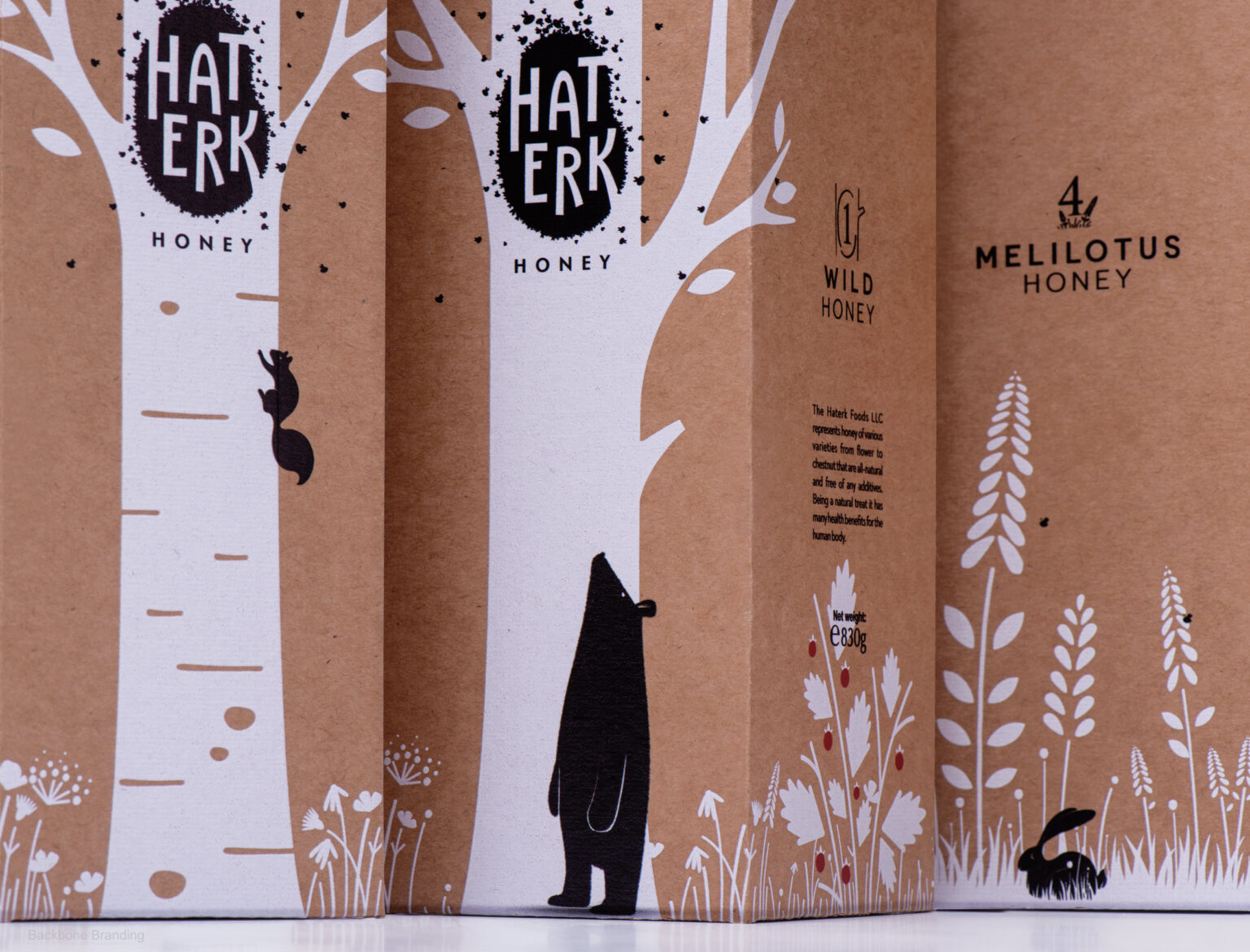
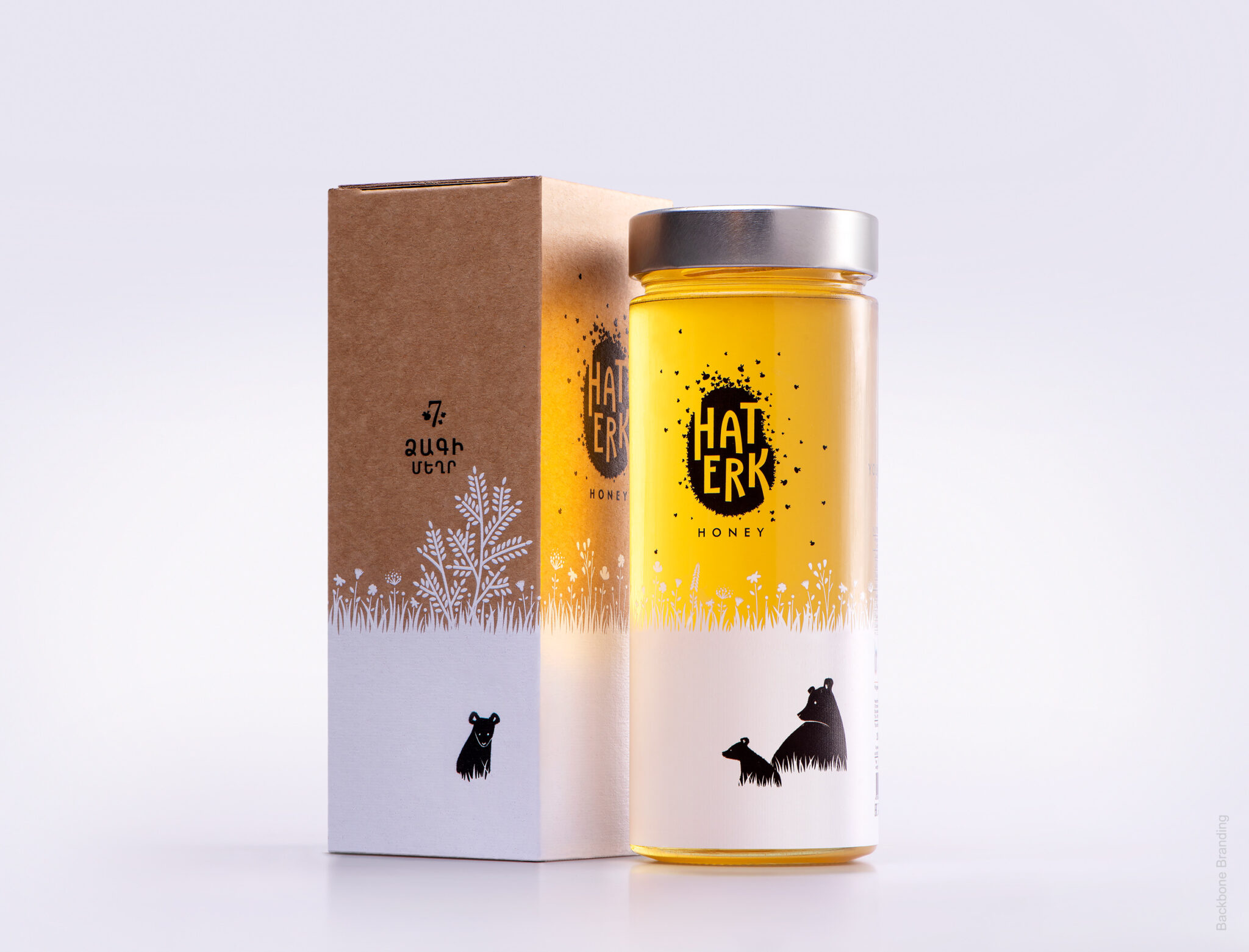
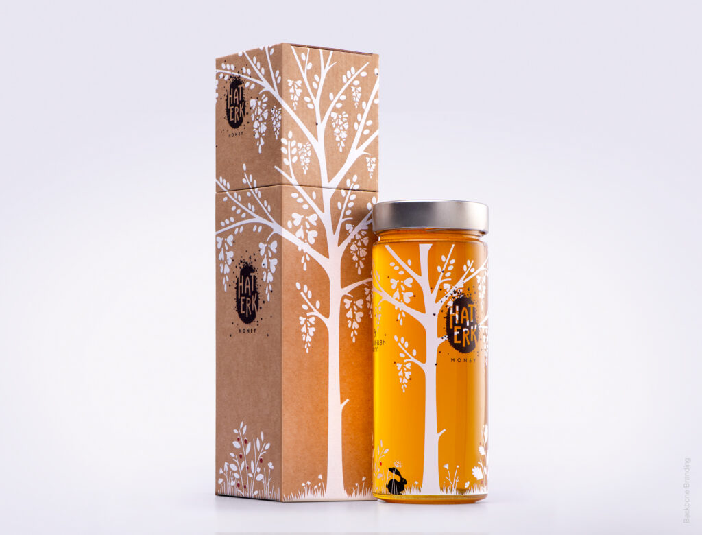
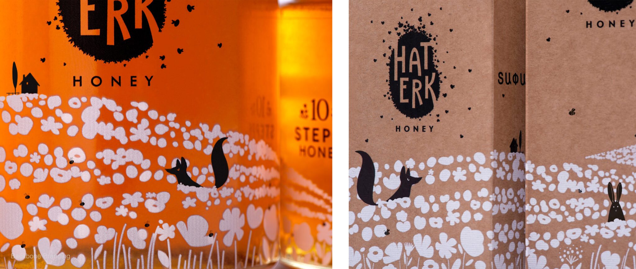
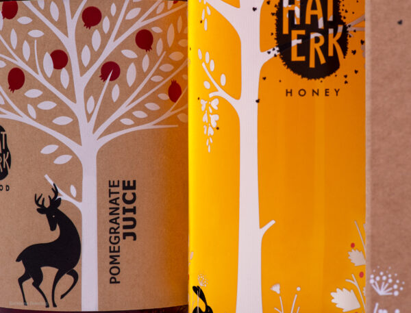
The packaging clearly brings the outside inside. The simplistic white and black designs are silhouetted over the varying hues of honey shining through the clear glass jars. Fir trees and fruit blossoms scattered in the wake of majestic mountain peaks, branches heavy with fruit, meadows of flowers, and, of course, happy animal life perfecting the idyllic scenes presented to you.
Even the outer packaging is food for your eyes. Lined up on the shelf or stacked on top of each other, a forest of trees grows, stretching out its branches as you add to your collection. And so, on each jar, we follow nature’s footsteps, sharing the discovery of her most generous gift to man.
We have enjoyed going down the paths and learning about the stories of each type of honey that we needed to visually introduce. We are certain that buyers will also find the picture stories enchanting.