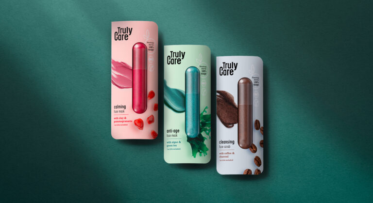
In our day-to-day work as packaging designers we notice that single treatment products, such as face masks, are often also sold in single-use plastic packaging. While single treatments are convenient for many consumers, single-use packaging means a burden on the environment. Therefore we challenged ourselves and designed Truly Care – a sustainable single treatment and zero waste face mask. Truly Care was designed to create as little waste as possible. The packaging consists of a paper wrap and a capsule that contains face mask powder. The paper can be returned to its recycling cycle because we paid attention to not using hot foils or any other finishing that would exclude the paper from its recycling cycle and make the packaging more expensive. The capsule itself is vegan and made of agar-agar – the same material used for nutritional supplement capsules.
The capsule contains the face mask powder which must be merged with water before application. By pouring hot water over the capsule, the shell dissolves. The powder can then be mixed with the water and the dissolved shell so that the mask can be applied. To support sustainability and to create a healthy product, the amount of ingredients is kept very low. The anti-age fuse mask consists of algae powder (spirulina) and green tea leaves. The calming fuse mask contains concentrated pomegranate powder and clay. The cleansing fuse scrub is made of coffee and charcoal. No additional microplastics, chemical dyes or any other chemical agents are included. Truly Care is organic and vegan and the face mask can be flushed away without any concern.
The motto of Truly Care, “no frills included”, does not only refer to the ingredients but also to the product itself. The packaging material was kept as minimalistic and pure as possible. Furthermore the visual appearance of Truly Care speaks a clear and straightforward design language. The paper wrap only shows the main ingredient and the texture of the product to give buyers and consumers an idea of the product. On the back easy, minimalistic icons guide consumers through the user instructions. The product’s sustainability and organic ingredients are communicated through the “bio” and “vegan” icons. We refrained from using explicit sustainable features, like brown paper, because we believe that these days it is one’s duty and it goes without saying to design any product as sustainable as possible. This should not only be communicated to a sustainable target group because we want everyone to use and see it.
„Truly Care“ tells what the product does: It’s an honest and genuine caring product for your skin. Hence we chose a minimalistic but sturdy font to represent the products’ features. The omission of serifs underlines the „no frills included“ motto because a striking and detailed font would not represent the raw pureness and strength of this product. The „c“ in the logo was extended by a little line which, combined with the letter C, represents the shape of the Truly Care face mask capsule.
Truly Care is developed by siids, the baries innovation hub.
