Koryphé: Premium Food Plant.
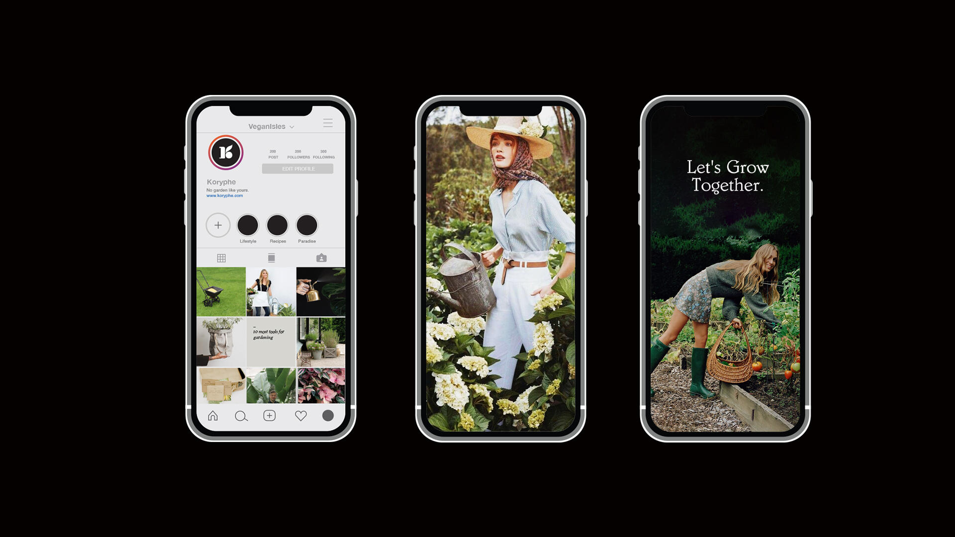
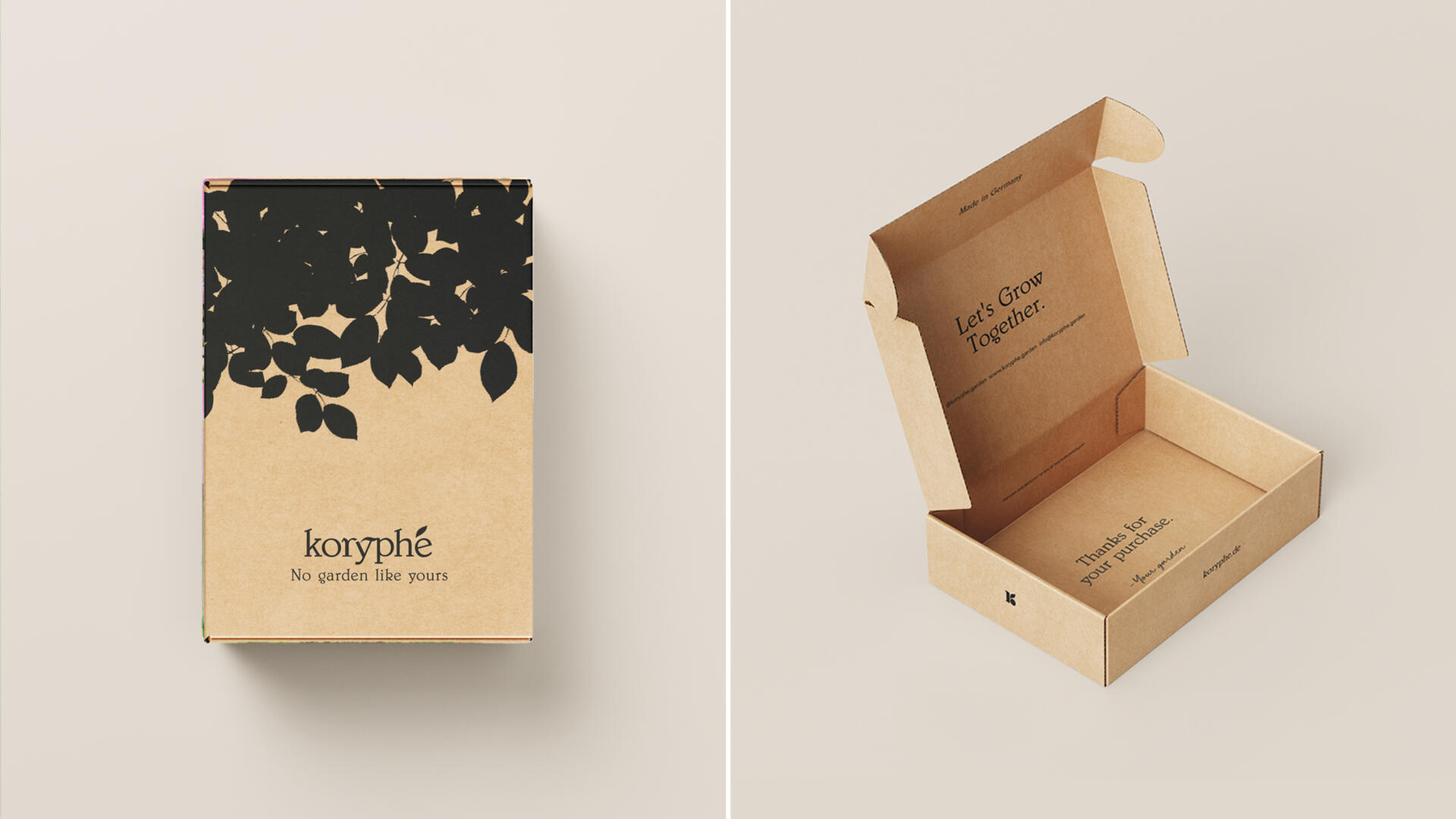
Koryphé is a digital-first sustainable gardening brand in Germany with the mission of nurturing people’s gardens. It is a brand with a family tradition that what it sought was to reinvent itself and offer consumers the highest quality products with the German guarantee. Koryphé is a new brand with a Bold, Minimalist Style.
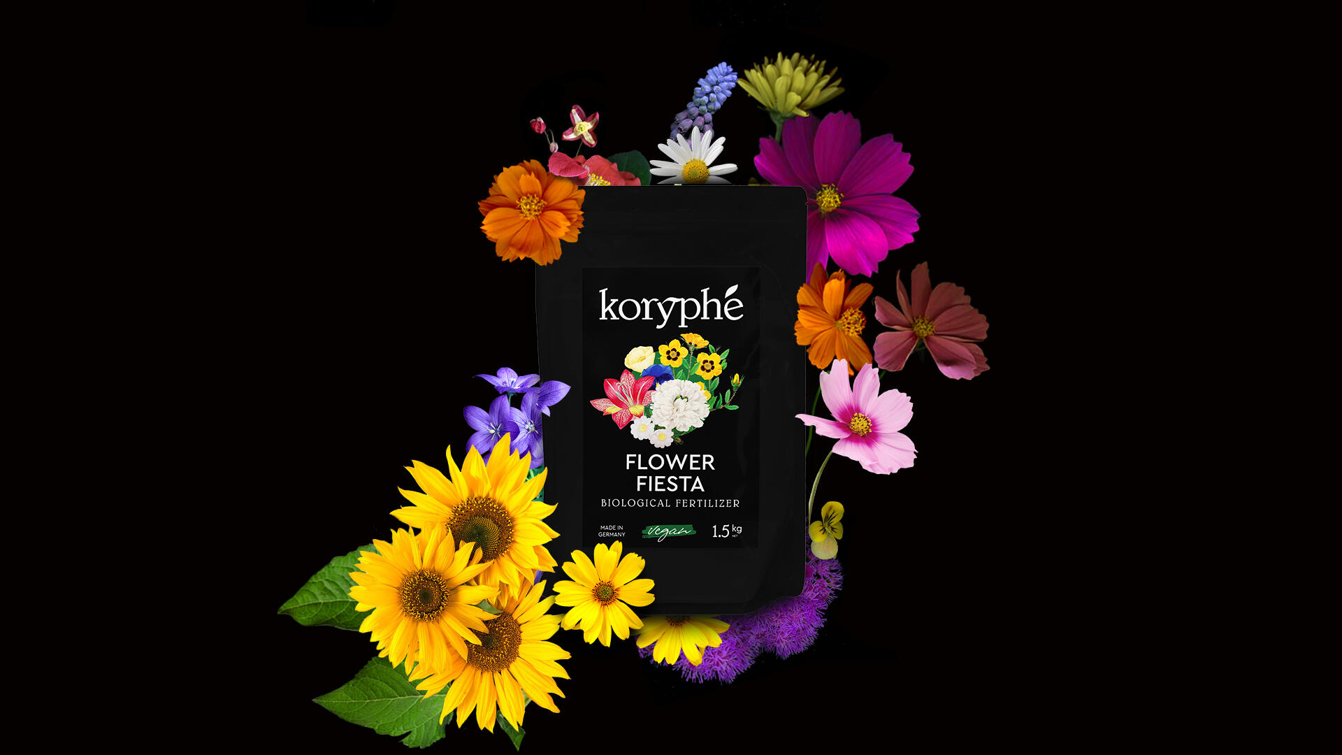
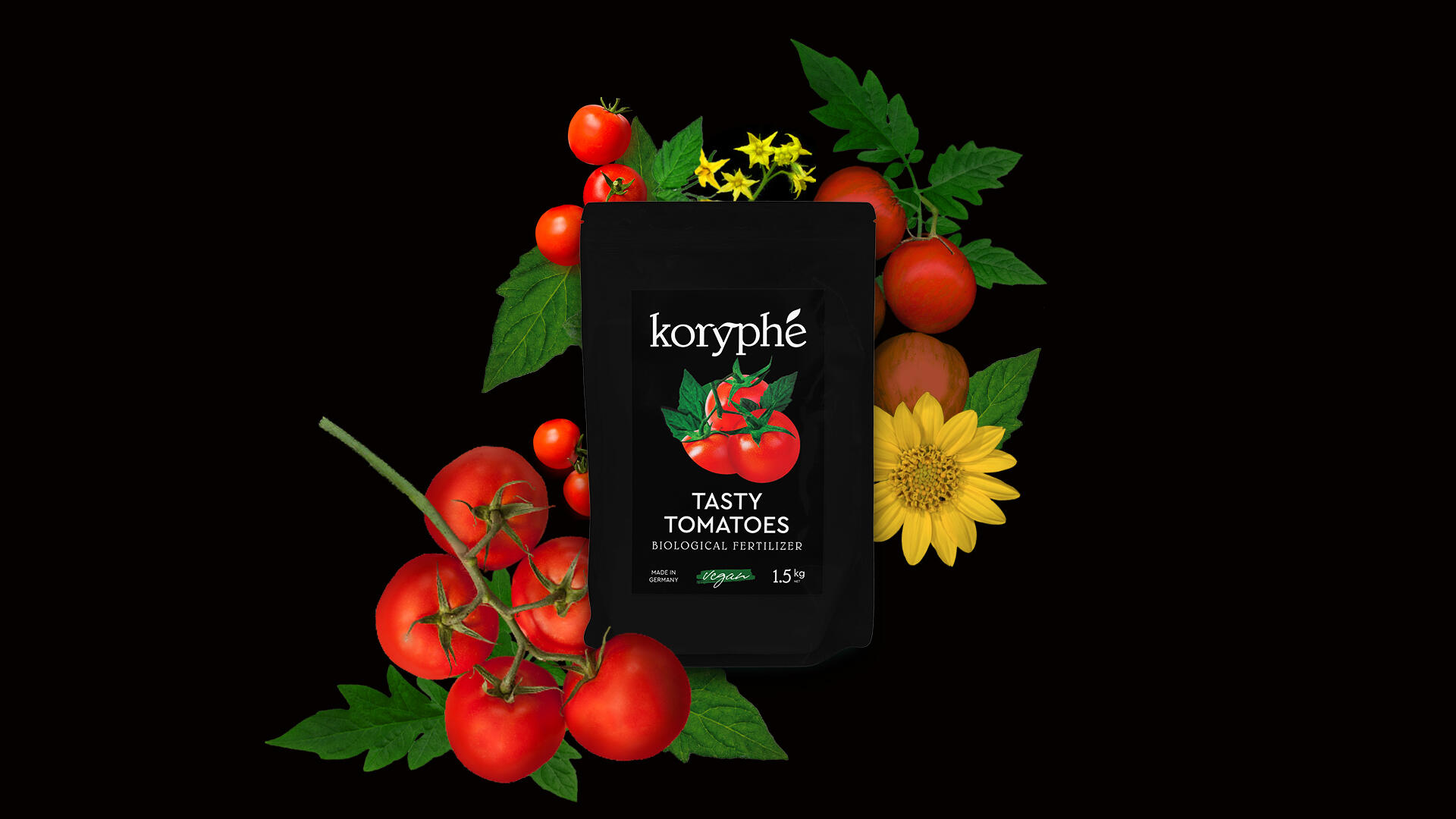
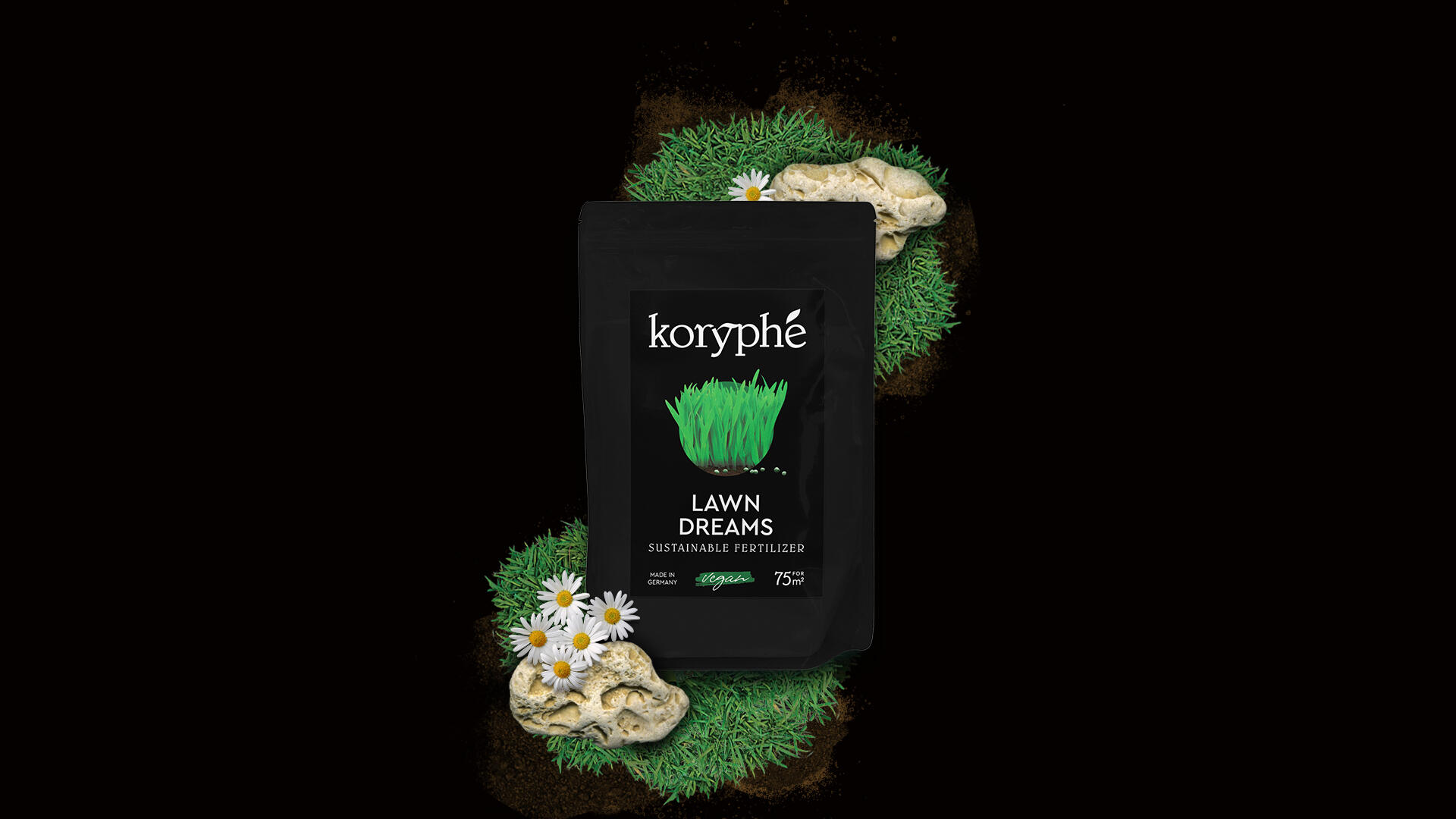
The world of plants is full of color, using black as the base of the design has been an disruptive choice. It is well known that it is the color we associate with the premium world. We reinterpret the existing codes of premium and brought them to the plant care aisle.
The label shows a central composition where bright and high-contrast images of plants stand out, emerging from a green circle, as if coming out of the bag itself. It is a composition that allows us to play depending on the contents of the bag while creating unity and the same language for the collection. For the logo, we selected a classic serif typeface as the base, and added gestures reminiscent of nature. On the monogram, we can even see the letter K with fruity elements. In addition, the graphic elements are inspired by typical garden blackboards where crops are named. Even the typographical selection has to do with this game of blackboards: something simple that reminds us of a more personal garden.
The art direction we used the look and feel of the Scanography technique: saturated colours and dramatic contrasts to pop out the main character: the nature.