The Armoder design studio creates the design for the Capa Rota wine image
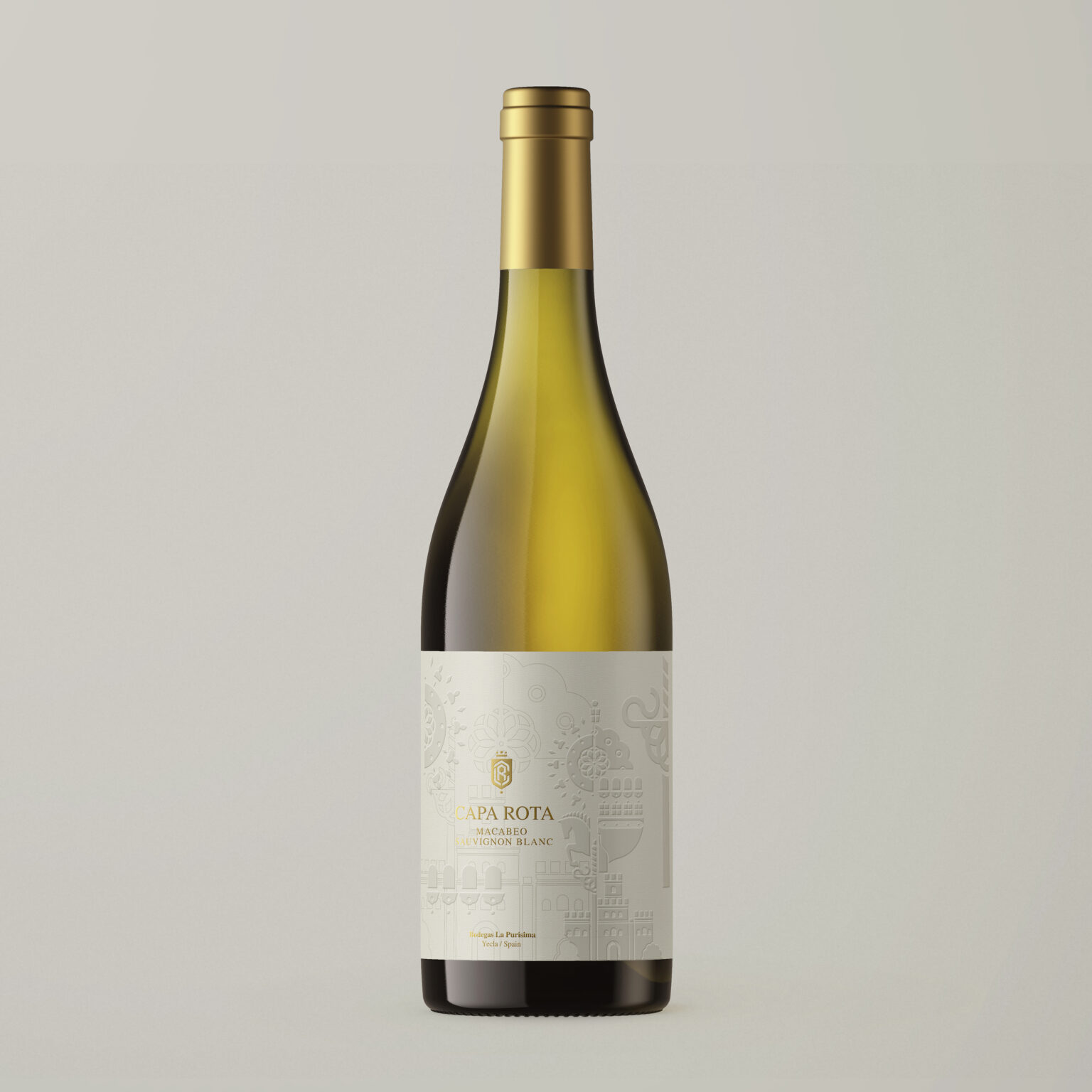
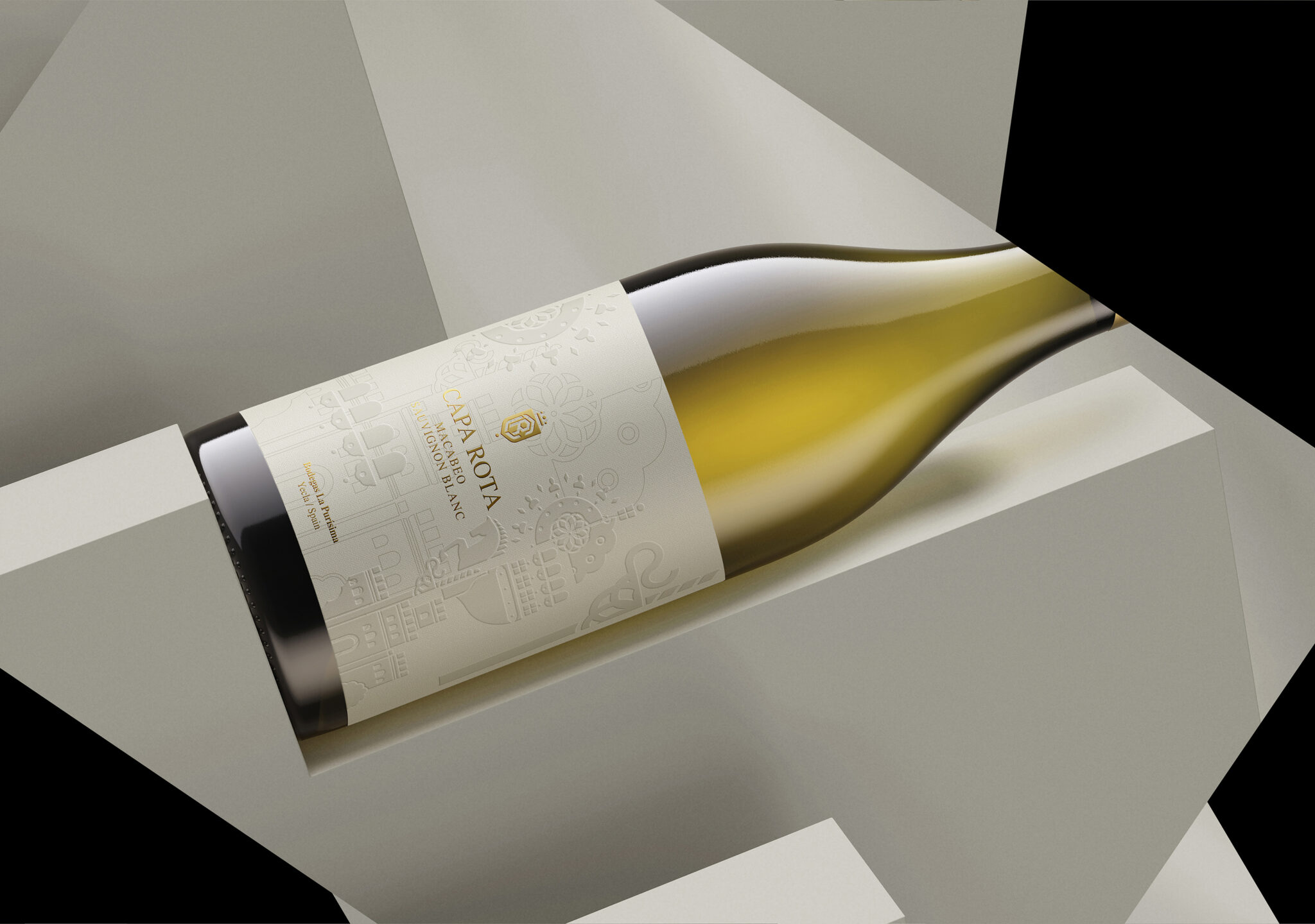
Our design and creativity proposal for the image of Capa Rota wines from Bodegas La Purísima is inspired by a scene from ancient times. We created the logo and recreated a scenario in relation to a stately world. A visual composition that integrates, among others, elements such as horses, shields and buildings.
At the beginning of the project, we created the visual narrative of the image of the wine Capa Rota Monastrell Selection and Capa Rota Macabeo Sauvignon, both in the Burgundy bottle, recreating all the elements mentioned in a single representative scene of the range of wines, differentiating them with the selection a black background for the Monastrell Selection variety and an off-white background for the Macabeo Sauvignon variety.
In our Armoder design studio, we create the illustration of each of the reinterpreted elements that star in the image of this range of wines, such as shields, castles and a rose window. The elements that make up the illustration are highlighted in braille varnish and in the descriptions of the product such as its name, logo, variety and winery, a gold stamping is used, enhancing its strength.
The Capa Rota wine design is born from the deconstruction of that environment, a composition of elements that reflect an identity, within a frame of rhythm and mystery, a journey between gallant scenes, displaying its distinction and nobility.
From the beginning, at Armoder estudio, we imagine the scene contemplated from the rose window, which stars in the image of the wines, contemplating through the windows of its building, the arrival of Capa Rota.


