Single Malt Whisky from England: Traditional methods with a touch of innovation.
MOMENT OF CHANGE:
Weetwood is an established independent brewery and distillery in the heart of Cheshire. Their team has always made everything by hand using real, high quality ingredients, sourced locally where possible.
Weetwood has grown a loyal customer base since the brewery’s beginnings in 1992, continuing to make the great quality beer that Weetwood is known for and in 2018 opened their distillery producing Vodka, Gin and Rum.
Sales have been steadily progressing, but Weetwood identified the next phase of growth… Cheshire’s first single-malt whisky.
Weetwood wanted to challenge the belief that a good single malt whisky needs to be produced in Scotland and requires ten years of aging. With this in mind they have worked hard to generate a distinctive flavour and character in every step of the multi-year process. The single-malt is aged for at least three years in American oak barrels, made bespoke at 3/4 size, shaved, toasted and re-charred. This means the liquid has maximum liquid-to-wood contact throughout and takes on a warm, toasted flavour. And then nature does its thing.
The cold Cheshire winters and temperate summers mean the liquid goes through extremes of changing temperatures, deepening the flavours of the whisky to even greater degrees and resulting in something truly unique to Weetwood and their local area.
Looking to appeal initially to their existing affluent, local catchment, with so few English whiskies, there was also the opportunity for them to take the brand national. We needed to create a brand that reflected our audiences’ discerning tastes and their appreciation of craft, culture and timeless classics. Our brand also had to be ownable and as inimitable as the liquid Weetwood had crafted.
WE DELIVERED:
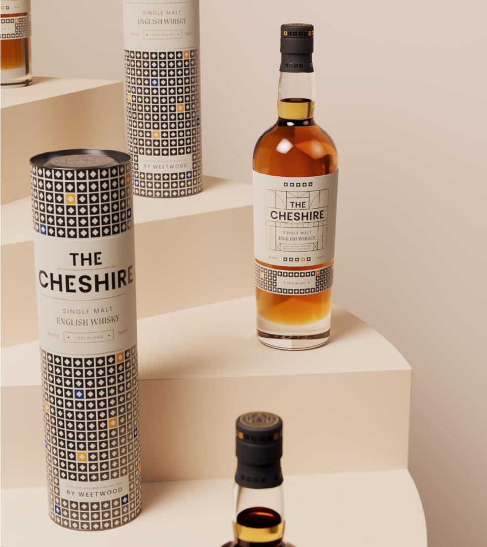
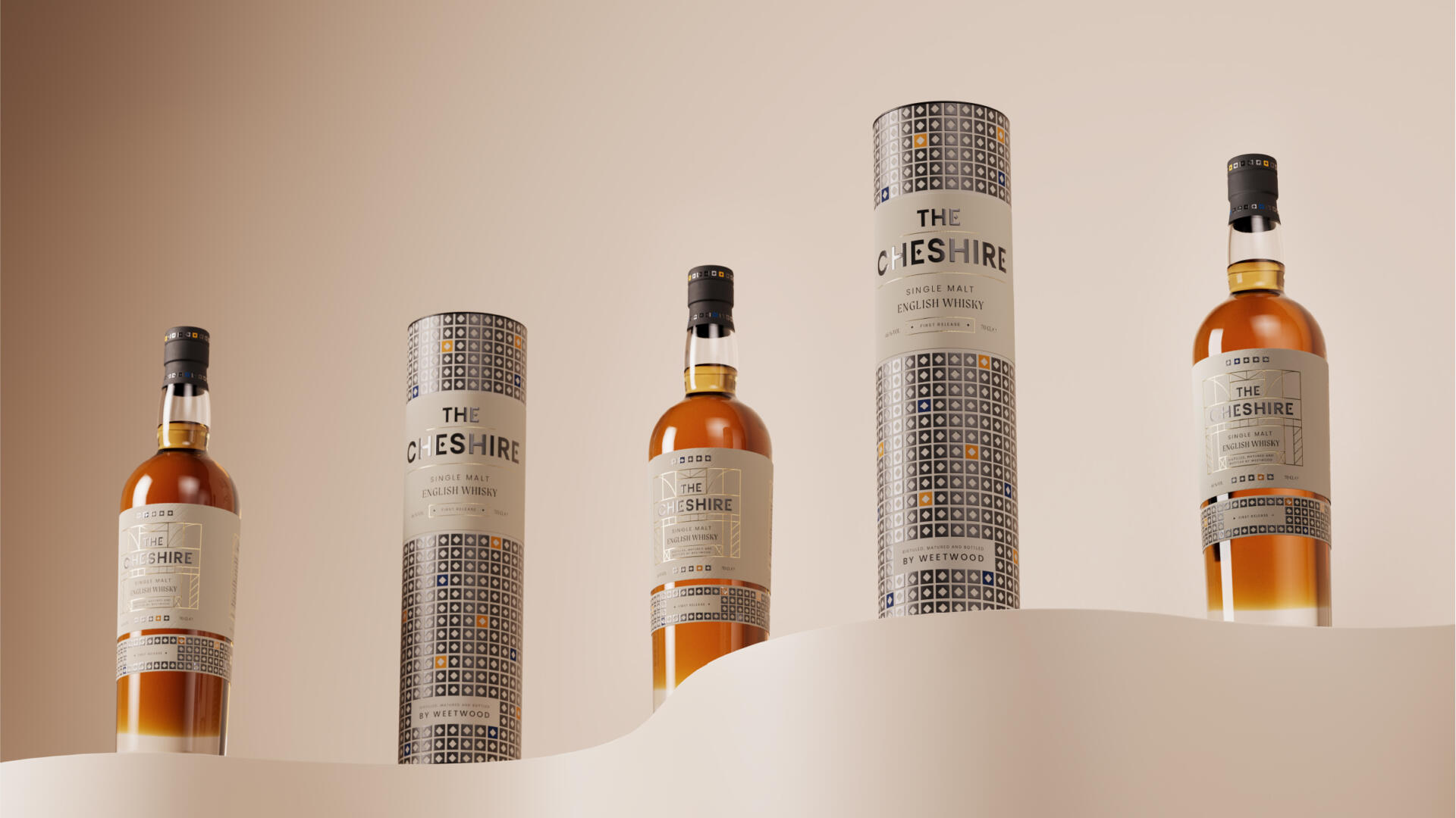
As strong as the Weetwood brand is locally, we felt we needed a nationally recognisable and instantly understandable name for the whisky. And so, The Cheshire was born. Obviously English, but also reflective of the unique place Cheshire is and its contribution to the production of the liquid.
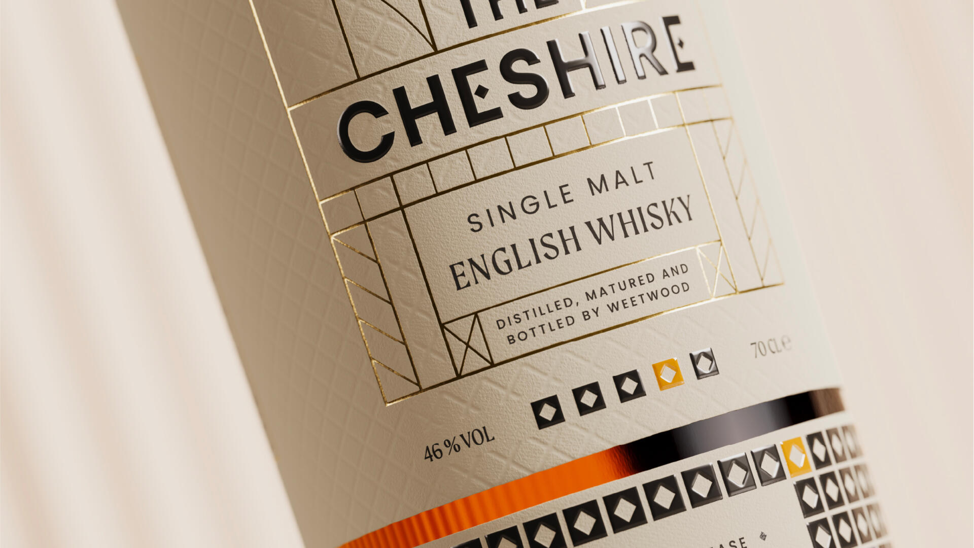
Cheshire also became our inspiration for brand development. Deep exploration of what made Cheshire so distinctive ranged from its rural heritage to its role in the industrial revolution. But it was the unmistakable history on show in Cheshire’s architecture that really stood out. The striking boldness of medieval timber buildings alongside ornate Victorian patterns felt truly distinct. Our logo creation was influenced directly by this architecture. The strong, solid, caps typeface reflects the black timbers and letters and are completed with small squares, hinting at the geometric Victorian patterns from flooring and stained glass.
The logo inspired the development of a bespoke font for the brand, where the bold typeface is embellished with our square ‘tile’ asset. A more traditional, serif typeface is utilised as a secondary typeface to reflect the heritage we wanted to embody.
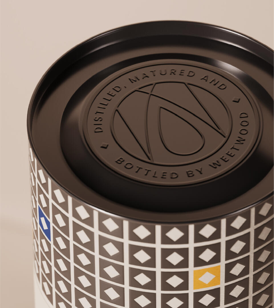
Our ‘tile’ became the literal cornerstone of our brand design. It is used to break-up copy, introducing detail and interest as well as the splashes of colour from our palette. It is also used to create real ‘off-the-shelf’ impact as a repeating pattern on the premium tube the bottle sits in.
Gold foil finishing on some finer details of the design again reflect the premium nature of the product.
A subtle, but beautiful, pattern on the front of the label is inspired by the patterns from Cheshire’s timber-framed buildings.
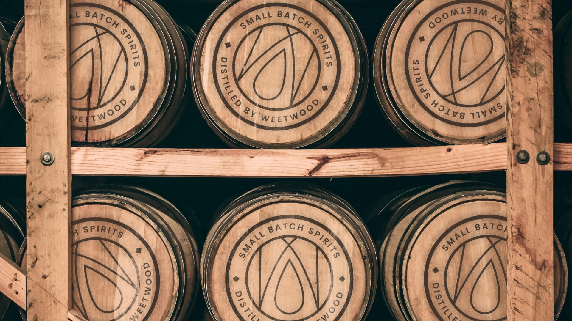
Bespoke ‘stamps’ link the product back to Weetwood, whilst also providing storytelling of the process and provenance of the whisky. Our master stamp is also on the top of the bottle and tube cap.
POSITIVE CHANGE:
The Cheshire reflects the history of the the county’s evolution and its strong position within the Industrial Revolution.
The sense of timeless tradition in the packaging and brand suite we have created for Weetwood Whisky is inspired by the renewal and innovation that defines the area from during those defining years as well as the established local affluence achieved from the hard work and industry in the time since.
The whisky itself, along with the branding design, is inspired by the past but is future thinking and continues that trend of innovation and exploration.
The Cheshire is not to be constrained by tradition but encouraged by it.