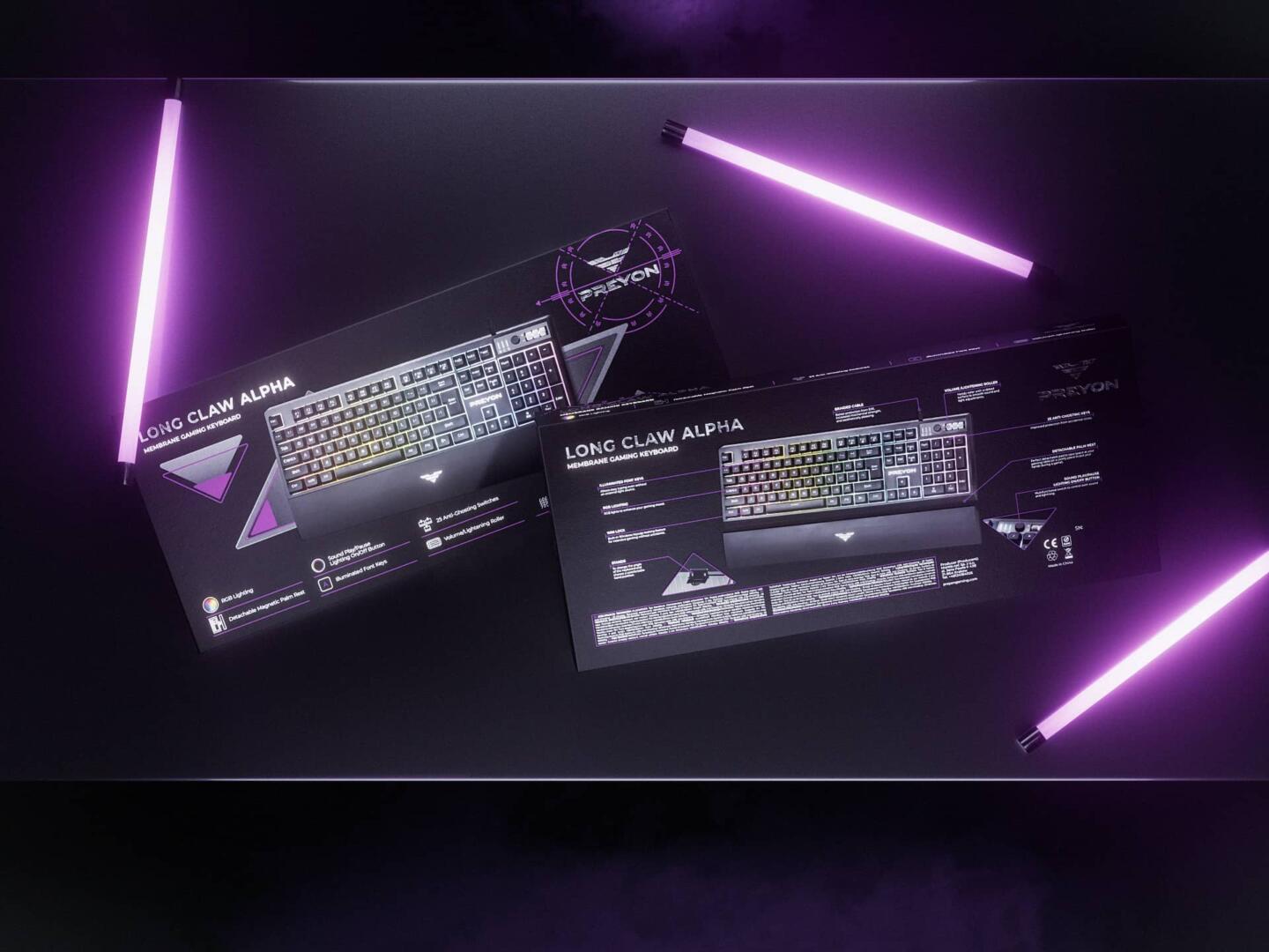
Work on the Preyon brand began from the scratch. Our client had a clear understanding, that the gaming accessories market was growing more than 10% per year and now was the best time to take their place under the sun. Thus, we have developed the name for the brand, the concept of the design of the logo and corporate identity, product packaging for 30+ SKUs, copy texts, descriptions, and key visuals. We’ve prepared the entire product line for printing as well.
The name Preyon refers to the word “prey”, but thanks to the “on” ending we add more dynamics to this word. This brand speaks about the search and the process of chasing victory (in this case, it is the victory in the game that is the main trophy for the gamer). The general visual style is inspired by futuristic military aesthetics, and the big idea of the entire trademark could be described as “birds of prey”.
The trademark logo is a predatory bird in flight and stylization for the military chevron. All names of the products are associated with an air theme: the names of birds, the names of winds & aerial weather conditions. Matte protective plates in packaging design — a bold reference to the latest combat aircraft, whose coating consists of composite materials.
This product is a private label and developed specifically for the Morele marketplace.