Client:
The company has been working for a long time under the name of the category “Orthodontist Center”. Despite the fact that there is only one such center here and it was the undisputed leader of the direction in the region, but still it was a problem when searching from other places and simply identifying oneself and distancing oneself from competitors. In 2022, the company
expanded rapidly and moved to a new large clinic building. Global changes have become a motive to dig deeper and change what has been brewing for a long time — changing the name and creating an up-to-date corporate identity.
Goals:
The new interior and the growing number of customers demanded a change of image to a more meaningful and concise one at the same time in order to better match the audience. In addition, it was not so easy for clients from other regions to find a clinic by category name. In addition, it was morally outdated, did not carry the nature of innovations and the changes that were taking place.
Decision:
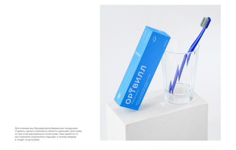
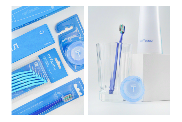
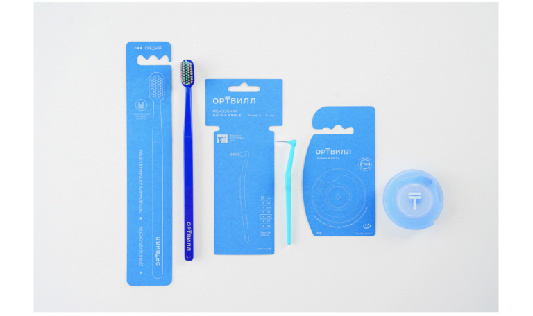
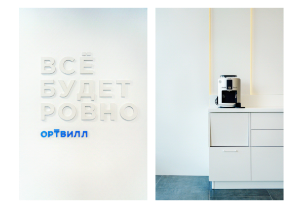
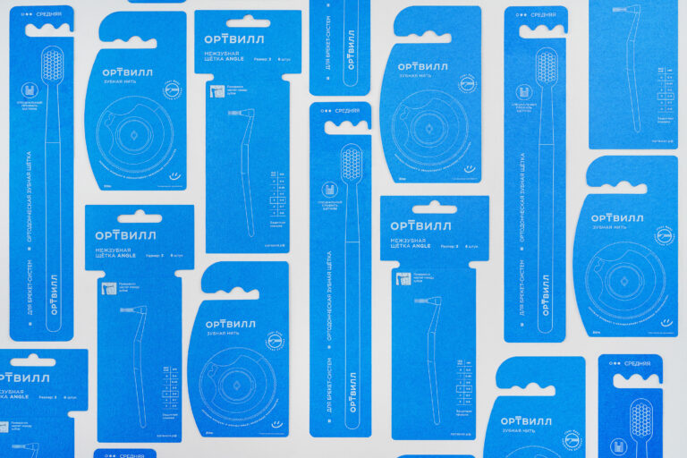
In our work, we started from the feeling that the brand should give confidence in its professionalism. From the sense of calm that he gives to patients. And so the name was selected, which absorbed both a hint of the main specialization — orthodontics, and the promise that “the teeth will be even.” We studied the competitive environment and applied an integrated approach to branding development, starting with the development of the name and ending with navigation and communication elements.
Process:
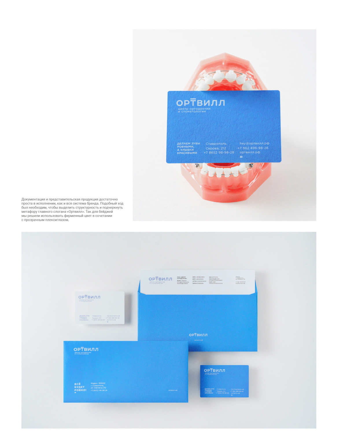
Throughout the development, we felt the trust of the client and worked in a single bundle with his team. We looked at trends, discussed and almost immediately came to a consensus. The brand should be distinguished by a confident and positive tone, talk about professionalism and technology. At the same time, we should not forget that the main audience is teenagers with their rebellious spirit. Although not the only one. We saw the importance of trying, on the one hand, to find ourselves in a sense of calm, and on the other hand, to give people the emotions that they receive along with physical changes.