Pastry is like music. It rises and falls, can be a quick fix when you want something sweet, soothes when you have the blues, can offer you flavours that march along with your triumphs and festivities. Pastry doesn’t stop (or you don’t stop with pastry) until you reach that psychological crescendo. To us, relating music to a confectionary shop made perfect sense.
A suburban pastry shop came to us for a new brand identity after the end of its cooperation with a franchise chain. The new identity had to be quite unique to stand out of the heavy competition and create an impressive brand-new image.
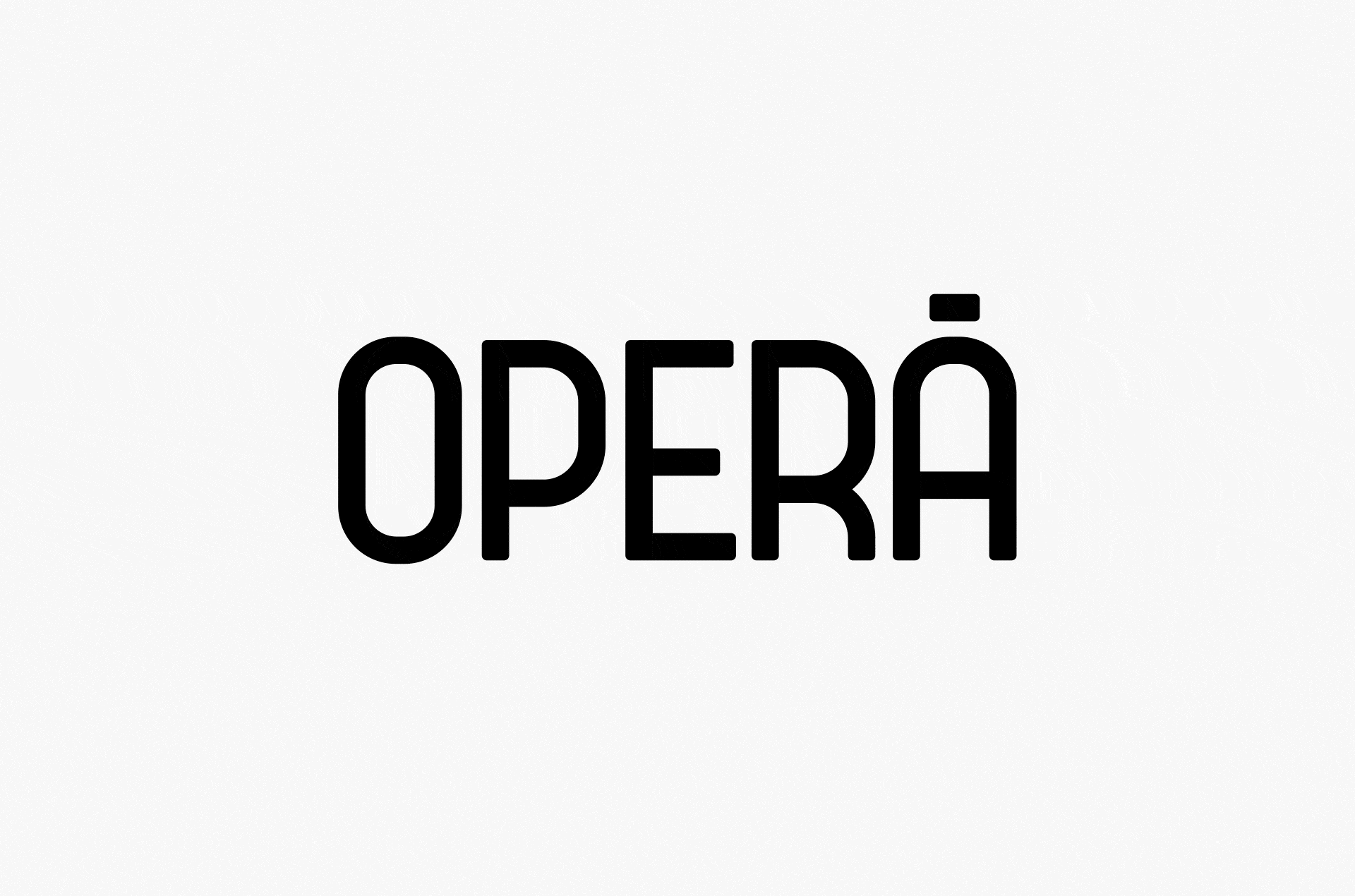
We gave the pastry shop the name Operá with the accent in the last syllable for that French je ne sais quoi. We imagined that every bite of sinful chocolate or moist éclair was like a sweet sound. And like with opera music, pastry filled the senses with something great, making the world a bigger, fuller, pluralistic place.
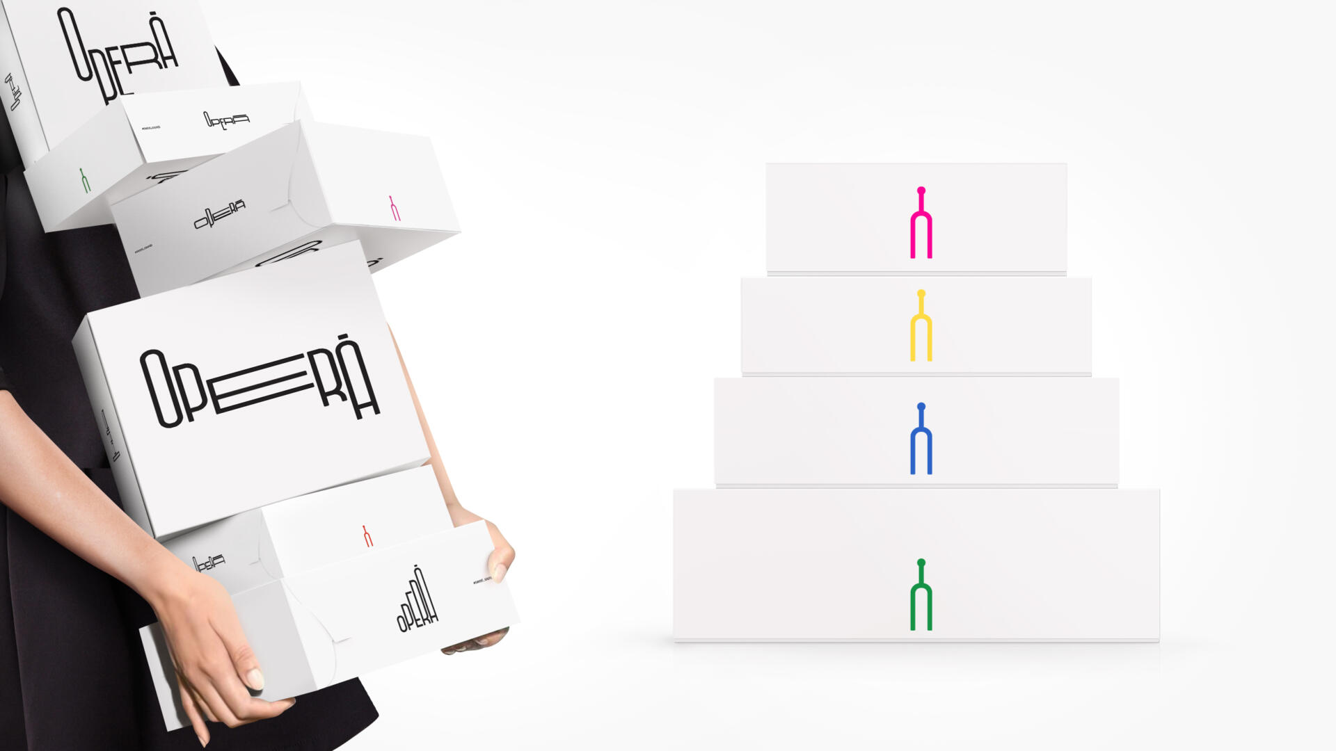
We created a logo that ascends and descends like notes on a music sheet. The logo is never stable but unfolds into a melodic journey. Taste becomes sound. It comes in waves and gives us a different experience, every time.
The application of the logo on the boxes was also ever changing. We used colour on the inside of the box, in a way that it illustrated the elusive movement of the maestro moving his baguette; a way to see the music.
This is how we managed to create a unique identity, through a concept that unfolded on different applications.