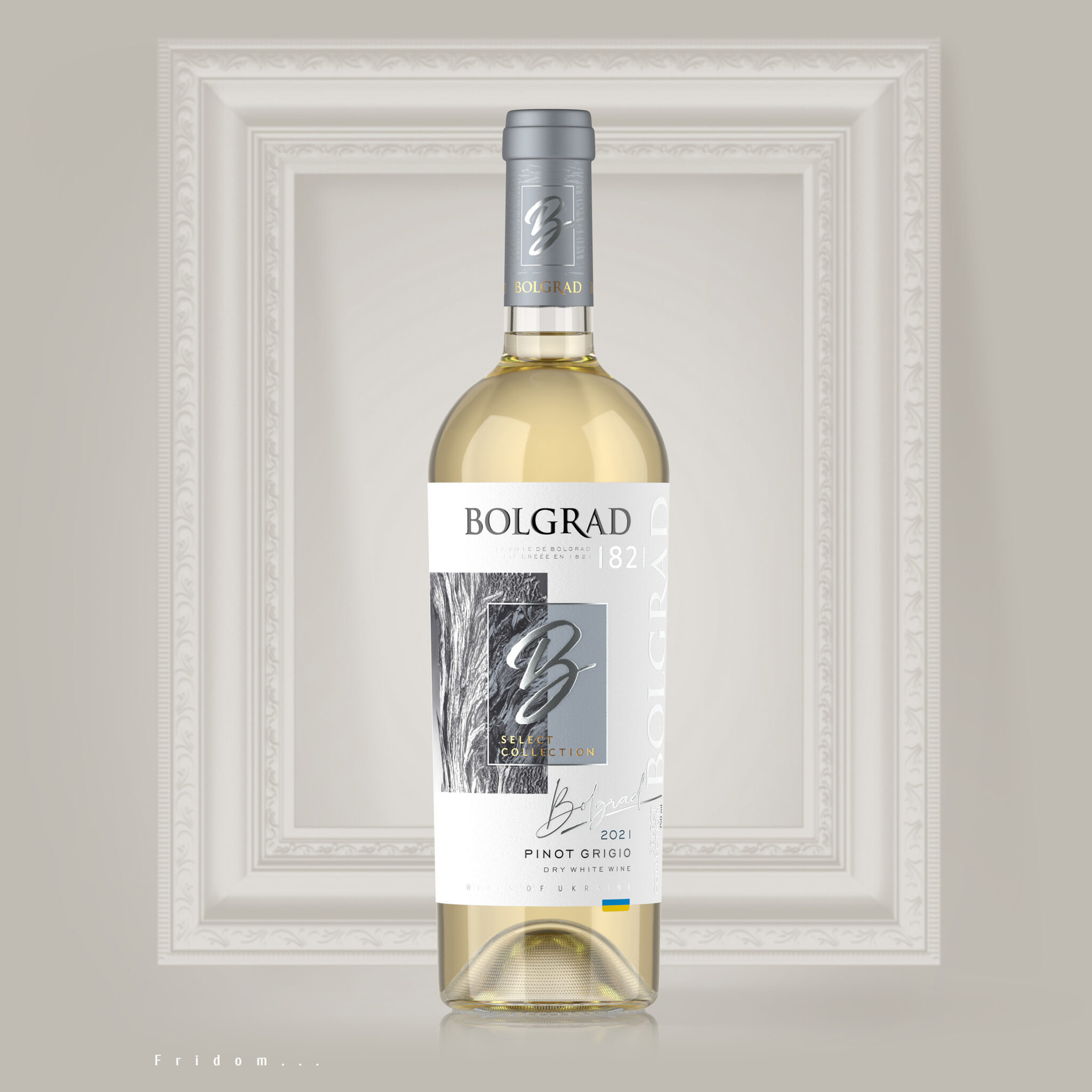
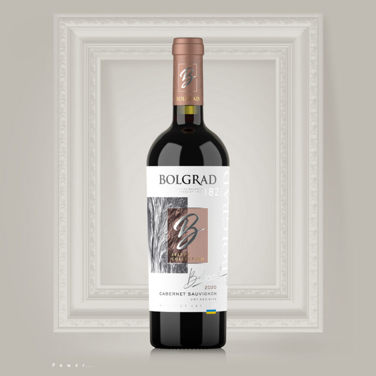
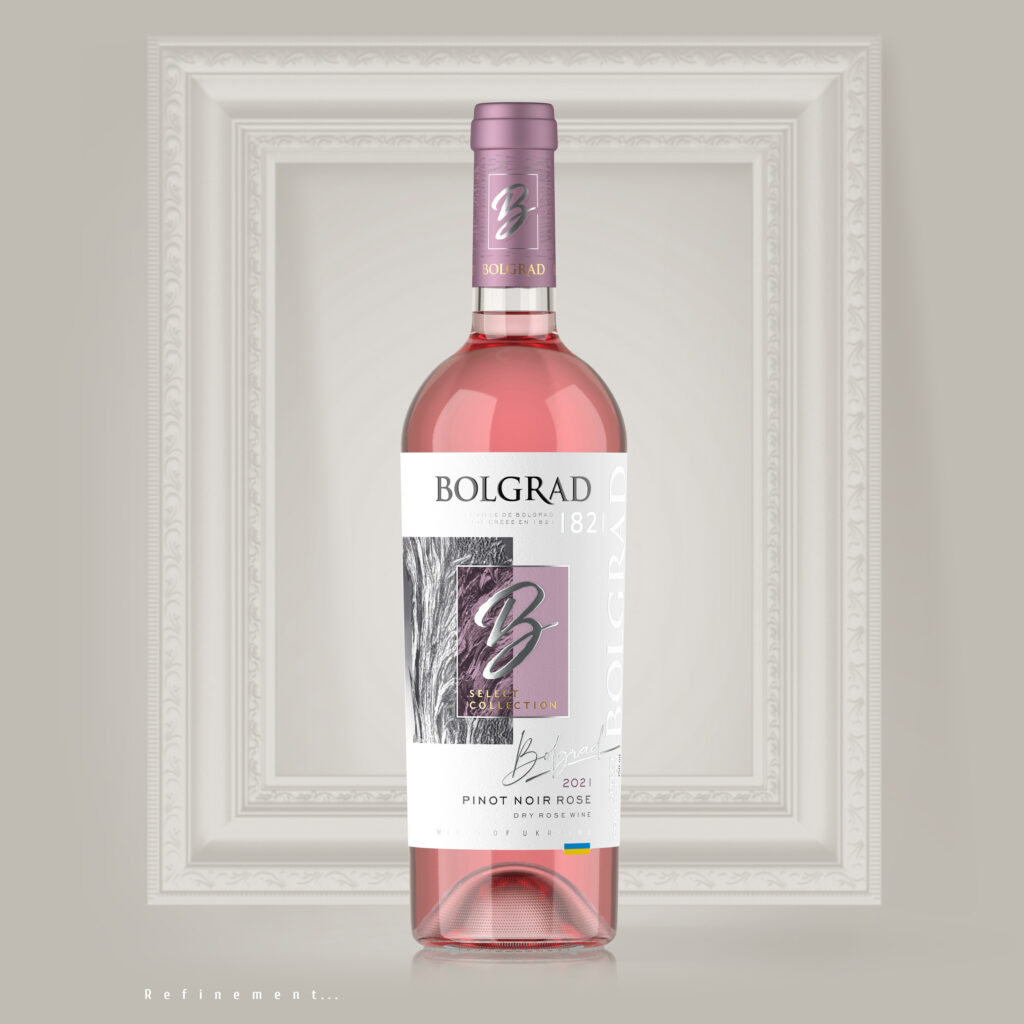
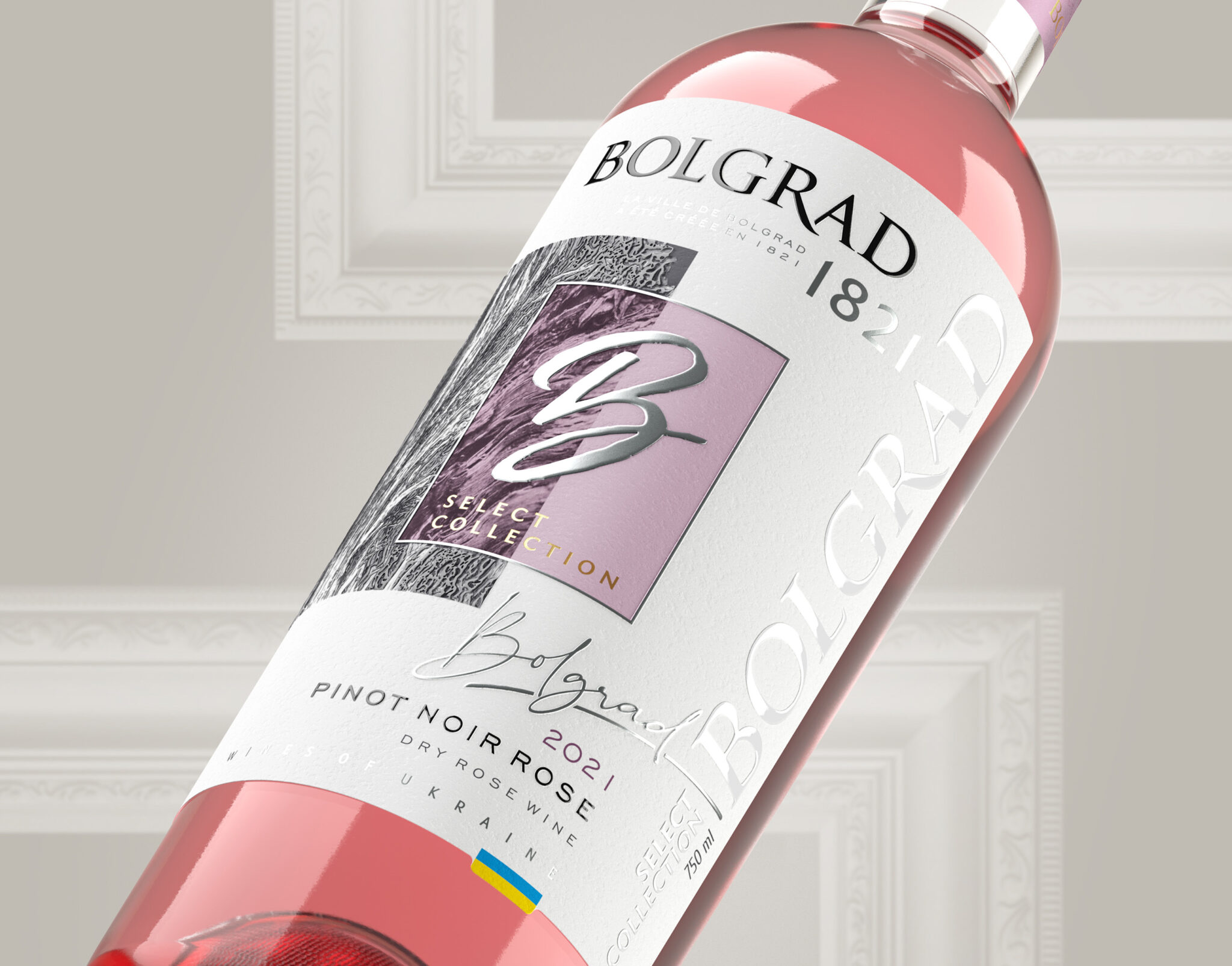
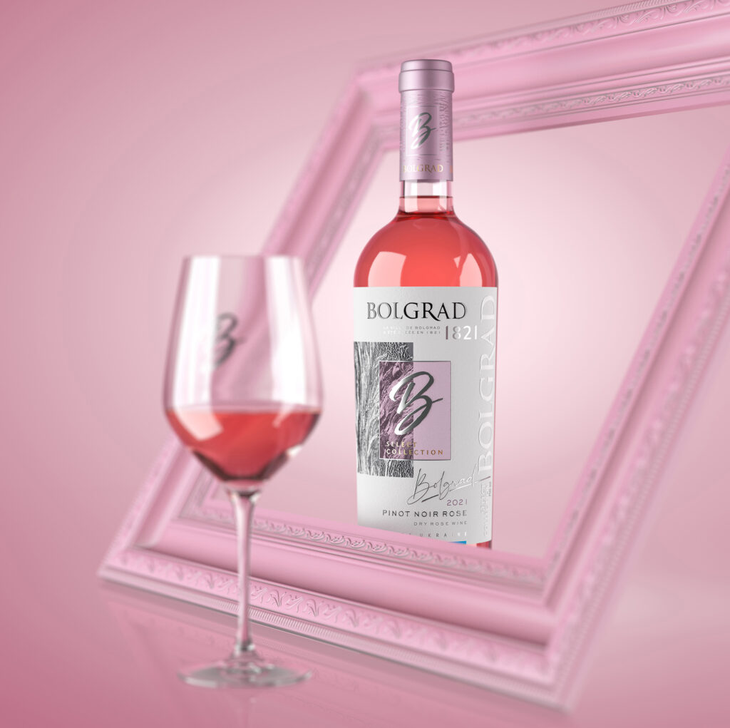
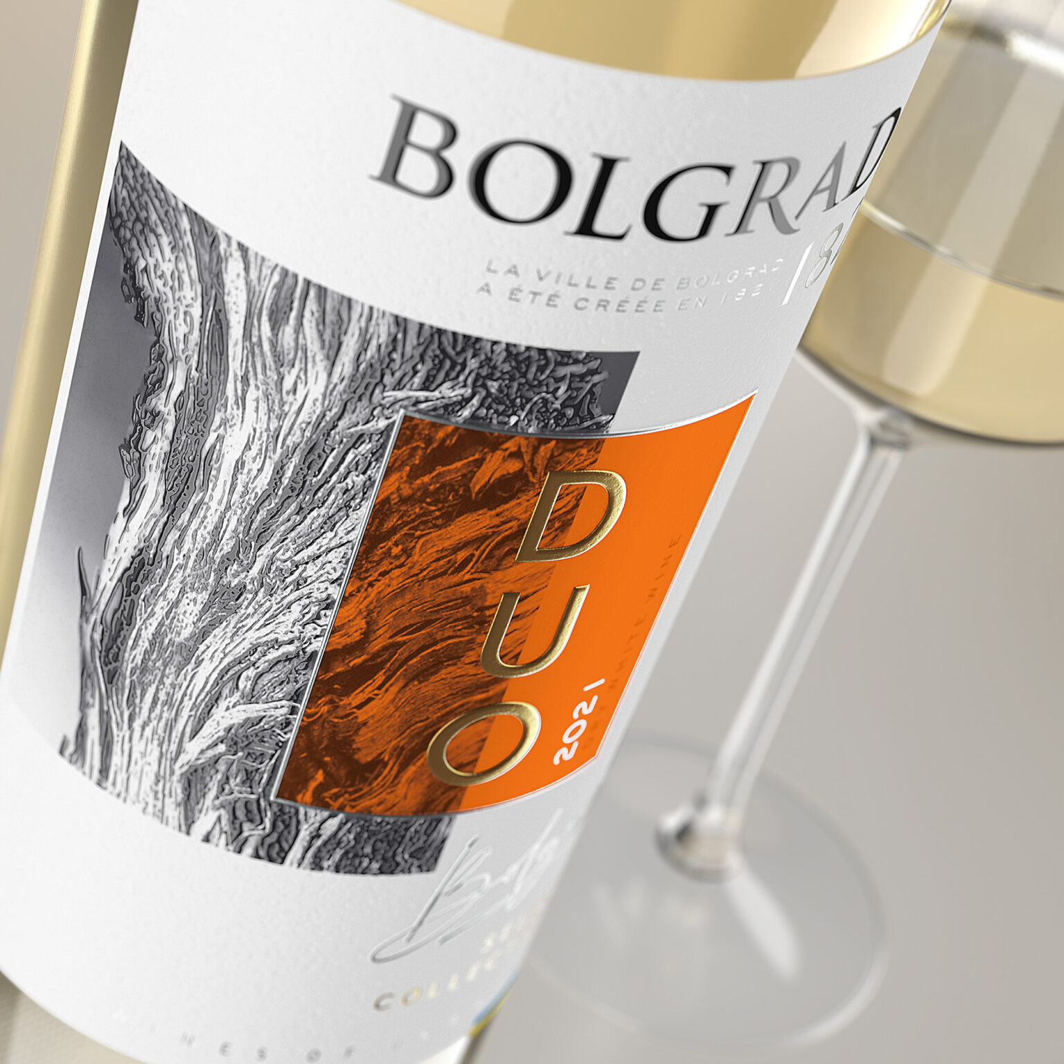
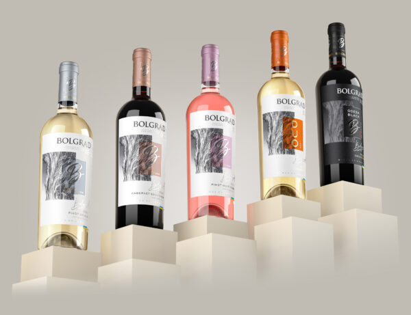
A series of wines with such a name requires appropriate branding and packaging design. We had the task to rebrand the series of Select Collection wines from the Ukrainian wine producer Bolgrad. Without taking over anything from the past, we had to rethink the concept and create a new visual image, strikingly different from everything else.
At this difficult time for Ukraine, we thought about what a Ukrainian wine producer can say about itself on the world market? What would he want to declare? What message would he like to convey to the world through his product?
Freedom. Strength. Refinement. Sensuality. Dignity.
These are the messages we decided to embody in the new wine concept. We wanted to convey a sense of refinement, exclusivity and selectivity. At the same time to do it in the most restrained and artistic way.
The developed concept combines two elements.
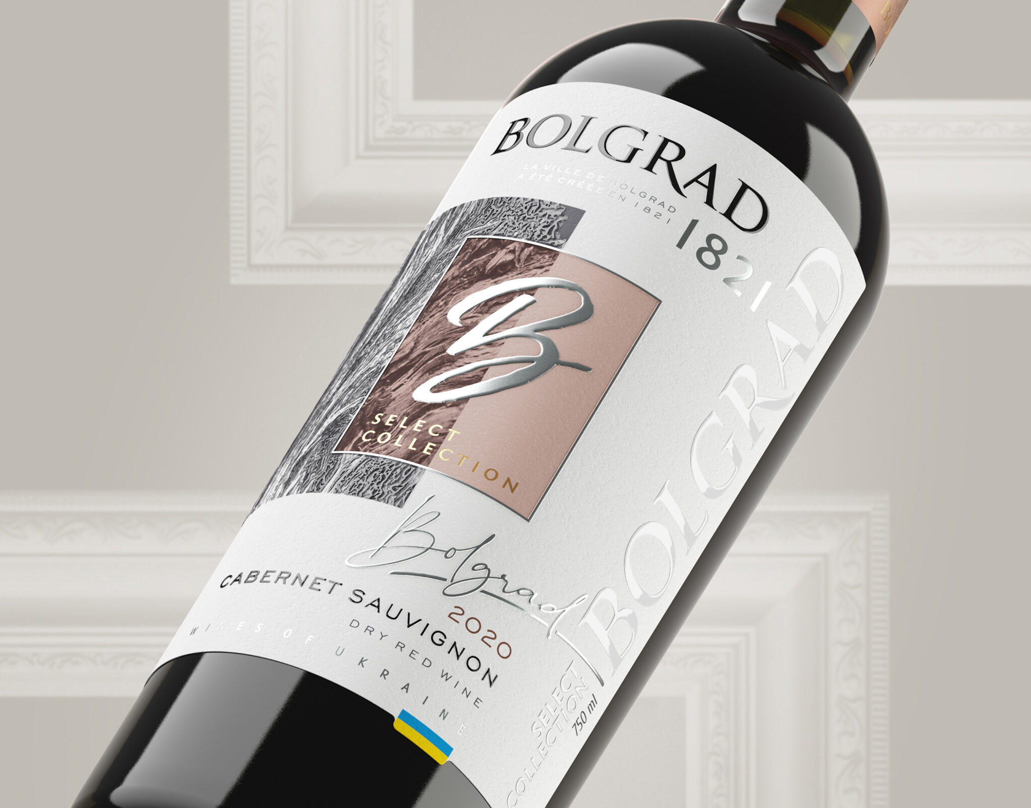
The first beginning symbolizes the image of old vines, which acts as a kind of pattern. It’s a tribute to the earth, to traditions, to our thousand year history.
The third beginning is symbolized by a handwritten letter B – the first letter of the manufacturer’s brand name. It is placed in an ascetic laconic frame with the addition of restrained soft colored tones. This central composition of the label symbolizes modernity, dynamism, aspiration for the future, readiness to experiment.
Choosing the best from our heritage we improve it to achieve a new high result. This is the meaning behind this concept.
Two seemingly irreconcilable beginnings: the past and the future. Traditionality and innovation. Conservatism and experimentation. Combined together in one composition, they create a single picture. It’s like being in an exclusive art gallery and looking at a work of modern art.
Bolgrad brand invites each of us to enjoy the exclusive creation of wine art.
Bolgrad Select Collection – instead of a thousand words!
