Psorilom – complete freedom and protection from dandruff!
Alkoy Group is a leading Russian developer and manufacturer of innovative health products. The company’s assortment consists of a wide range of medicines, medical and children’s cosmetics, nutraceuticals and homeopathy.
Psorilom is a line of non-hormonal therapeutic and prophylactic agents for problematic and dry skin.
Task
Develop a packaging and logo design that will:
- Remain recognizable to the audience;
- Increase the visibility of packaging and logo in the category;
- Differentiates the product from competitors, increases brand memorability;
- Be relevant to the modern pharmaceutical market and the visual world of consumers;
- Have a clear system of differentiation between the two main lines and convenient visual navigation through the text.
Solution
The first stage in our work is an audit of the effectiveness of packaging design according to our “Three Layers of Efficiency” methodology. It helps to evaluate how competitors work, what are the pros and cons of the current design, whether the packaging conveys the benefits and advantages of the product. We are looking for points of growth through which it is possible to increase the effectiveness of the design.
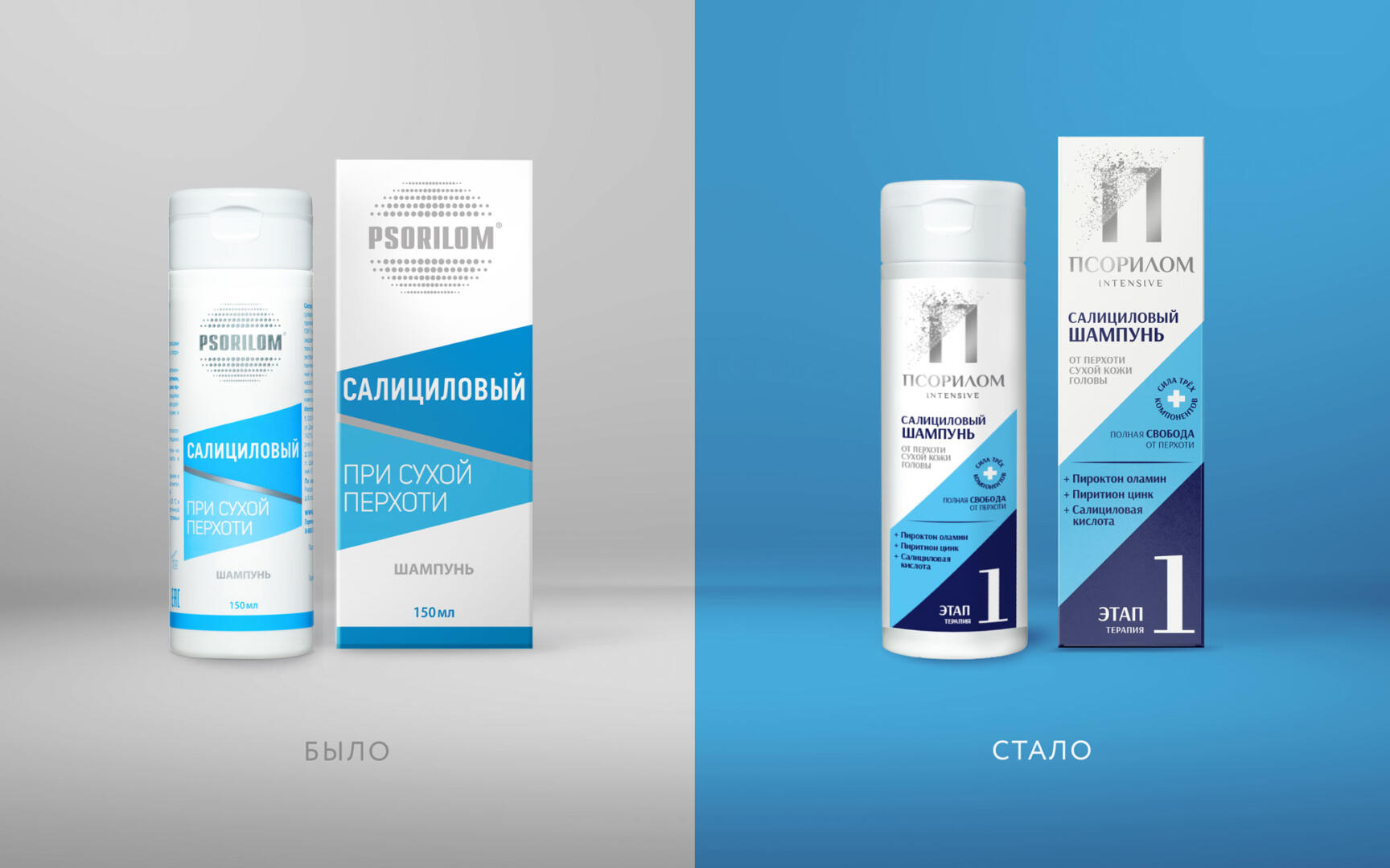
Psorilom is visible on the shelf due to the large spelling of the name and geometric elements in the packaging architecture. But due to the use of a different axis system, which uses a negative angle, the name is not very readable at such an inclination. Also, the properties of the product and how to use it are not entirely clear.
Our redesign approach is do no harm. If the brand has good sales, we need to be very careful so that the redesign does not become fatal and helps to increase these sales.
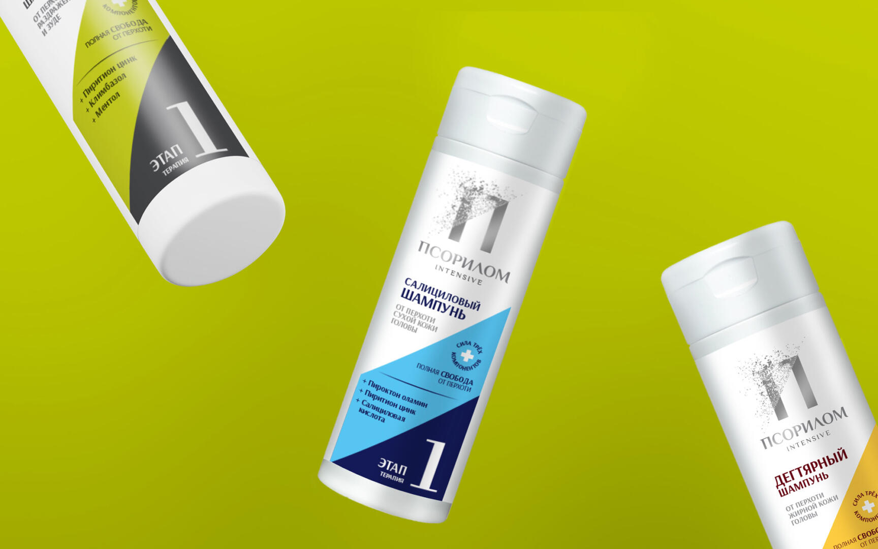
We did not touch the packaging architecture in order to maintain brand awareness for loyal customers. But they made the design more modern, worked out the geometric elements, making them brighter and giving them more space on the packaging. They contain information about the properties of the product and the USP of the brand.
The diagonal becomes an important element on which the entire design is built. The brand name is written horizontally, a large letter P appeared, which is also based on a diagonal consisting of flying particles, denoting the problem of combating dandruff.
Thanks to color differentiation, it is easy for the buyer to decide on the choice of shampoo for his hair type. The category of the product is large, additional brands (“the power of three components”) emphasize the benefits of the product and the main components that make up the composition.
The new design conveys the impression of a modern, expert and up-to-date brand that you can trust and offer modern solutions to a problem. We hope that the new packaging will help the product to stand out on the shelf, and companies to increase their market share and sales volumes.