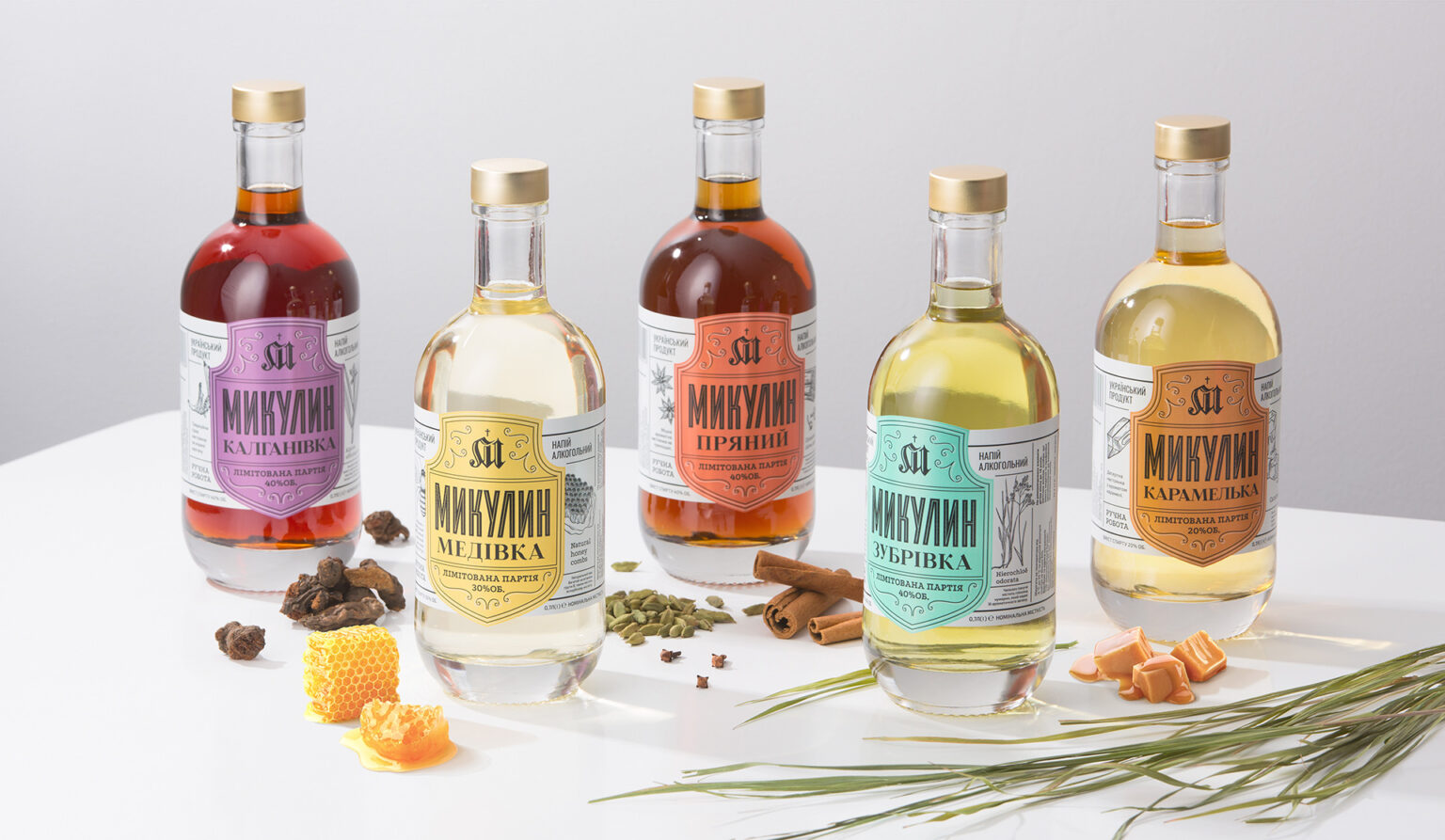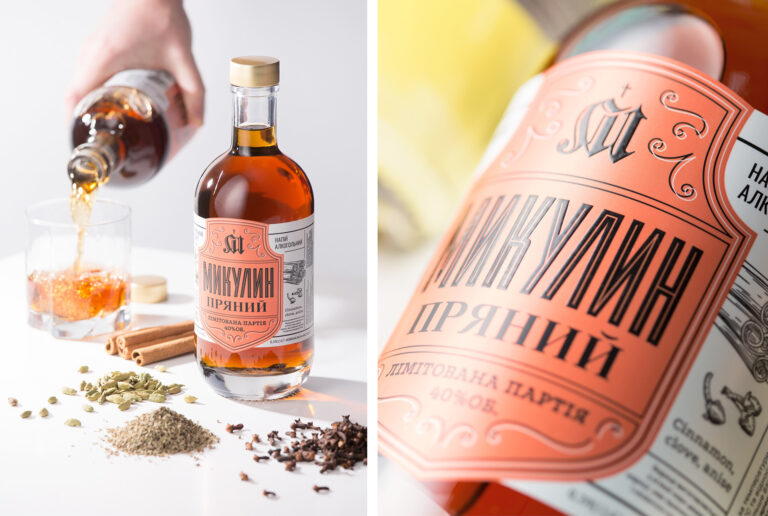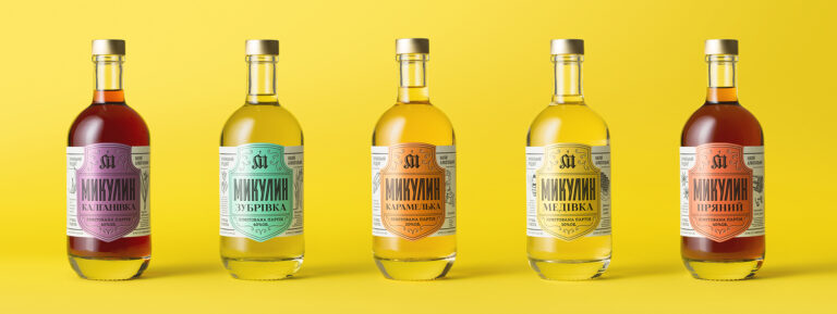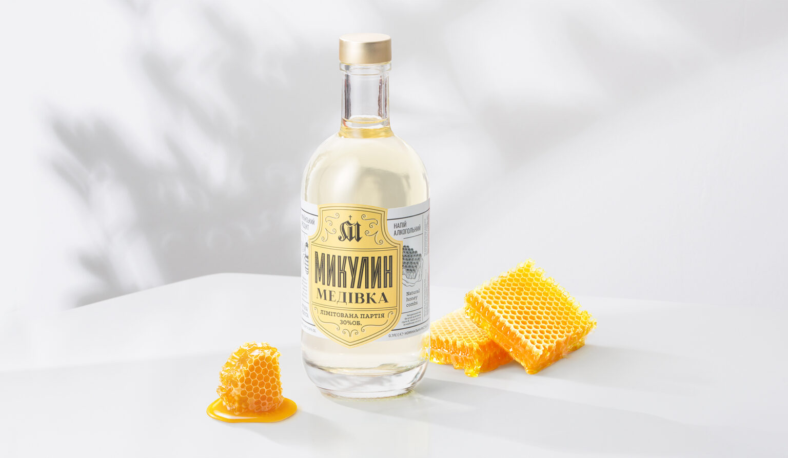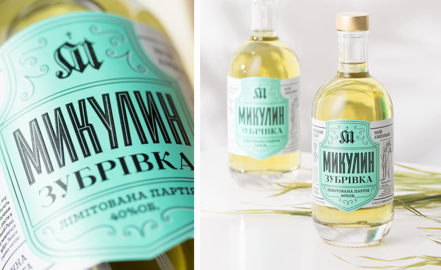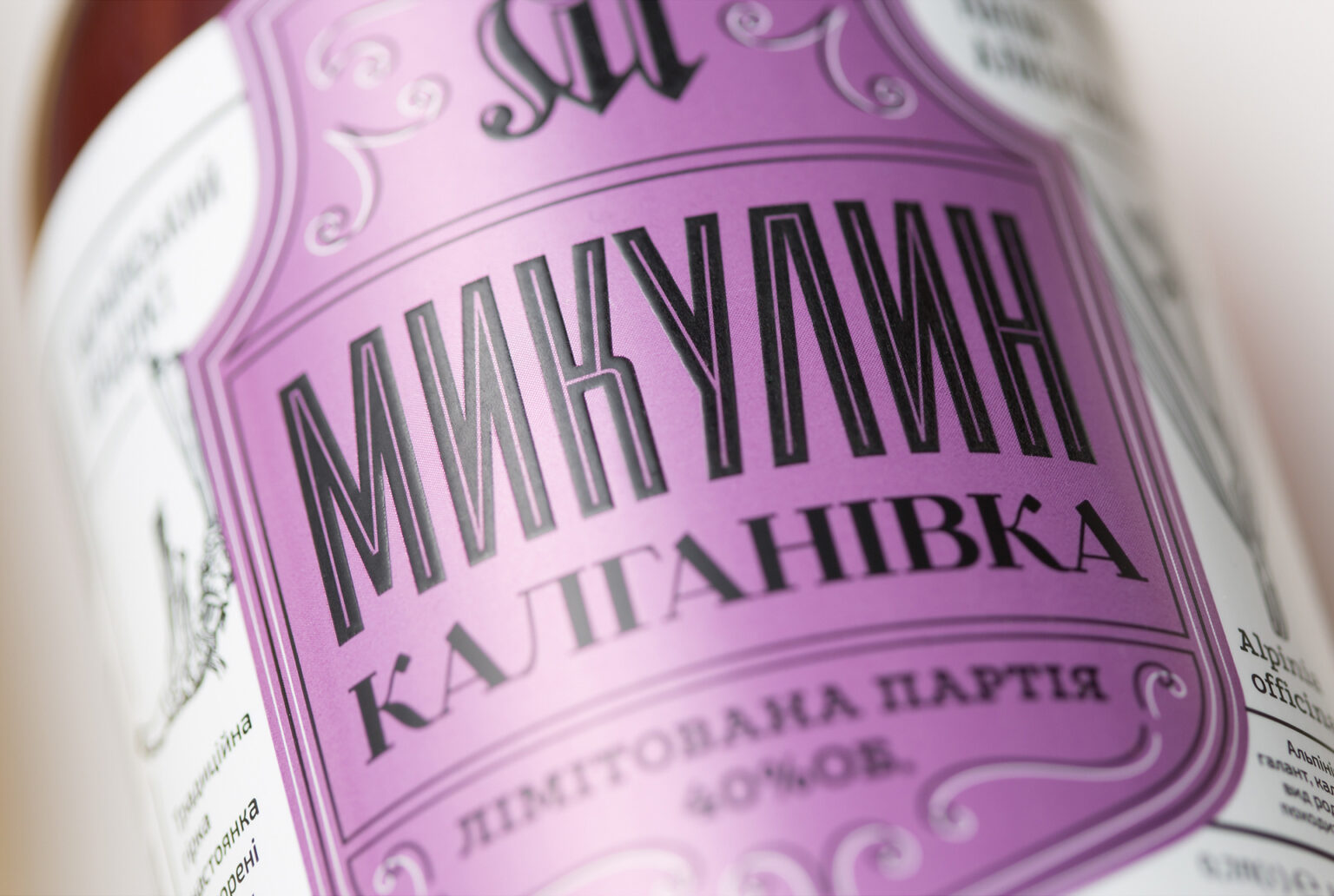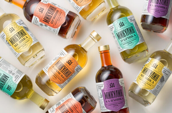
A shield image, used in designing previously developed drinks, served as the basis for the label. We were able to organically display all the necessary additional information around the shield. Main ingredients, depicted by means of catchy illustrations, are displayed right next to the shield. Infusions are a great drink for those who love to have fun and get together with friends, thus we decided to use a variety of bright colored labels for each of the drinks in the series. All of these steps ensure that the infusion bottles pop against the background of other drinks on the shelf, and evoke positive, happy emotions.
Curator’s Insight
The ingenious incorporation of a shield image serves as a brilliant metaphor, effectively conveying the concepts of protection and strength. This clever choice resonates particularly well with consumers who seek to fortify their immunity or boost their energy levels.
The deliberate use of bright and vivid colors assigned to each unique flavor plays a pivotal role in product differentiation, effortlessly capturing the attention of discerning shoppers as they peruse the shelves. It’s evident that the design team skillfully crafted a visual narrative that exudes a positive and joyous message, seamlessly aligning with the drink’s intended purpose—sharing delightful moments with friends and savoring a truly remarkable experience.
Undeniably, this unique and memorable design eclipses its counterparts, boldly standing out from the crowd with its irresistible charm and undeniable visual impact. It commands attention, eliciting curiosity and inviting consumers to explore the delightful concoction within.