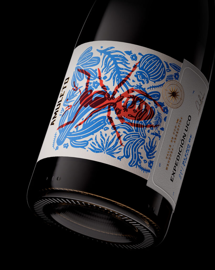
VANTABLACK STUDIO HAS DESIGNED AMULETO – Expedición Uco
The ‘Expedition Uco’ wine project embarks on an intricate journey to the heart of nature, where each bottle becomes a testament to the struggle for vitality. The label, akin to a window into the subconscious, portrays the industrious ant, a symbol of persistence, standing out against a network of lines mirroring the intricacies of the soils that nourish our vineyards. This graphic dance embodies the symphony of life and death intertwined in an eternal ballet in the very unforgiving terrain our vines seek sustenance from. Just as humans delve into the depths of their psyche, in ‘Expedition Uco,’ we explore the mysteries of the earth to distill the energy forged through this fusion of opposites.”
Curator’s Insight
Let’s talk about the ant – it’s more than just a bug. It’s a symbol of never giving up, a little hero that mirrors the vines’ fight for survival in tough Uco terrain. This label isn’t just a sticker; it’s a tribute to the dance of life, a show that goes on in the background while we sip the Expedición Uco wine.


