Thanks for the invitation to dive into this unique design concept that celebrates heroes, Wu Ke Dan.
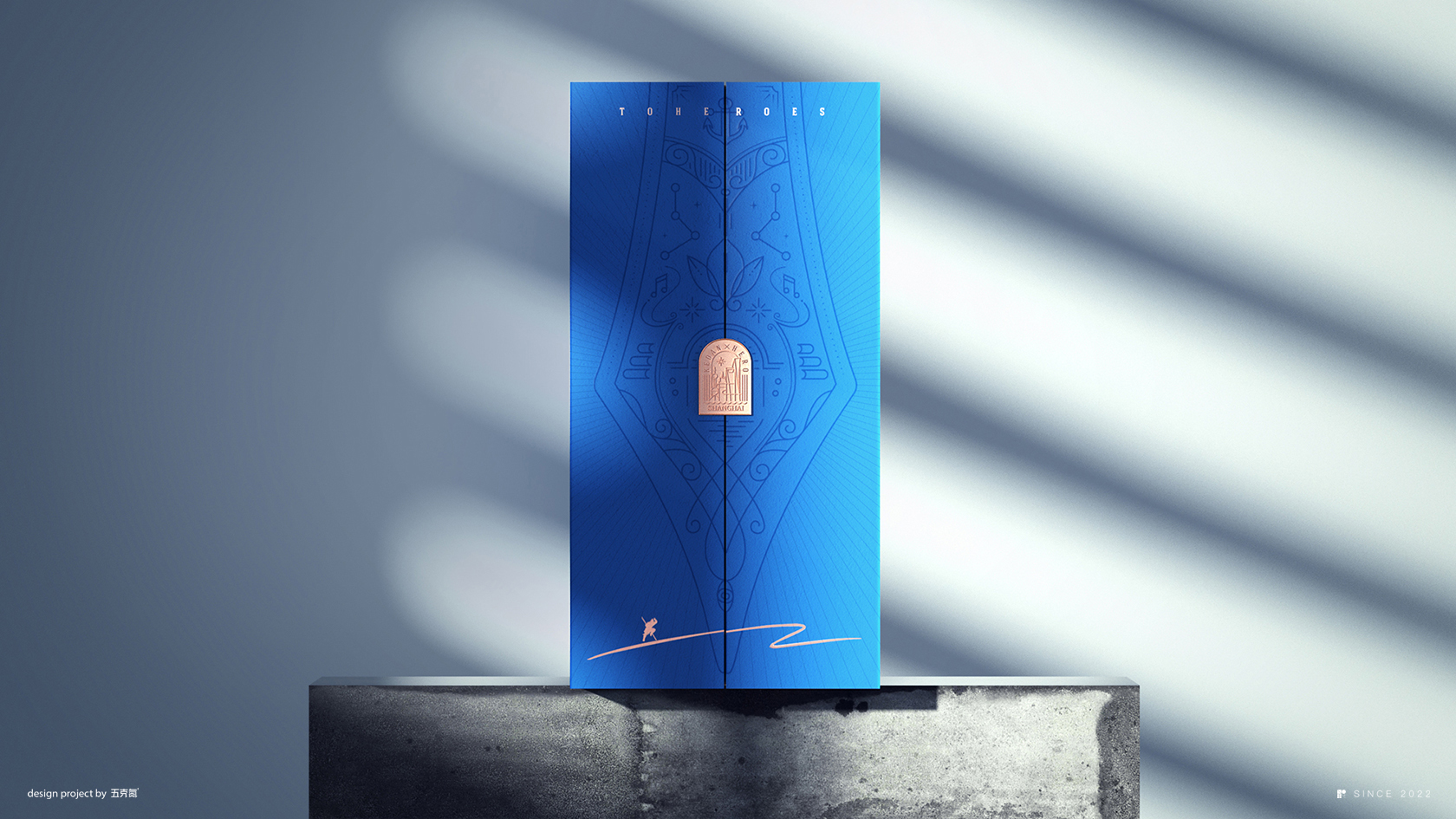
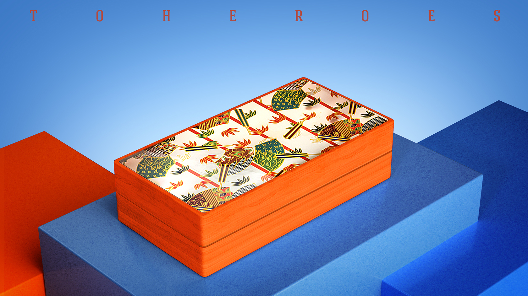
Firstly, let’s talk about the essence of this packaging – it’s not just about enclosing pastries; it’s a symbol and a concept. Heroism takes center stage here, and that’s something truly distinctive. It goes beyond just a container; it’s a tribute in itself.
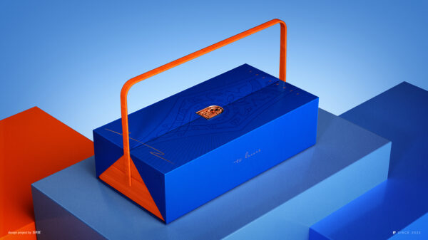
The choice of a bright blue box with a gold emblem immediately catches the eye. Blue often symbolizes depth and stability, which is intriguing when combined with the concept of heroes. But what really stands out is the illustration of a fountain pen on the box. This might seem like a small detail, but it’s incredibly powerful. The fountain pen is an emblem of wisdom, creativity, and communication – qualities that are closely associated with heroes. The use of bright orange for the handle adds a dynamic contrast, injecting energy into the design.
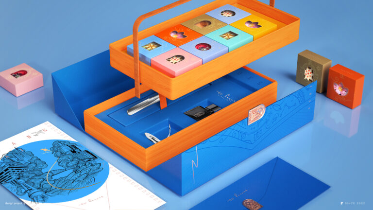
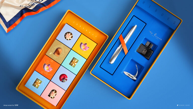
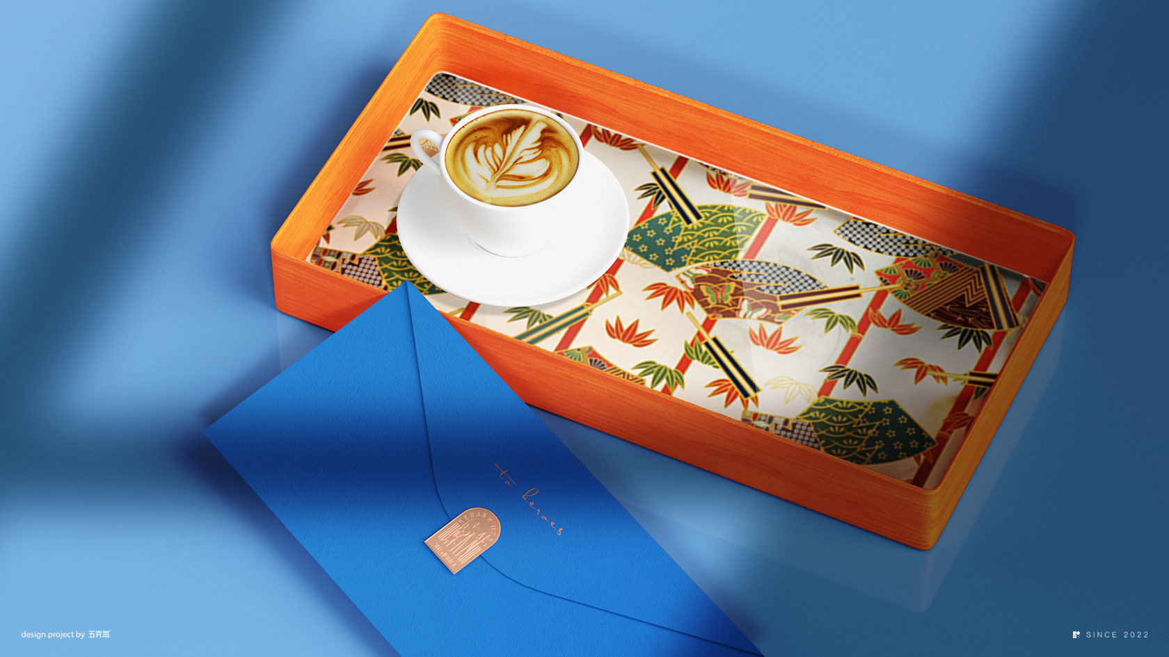
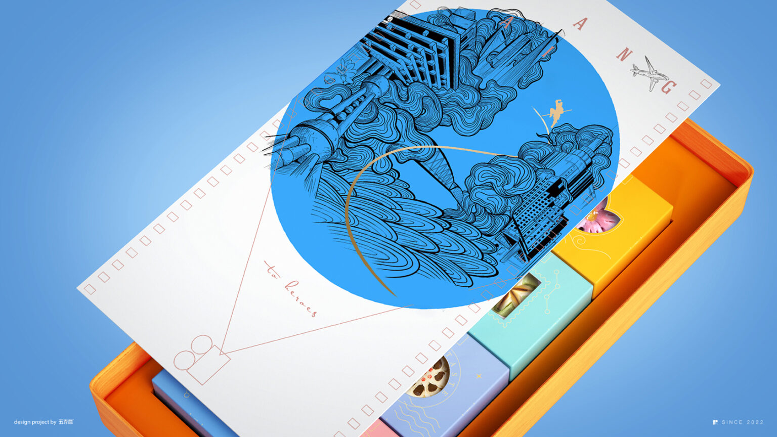
Now, let’s get to the surprise element – the handle is actually connected to the inside box containing smaller boxes of different colors holding pastries. This is where the packaging design takes a genius turn. It’s not just about the exterior; it’s about engaging the recipient. Opening the box becomes an experience in itself, symbolizing the act of uncovering the hidden hero within.
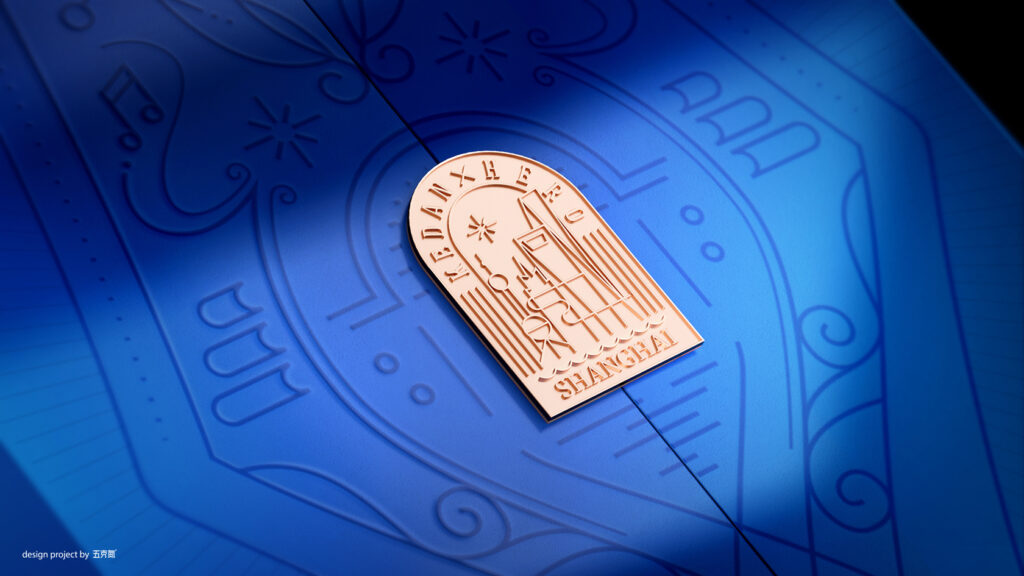
And underneath, the silver fountain pen designed after the Shanghai Tower is a true gem. It’s not just a pen; it’s a symbol of aspiration, growth, and progress. This touch adds depth to the design, connecting it to the city’s skyline and the heroes who contribute to its rise.
But what I find most unique about this packaging is its cultural resonance. The idea of opening the door and welcoming in Chinese culture perfectly aligns with the spirit of “Hai Nai Bai Chuan,” and this is something not everyone might grasp. It adds a layer of meaning that makes this packaging truly special.
Design: Wu Ke Dan
WeChat: we-5gN