THE DESIGN CHALLENGE
Adapt the recently upgraded packaging for iconic cream liqueur, Amarula, into a standout gin bottle. Taking into consideration craft gin cues and transparent liquid implications, whilst ensuring brand fit.
DESIGN INSPIRATION
The brand stands for free African spirit and tells a special story of the enigmatic elephants and their unique relationship with Marula fruit. This indigenous fruit is a key ingredient in the new gin extension.
DESIGN SOLUTION
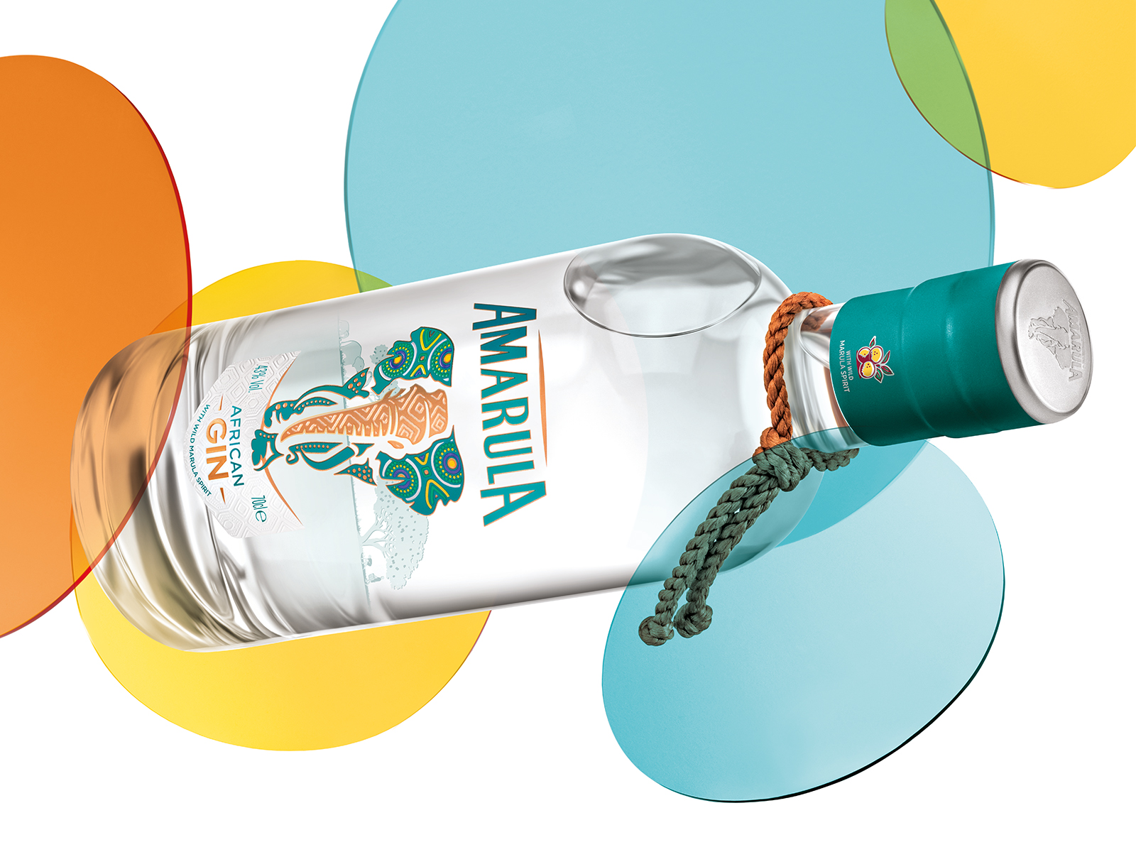
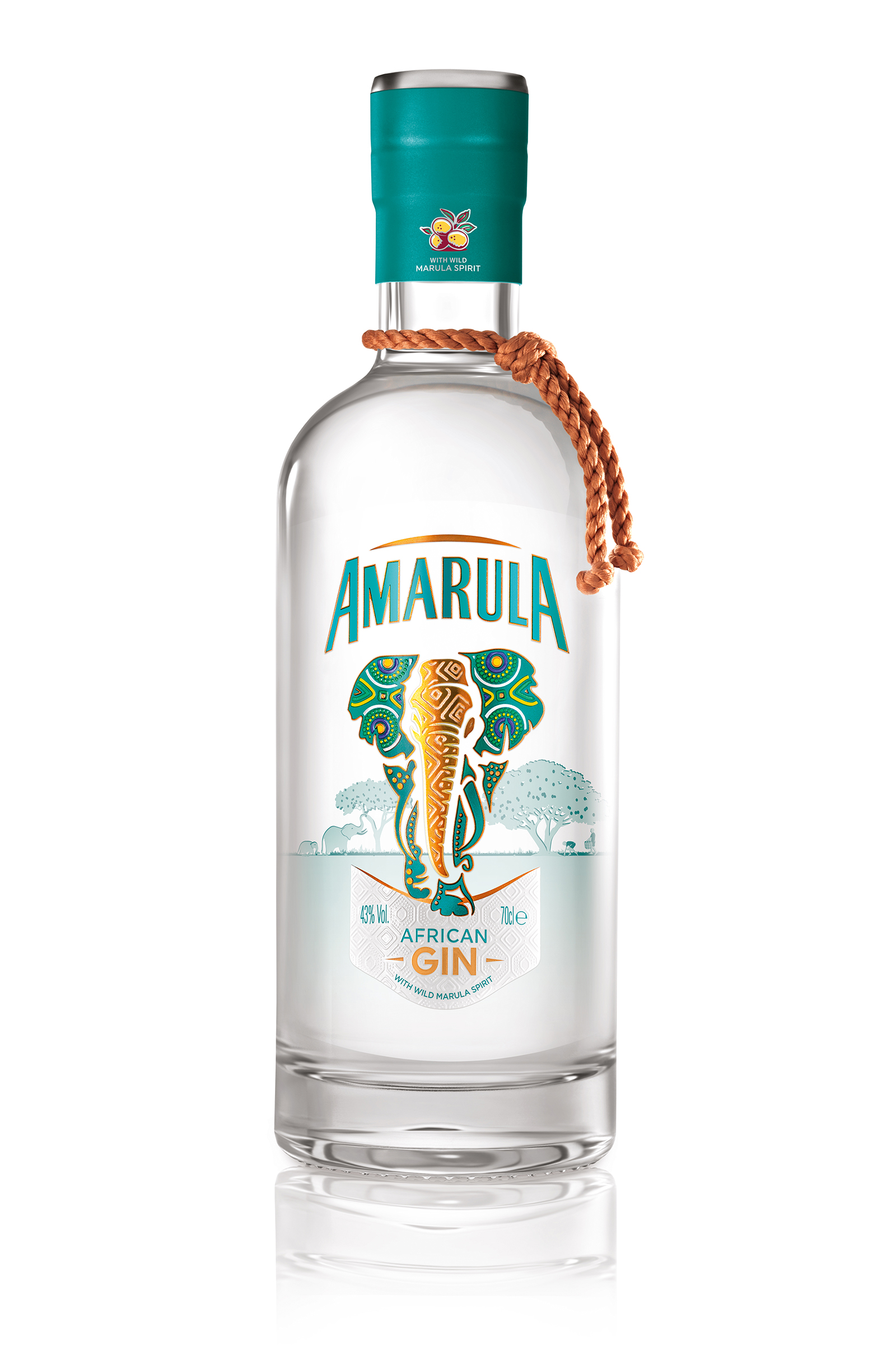
Building on the 2021 pack upgrade, the gin encapsulates the energy and vibrancy of the Amarula African Spirit. Bright blues and silver metallics depart from the warm tones of the cream to signal gin refreshment. The bottle shape enables a print on the inner surface of the back label – of Amarula trees – that are seen through the liquid and glass, creating the impression that the elephant is blending into its natural habitat. PSL front label of the elephant appears to be enjoying and harvesting the fruit. Overall good brand consistency, with enough flex to signal a new category and gin refreshment.
THE RESULT
Amarula Gin is recruiting new consumers into the brand and allowing Amarula to play in excitingly different venues and occasions.