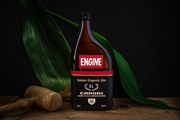
ENGINE CARONI is the new extension line of the ENGINE gin brand. It takes the Italian notes of ENGINE, the sage & lemon, and bring them on a tour in the Southern America, aging them in barrels that previously contained the prestigious Caroni Rum. This bottle is a big revolution in terms of packaging for the brand. With this addition to the brand family, ENGINE introduces a glass bottle next to the existing metal can, a bottle that has to show the premiumness of the aged product.
This project for me was a big challenge in terms of design and feasibility. First of all the bottle shape needed to be both consistent with the brand and as disrupting as the current Engine can: to achieve this goal it took me a lot of sketches and attempts. The brief was to maintain the idea of a “motor oil can” as for the previous bottle, using as inspiration the more recent plastic ones with a longer neck. Starting from that I developed several shapes before arriving to this final one. The result is a bit far from the classical “oil-can” but is able to recall it in the mind, thanks also to the brown glass (and the ENGINE logotype).
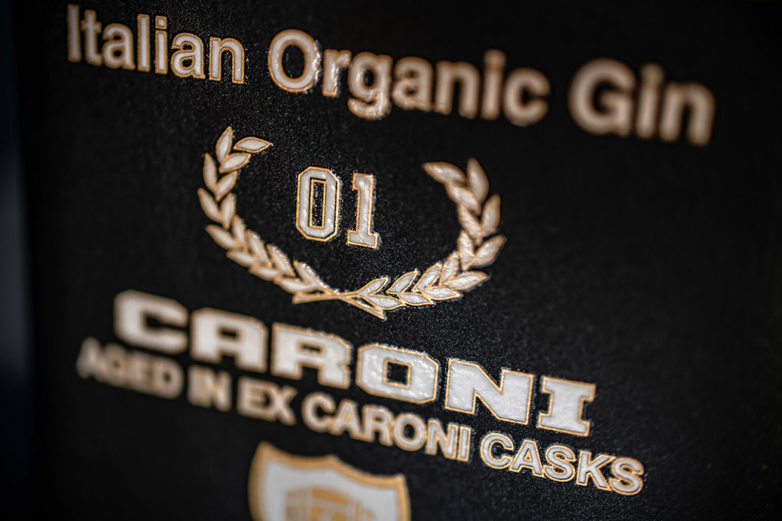
The label as well needed to be in line with the one of the can, but also more elegant and craft, and also technically attachable. The solution was simple: use a craft paper label, with a lot of embellishments (gold, embossing, varnish…). This was easier to say than to do. Due to the shape of the bottle (that is squarebased as the can), the label needed to be a small rectangle on the front. This was in direct contrast with the brief to recreate the same visual image as the can. The problem was solved thanks to a joint effort with the suppliers: the filler and label printer. A specific die-cut was created to follow the surface all around without wrinkles, and was then hand applied.
Due to the shape of the glass, the logotype needed to be a single and separate label. Again a craft paper was choosen, ennobled thanks to embossing, glossy varnish and a trinity gold foil line, going around all the white letters.
Being a special edition of only one barrel, the number of bottles is very low. The total amount of product that was possible to produce was only 5000 bottles of 700ml. To celebrate this, we use the Variable Data to make each label unique, printing on the side the exact number of the bottle. Near that data, is also shown the release date and the type of cask in witch the gin was maturated.
The final bottle is truly unique and eye-catching, maintaining the coherence with the standard product, with a very interesting twist. A great packaging design challenge, that resulted in a great product innovation.


