Wellshire, a leader in premium natural meat products, recently tapped long-time partner Little Big Brands to lead a redesign of their portfolio.
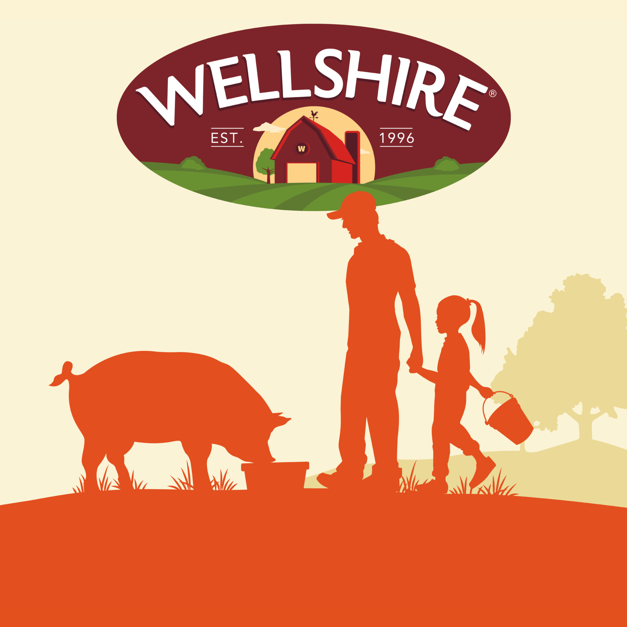
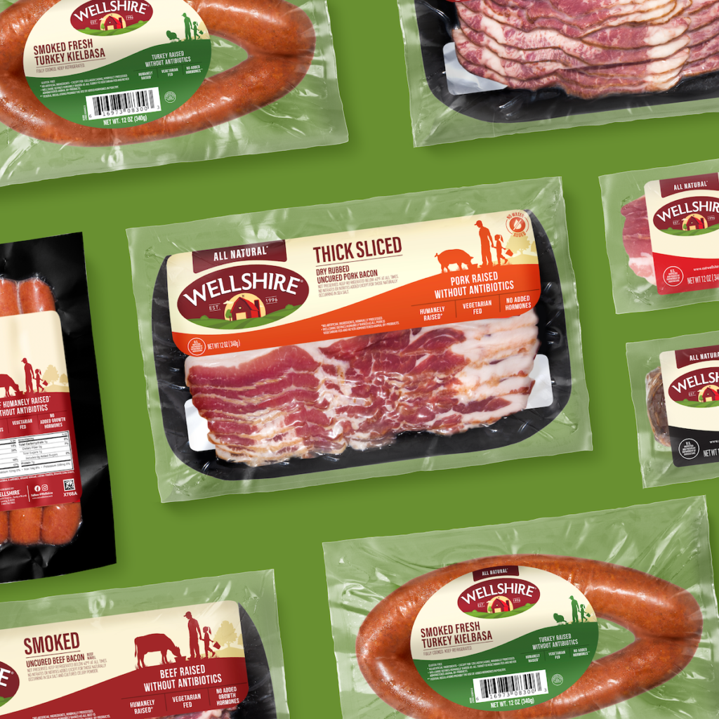
The work leaned into the brand’s family farming history and DNA, while helping increase shopability and shelf standout. Since its inception in 1996, Wellshire has been fueled by its passionate pursuit and simple mission to make quality meat products that help people live well. Partnering with farms that are dedicated to humanely raising animals free of antibiotics adds to the feel-good nature of the brand. The refreshed design leans into this brand purpose with a multi-generational silhouette interacting with animals related to each product and category.
The barn logo was refreshed to be bright, airy and open, a nod to Wellshire’s commitment to the humane treatment of animals. Consumers weighed in on brand equities which influenced the respectful evolution of the brandmark. Type has been modernized while maintaining the arc and maroon color. On-pack copy was streamlined and key claims strategically prioritized in the communication hierarchy to give consumers a fast, organized read.