Grape Expectations: The Creative Pack’s Fresh Take on Lolly’s Frozen Grapes
Lolly’s Frozen Grapes, a delightful product born from two mothers’ culinary passion, craved a packaging refresh that mirrored its vibrant spirit. We answered the call with a design that’s as juicy and irresistible as the product itself.
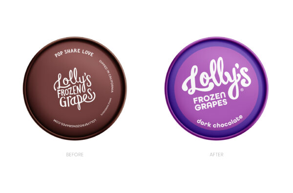
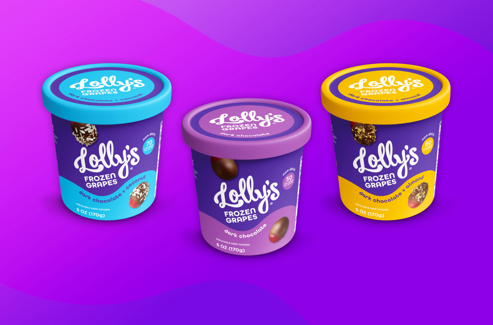
We embarked on a journey to infuse Lolly’s with a vibrant personality while preserving its endearing spirit. The logo, once timid, now commands attention with a bold, handwritten flourish. A daring departure from the original brown, our design embraces a captivating purple—a nod to the grape’s essence and a playful wink at the brand’s lighthearted nature. This vibrant hue, coupled with strategic color blocking, creates an irresistable on-shelf presence, shouting “Lolly’s” from across the aisle.
We introduced a dynamic wave that’s as smooth and decadent as the product it represents. This playful element dances across the packaging, harmonizing with the brand’s spirited nature. Flavor-specific color accents within the wave add a delightful touch, further enhancing the package’s visual appeal.
To tantalize taste buds and drive purchase decisions, we showcase mouthwatering images of the product. By artfully revealing the grape enrobed in chocolate, we offer a transparent glimpse into the delightful surprise awaiting consumers.
The result? A brand transformation. Lolly’s is no longer blending in; it’s the star of the freezer aisle. Our design is a bold, confident statement that perfectly captures the brand’s essence and makes Lolly’s Frozen Grapes impossible to ignore.


