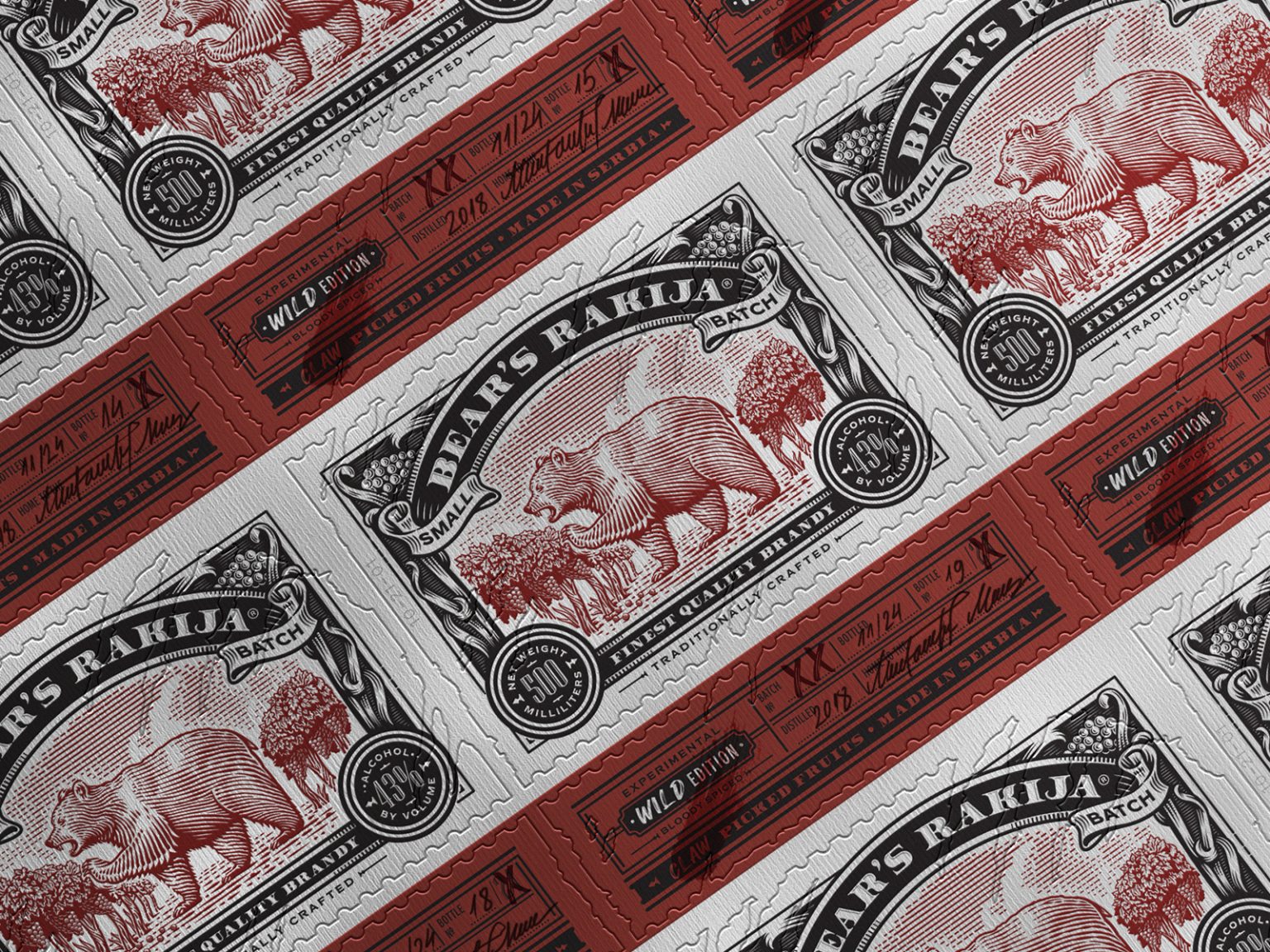
The label for Bear’s Spirit has undergone a transformation to reflect the bold essence of new flavor, Wild Edition. This design shifts from the calm and friendly bear to a more dynamic and fierce depiction, embodying the adventurous spirit of the new offering.
Wild Edition is an experimental spirit crafted from an exquisite blend of wild fruits, including aronia, blueberry, cranberry, juniper, and a selection of wild medicinal herbs, while the base of the distilled Spirit is grape. These vibrant ingredients create a striking deep red liquid, which serves as the accent color for both the label and the main illustration.
Red wax is elegantly applied to the bottle neck and cork, enhancing the overall aesthetic while also serving as a secure seal that imparts a handcrafted quality. This attention to detail not only elevates the bottle’s appearance but also underscores the brand’s commitment to artistry. Additionally, a small, engraved original Bears logo is elegantly tied around the neck on a circular aluminum coin-shaped pendant, further emphasizing the brand’s identity and craftsmanship.
The claw marks are intricately engraved on the bottle, providing a personal touch that harmonizes with the label’s die-cut design.
The die-cut design of the label creates an “torn” effect, showcasing the bear in a larger format. This die-cut, combined with the printed elements, mimics the appearance of claw marks, adding a unique touch and enhancing the storytelling aspect of the design—just as slogan says: “Leave the mark, unleash the wild.”
For the label printing, we utilized premium textured White Laid Estate Paper, specifically designed to endure moist conditions, making it resistant to water, tearing, and shrinkage.
This paper complies with the Cobb range standards for absorption capacity, ensuring optimal moisture absorption without excess or deficiency.
The labels incorporated a unique “torn-like” die cut and were printed in A3 format on self-adhesive material. Given that the labels are produced in small batches and limited quantities, the use of die cut rolls was unnecessary.
By opting against the die cut roll printing method, we facilitated a more straightforward handwritten approach for the informational elements on the labels, including the bottling date, year of distillation, bottle number, and signature.
Each label is individually signed by hand.
The side of the bottle features a foil sticker displaying essential brand information, accompanied by a short list of main ingredients.
The brandy’s slogan, “Leave the Mark, Unleash the Wild,” is integrated throughout the entire branding and marketing campaign.
Design/Illustration/Mockups: Milos Milovanovic


