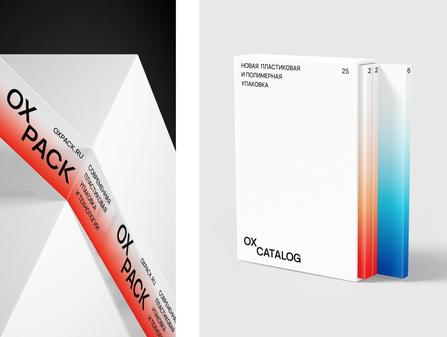
OXPACK is a manufacturing packaging company that creates leading product solutions.
METAPHOR.
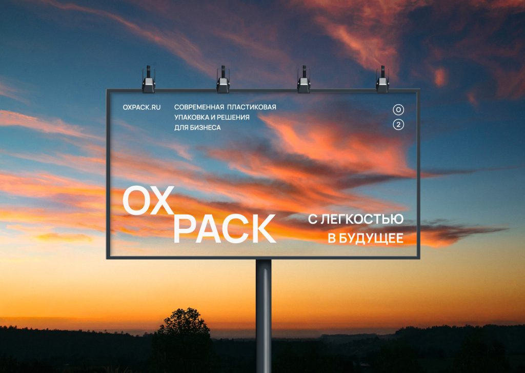
Take-off, rise and movement into the future. The metaphor is played out in all components of the style and at its different levels from graphics to meanings and slogans.
5 LEVELS OF OXYGEN (BASIC MECHANICS):
1) Logo and typography.
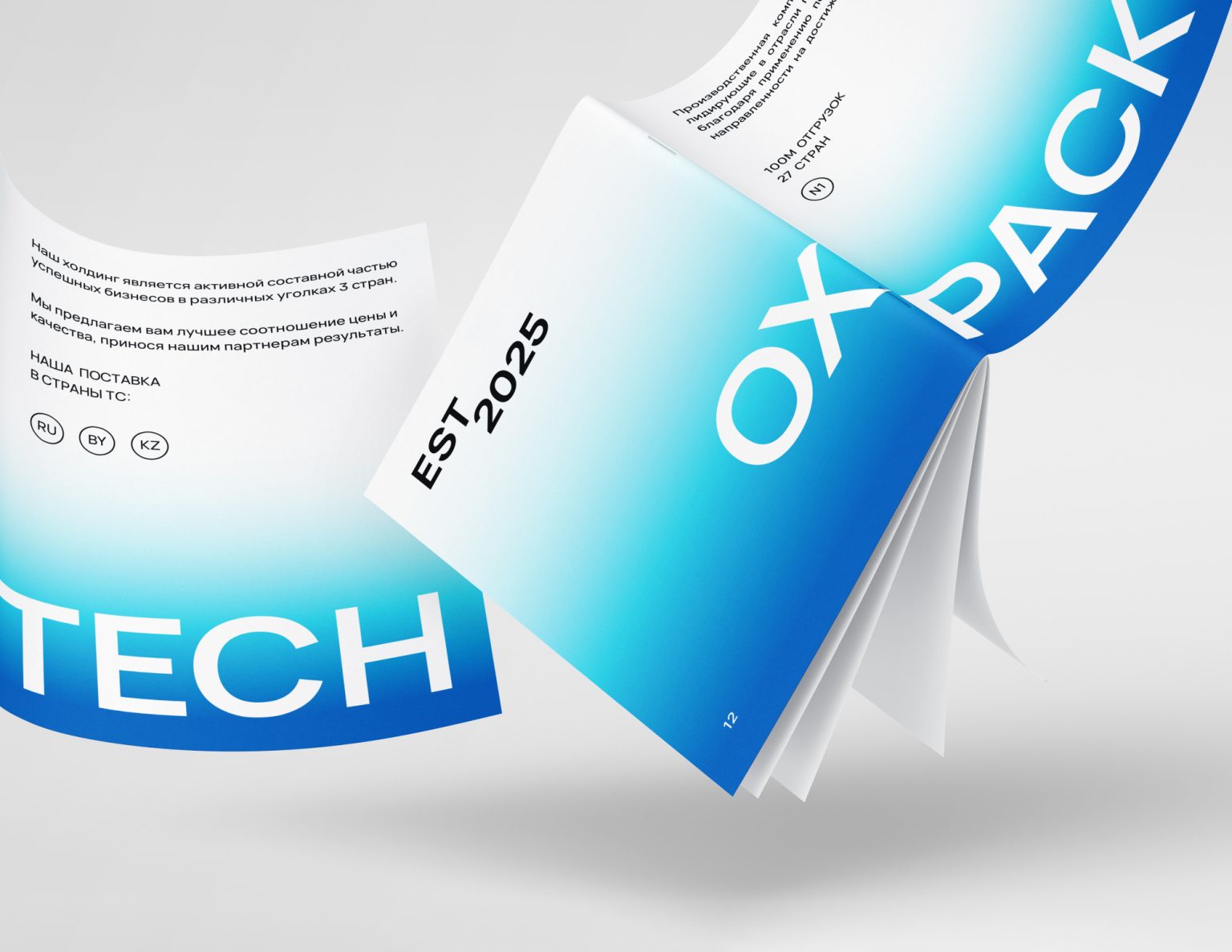
The accent part of the logo flies up and plays out the idea of the project. A similar principle is in typography, i.e. movement from bottom to top from heavy objects to light ones.
2) Layout.
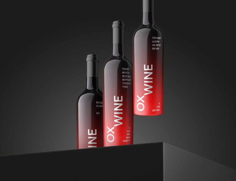
Flying layout with oxygen between the top and bottom, carried out along vertical guides, which are set by the lower typography.
3) Gradient.
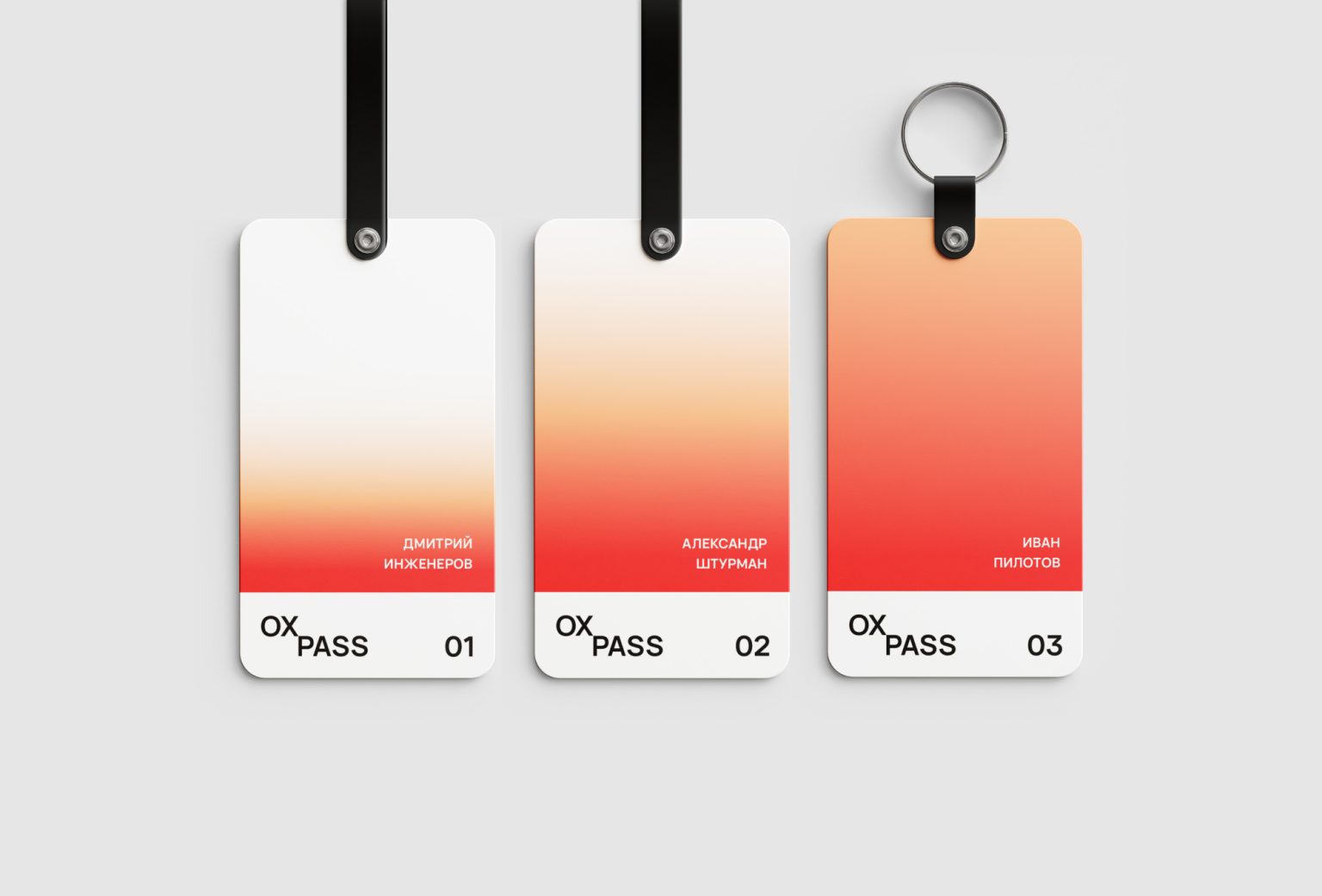
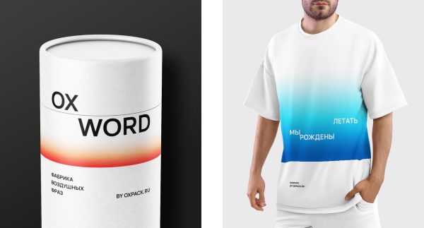
Flying gradients with a transition to the background and with the technique of shifting the gradient vertically. The colors of the gradients are inspired by the palettes of the sky. The composition often uses an allusion to the horizon line.
4) Meanings and slogans.
The ideas of air, lightness, rise, growth and flight are played up.
5) Transparent materials.
This provides a functional implementation of the idea of lightness and airiness.
MODULES.
Packaging, marketing, advertising, image, printing, documentation, 3 souvenir and event modules (OXBOX, OXWORD, OXFEST).
