About
Industrial design and innovation consultancy Morrama has revealed a vibrant packaging transformation for wagamama’s in-store retail range of sauces and meal kits.
This redesign marks the latest collaboration between Morrama and wagamama, with the design agency previously developing the company’s sustainability-focused takeaway packaging in 2022. This saw Morrama replace the brand’s existing black, virgin plastic bowls with a light grey recycled PET bowl and side dish.
Solution
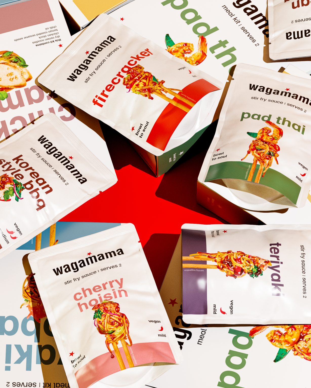
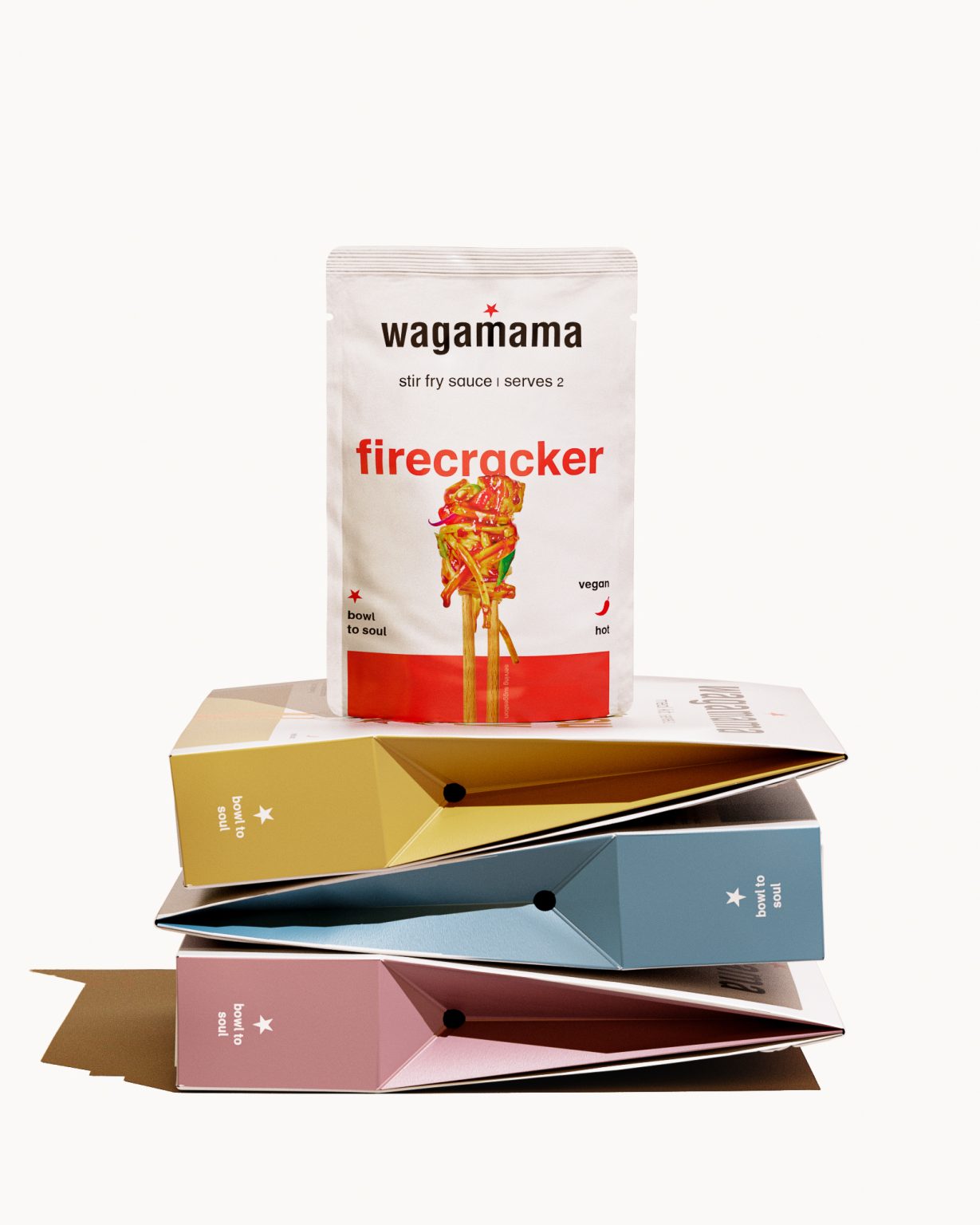
The new design utilises bright colours and a bolder dish name to pioneer a fresh visual identity for the range, which includes meal kits, stir fry sauces and mayonnaises. Morrama also utilised creative photography to capture the vibrant finished dishes, accentuating food images between two chopsticks to create an appetising visual focus, and to bring to life the iconic flavours of wagamama in a highly engaging, unique way. The range retains existing attributes from the original packaging launch (in 2021), including details such as the clear ‘shop’ and ‘cook’ instructions, chef’s tips, and a QR code for inspiration from the wagamama kitchen.
Morrama took a unique approach to developing the packaging design, utilising AI to speed up the design process and test different styles without needing to use a photography studio. This distinctive way of working allowed for more collaboration with the wagamama team and resulted in the end product – a visually appetising design which aims to increase the brand’s shelf appeal and enhance the at-home dining experience.
Result
Morrama reimagined the range’s existing packaging to create a new look, breaking away from the conventional black background more commonly used by Asian inspired food brands, helping wagamama’s retail products stand out on shelf with more impact. Morrama and wagamama are happy with how the finished design acts to showcase wagamama’s bold flavours and quality and helps captivate shoppers.”

