
Background
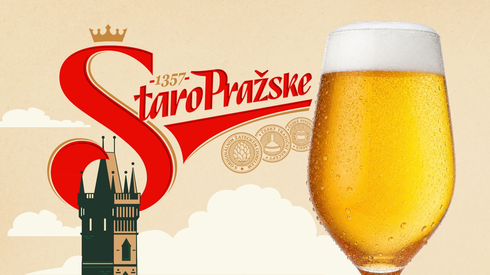
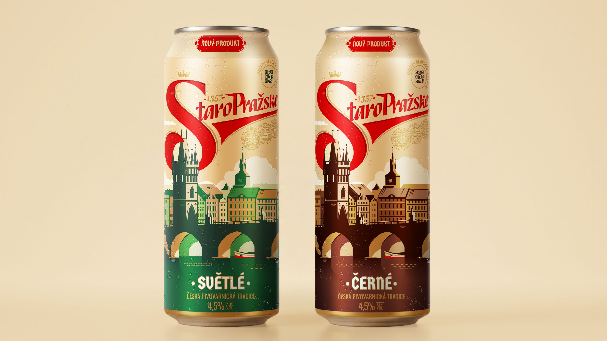
The Staropražské beer brand is a new product from the Moscow Brewing Company, created under the license of a classic Czech recipe. Staropražské was created in the heart of Old Prague, where brewing became part of the culture as early as 1357. The classic Czech brewing method and select raw materials preserve the consistent flavor, richness, and soft bitterness that distinguish true Czech beer. It is available in light and dark varieties.
The brand’s core audience is millennials who fondly remember their trips to the Czech Republic, as well as connoisseurs of traditional Czech beer seeking a familiar taste with a modern twist.
Challenge
VIEWPOINT was tasked with developing a brand positioning strategy that would highlight its core values and emotional benefits to consumers. During the brand platform development phase, it was important to determine how Staropražské could become a symbol of travel memories and a guide to the atmosphere of old Prague.
Based on the positioning, a visual brand identity had to be developed for two SKUs: light and dark. The design had to stand out on the shelf while remaining within the category’s visual codes and preserving the recognizable elements of the beer identity. At the same time, it was important to create a connection with the brand’s unique recipe and brewing traditions, thanks to which Staropražské, a special beer, has long been known and loved by consumers.
Solution
Based on the developed strategy, the VIEWPOINT team began creating a visual concept capable of conveying the spirit of old Prague and evoking the romance of past travels.
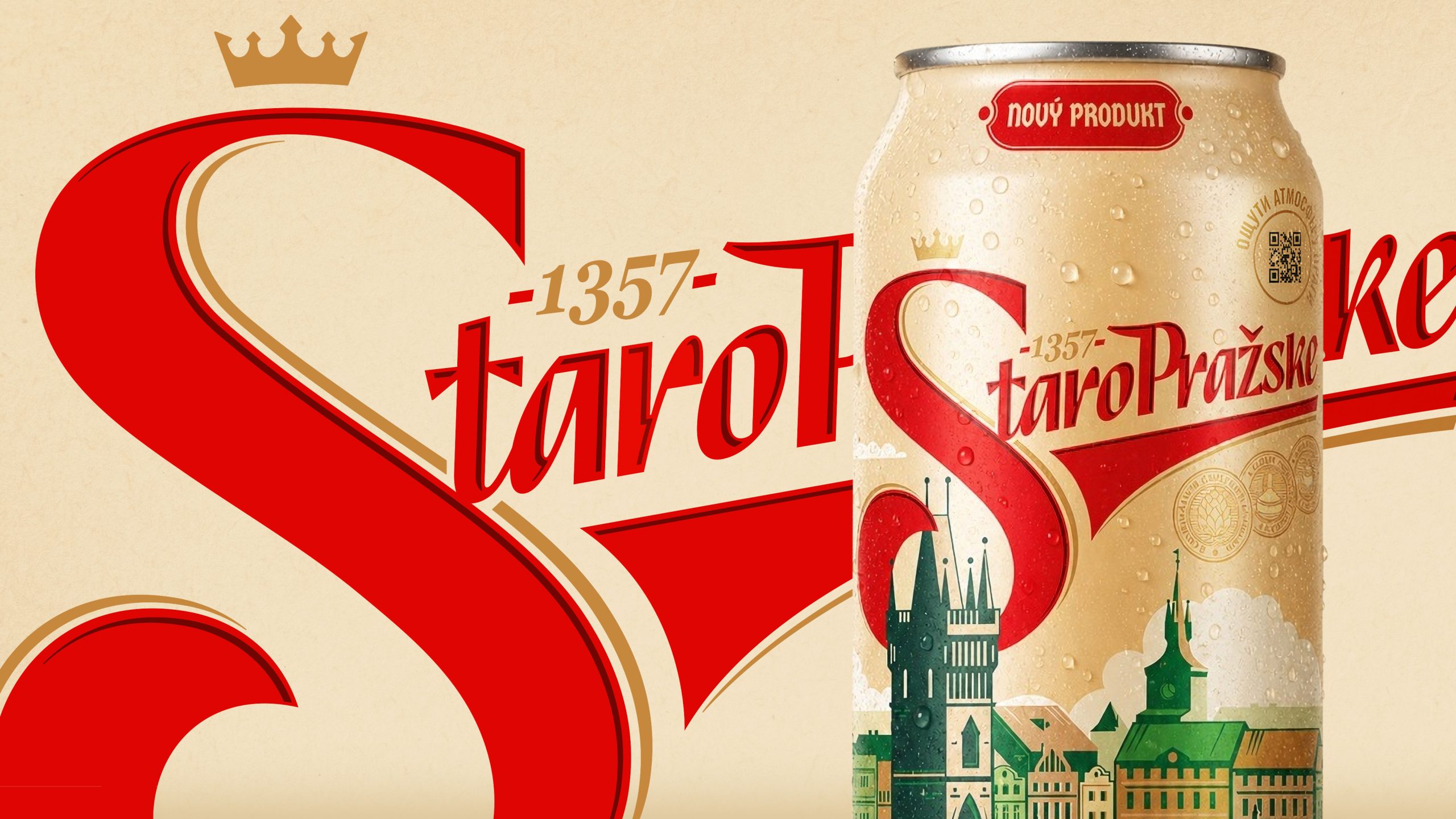
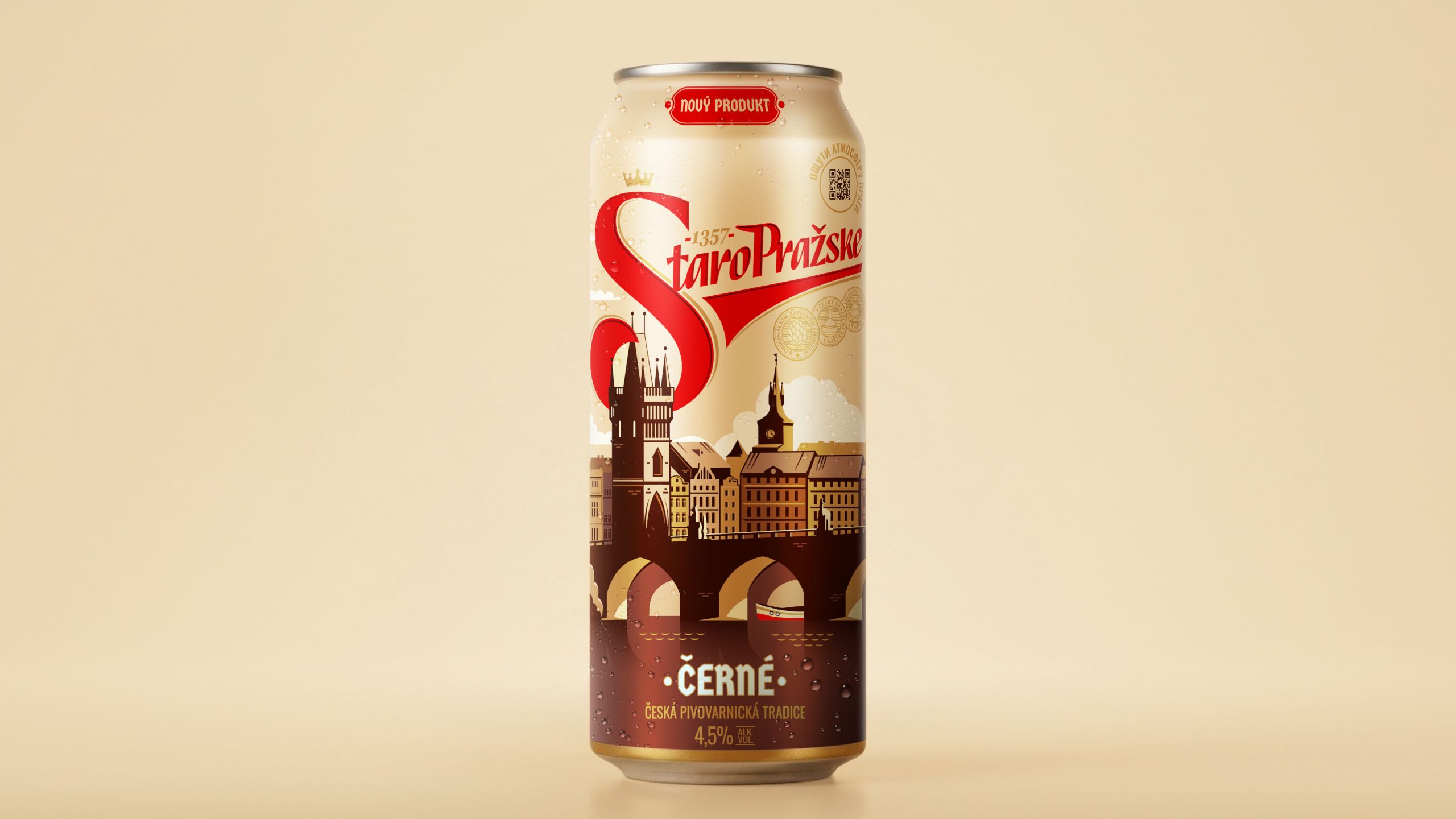
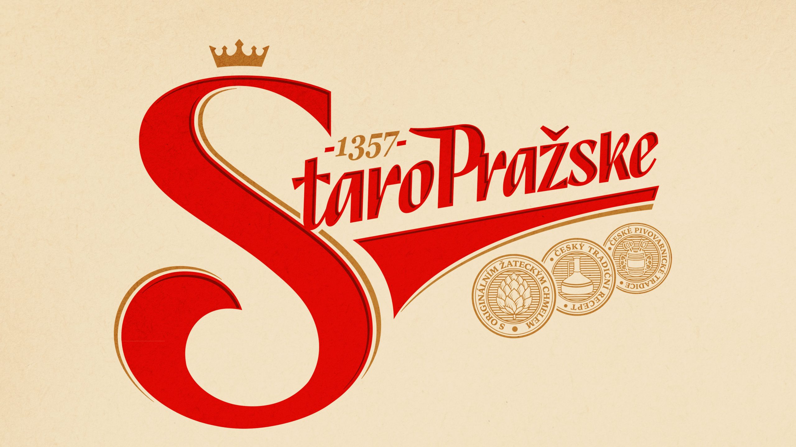
The logo, inspired by the silhouette of the Charles Bridge—one of the main symbols of old Prague—forms the foundation of the brand’s entire visual system. The color palette draws on traditional beer-related tones, complemented by modern accents: dark beers in brown tones, and light beers in green. The classic design structure is supported by carefully selected fonts, award medals, and traditional graphic elements.
A QR code on the packaging adds an additional element to the consumer experience: it opens a virtual tour of Prague, strengthening the emotional connection with the brand.
The result was a design that combines the nostalgia of travel, the romance of old Prague, and Czech brewing traditions, all presented in a contemporary visual language.

 Lisa Pokrovskaya
 Simple Studio
 Studio Unbound
 David Byerlee
 M&A CREATIVE AGENCY
 alchimistestudioParis
 monther al omari
 Studio Be Design
 LogoSayLove
 agenciabud
 Shustova p
 mutta
mutta @Allenarts13
 Sirka Agency
 Atiq Alam
 Dozen Agency
 j.substance
 SCD
SCD Cristian Lepore | crilep Copia
 Chris Creative Works