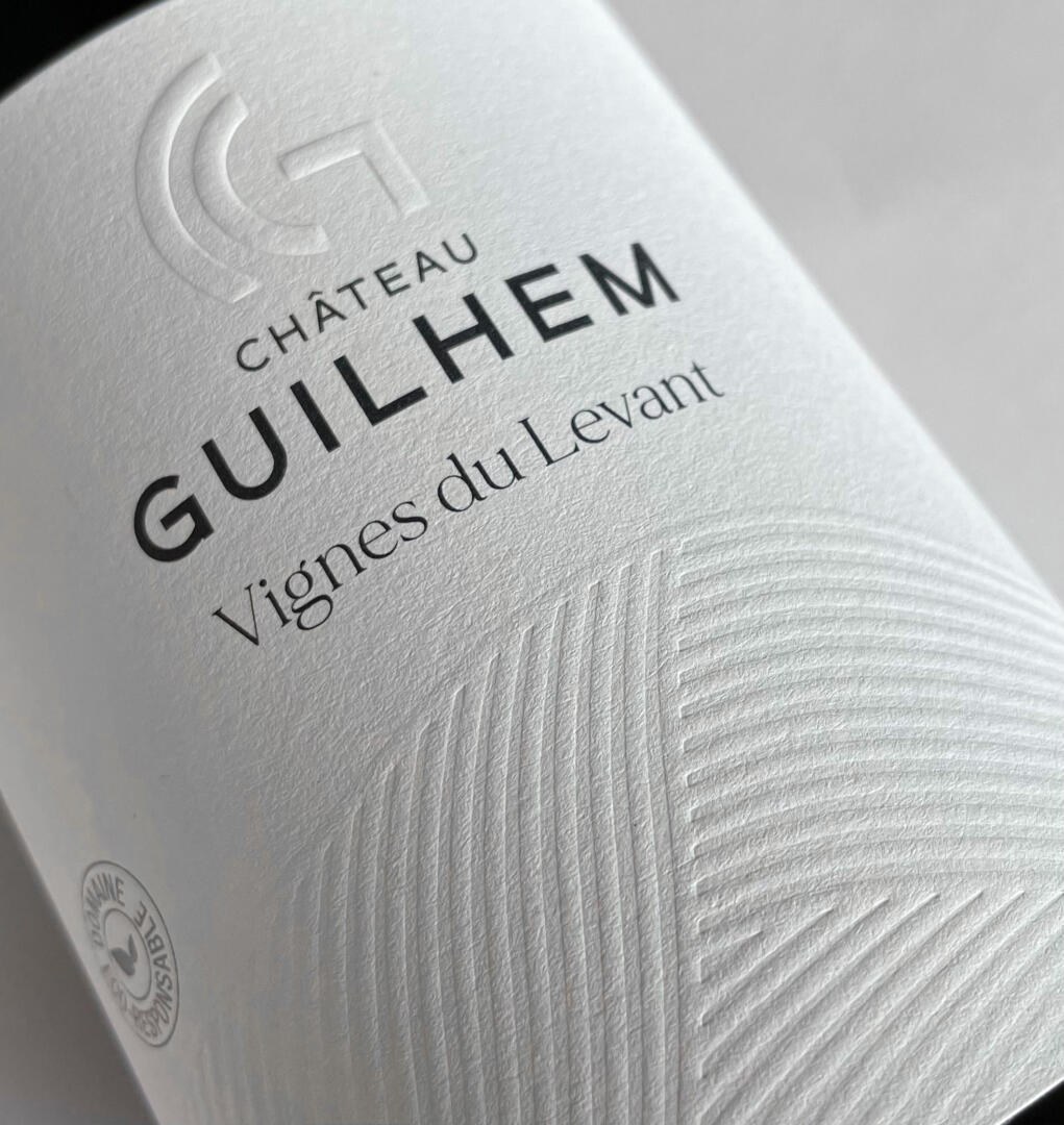
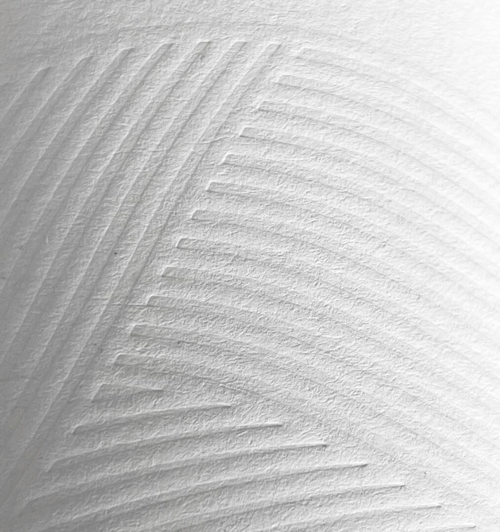
A G leaning against a C, a minimalist monogram for the new visual identity of Château Guilhem, which also entrusted us with the redesign of its ranges with the sole constraint of eco-design, echoing the eco-responsible steps taken by the estate for over a decade. We eliminated everything (capsules, colours, back labels) and opted for a band label with optimal dimensions to avoid wasting paper. There is nothing left, yet everything is there: a château set on the Malepère hillsides treated in dry curves.