Starting with the forefather Mr. Stergiou delivering fresh delicacies in Athens city center in 1958, the Stergiou Family has grown into one of the most successful brands in the Greek food industry. Known for its high-quality sweet and savory freshly-baked products, the brand has built a reputation for daily distribution and excellence.
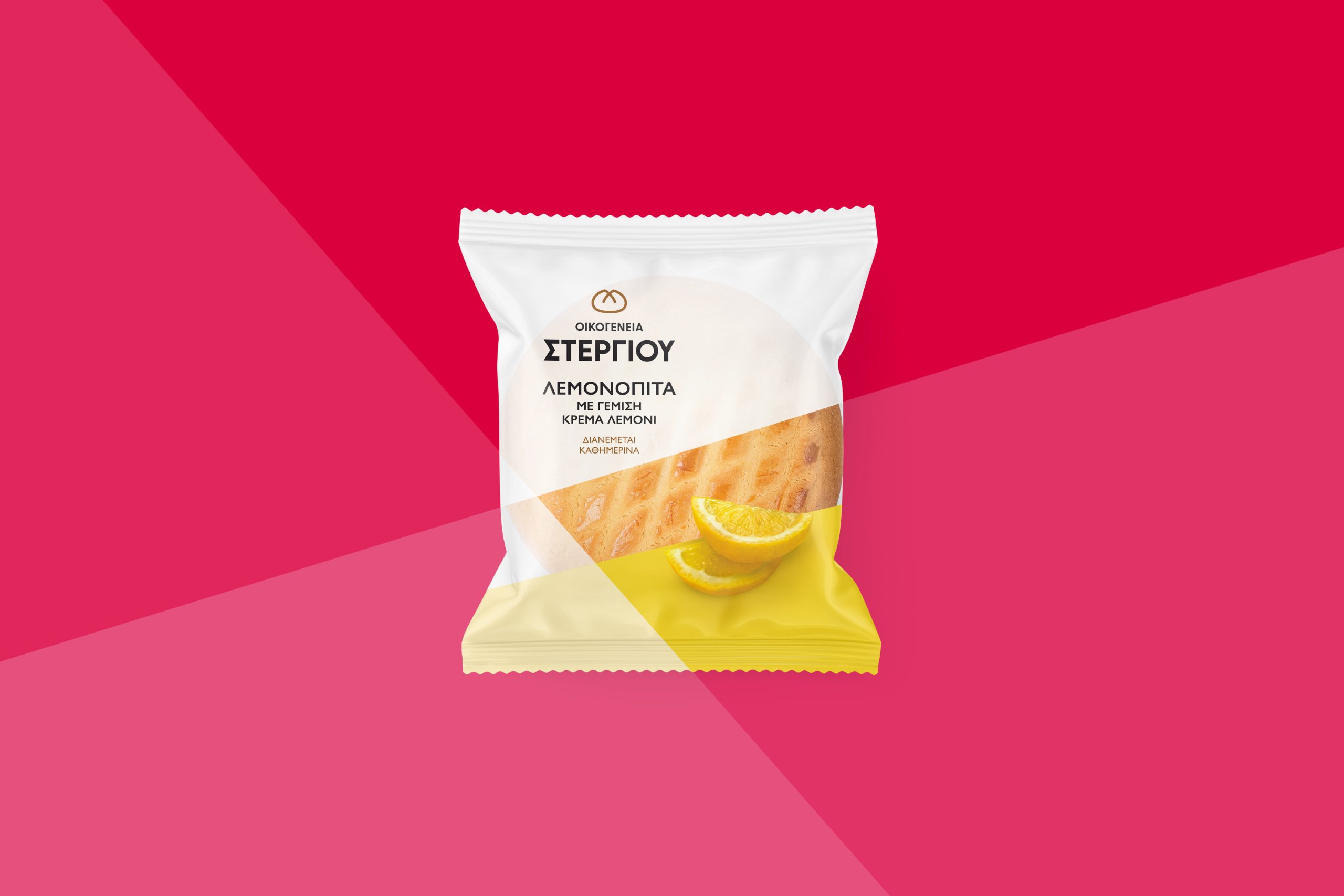
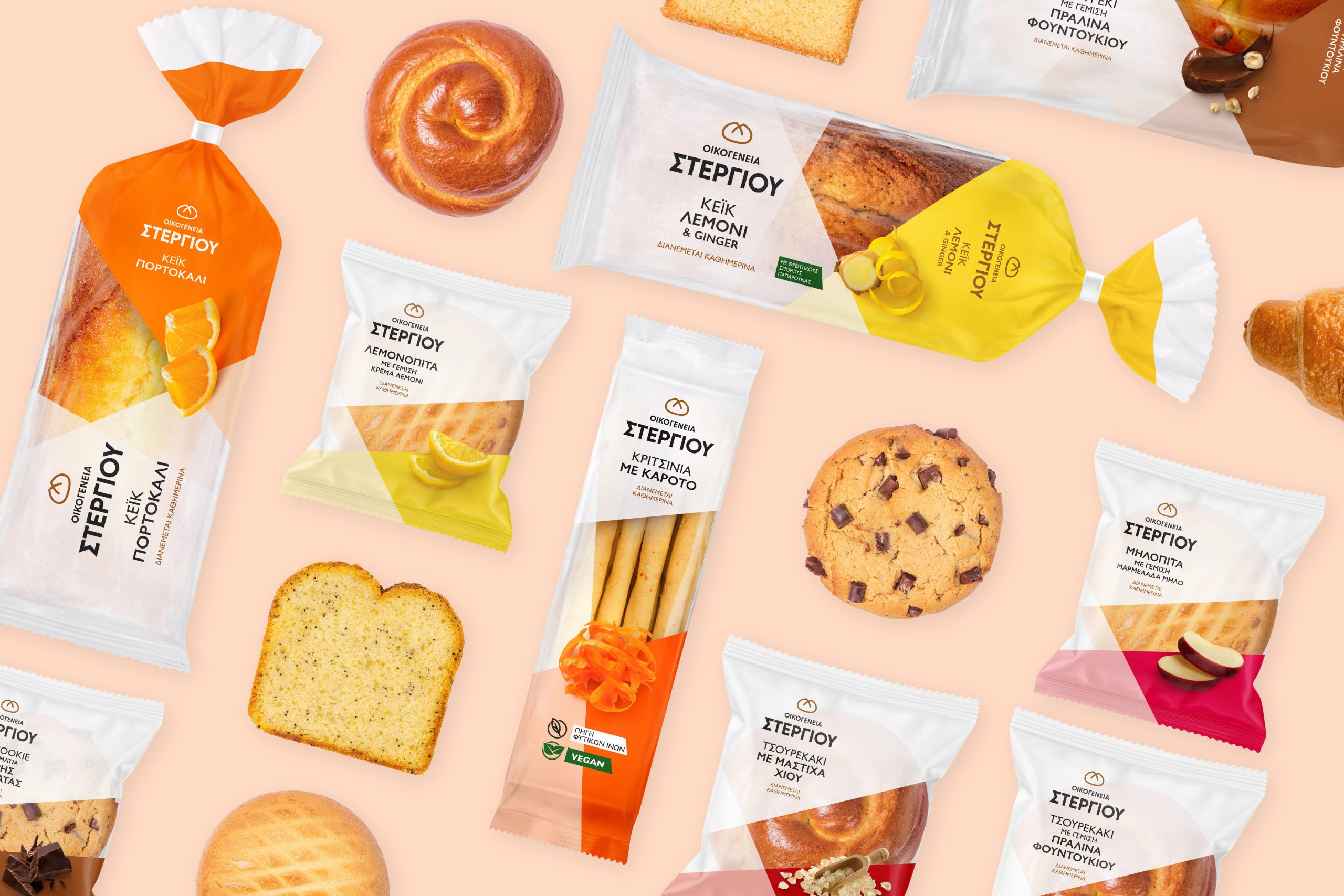
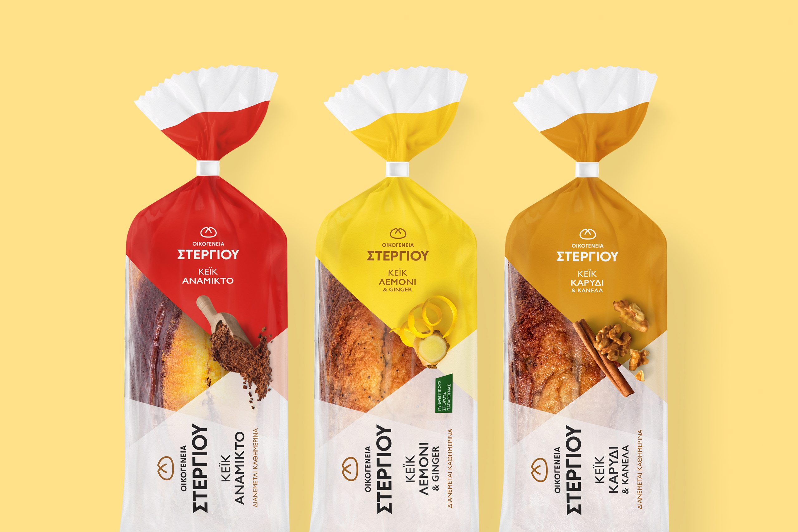
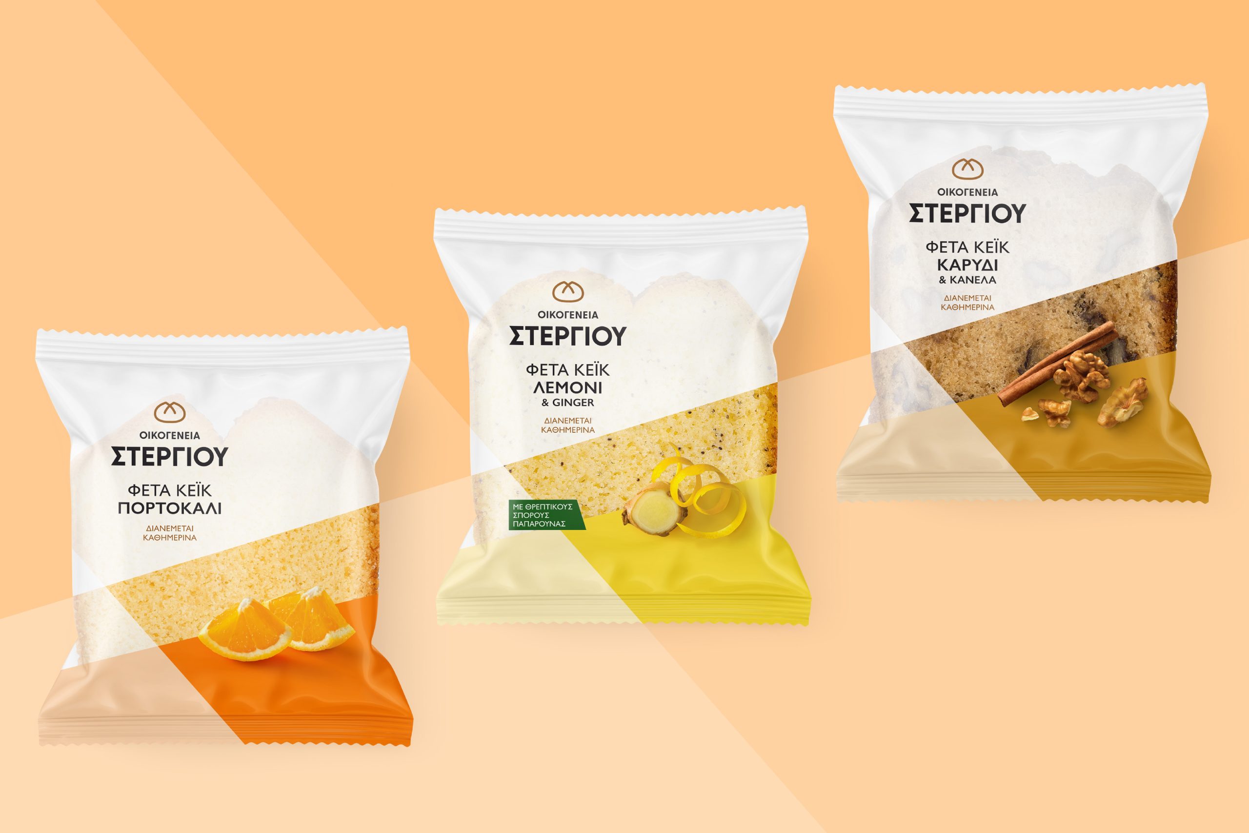
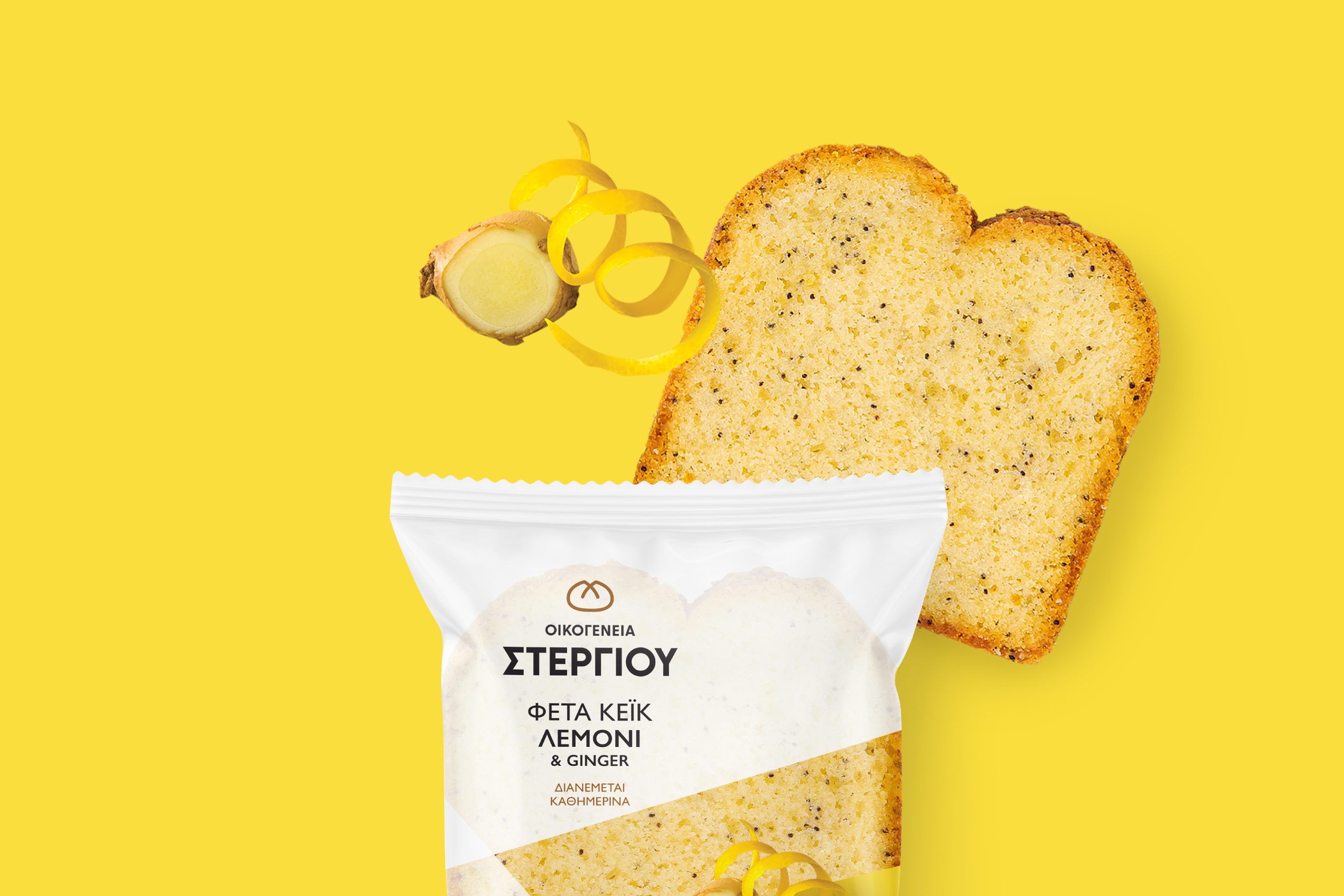
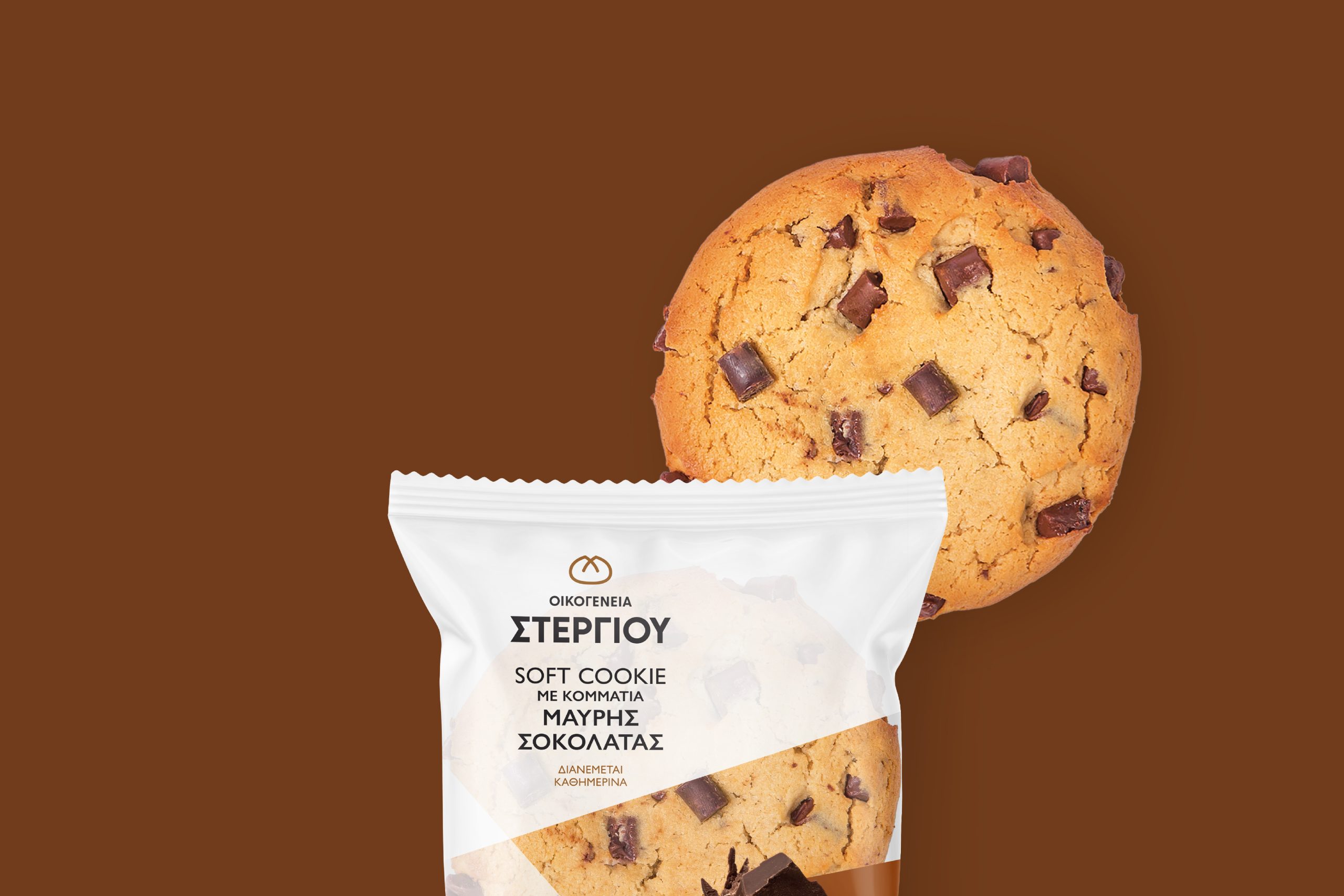
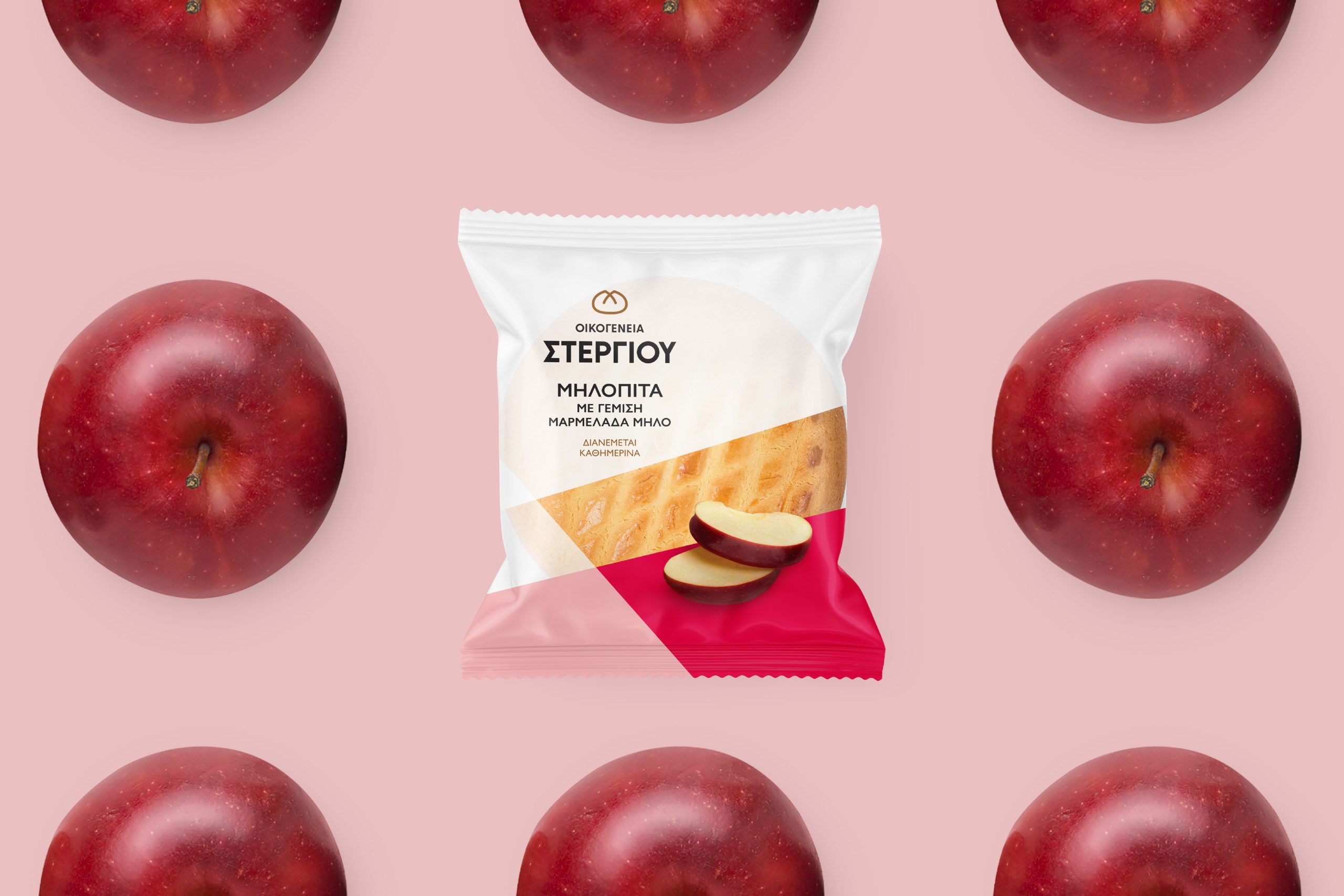
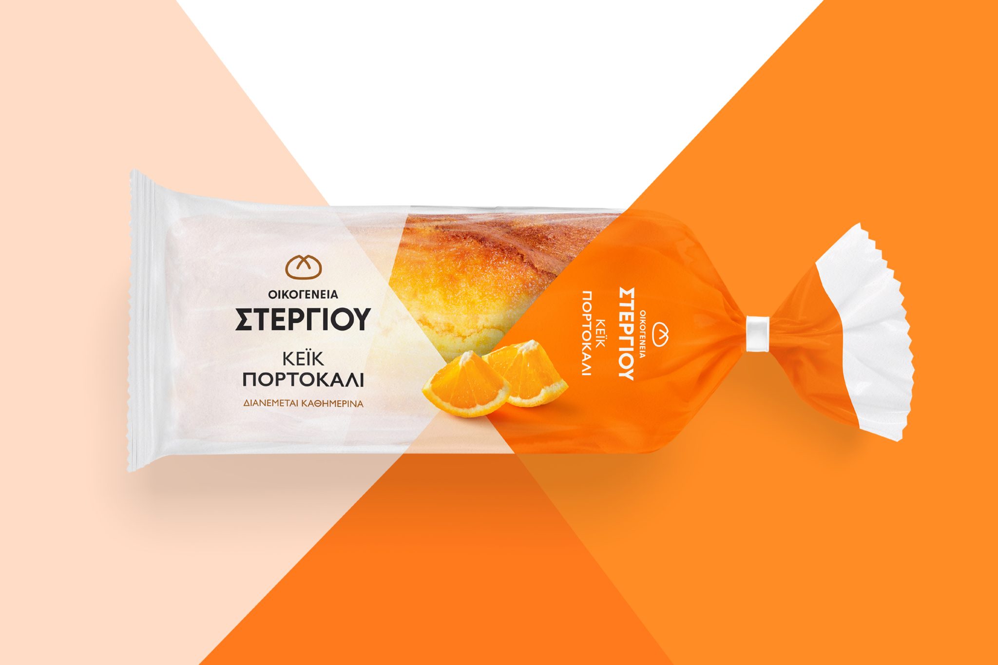
For the identity redesign, MILK Branding Professionals brought back the white color, which originally made the brand recognizable. White symbolizes purity, honesty, and freshness—values that the company has always stood by. By moving away from intense colors, the new packaging creates a clean, cohesive block on the shelf, reducing visual clutter and confusion.
The inspiration for the multi-layered effect on the packaging comes from the traditional use of baking paper, which has been wrapped around freshly-made delicacies for decades. This design choice connects the brand to its artisanal roots and baking heritage.
Transparency was a key element in the packaging design, allowing consumers to see the freshness and quality of the products. The goal was to make each product feel less industrial and more artisanal, emphasizing its handmade appeal.
The logo was also redesigned by MILK Branding Professionals to depict a dough shape. This simple, modern, and clear logo reflects the company’s philosophy and artistry, symbolizing the patience and perseverance that go into every product.
With a clear brand name, a distinctive logo, a structured identity system, and an image that aligns with its positioning, the Stergiou Family brand remains true to its core values while maintaining its place as a top choice for consumers.