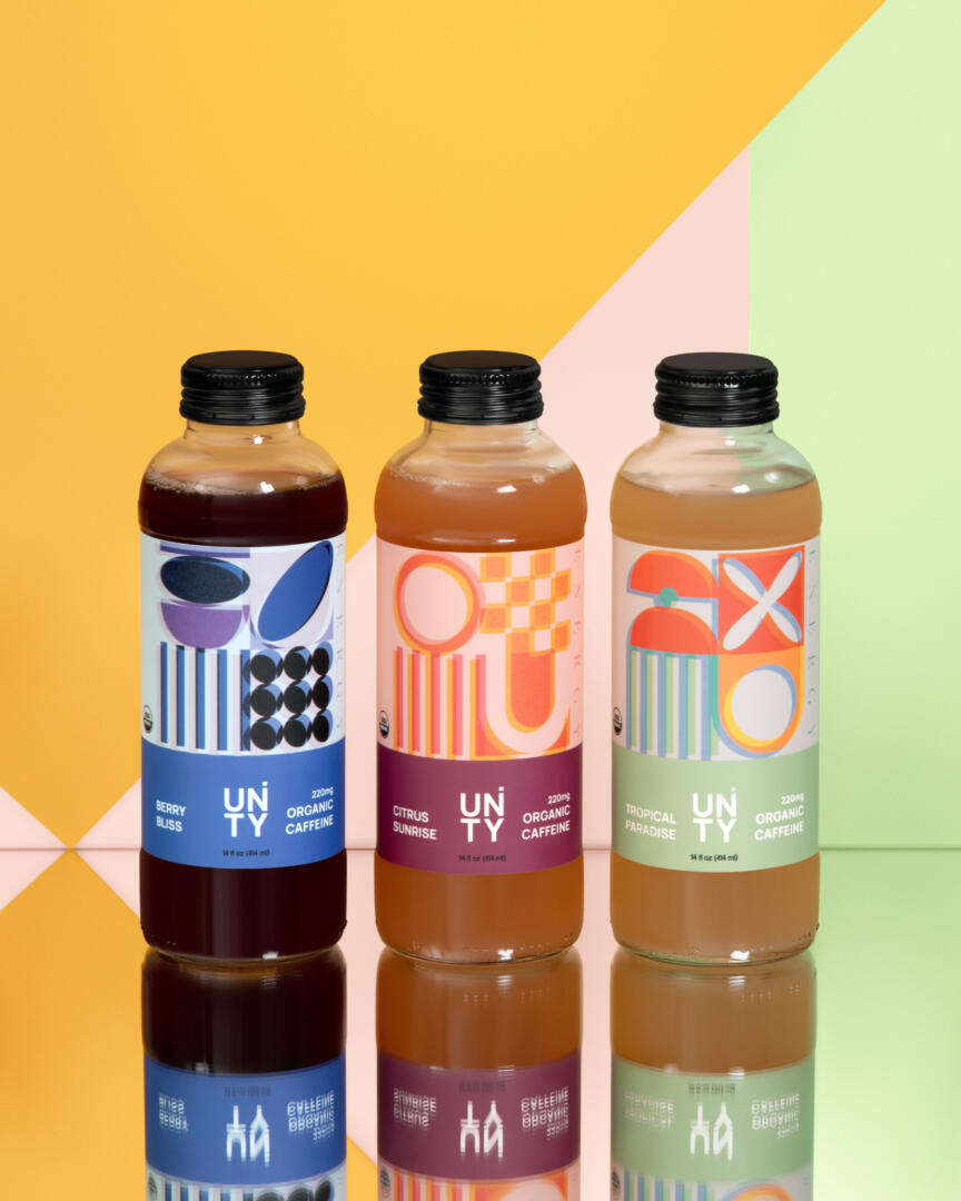
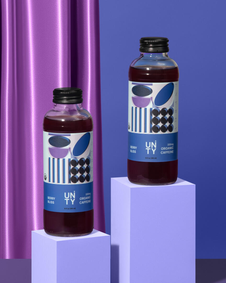
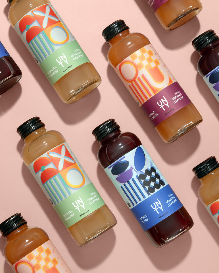
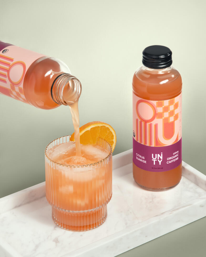
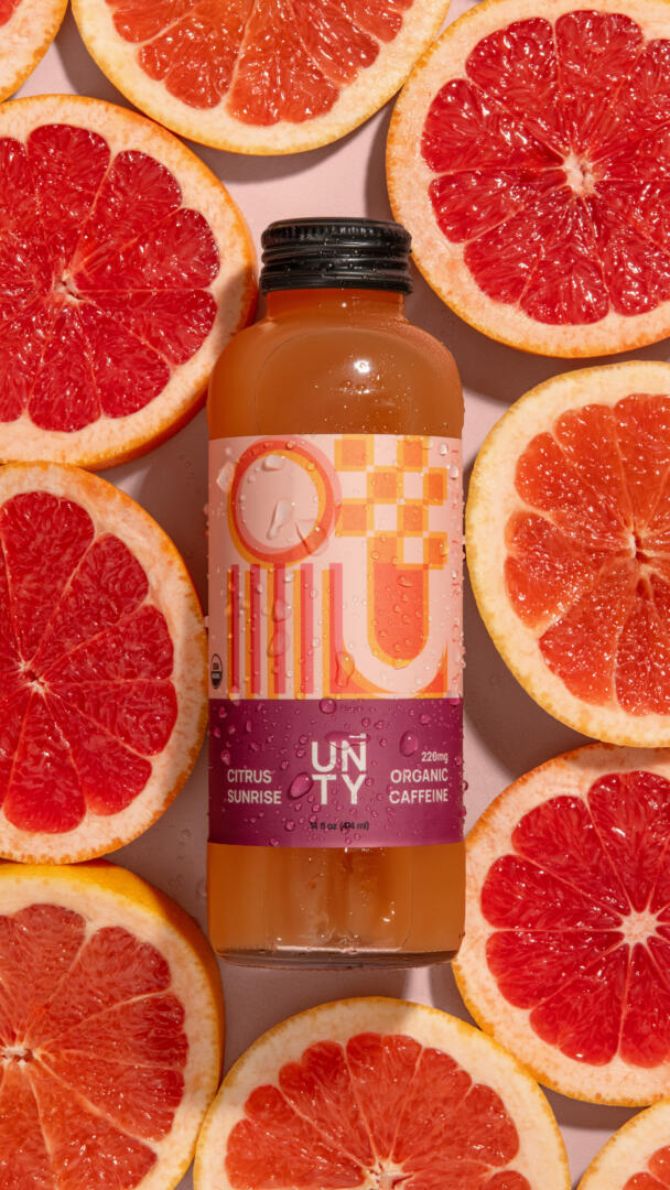
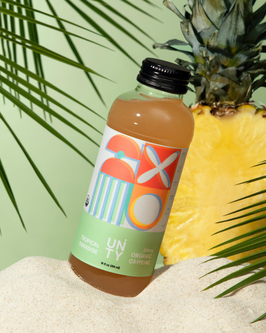
Re-branding and label design for Unity Wellness Co. Overlapping geometric patterns slightly moved to show the jitter and the buzz indicating the energetic qualities. Each flavor with a different arrangement to symbolize the differences as well as similarities of the goodness you’ll find inside. The “i” letter hidden within the “n” to indicate unity and symbiosis in the logo.
Curator’s Insight
The labels on these products aren’t just ordinary stickers, they’re like a bunch of cool shapes hanging out, and they’re not afraid to move around a bit. It’s not just for fun; those shifting shapes show off the lively and energetic vibes you’ll find inside the products.