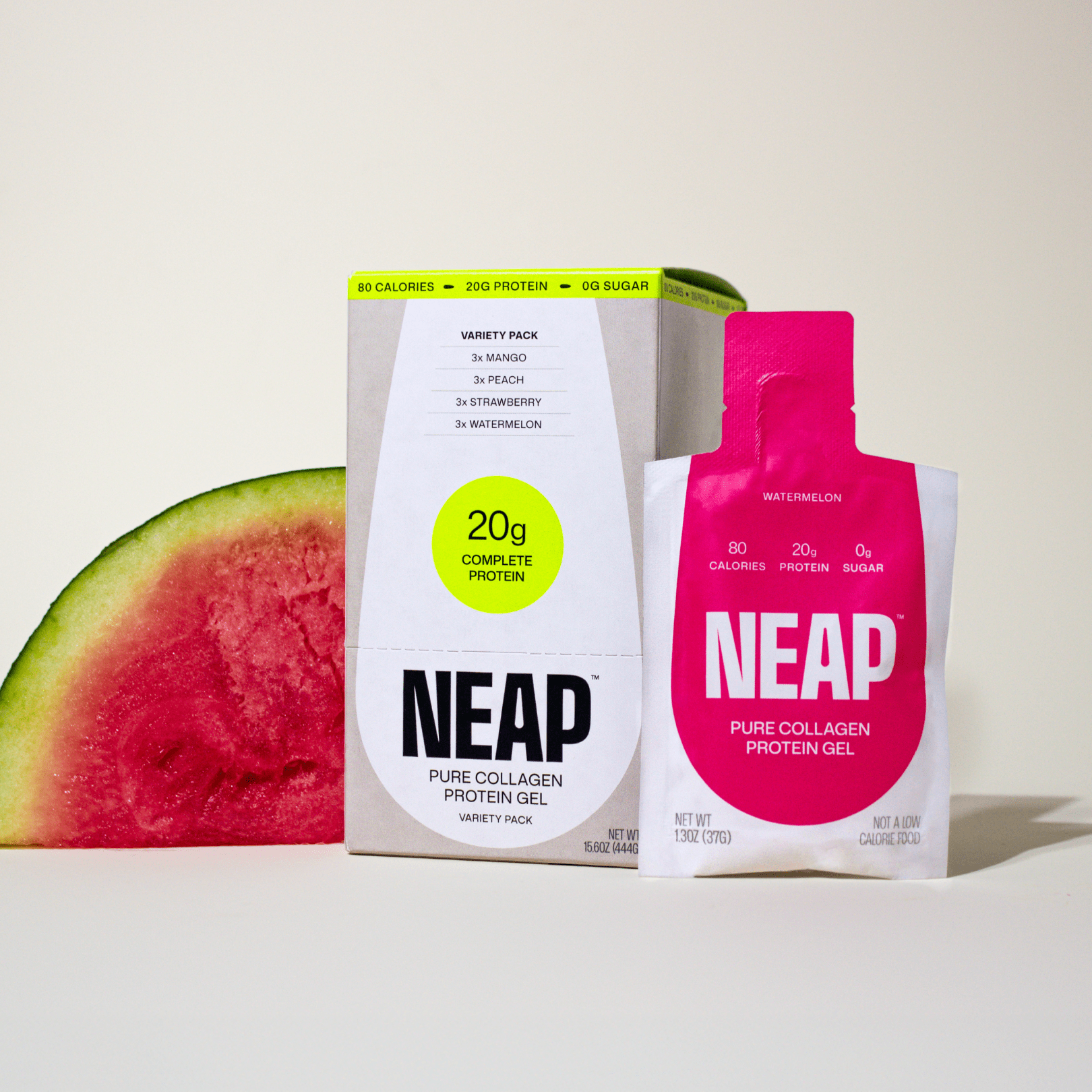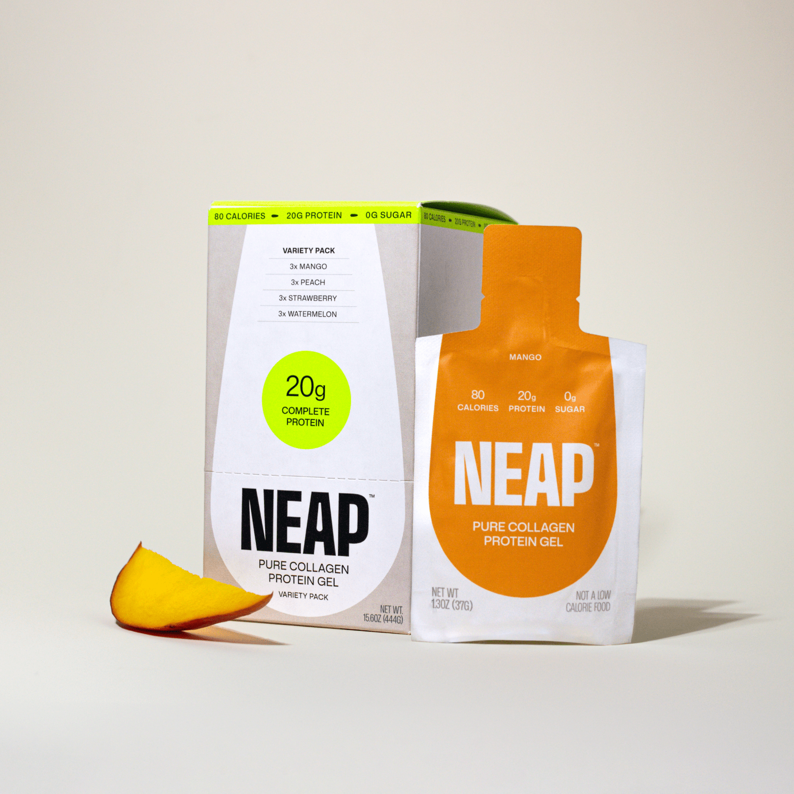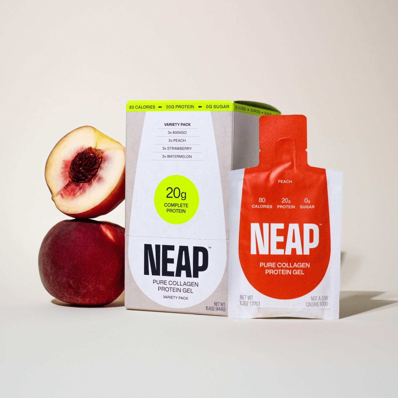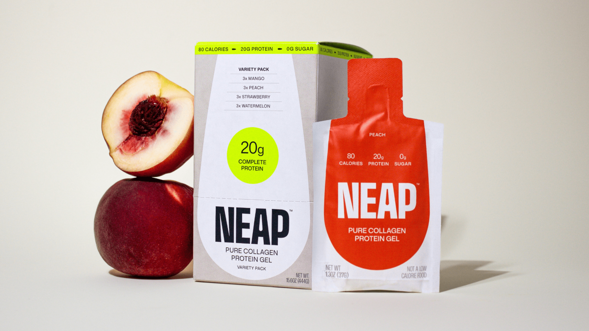
As the first protein gel ever made™, NEAP created a new CPG category that demanded a completely new packaging approach. The product was born from frustration with protein powder’s inconvenience and protein bars’ ingredient overload – a problem solved through efficiency, functionality, and simplicity.
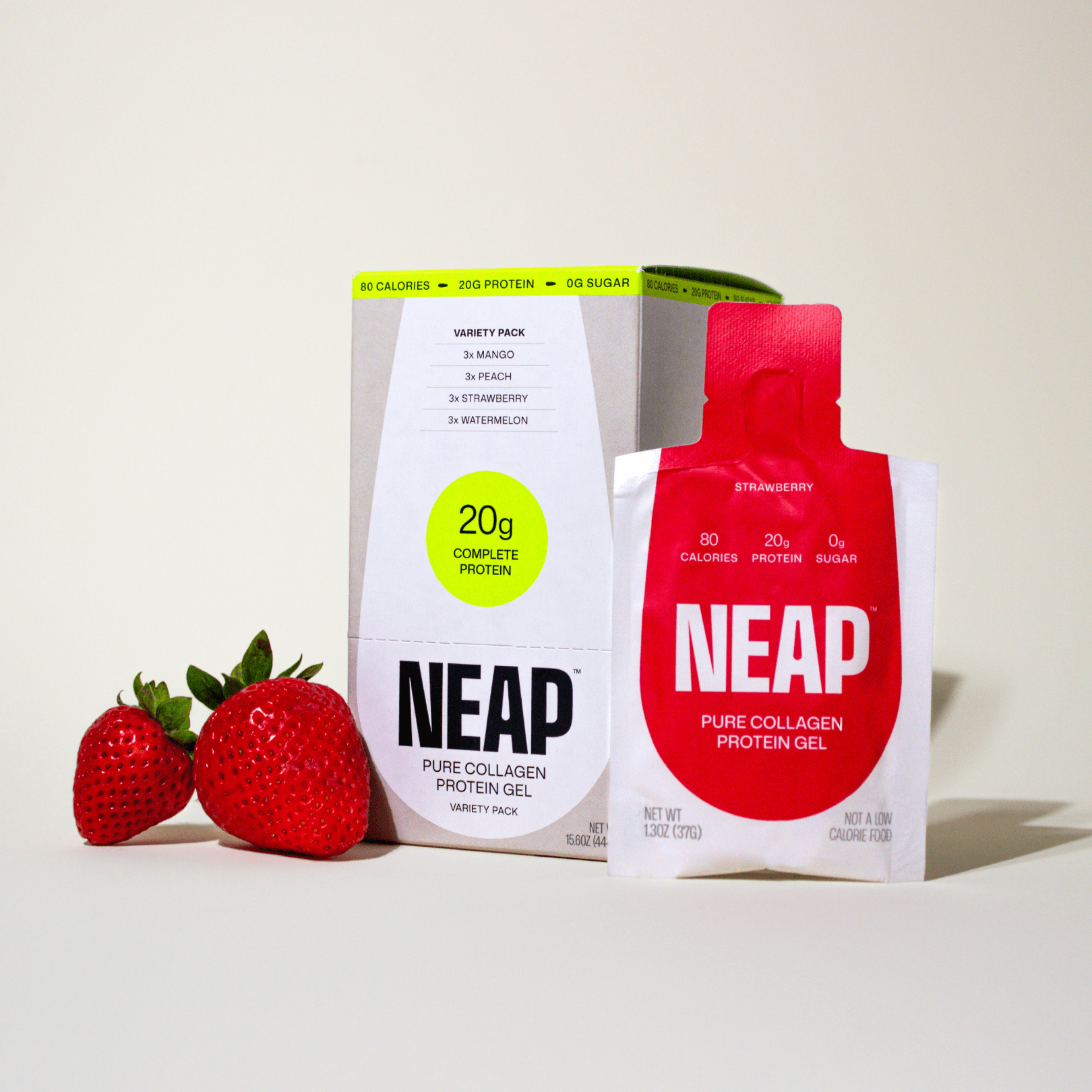
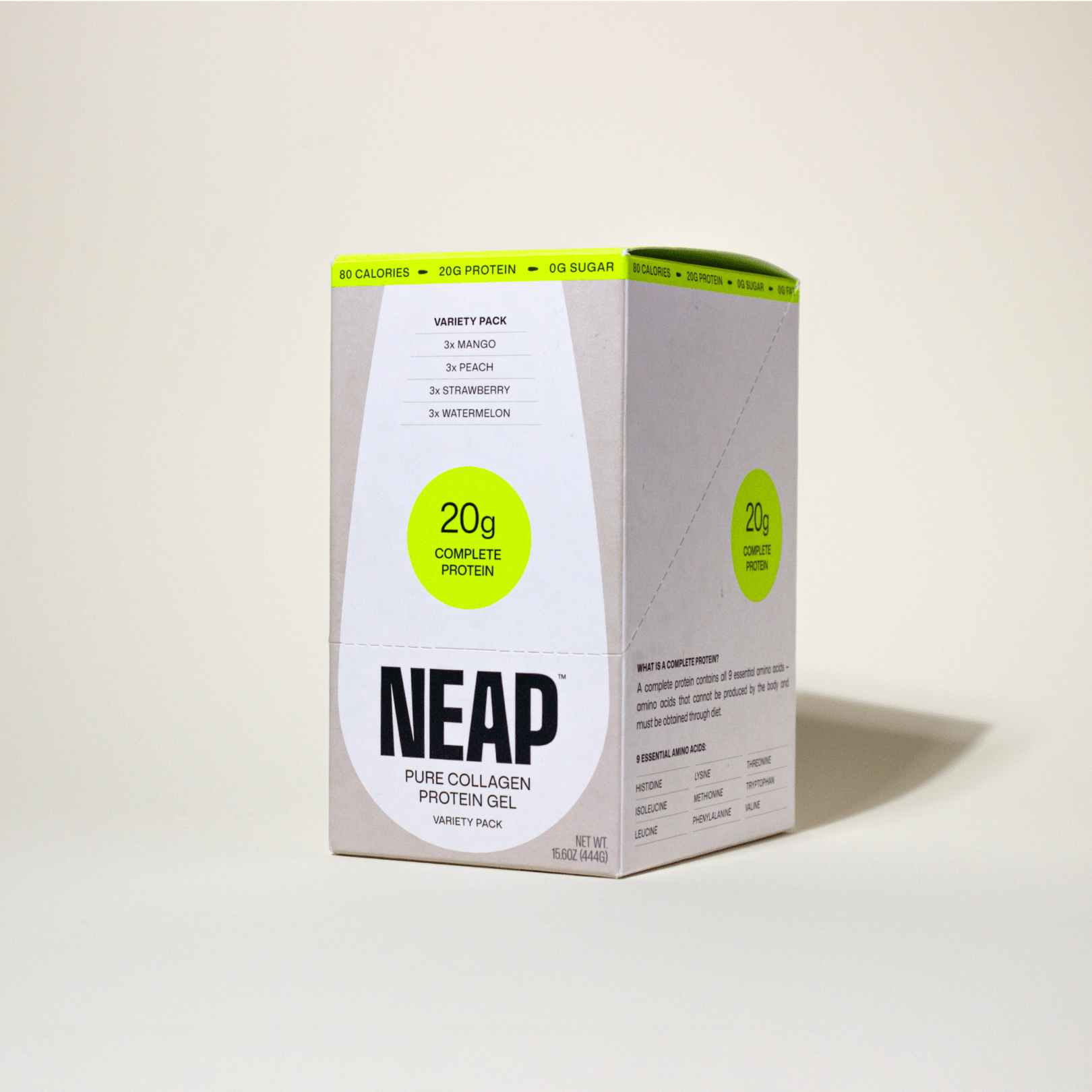
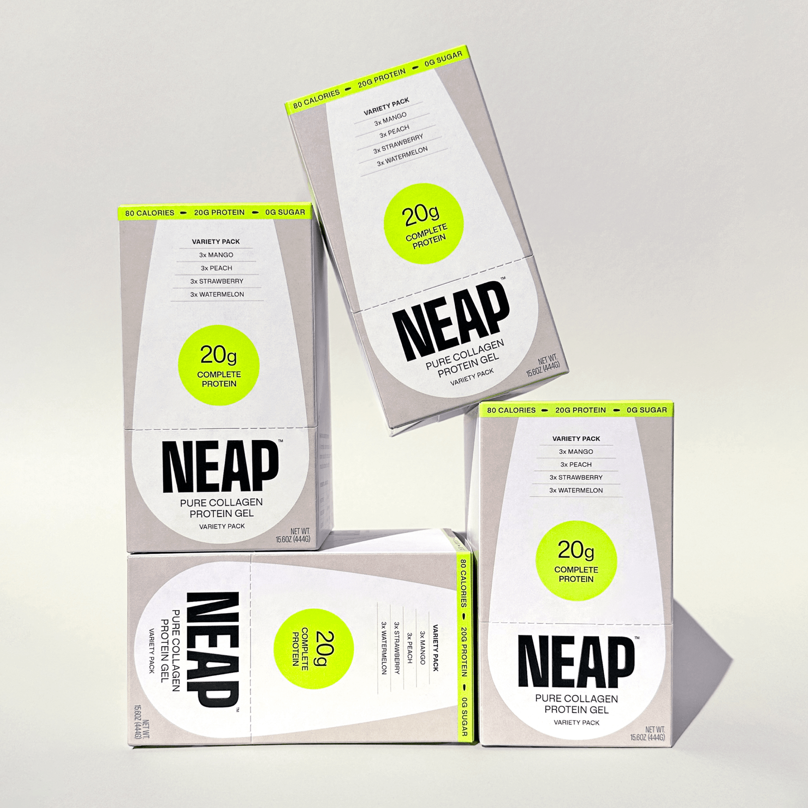
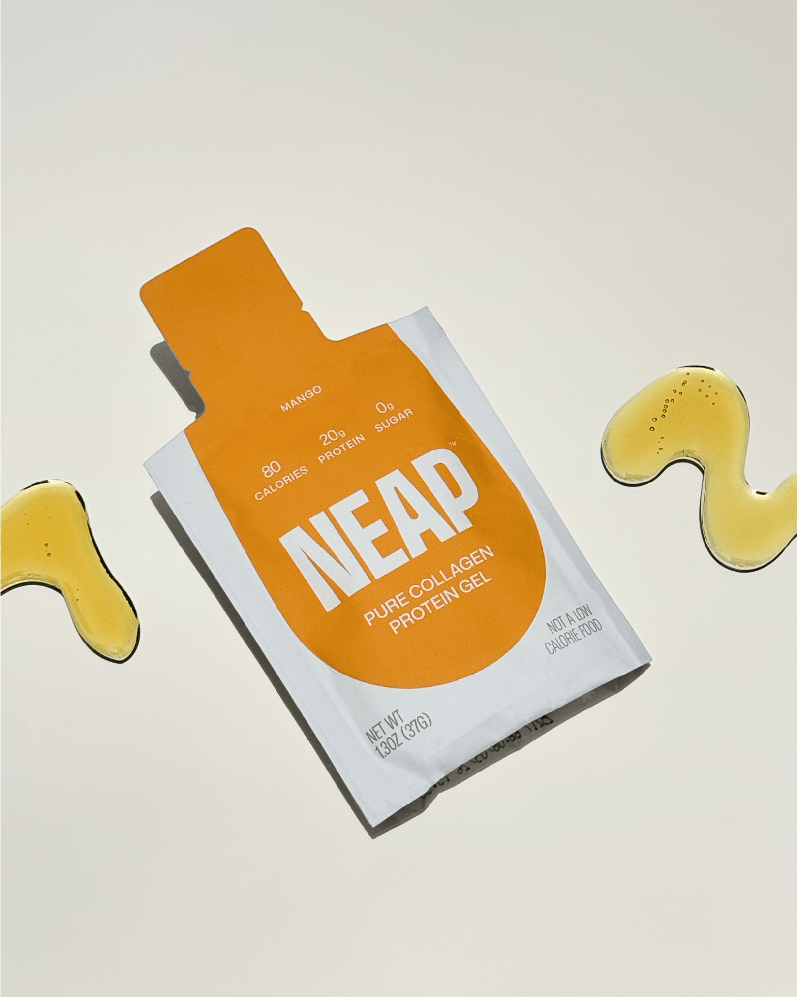
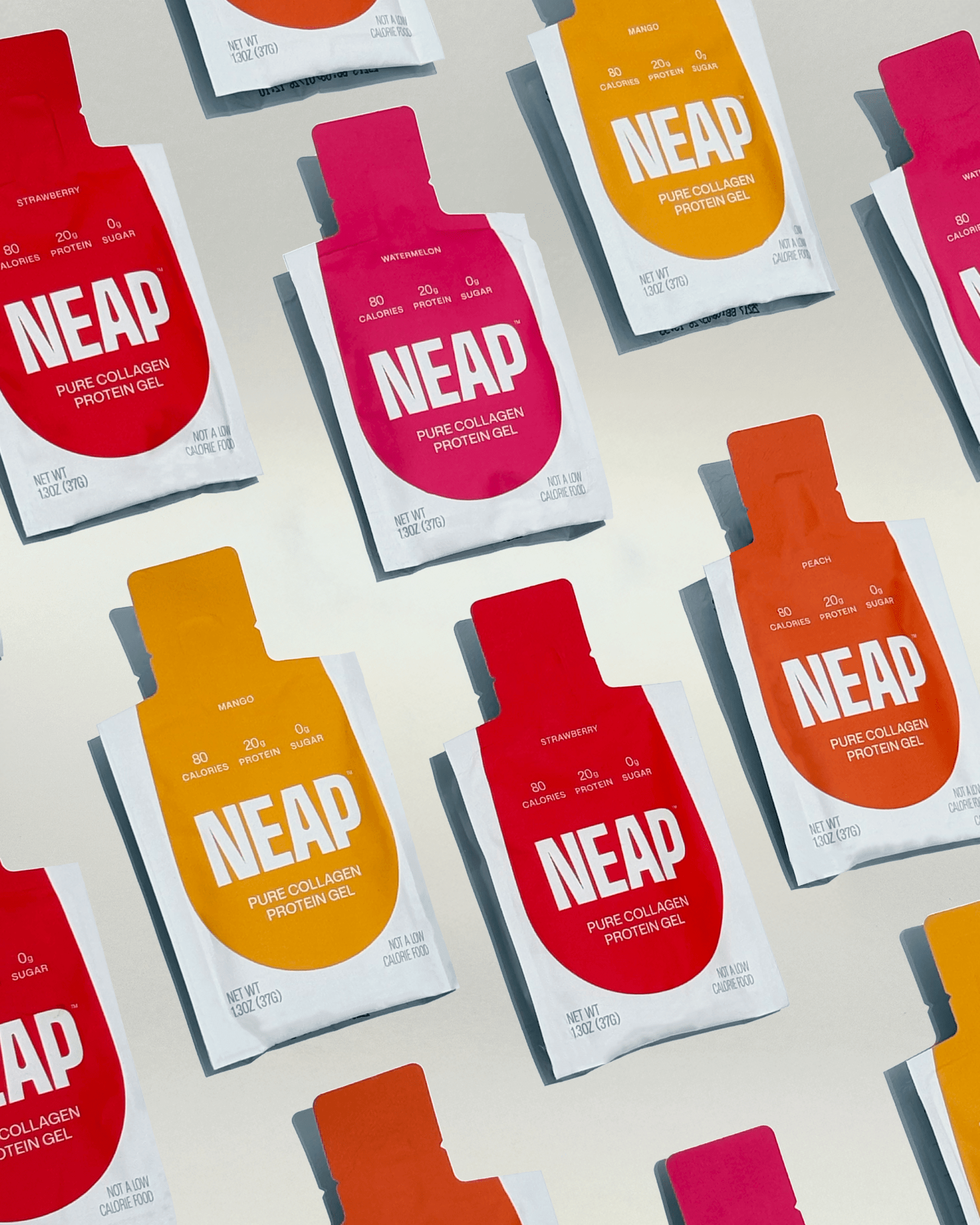
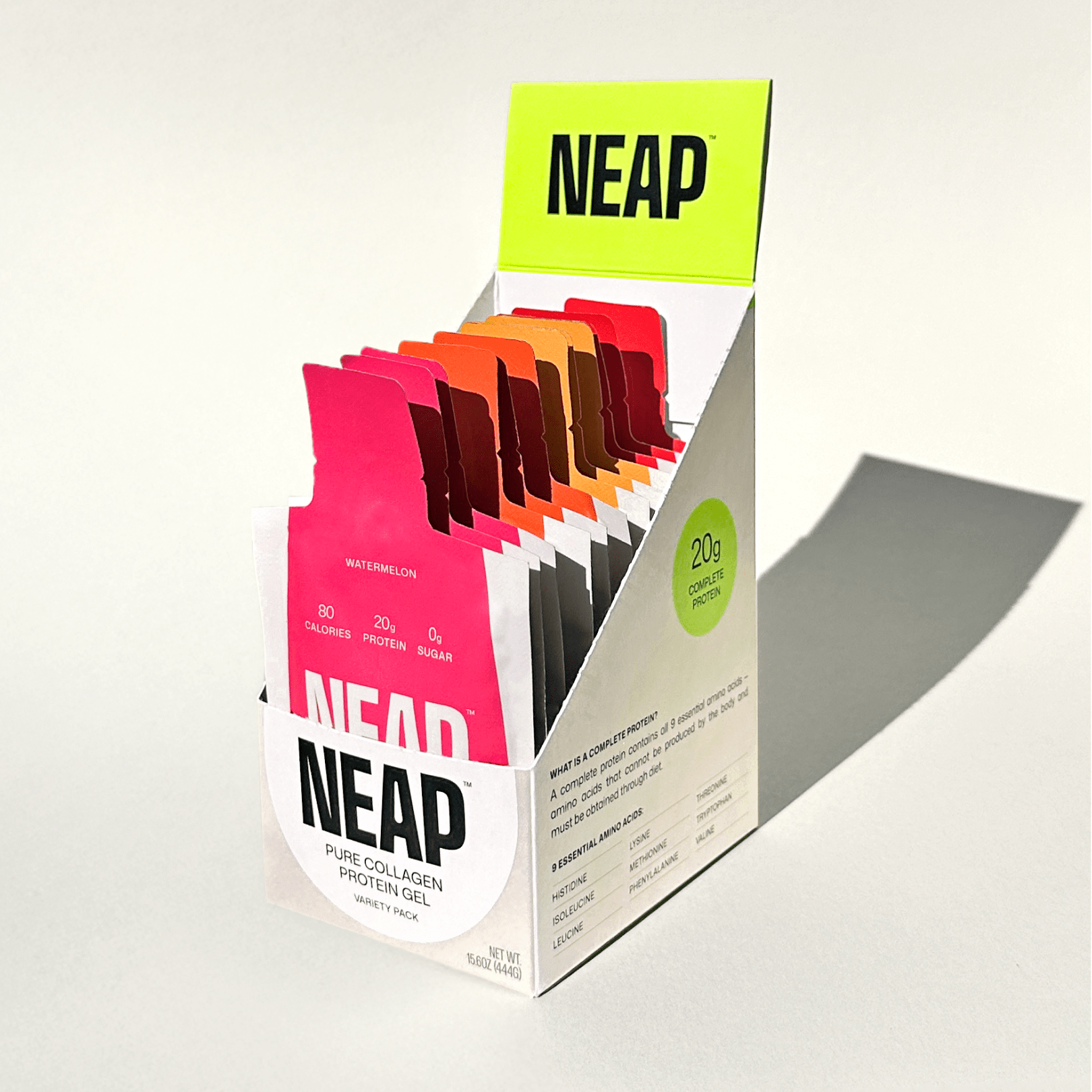
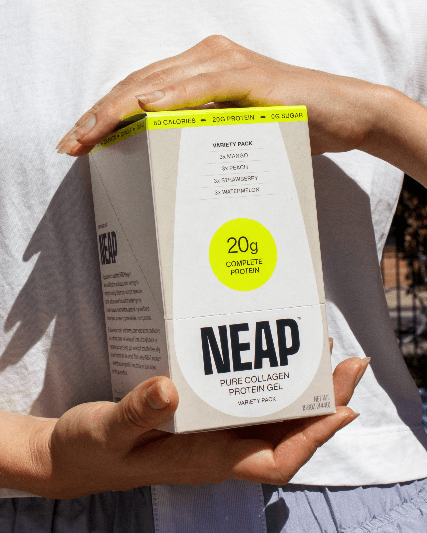
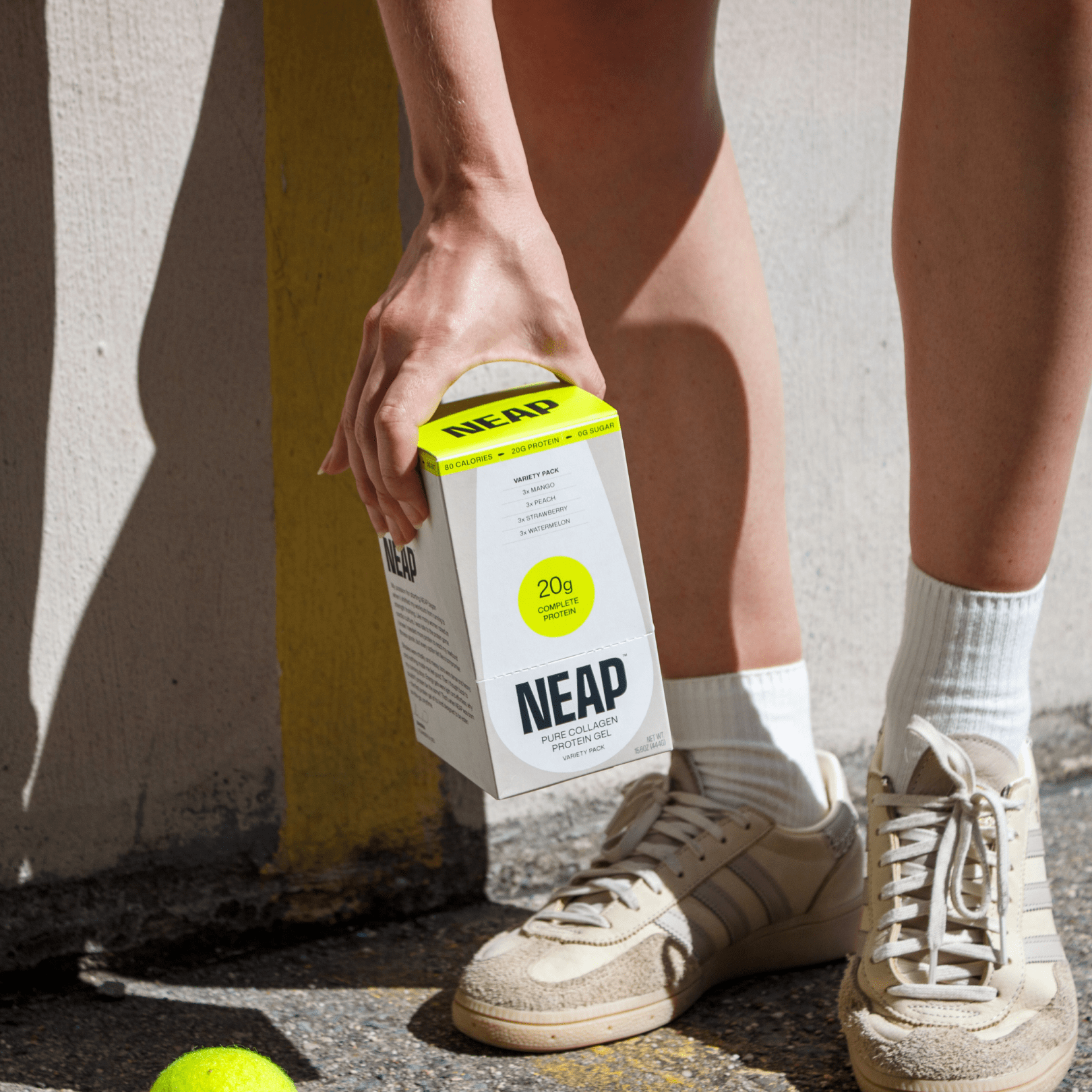
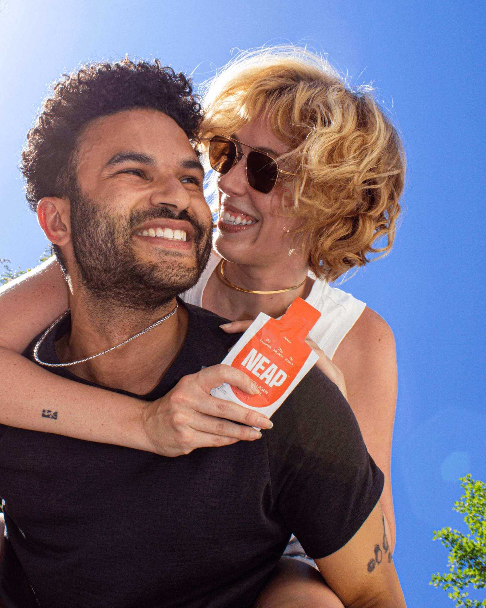
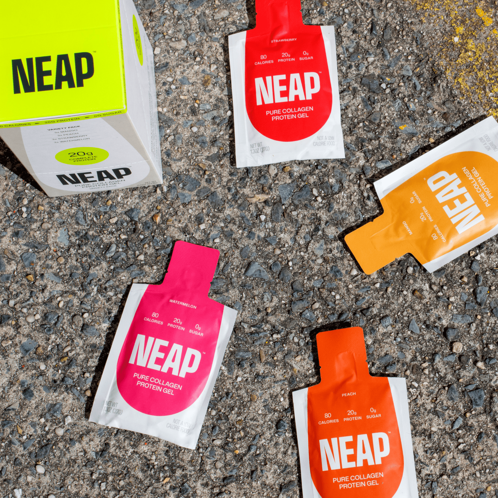
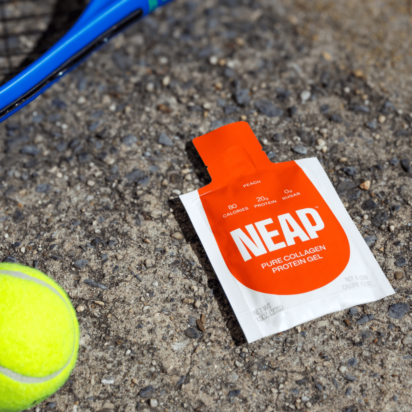
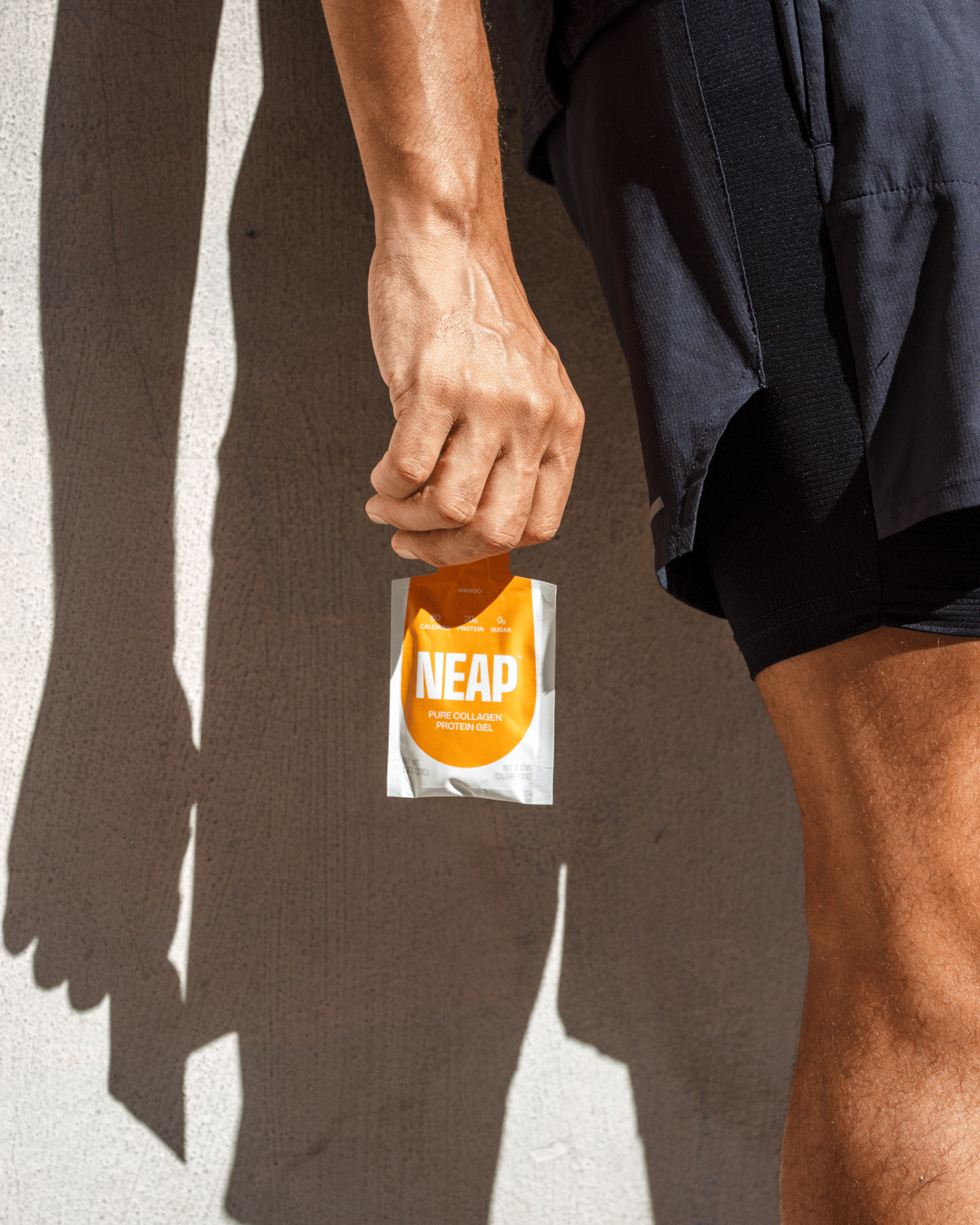
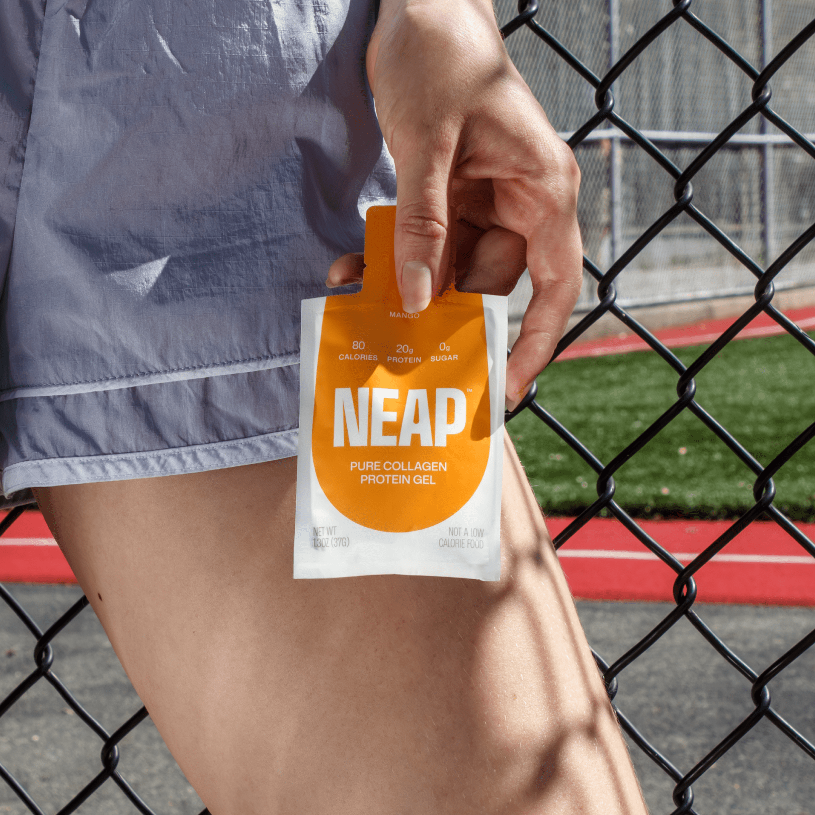
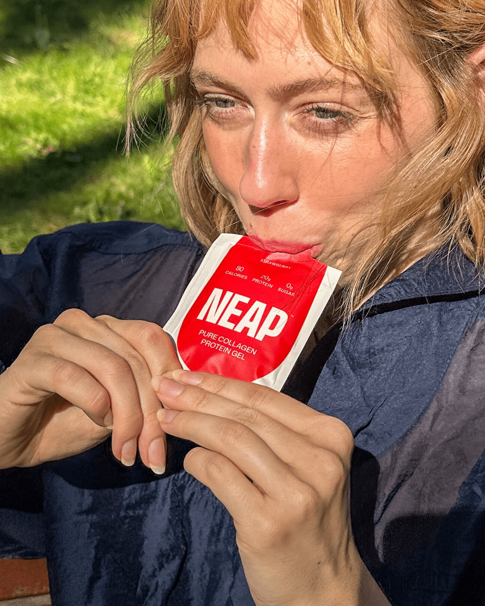
NEAP’s visual identity reflects that same ethos. Designed for ambitious, on-the-go achievers who refuse to compromise on nutrition and convenience, the design system communicates clean ingredients and confident performance through a juxtaposition of minimalism and bold brand elements like the logo and brand lime green. Nods to NEAP’s gel format are woven throughout the brand – from the rounded closed counter in the logo’s “A” to the gel-drop icon on the box and pouches.
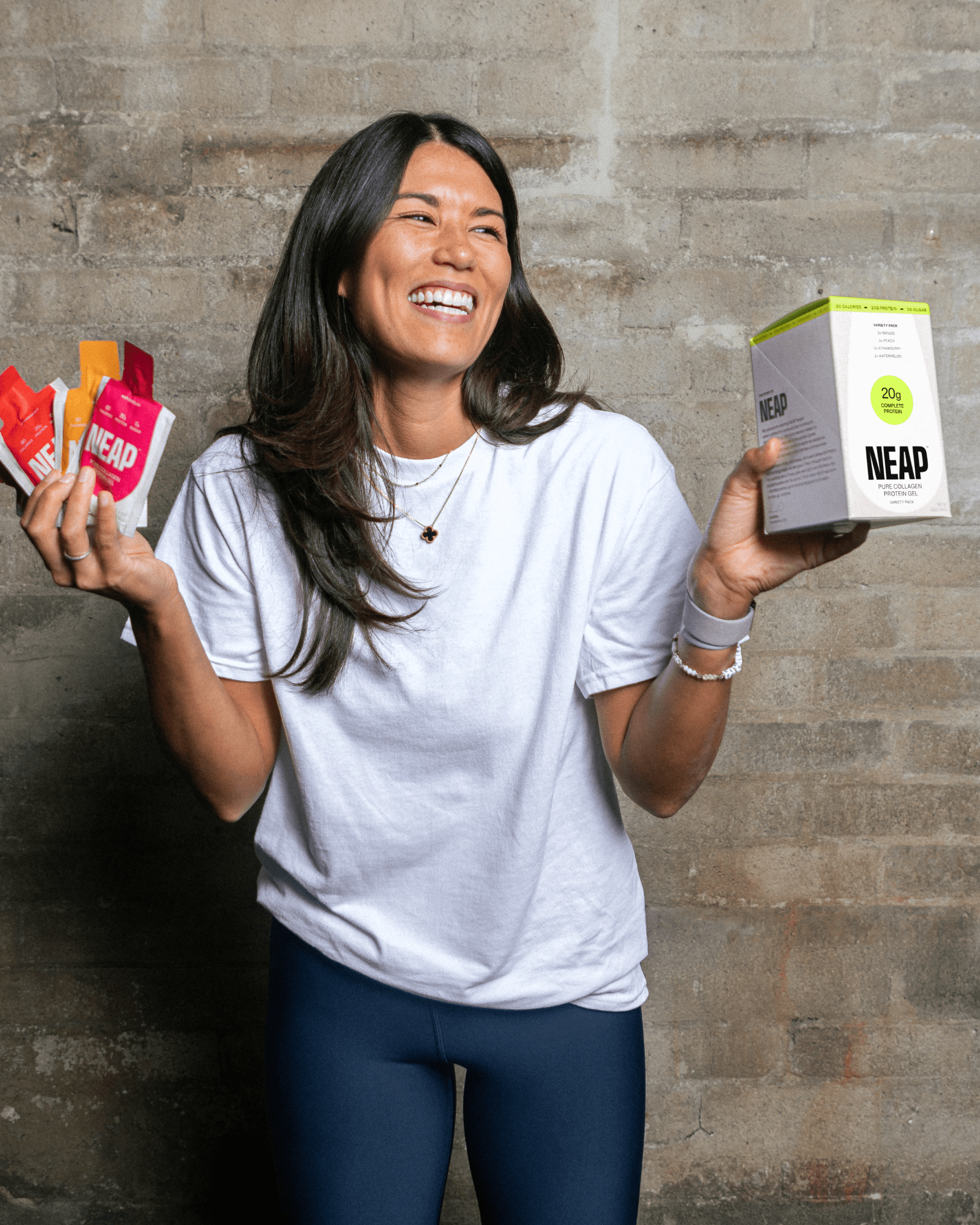
The no-mess 1.3oz pouch was engineered for portability and efficiency, delivering 20g of complete protein with 80 calories, 0g sugar, and 0g fat. The outer carton supports both D2C and retail, converting into a shelf-ready counter display via a perforated, tear-away front panel.
An intentional breakaway from the legacy sports nutrition market, NEAP proves that high-performance fuel can be simple, smart, and beautifully designed.
CREDITS:
The brand identity, packaging design, and website design were designed by Michelle Unger (with additional support from Lea Cawthorne on packaging design). Michelle Unger did this as a freelance project, but had such an incredible time working on NEAP – she ultimately gave up her freelance design practice to work at NEAP full time as Head of Brand.
NEAP was founded by Sandra Yamada. Find NEAP online:
www.neapfoods.com
https://www.instagram.com/neapfoods/