Pizzeta | Packaging That Gestures Italian
Project Overview
Pizzeta is an artisanal pizza base, crafted with care from natural ingredients and without compromise. Created through slow fermentation, it delivers the perfect texture – crispy on the outside, soft on the inside – and the authentic taste of Italian pizza, right at home.
The challenge for the BroHouse team was to translate this authentic simplicity into a memorable brand: a familiar, friendly name, a logo that breathes naturalness, and packaging that communicates ease, warmth, and the joy of effortless cooking.
Visual identity
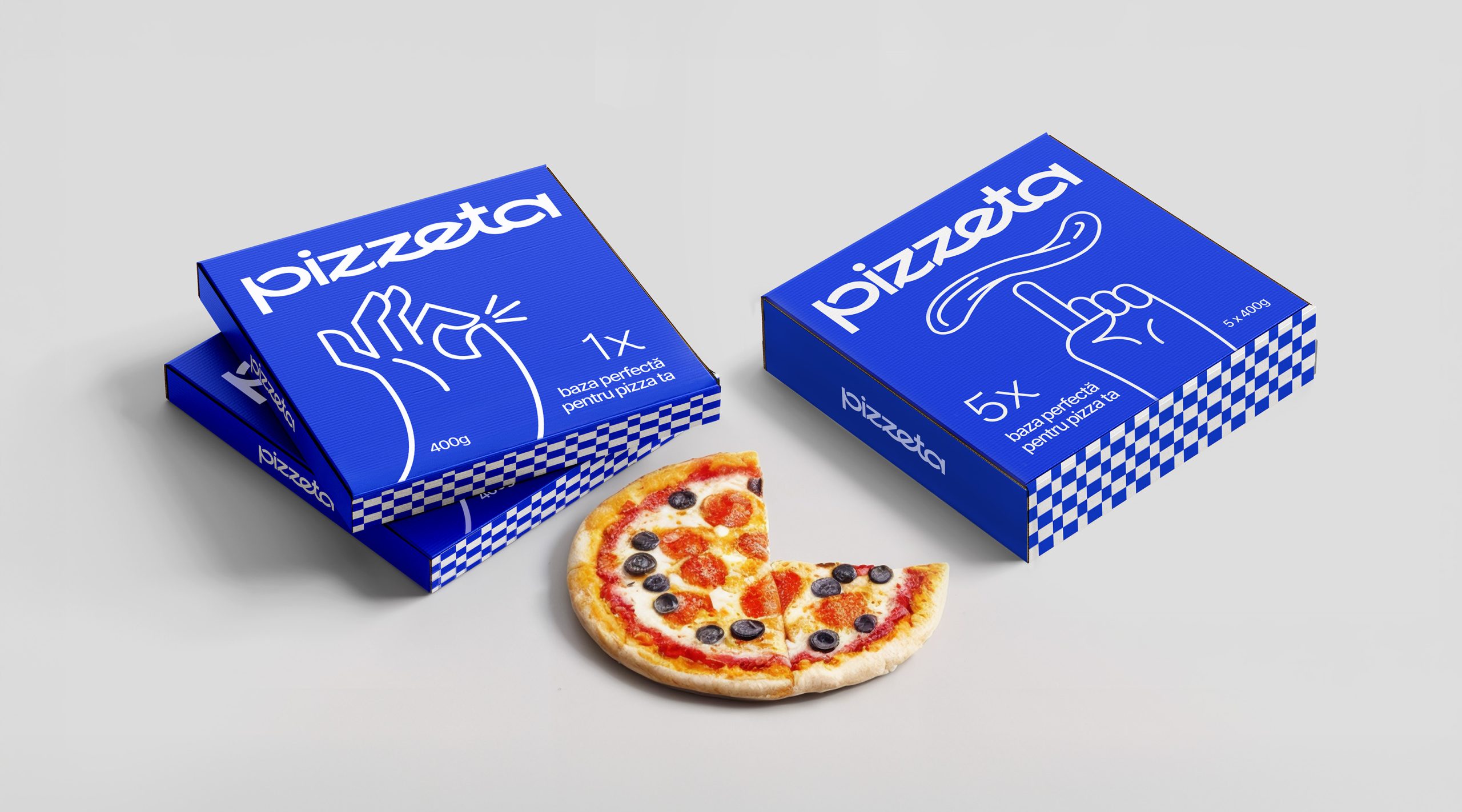
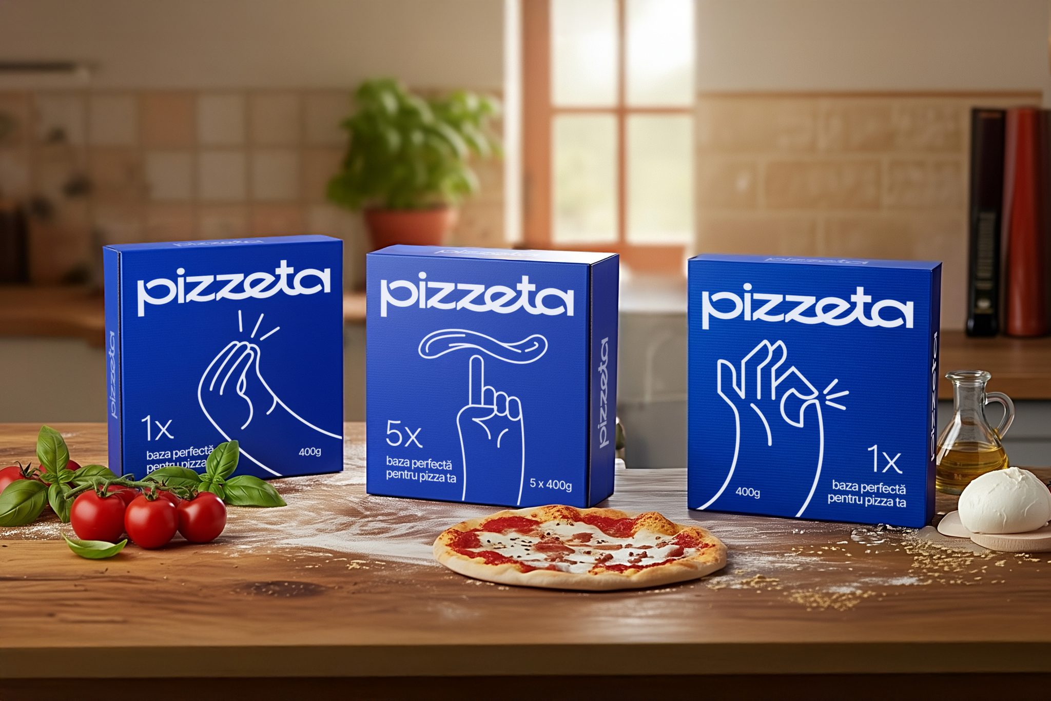
The visual identity and packaging express Italian authenticity without clichés. The minimalist logo embraces effortless elegance, while the packaging uses clean, fluid illustrations inspired by Italian hand gestures – the universal language of expression. Set on a fresh blue background, the design feels modern yet emotional, transforming simplicity into a recognizable Italian signature
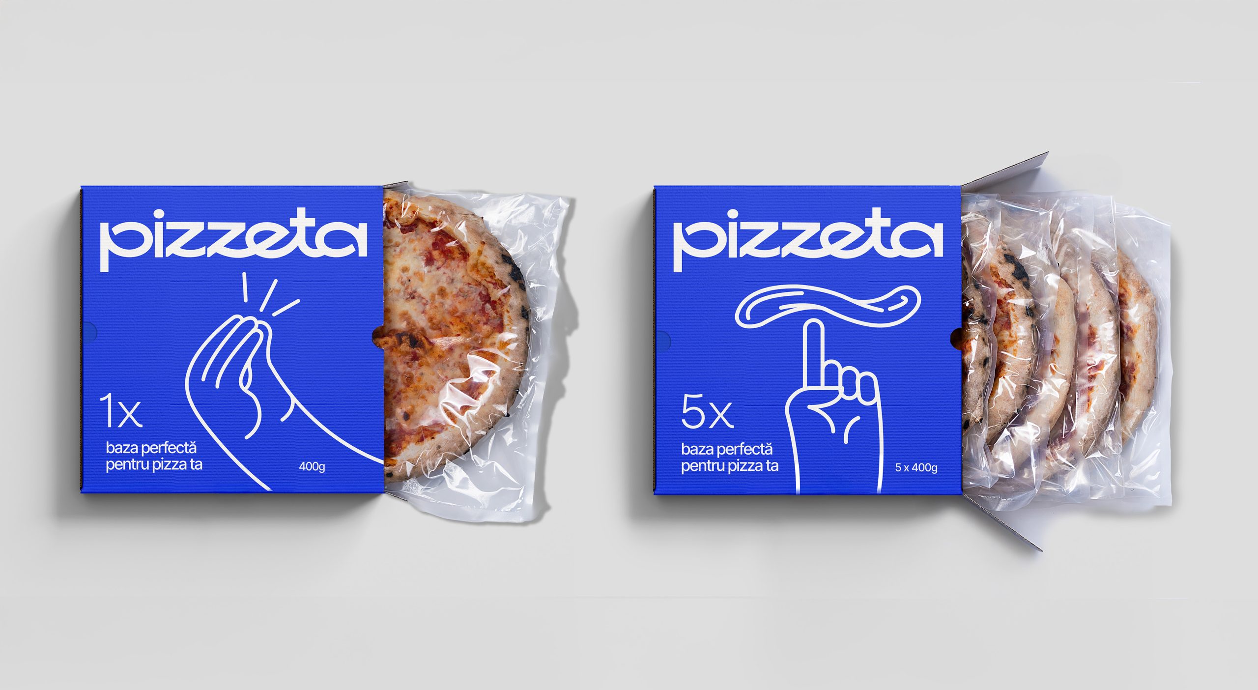
Design with gestures. And no words.
Pizzeta brings Italian authenticity to life through design that speaks the way Italians do – with their hands. The BroHouse team translated the emotion and rhythm of Italian life into a series of minimalist illustrations inspired by iconic hand gestures. Each gesture captures warmth, spontaneity, and personality, turning the packaging into a visual conversation – expressive, elegant, and unmistakably Italian.
The clean blue background and fluid line drawings offer a modern, sophisticated take on Italian heritage, avoiding clichés like pizza slices or flames. Instead, the design celebrates simplicity and human connection, embodying the brand’s essence: natural, authentic, and effortlessly joyful. Pizzeta’s packaging doesn’t describe Italy – it gestures it.
Brand Strategy & Naming: BroHouse
Visual Identity & Packaging Design: BroHouse
Client: Pizzeta
Country: Romania