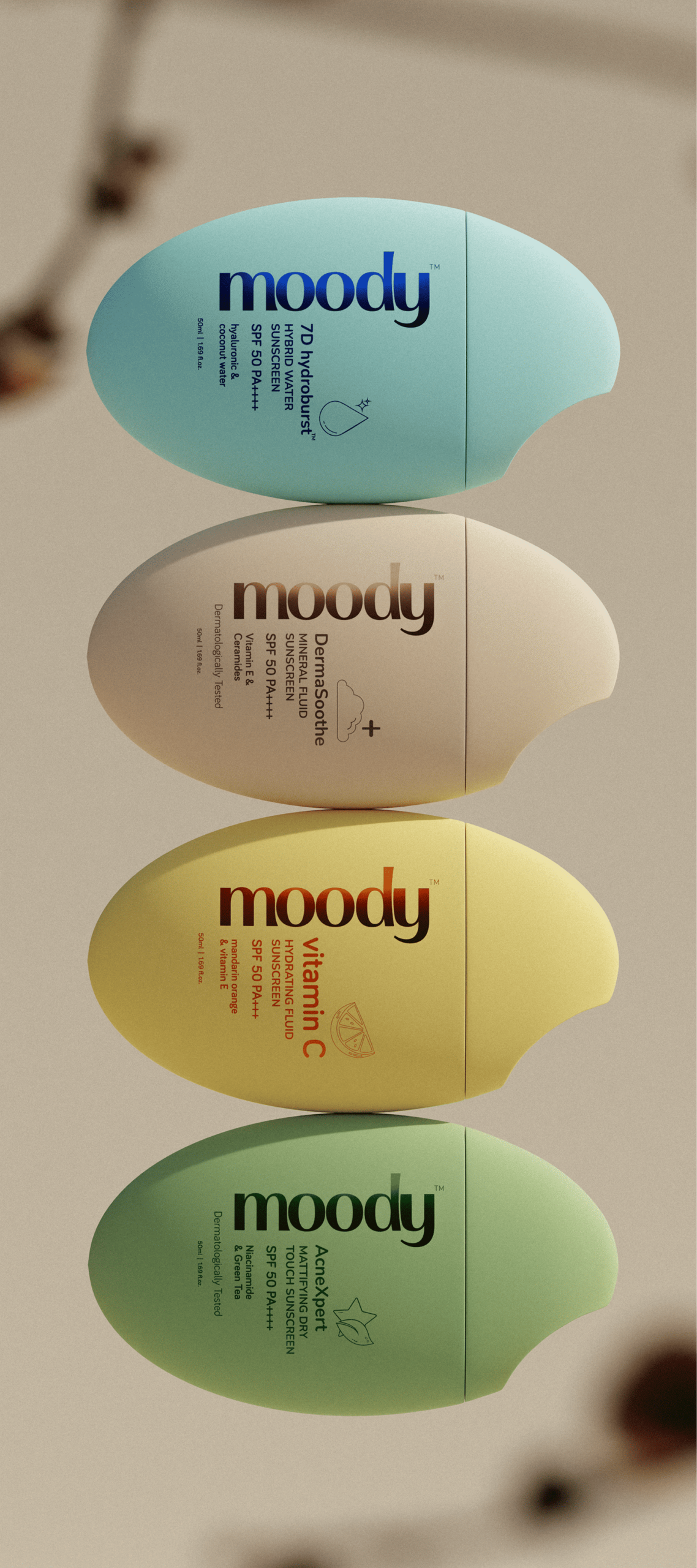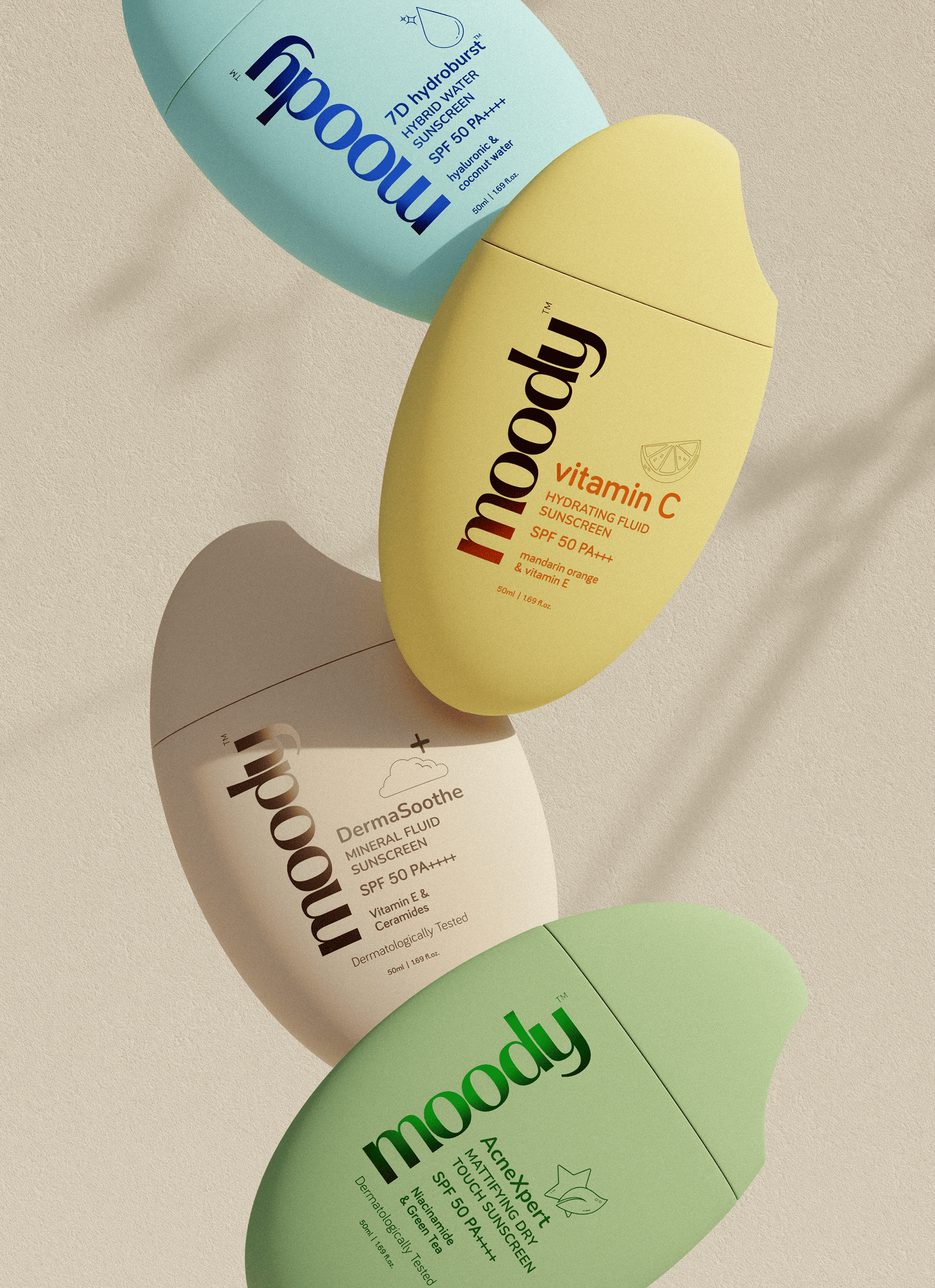
We crafted a complete 3D visual identity for Moody’s sunscreen collection a line built around gentle protection, skin-first formulas, and a design language rooted in calmness and clarity.
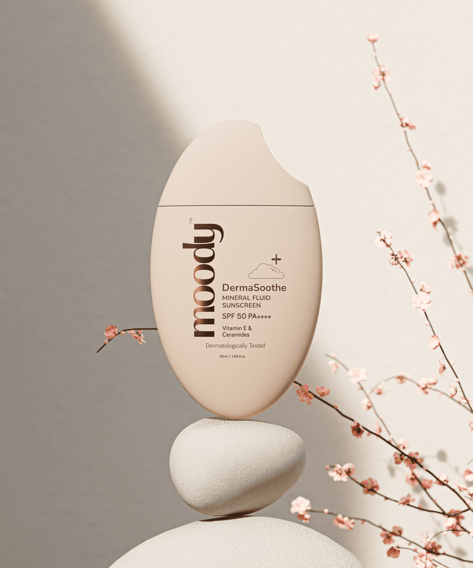
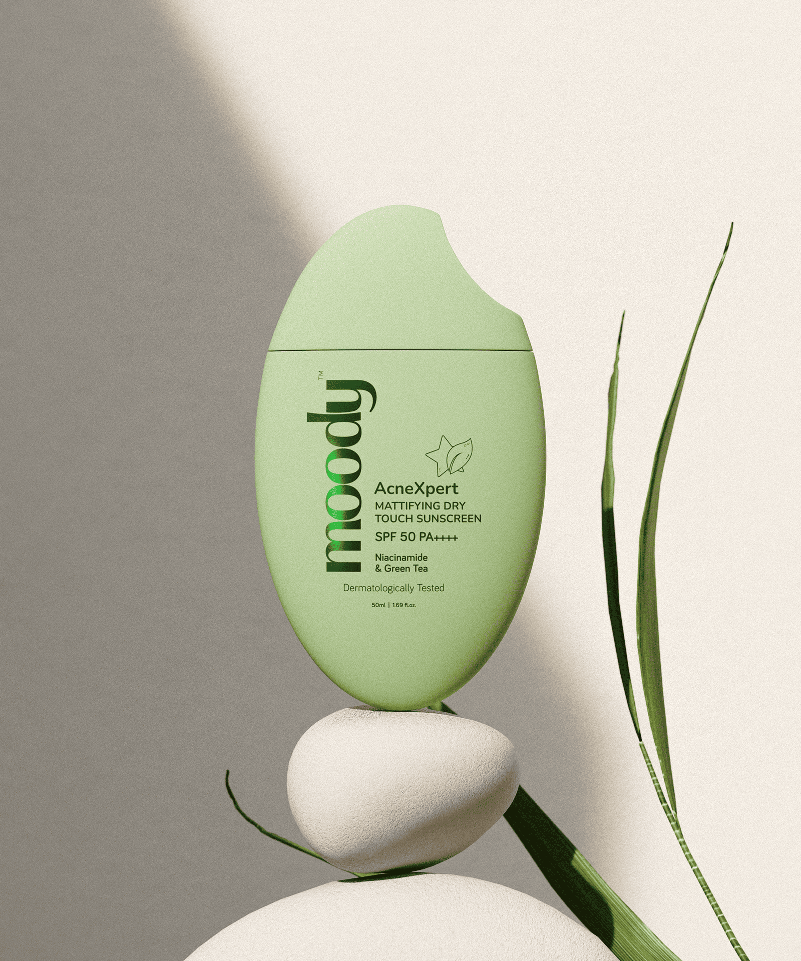
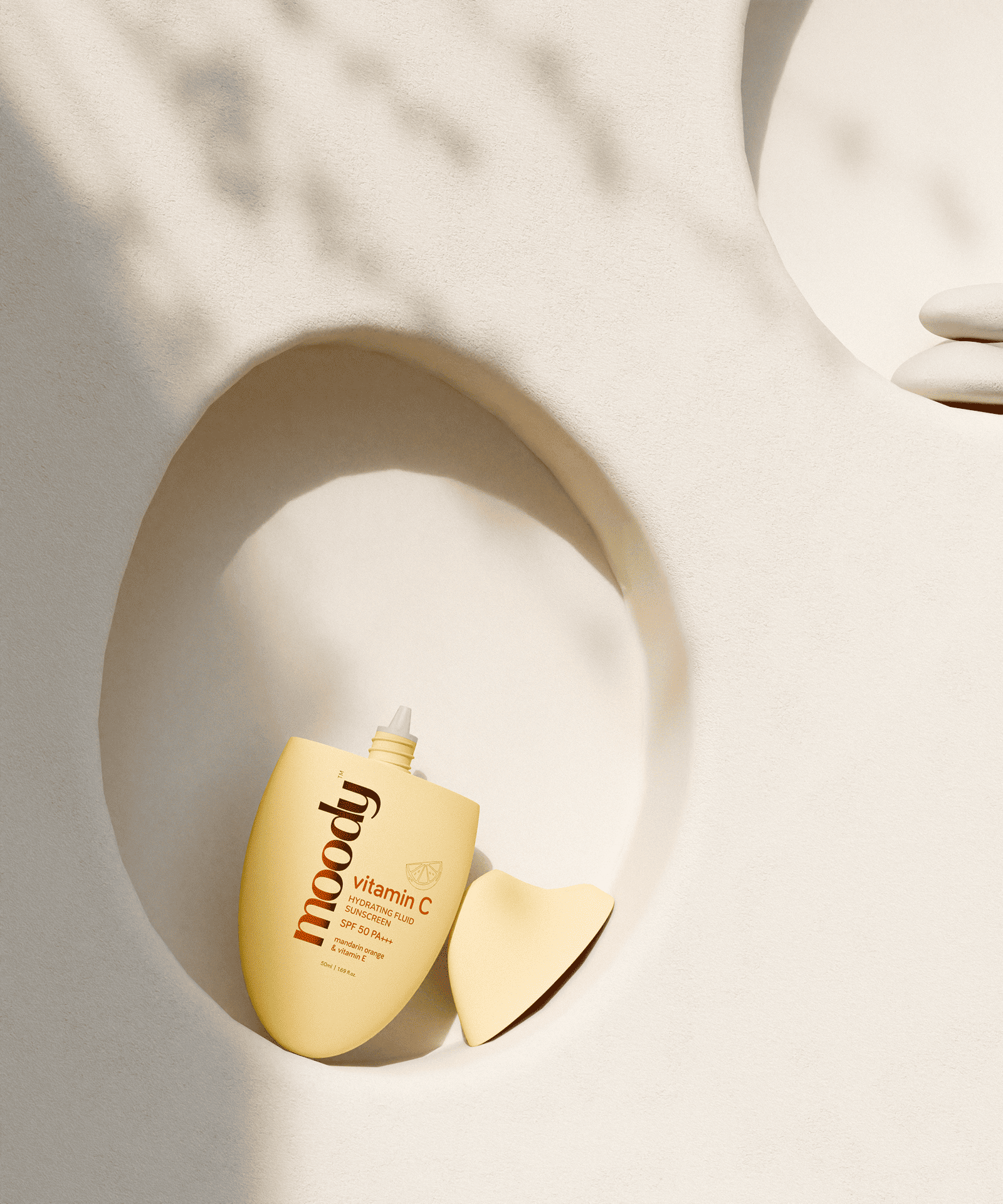
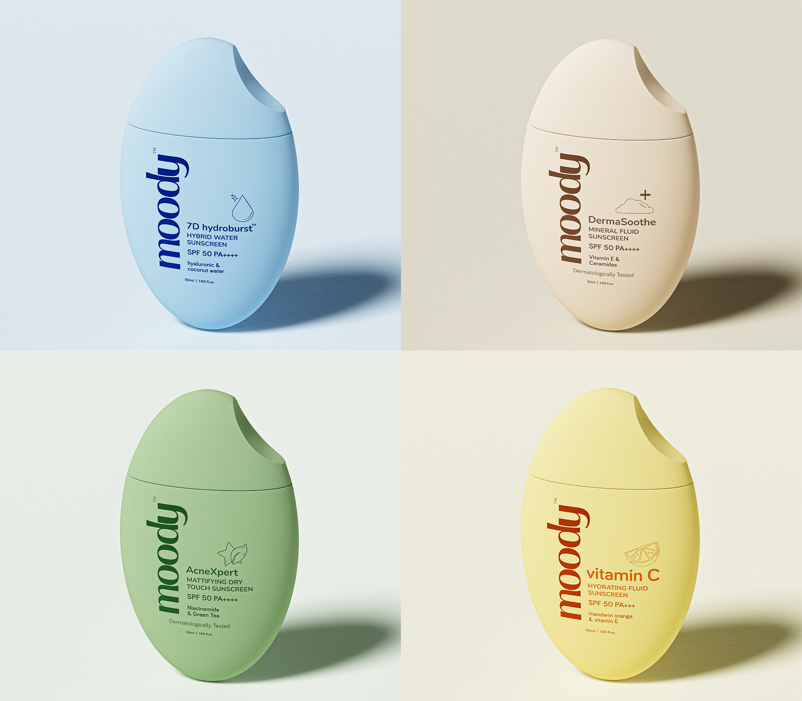
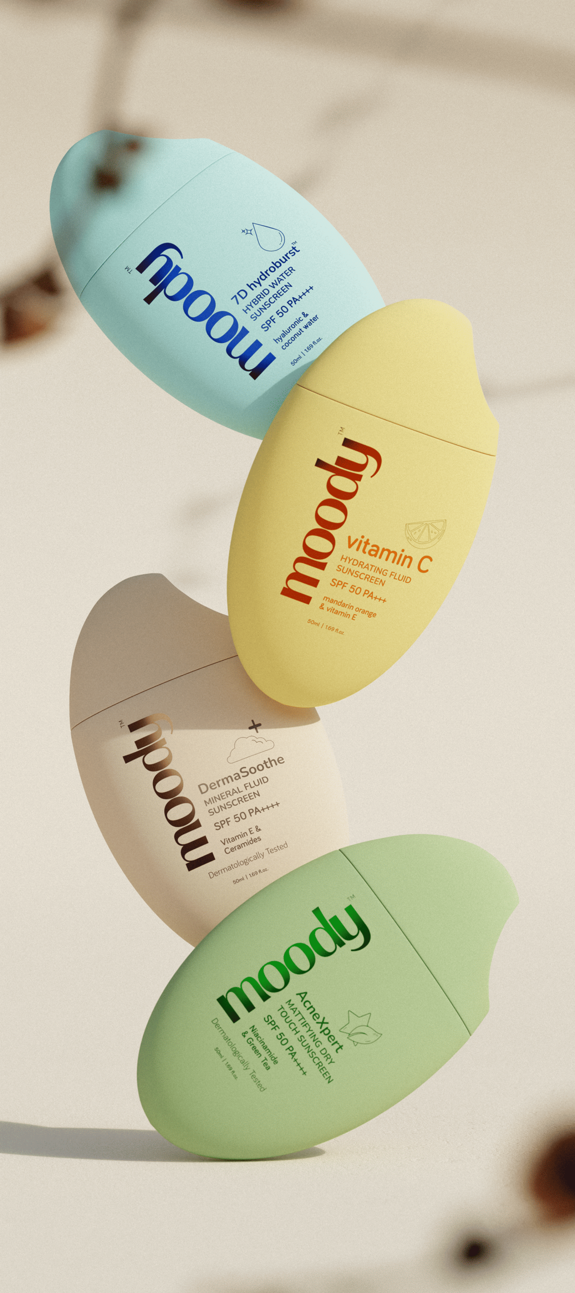
The project is driven by a soft, organic visual structure that mirrors the brand’s philosophy of simplicity and comfort. Each bottle’s sculpted silhouette is paired with soothing color palettes, allowing the variant’s purpose to speak through tone alone. From hydrating blue to bright citrus yellow, mineral beige, and acne-care green, every shade carries its own functional meaning.
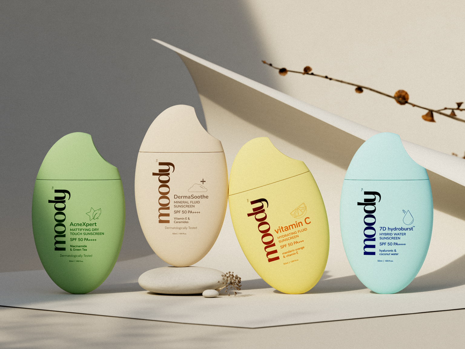
Using controlled lighting, natural textures, and grounded compositions, we designed a visual system that enhances the product’s dermatological credibility while keeping the experience warm and human. The environments stone, sand, sunlight, shadows were intentionally chosen to reflect each formula’s benefits: hydration, mineral purity, vitamin C radiance, and matte protection.
Matte finishes, clean typography, and minimal layouts highlight the honesty of the brand, creating harmony between color, form, and material.
This 3D series transforms everyday sun care into an aesthetic ritual, where each image reinforces Moody’s core values: gentle protection, modern simplicity, and emotional ease.