Feng Shui consultant Meltem Özertem has designed a special gold collection inspired by Chinese Astrology. Although Chinese Astrology is followed by millions around the world, there is no brand offering refined, elegant designs crafted from precious materials. This gap became the starting point of the project.
The target audience consists of individuals in the high-income segment who value not only aesthetics but also designs that symbolize protection, luck, and spiritual meaning. The brand aims to begin its journey in Türkiye and expand to prestigious retail locations worldwide, reaching consumers who are interested in Chinese Astrology and seek exclusive jewelry.
Accordingly, the need was for a packaging design that stood out, preserved its elegance, and commanded attention. Since the packaging would be the brand’s first point of contact in communication, it had to differentiate itself not only visually but experientially.
The primary goal was to offer consumers an unforgettable experience from beginning to end — a journey that starts with the first touch of the box and continues until the necklace is worn around the neck.
The strategy was built on three core pillars:
- Differentiation: Standing out even when displayed in high-end global retail environments.
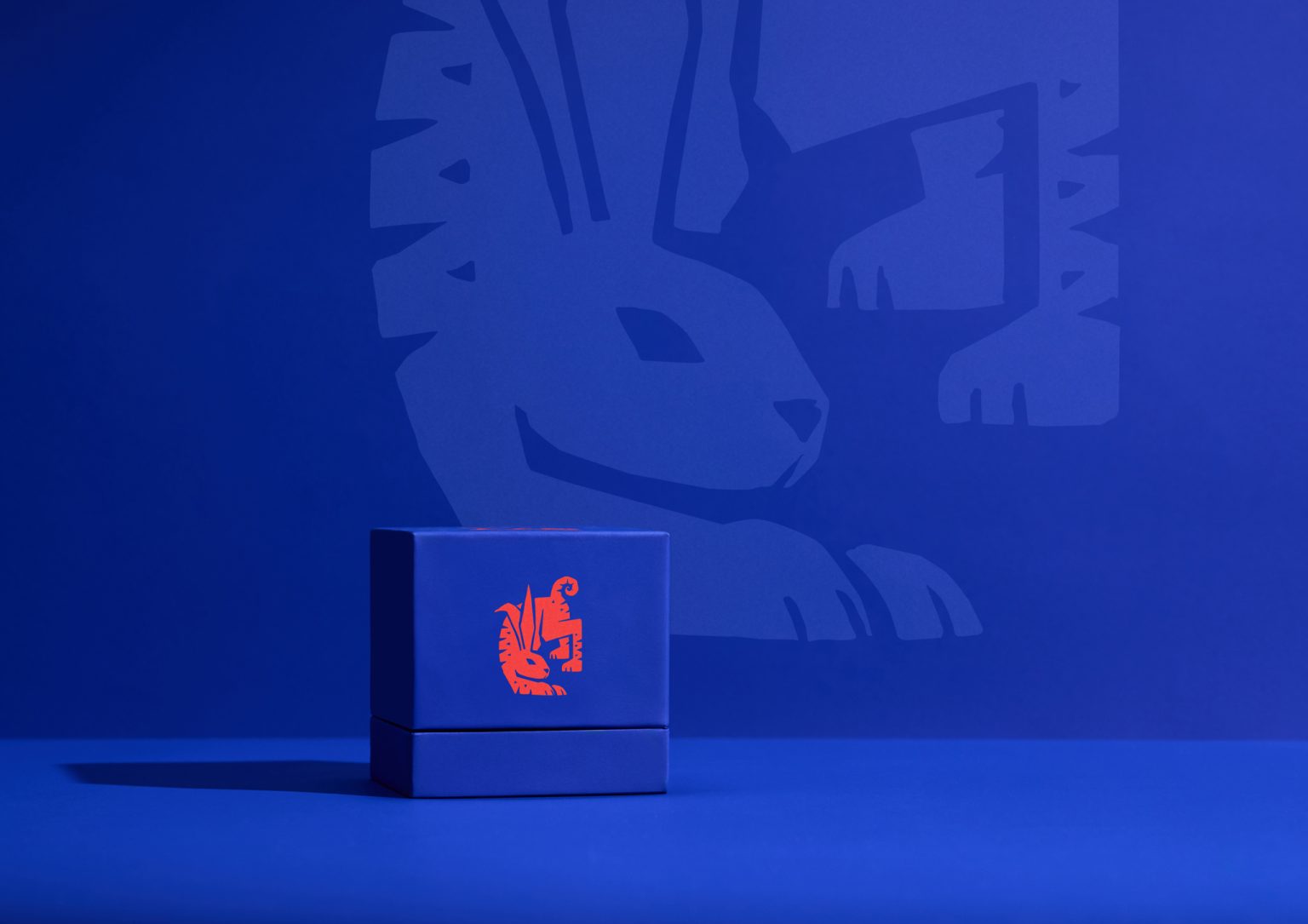
- Customization: Reinterpreting zodiac signs and symbols to align with the brand’s visual identity.
- Experience: Creating an opening ritual that forms both a visual and emotional connection, offering a sense of discovery.
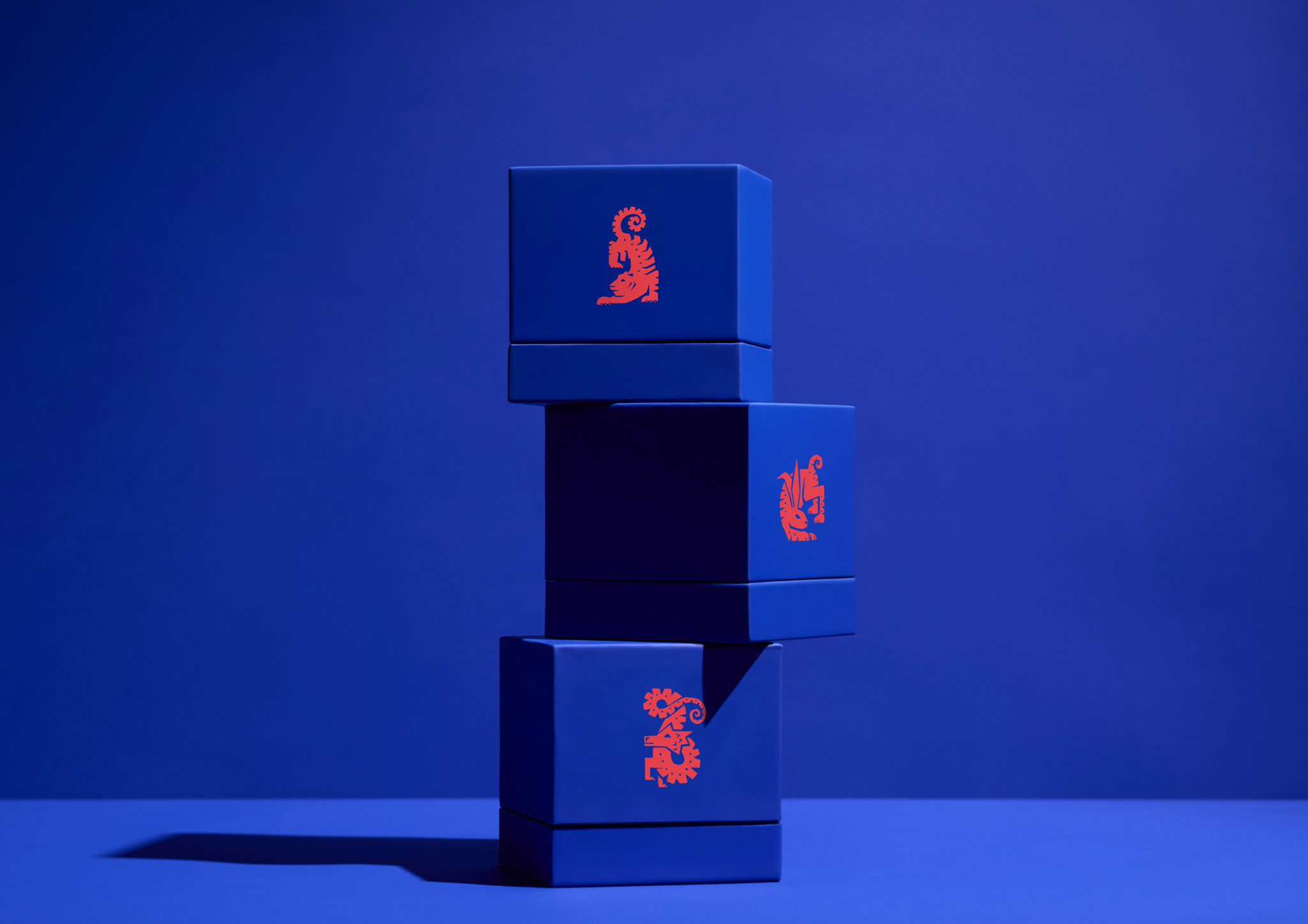
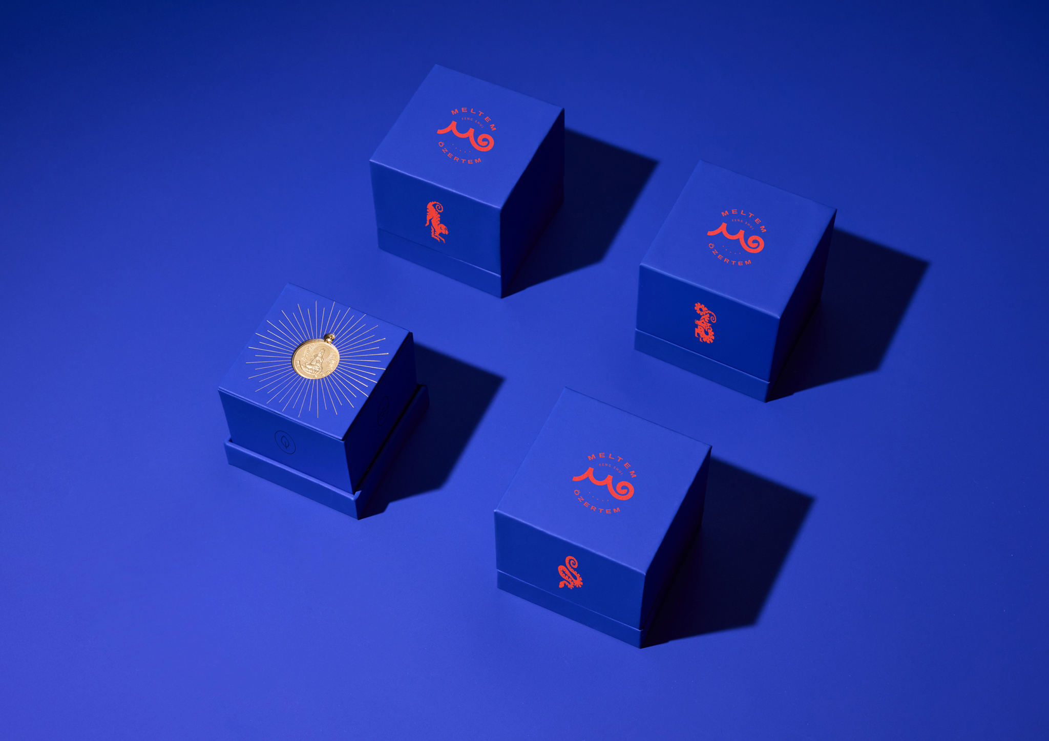
To distinguish the brand from other premium jewelry houses, we adopted a bold color language. Deep, confident blue — symbolizing trust — was paired with vibrant red, which represents luck and energy in Chinese culture. This contrast created an iconic look that allows the brand to stand out effortlessly on shelves.
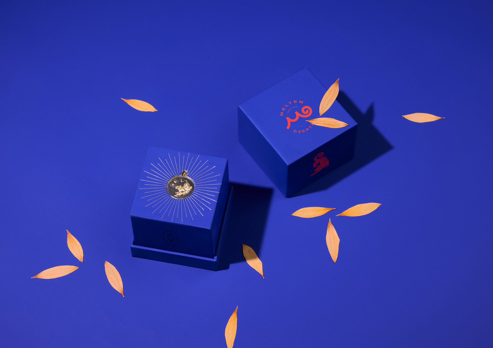
The packaging also features symbols of the four elements of Chinese Astrology — Earth, Water, Air, and Fire — delicately engraved on the box surfaces. The fifth element, Metal, is represented by the gold pendant itself.
Upon opening the box, the radiant Goddess figure on the back of the pendant reveals itself to the user. The concealed chain and the spotlight on the pendant alone add a refined, industrial sense of surprise. In this way, the packaging becomes more than a protective container — it transforms into a meaningful, immersive story.