

恩耐——美瞳包装
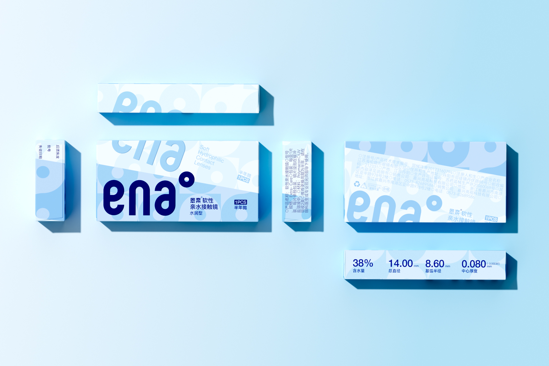
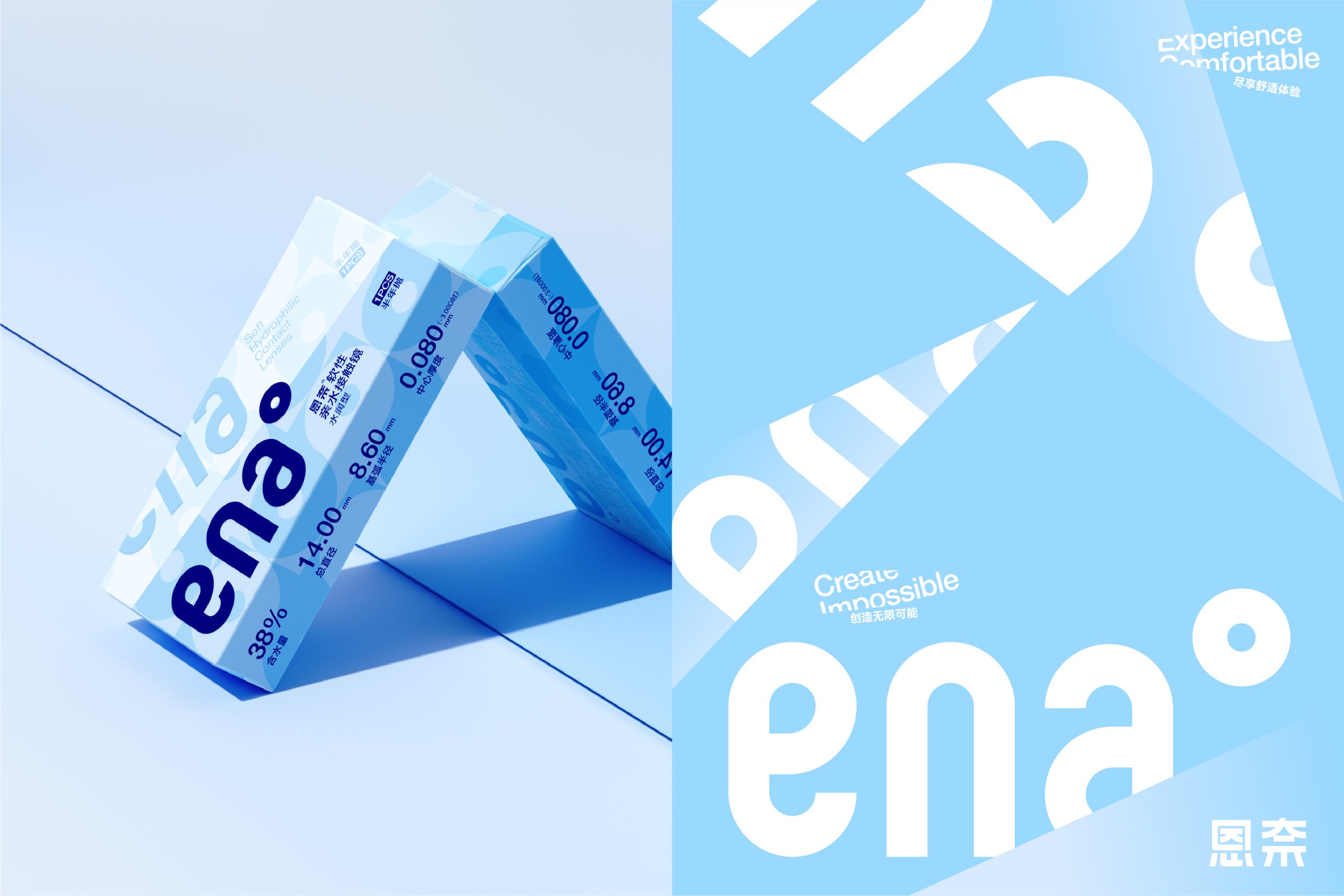
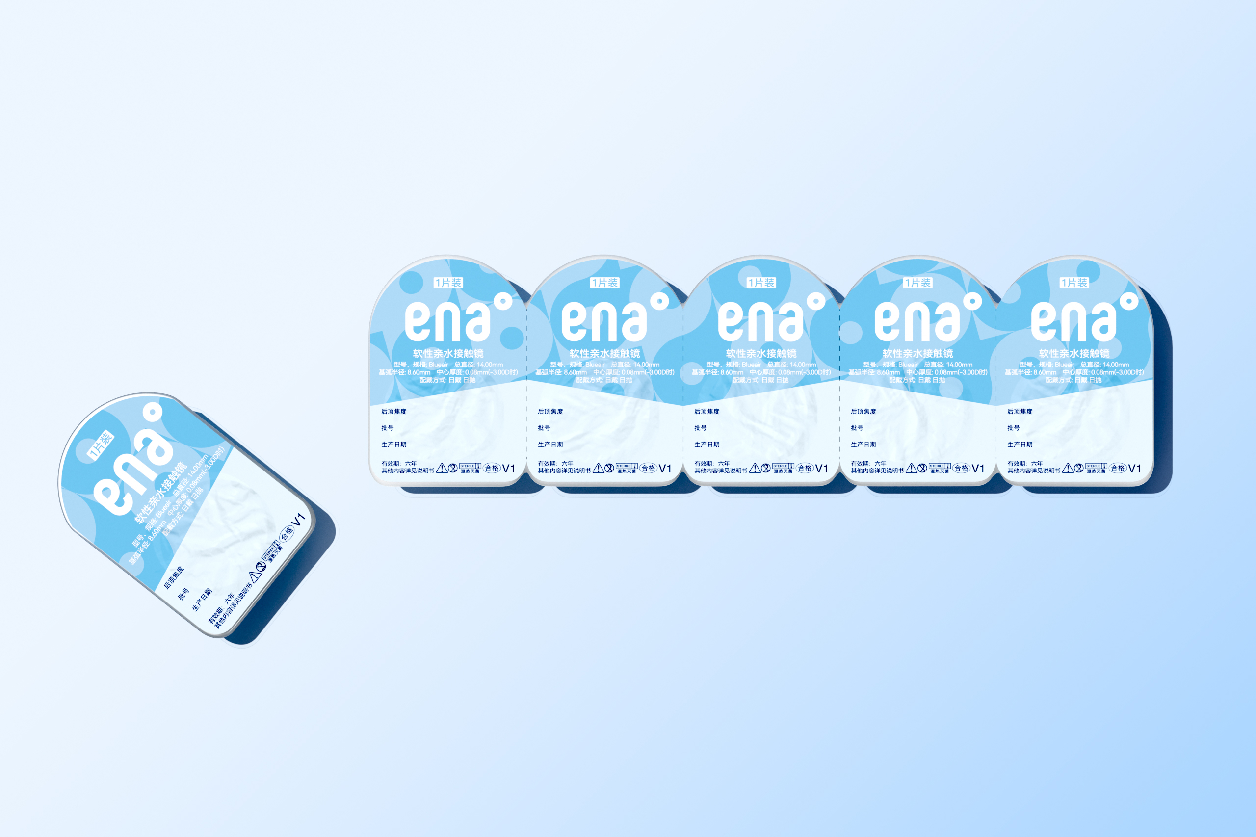
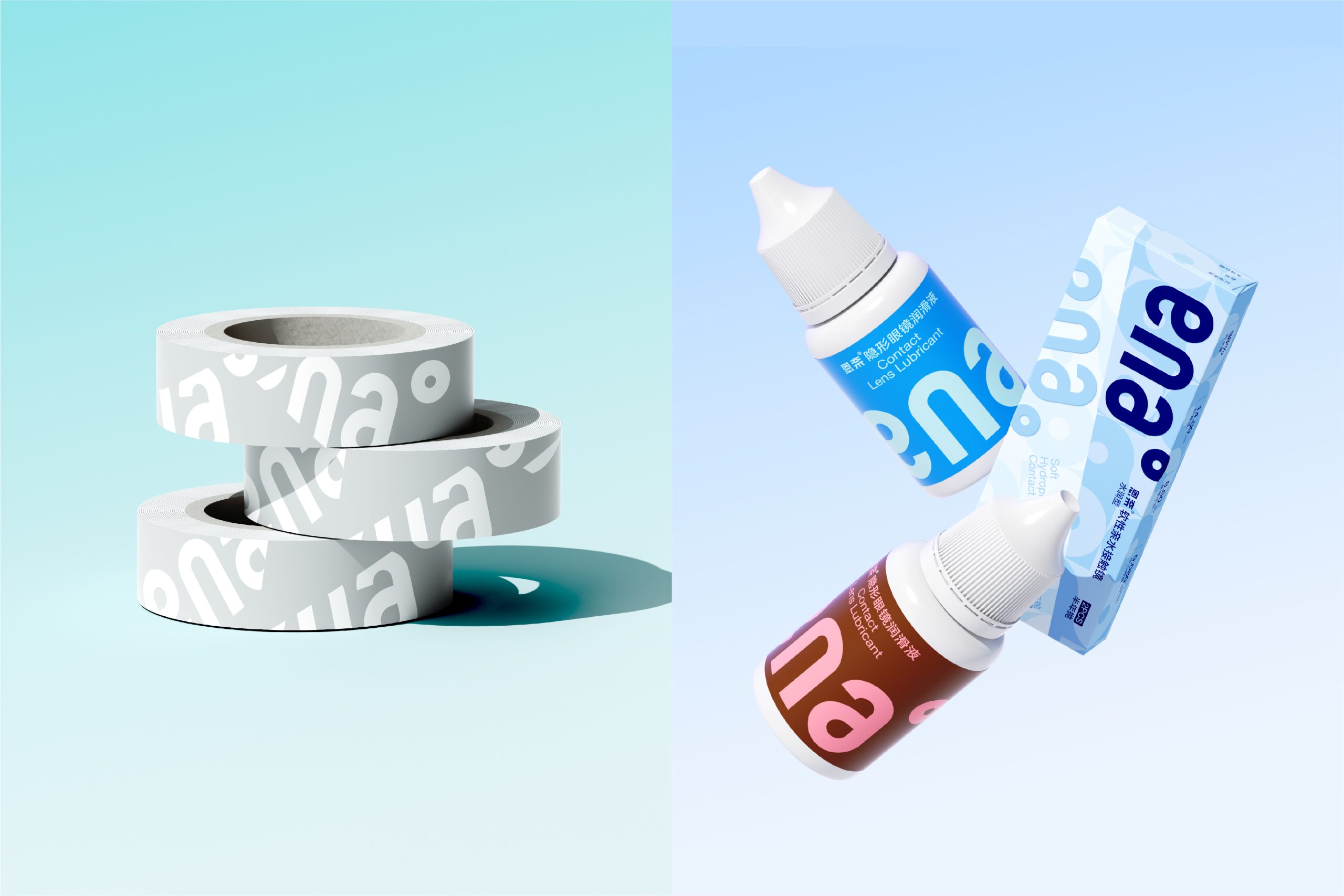
Ena is a Chinese contact lens brand that leans into softness and clarity as its core visual language. The packaging system spans seven SKUs across daily, monthly, and annual wear formats, each distinguished by a distinct pastel palette: sky blue, lavender, mint green, peach, and warm grey. The oversized “ena°” wordmark anchors every box, rendered in a rounded, approachable typeface that balances legibility with personality. A repeating ghost pattern of the logotype fills the background at a reduced opacity, adding textural depth without competing with the primary branding. Technical specs, including water content percentage, base curve, and lens count, are displayed along the top edge in a clean, structured row, keeping clinical information readable while preserving the overall warmth of the design. The result is a cohesive range that feels modern and consumer-friendly without losing its functional clarity.

.jpg)





 Natasha Spitsyna
 babyage
 GruppoSaida
 ahmedraoudgfx
 Hi estudio
 Nadezhda Gorelikova
 Studio Garces
 Brandsbylufo
 Rewot
Rewot alchimistestudioParis
 Asprey Creative
 kat bres
 Valérie Colace
 Atiq Alam
 Sara Communications
 David Hakobyan
 monther al omari
 Innovāt - Empowering Creative Innovation
 mmdesign
 Amjad Battal
 Hollóka Grafikai Műhely / Graphic Design Studio
 Palashcc
 ABC Design Communication
 ChrisSkarlatos
 Hedayat Hadavi
 Tia Nguyen