Agency: Étiquette
Head of marketing: Justas Razmus
Design strategy: Laura Ragaišytė-Važgėlienė, Edvardas Kavarskas
Art direction: Irmantas Savulionis
Design: Beatričė Baronaitė
Prepress designer: Daniel Samulewicz
Account management: Ramunė Baranauskaitė, Rita Dargytė
Technical designer: Sitora Šlauterytė
3D: Povilas Gavorka
Location: Lithuania
Project Type: Produced
Client: Vilniaus pergalė
Product Launch Location: Global
Packaging Contents: Chocolate
Packaging Substrate / Materials: Cardboard, Plastic
Printing Process: Offset printing, Foil stamping, UV lacquer, Emboss
SITUATION
Pergalė (est. 1952) is one of the oldest chocolate factories in Lithuania and the biggest confectionery producer nationwide, exporting to more than 45 countries worldwide, including but not limited to Taiwan, New Zealand, and Australia. The brand always pushes the industry limits with its more than 300 unique recipes, limited-edition lines and different sweets varieties.Pergalė described their need for rebranding as a step towards the future — swapping manual labour for robots meant that the old chocolate moulds were no longer used. It created a ripple effect since the new chocolate design didn’t fit into the old box while the graphic design was outdated too. So Pergalė approached us to create an entirely new look and feel for a beloved national brand.
SOLUTIONS
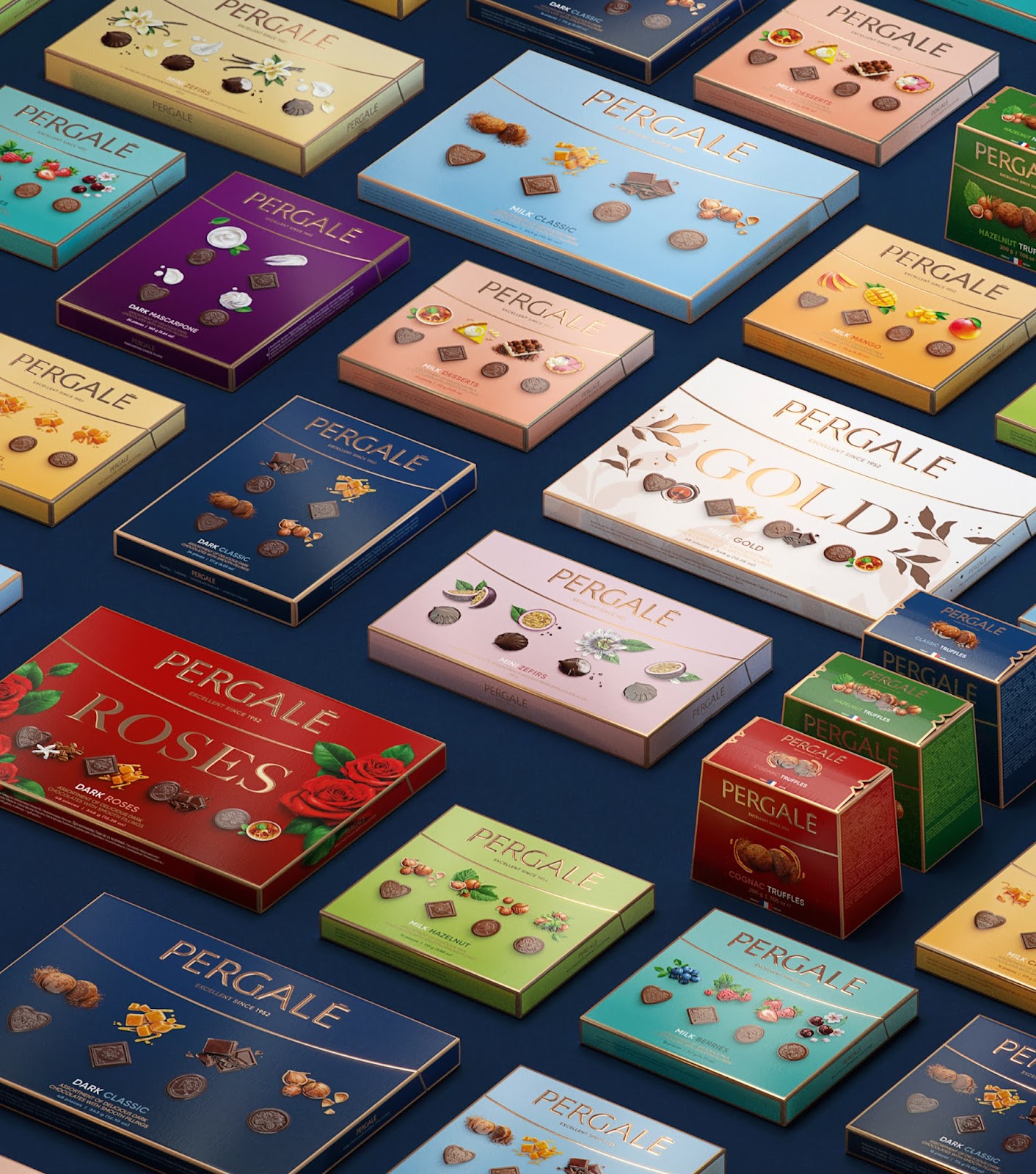
We know that big rebrandings tend to last for a prolonged time. That’s why one of our biggest priorities was to create a timeless design that will withstand temporary trends.THE LOGO. We kept the Pergalė logo as it is but removed the milk/dark chocolate indication. It allowed us to flatten and simplify the wave into an elegant half ellipse giving the logo much-needed airy composition. Moreover, the target audience’s understanding of what luxury is supposed to look like shifted majorly, so we decided to move away from overused gold, substituting it with a copper shade, reminiscing of master chocolatiers tools.
THE CHOCOLATES. The upper view of the chocolates and ingredients came from two insights. Firstly, this was the best way of showcasing the new chocolate design. Secondly, it responded Instagram inspired global trend — taking a food photo from above. When it comes to depicting food, designers are usually faced with three choices — you can use photographs, 3D models or illustrations. We decided to merge illustration and photography, choosing photorealism, which showcases the product’s best without looking too artificial or too perfect.
THE TYPOGRAPHY. We agreed that the frontside needed to be neat and eligible but look modern and crisp. That’s why for headline texts, we chose Gilroy typeface. Meanwhile, the backside was required to fit vast amounts of text, so a thinner and tighter PT Sans was chosen.
THE COLOURS. We needed a well-organised colour system to span across many SKUs, so we came up with a solution to use lighter colours for milk chocolates and deep shades for dark chocolates. That way, a customer can identify their favourite type of chocolate without reading the description. A subtle gradient throughout the box was used to create a feeling of depth. It also serves another advantage — once the package is placed on the shelves, it outweighs the inevitable darkening on the top of the box.
What’s Unique?
A vital visual asset created to enhance visibility on the shelves — a rose gold metallic Pantone frame going around the perimeter of every box.