SITUATION
The Radler category is very active in Lithuania. Three significant competitors are constantly competing for mainstream buyers’ attention. The category is growing, and more and more customers are discovering not only alcoholic but, more importantly, non-alco radlers, which they also consume to stay hydrated.
SOLUTION
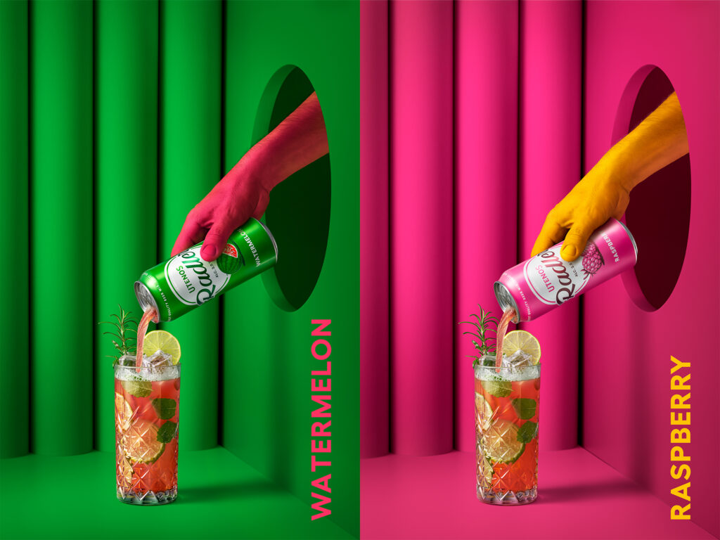
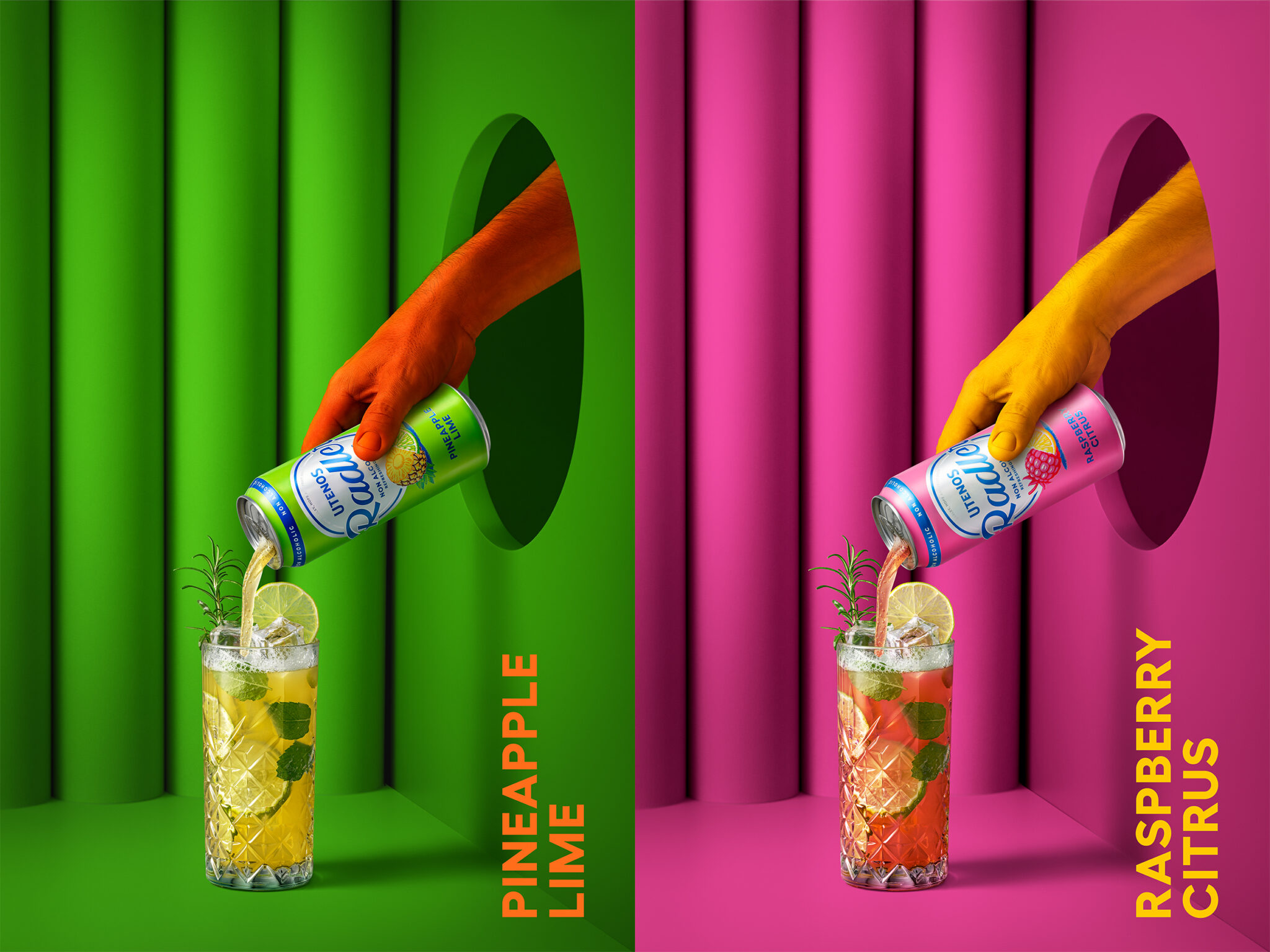
When the palette lacks colours — this design says — hold my Radler. And it stands out on the shelves and social media.
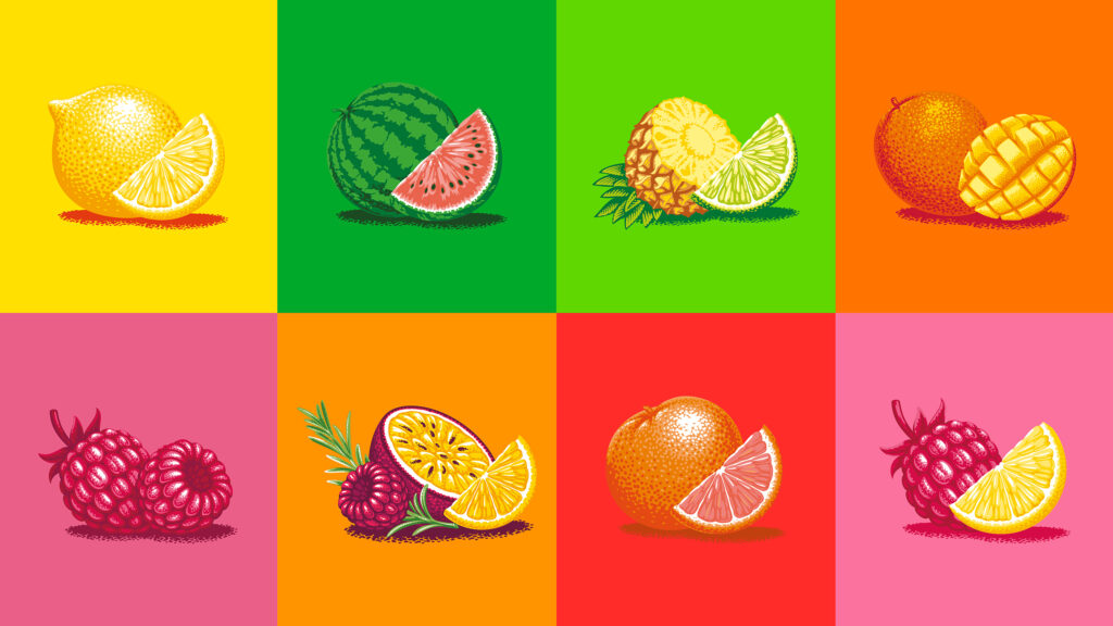
From nostalgic label-like white oval and logo font to illustrations replicating older printing technologies. Everything here speaks of the good old days when life seemed simpler and fresher.
Even though it appeared some time ago, this year, the various decades of the past century were more than ever intertwined in reviews of design trends. Dieline, the most influential packaging design review website, called it The Neverending Eras Tour.


