Background: “Matilde Vicenzi’s story started in 1905 with a fine production of pastries, Savoy biscuits, amaretto biscuits and puff pastries. Matilde Vicenzi’s world is captivating and fascinating, created to bring sweet times and warmth to people we’re fond of”.
This conceptual position is expressed by the Pasticceria Matilde Vicenzi brand which shows the icon of the lady, and the packaging system that transmits traditional quality with a contemporary style dedicated to lovers of classic Italian patisserie.
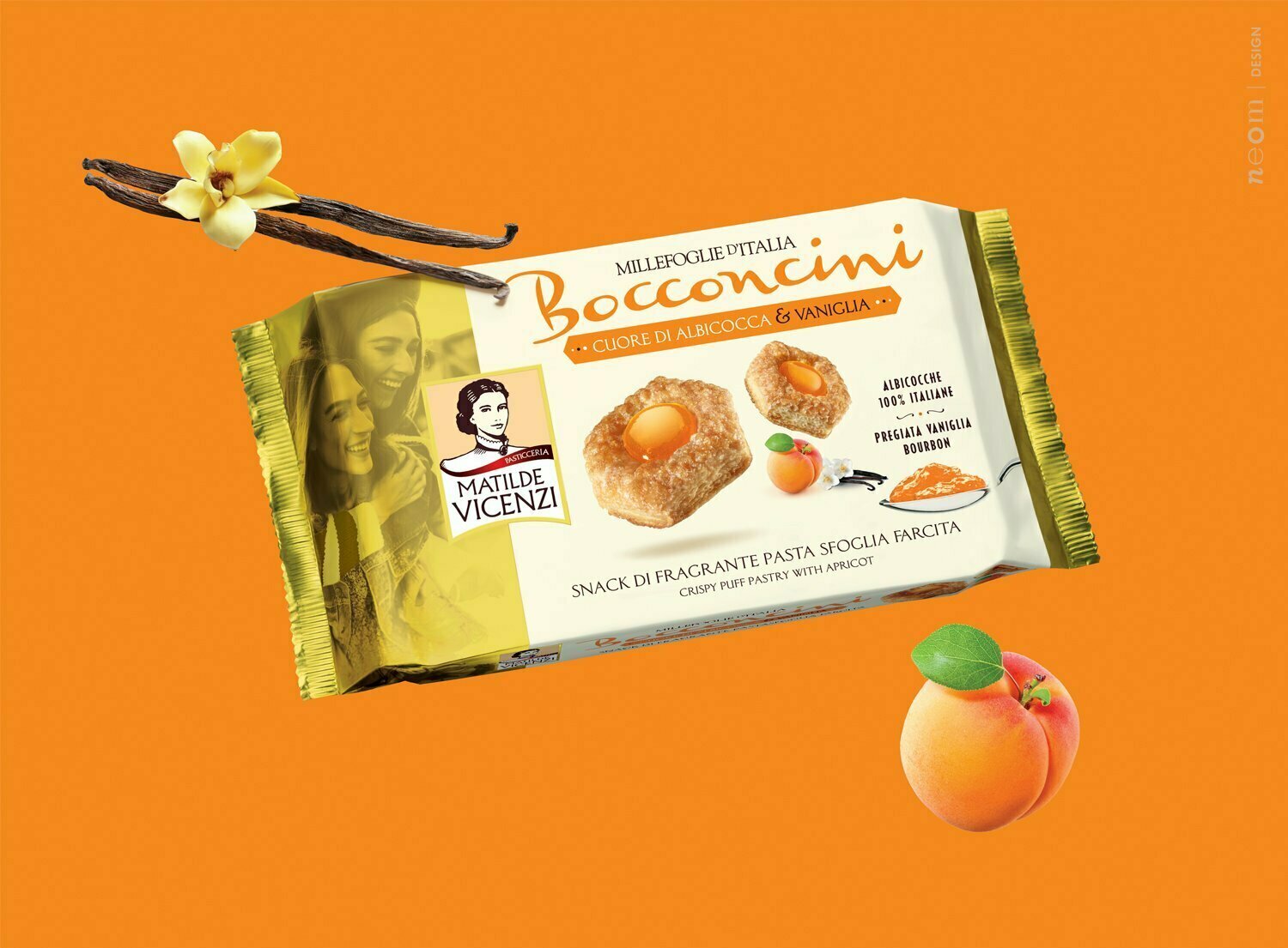
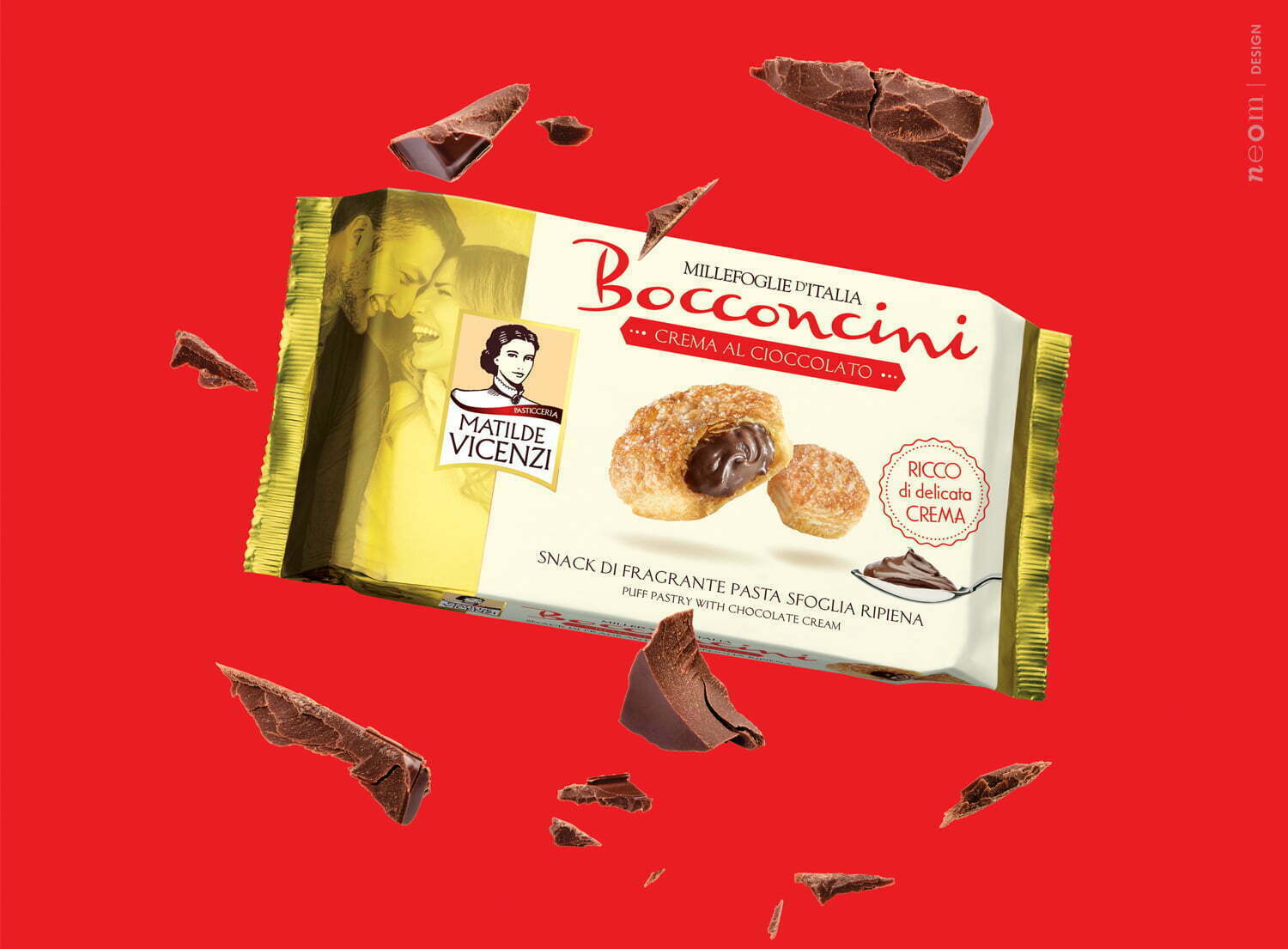
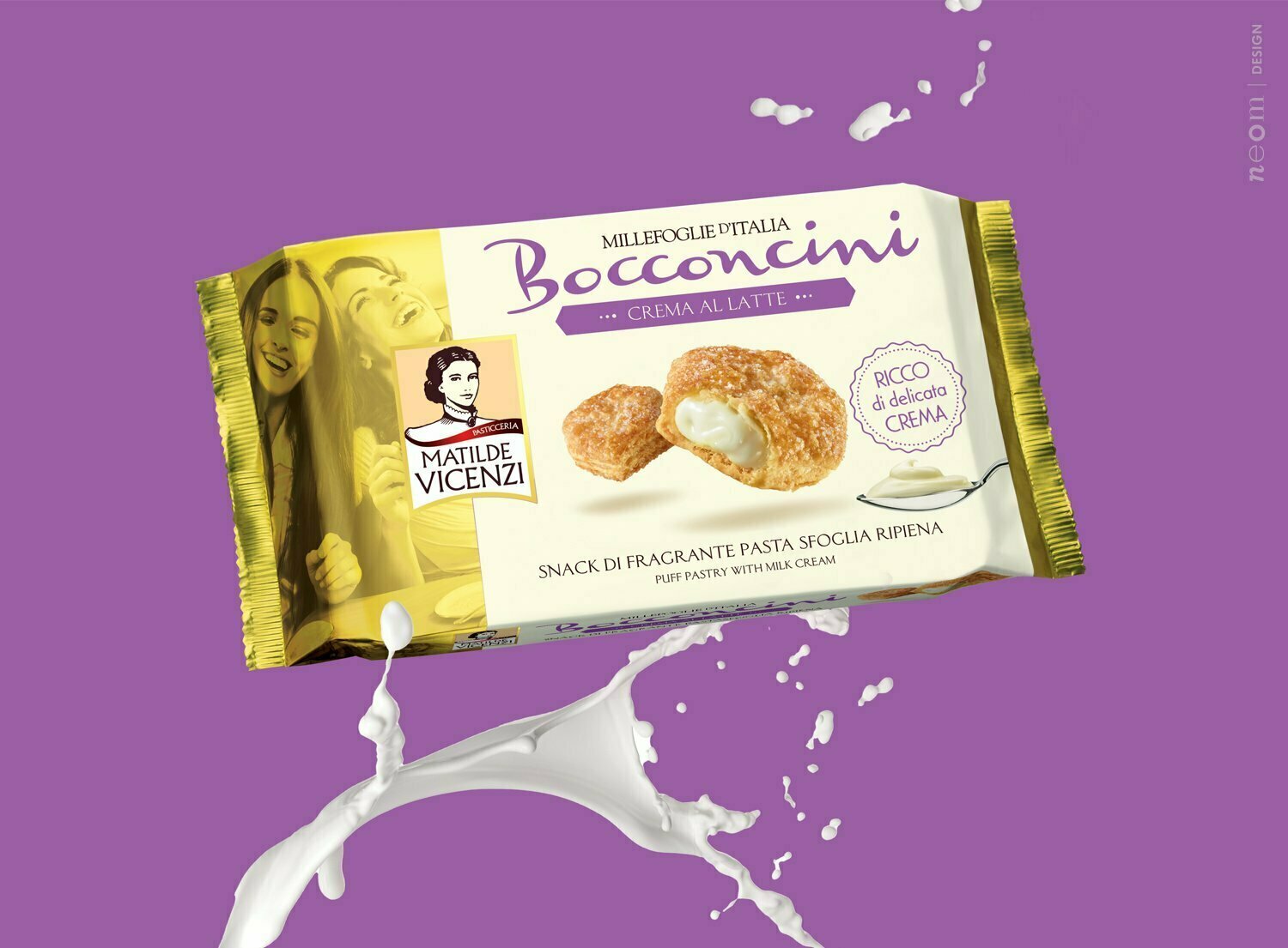
Strategy: After an in-depth analysis of the whole of Matilde’s mouth-watering world, it was clear that the Bocconcini are one of the most suitable products for young, informal consumption that alludes to a snack conserving the DNA of pastries.
Moreover, the Bocconcini brand is the one who can help the Matilde Vicenzi brand to rejuvenate its perception in the pastries market segment. In fact, while Matilde Vicenzi is well known as high-quality traditional pastry company and is well perceived by a mature target, is losing the connection with the young generations. Bocconcini will be the first project to start keeping this connection.
Project: The project should move in two main directions:
- to give more personality and force to the name ‘Bocconcini’ until it becomes a brand which, even though it’s a general name, is already clearly recognised by Matilde’s regular customers and brings a fresh, dynamic, sufficiently carefree style with it;
- create an image of the Bocconcini range close to the initial design yet also different enough to be perceived separately within the offer, all using a style of design and approach to the product that alludes to snacks, closer to the world of young people than the typical Matilde tradition.