When creating a brand and packaging identity, it is not just about description; it is about evoking feelings, atmospheres, and sensations. Nicey Gin expresses the pleasure of the product experience: “DON’T BE DRY, BE NICEY.”
The Brief:
The GIN segment is currently the most volatile in terms of growth percentage, as well as due to the absence of a true leader or a brand recognized by the majority. We are indeed facing a dichotomous situation where, on one side, there are large companies like Diageo, Campari, Bacardi, and Pernod-Ricard, which own established and historic brands such as Tanqueray, Bombay Sapphire, Gordon’s, and Beefeater, with enormous budgets and almost total market penetration capacity. On the other side, there are small and medium enterprises striving to earn a place in the sun. Among these, the companies delivering the best performance are the Italian distilleries, whether recently established or with a long tradition of “grappa producers.” From a product perspective, it is more or less the same. On one side, we have LONDON DRY, where the term Dry indicates a gin that does not include added sugar. An LDG is distilled with all-natural raw materials present, among which juniper must be included. It is not possible to add additional aromatic substances after distillation, only pure alcohol or water to achieve the desired alcohol content, which must be at least 37.5° and less than 57°. The visual language follows rather precise and shared codes and rules. On the other side, we have the “OTHERS,” with products featuring very distinctive recipes and a visual language usually associated with personal ideas and concepts.
The strategy:
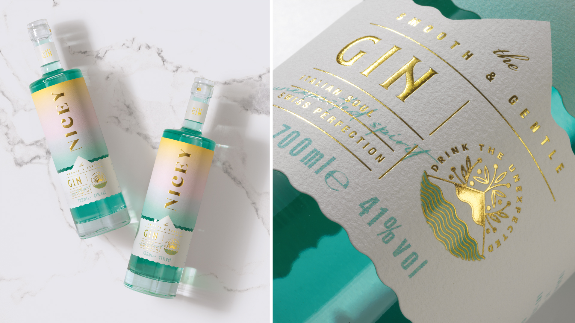
In the midst of this situation, NICEY stands out by offering a new vision of the product experience: joy, simplicity, playfulness, fun, and lightness are the key values of its proposal, presenting a new vision: “DON’T BE DRY, BE NICEY”. The gin is smooth and delicate, inspired by an enchanting mix of Italian Sardinian sea and Swiss love for perfection. The image we have created aims to represent THE MOOD, the inner experience that is embedded in the product’s very DNA. Relaxation, the pleasure of being together from dawn to dusk or from dusk to dawn, enjoying the precious moments life offers, whether alone or in company. It is a delicate balance and mix of strength and sweetness, character and softness, luxury and accessibility, because by its nature, Nicey is inclusive and loves to feel good in any situation. From a technical standpoint, there is an enormous amount of work and commitment from everyone to express the uniqueness and premiumness: thick glass bottle with a glass stopper, FSC paper highlighting the attention to sustainability, hot gold foil stamping on logo and texts of particular interest, artistic embossing on logo and gold, raised varnish on texts and symbol, 8 different Pantone colors chosen, tested, and artfully used. The result is an image that conveys a passion for authentic flavors and meticulous selection of ingredients. Values that blend to create an extraordinary tasting experience.
https://www.niceygin.com/