ROYALLEE BRAND is a brand that has been producing bakery ingredients for over 30 years.
Custard Powder is one of the best-selling products in the retail market for a long time. The custard powder is packaged in a sealed plastic container.
Most customers are regular customers; bakery owners, and enthusiasts bakers. The sales of products are steady. From customer data collecting most of them will remember the appearance of the packaging and the color of the label when purchasing.
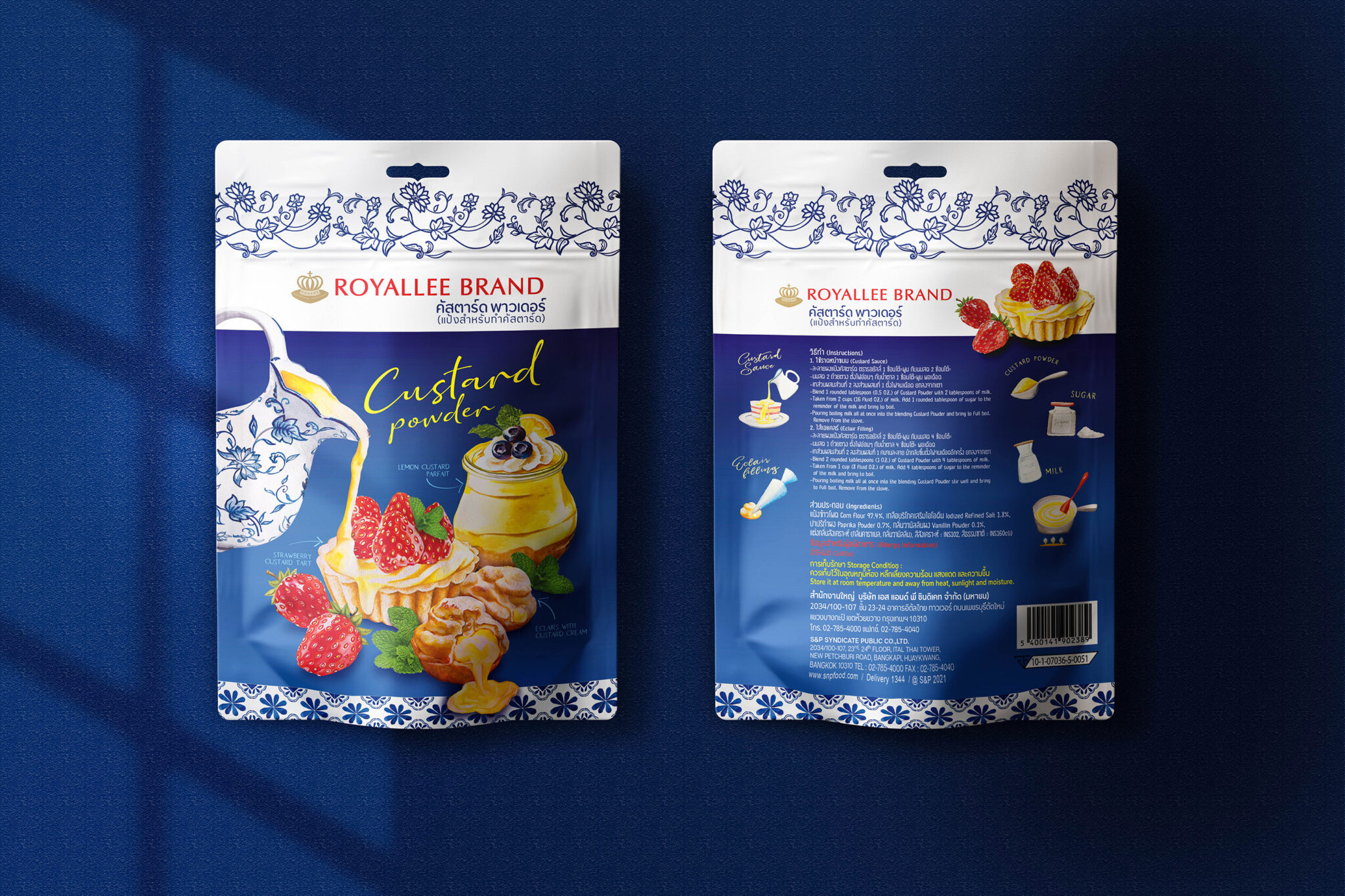
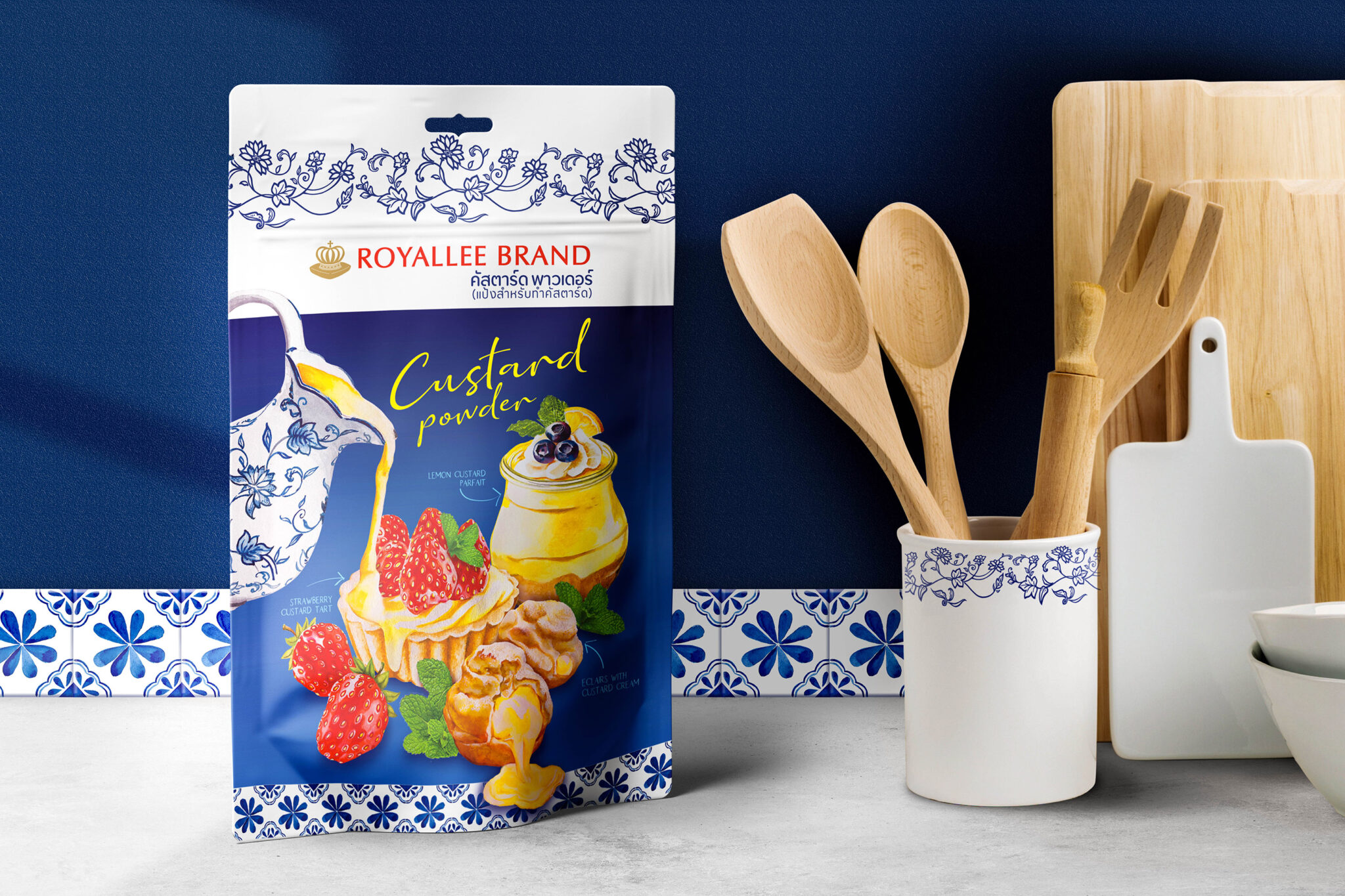
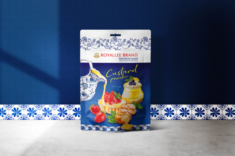
ROYALLE BRAND has made a big decision to reshape the packaging due to the plastic materials for producing the can being costly, hard to use, and outdated. So turned to use plastic pouch bags; Moisture-proof, zip-lock closure, easy to open and close. Can be displayed on the shelf. Make the brand image look better when compared to competitors and reduce the cost of packaging.
Brand Design Strategy :
• Product Reminder
It is not easy to reshape the packaging when the customer has brand royalty and remembers the product from the packaging. Therefore, the design process must remain consistent. Such as the overall color, the image style, to remind the customer when choose to buy. So, the packaging retains mainly white color, the blue and red tone for highlight objects.
• Increase Sales
When packaging improvements, As a designer I want to how much the new packaging help to increase sales. Since the product is quite a small market segment, most people use it for eclairs filling. But custard powder can be used to make many other desserts. So, the illustration and recipes of sweets such as fruit tart, parfait should help to inspire ideas for customers who walk through the shelves in supermarkets.
Design Idea :
Under the concept “I love baking” because the main customers are women and enthusiasts bakers, Bring the Mediterranean style tile pattern and the flowers on the ceramic crockery have chosen to along with blue and white tones that are the color tone of the original packaging. The illustrations are drawn with watercolors on paper in Mediterranean style to look harmonious and unique.
Result :
After launching the new packaging, customers can still remember the product. And also get more new customers to make sales increase sequentially. For designers, the increase in sales of products is regarded as a reward for achieving purposes and inspiring myself for the next challenge.