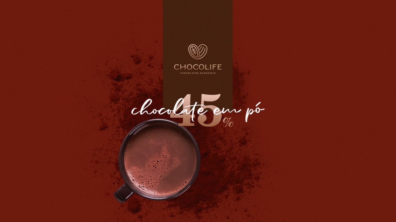
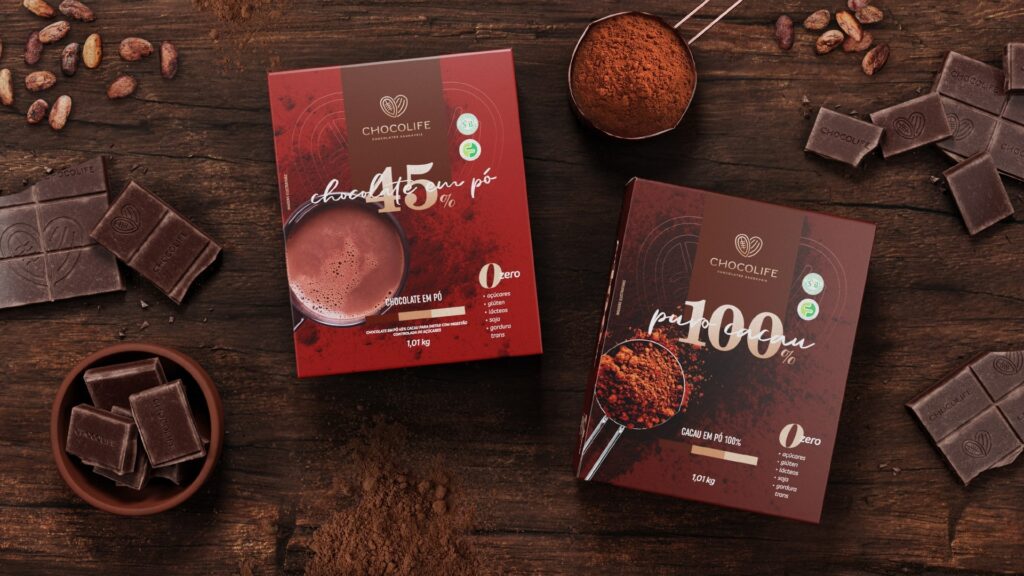
Pure 100% Cocoa (100% Cocoa Powder) and Chocolate in Powder (Powdered Chocolate), are two products from Chocolife’s line of powdered chocolates, which received a redesign in the packaging of the canned version and the addition of a larger size, with 1.01kg, in the brand’s portfolio.
Bringing Chocolife’s new visual identity to the chocolate powder line, Pure 100% Cocoa (100% Cocoa Powder) and Chocolate em Pó (Chocolate Powder), the idea behind the redesign of the packaging was precisely to reposition the line in the market, emphasizing through the visual resources used that in addition to being delicious, the products are healthy.
For the diagramming of information and visual elements on the packaging, it was preferred to emphasize the type of chocolate powder, as well as the percentage of cocoa contained in it. Complementing the central head, it was chosen to use the Chocolife logo as a seal, both on the box and in the can version. The visual appetite was also explored through the powders in use through images on the left side of the front, bringing harmony to the composition.
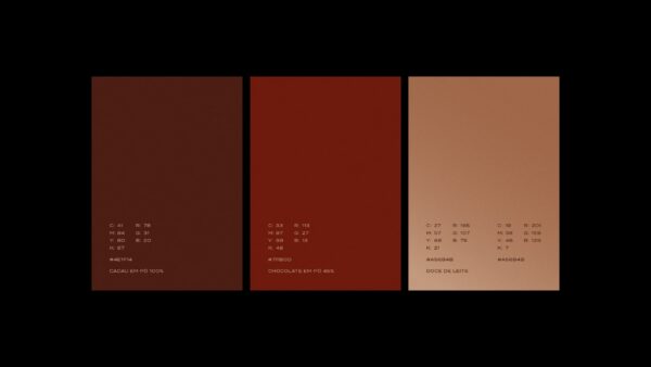
In choosing the color palette, inspiration was sought in the coloring of the powdered chocolates, brown for Pure Cacau 100% and a burnt red for Chocolate Powder 45%, in addition to the brand’s specific golden gradient. In the typographic decisions, it was decided to bring, in addition to the typographies of Chocolife’s visual identity, two new ones, one cursive and the other serif, bold, which together create a pleasant and attractive aesthetic harmony.
The benefits of healthy chocolates, as usual with Chocolife products, are also highlighted on the packaging. The main attractions from a nutritional point of view are not only on the front, but also on some of the sides of the products.
The result is unique packaging, which fulfills the strategic and design objective, which is to reposition products so that their perceived value increases before consumers and achieves a greater market share for healthy powdered chocolates.


