SITUATION
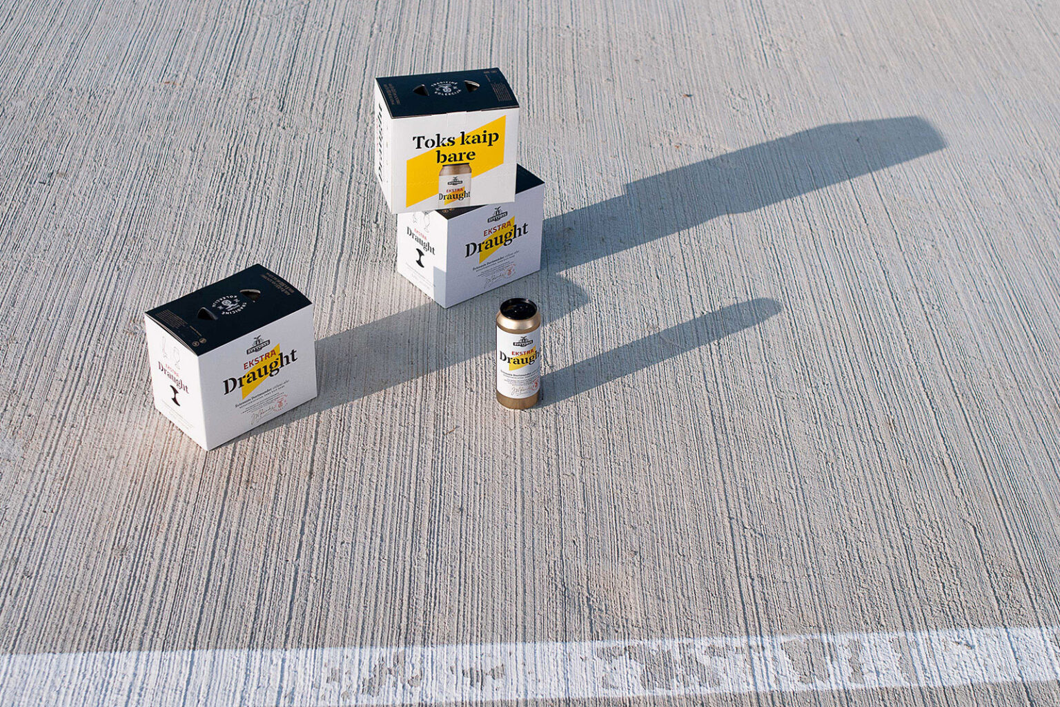
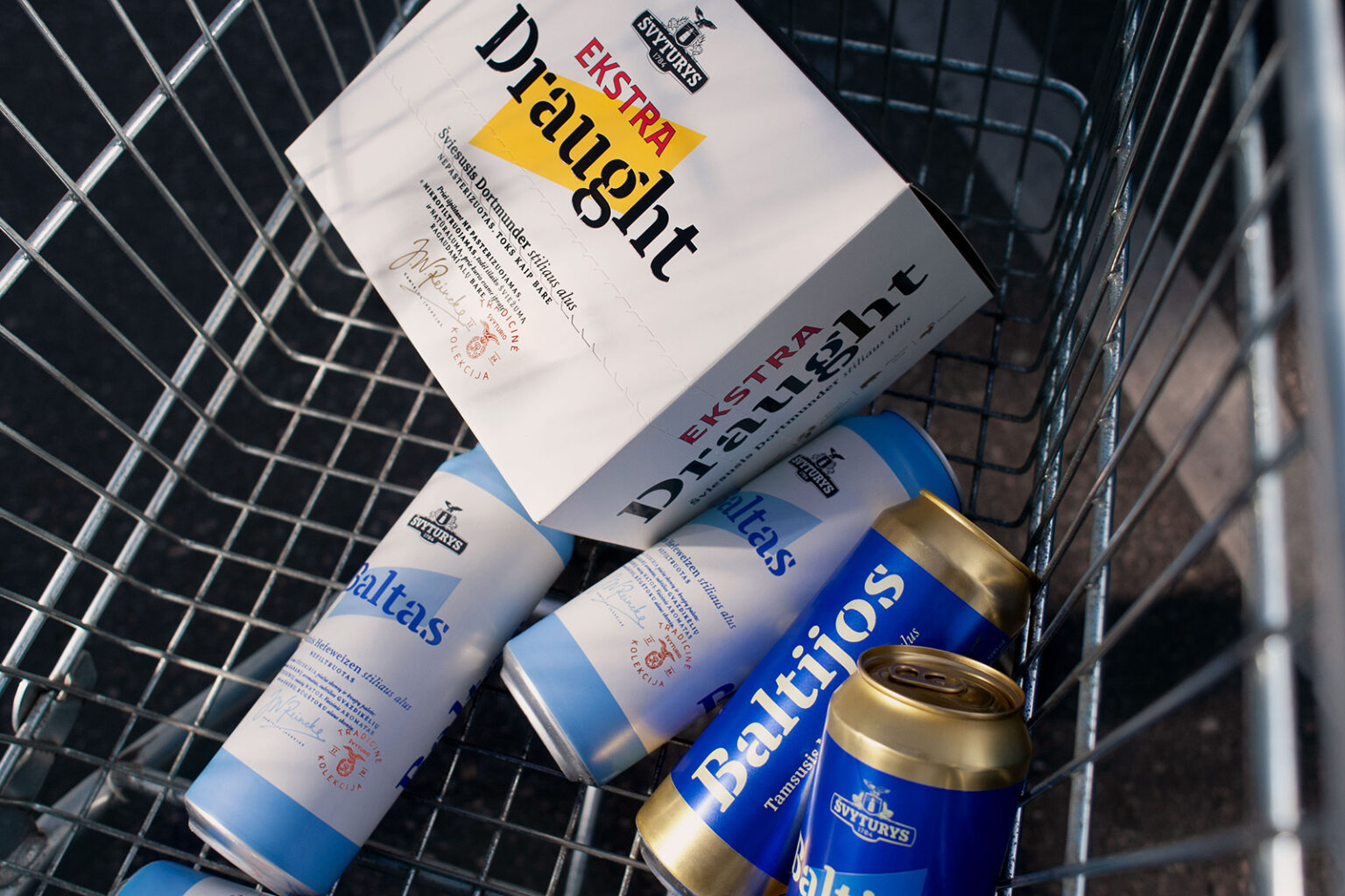
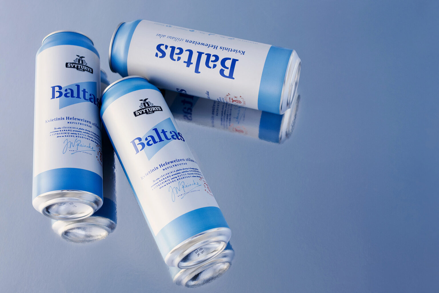
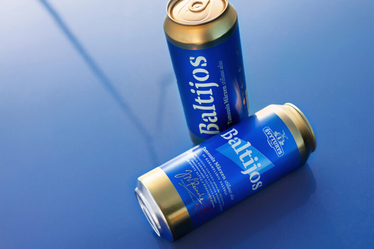
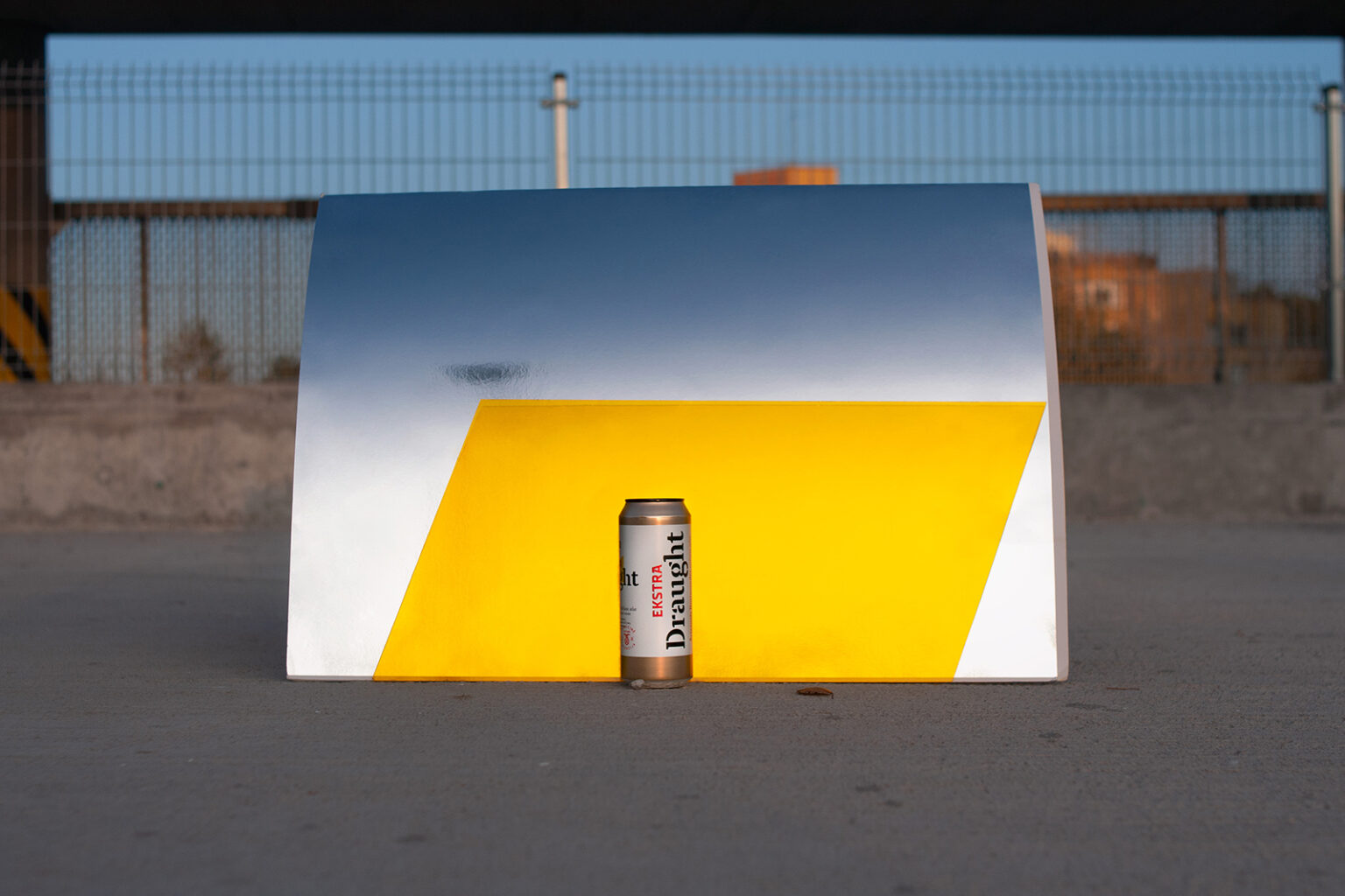
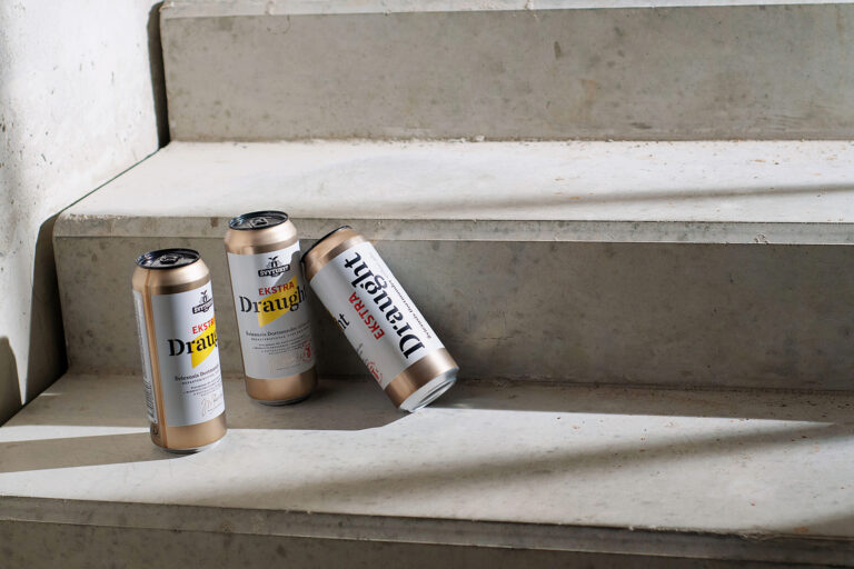
Švyturys is one of the most favourite Lithuanian beer brands. The Traditional Collection was created to reveal the many varieties of beer to the mass market. The changing lifestyle and the beer-drinking habits of the target audience have led to a revision of the design. We’ve been tasked to update the Traditional Collection, consisting of Dortmunder Lager Švyturys Ekstra Draught, Hefeweizen Švyturys Baltas, Märzen Švyturys Baltijos, etc. The new look and feel should highlight beer craftsmanship’s story and meet a design aesthetic familiar to nowadays city dwellers. In other words – to unite the glorious past and the urban present.
SOLUTION
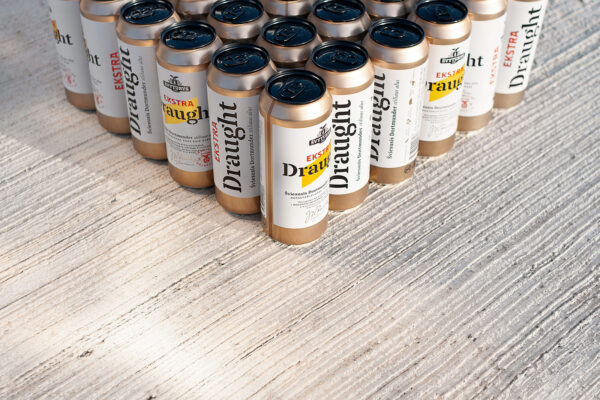
To unite the glorious past and the urban present – challenge accepted. Various documents have inspired us to meet the theme of the past. The historical theme is emphasized by the coat of arms of the distillery and the signature of the founder J. W. Reincke. We found pairings of several fonts, uppercase and lowercase letters combinations, as well as wide letter spacings. To meet the present, we’ve taken urban metallic surfaces and imitation of craft brewers’ favourite paper labels on a can. Different cap colours subtly enhance the uniqueness of the collection. The monumental, geometric light ray that unites the Švyturys (a lighthouse in Lithuanian) brand has become the collection’s primary graphic connection.
