THE CLIENT
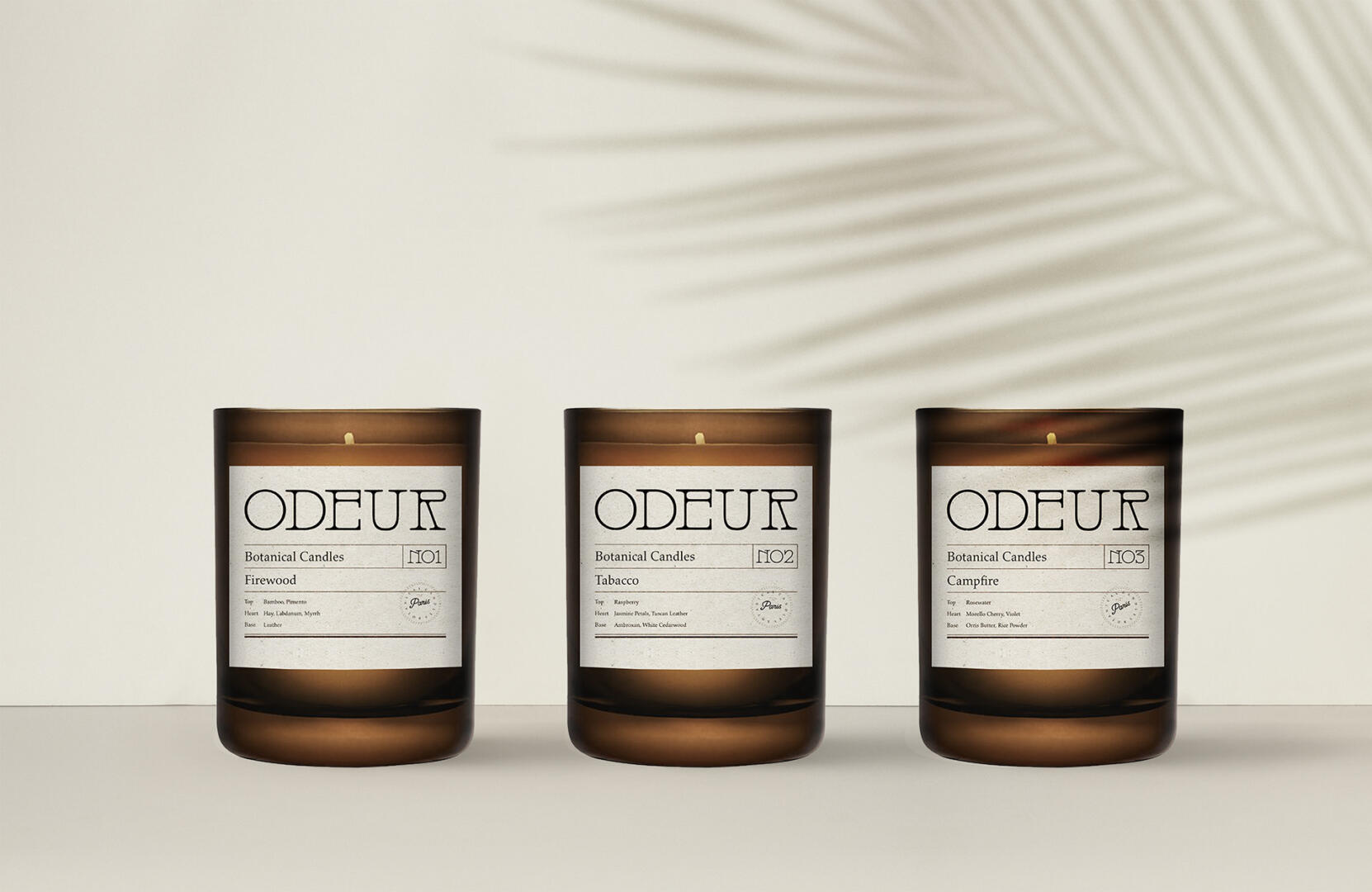
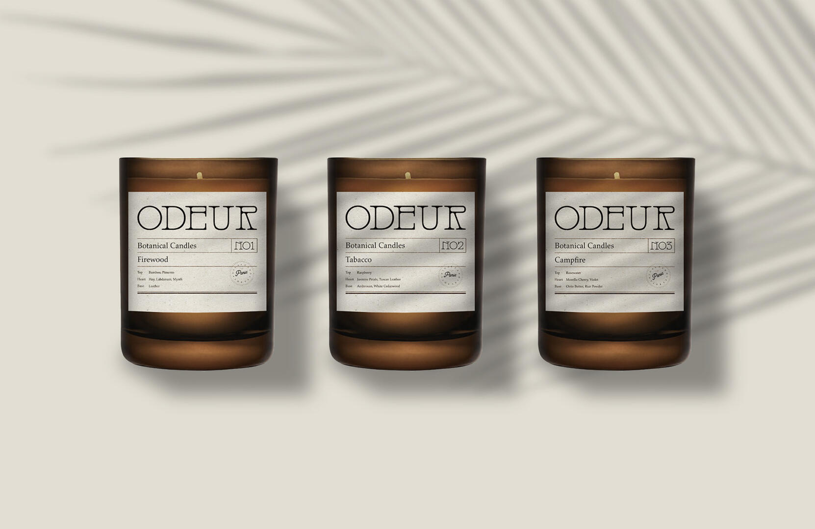
Odeur is a botanical candle brand based in the USA. Their goal is to create the aromas that are hard to recreate, such as Camp-fire, Fire-wood, or Tobacco-smells.
THE KEYWORDS
Professional / Prestigious / Minimal / Eye-catchy / Strong
THE SOLUTION
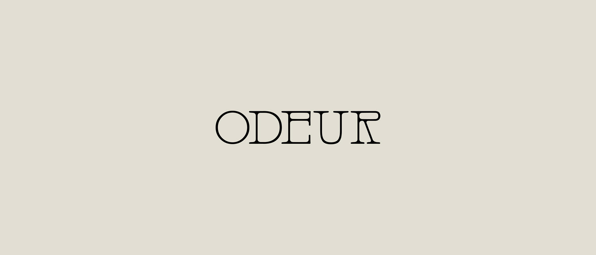
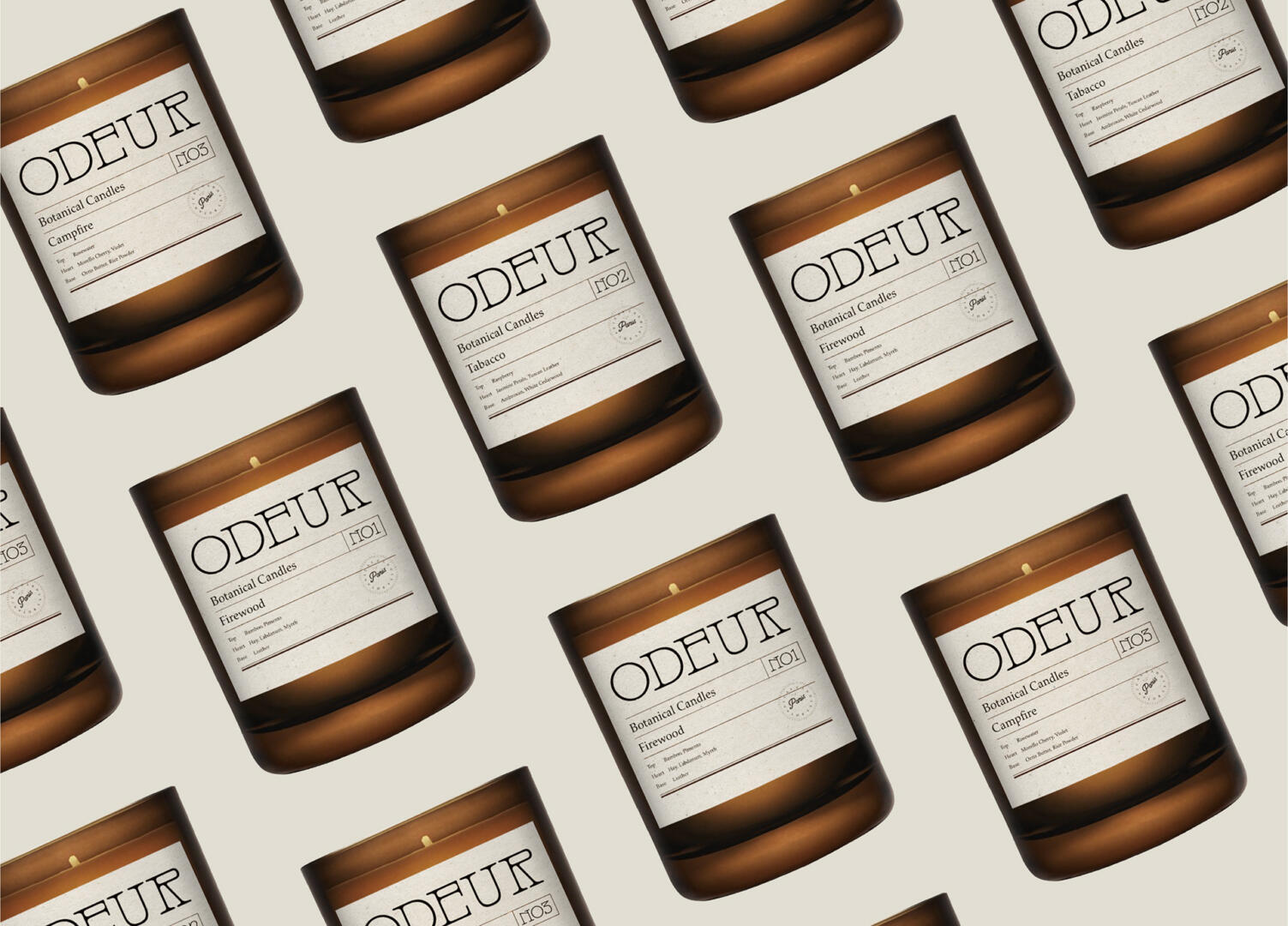
We created a timeless logo with a monospaced font, which has an affirmative effect due to the width of the fonts.
The color palette has an associative feel with the flavors it was picked for. As greenish ash tones are chosen for the Firewood, brown and yellow colors are connected with Tobacco colors, and brownish peach colors are associated with Camp-fire.
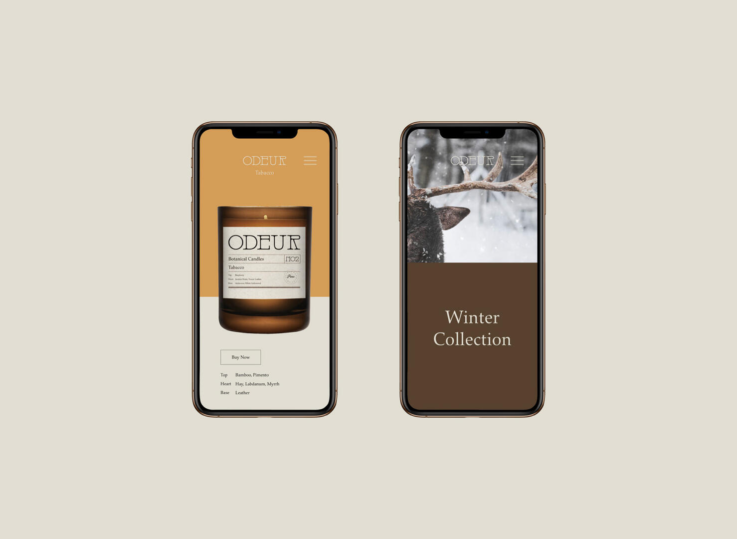
The packaging boxes are designed colourfully according to their aromas. We included all of the information on the front of the packaging in a faded font tone so that the logo and the aroma’s name would stand out at first glance. the back side of the box, we included the description of the aroma and its ingredients.
The candle’s design is classy and simple, with a prestigious feel due to the combination of the dark glass and creamy label with minimal layout.