Crafted from nature. Refined by artisans. Perfected with science. Pique create some of the healthiest and most bioavailable drinks and supplements on the planet.
Through design we enabled the brand to tell the complexity and tradition of their story while reflecting the cutting edge nature of the brand’s formulations.
Pique had began to establish itself within the health and wellness space. They had a core, loyal following but were on a mission to reach a wider audience. Key to the brand was a complex multi-faceted story of exquisite ingredient sourcing, a deep appreciation of multi-generational craft and artisanship which was then brought together by top-of-their-field scientists to create a tasty range of cutting-edge wellness solutions.
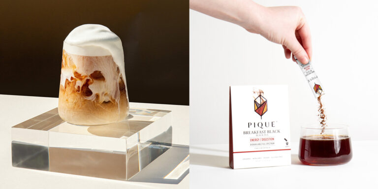
Historically a tea brand, Pique wanted to expand their presence in health and wellness by introducing a range of functional drinks and liquid supplements. Although it was a very natural progression for the brand, they needed to visually reinvigorate their brand to confidently compete in this more scientifically-efficacious space.
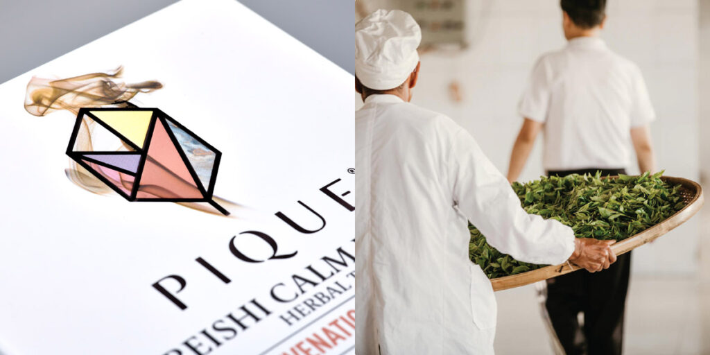
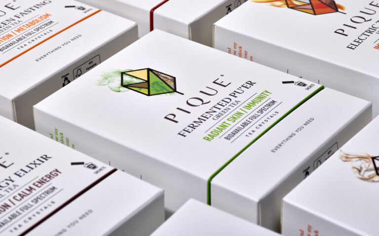
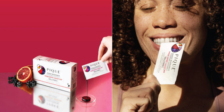
The brand’s multidimensional story led us to create a range of geometric crystal symbols for the brand identity. Each product range was given its own identity shape that then related to the product form (a geometric leaf for tea, a circle for the liposomal products and so on). These scientific shapes each were given seven facets. These facets represented the 7 pillars of the brand story but also enabled each product to individually tell their sourcing, ingredient and benefit stories all while being held within a strong, iconic form. This created an exquisite library of icons, each one unique, but clearly from the brand heart.
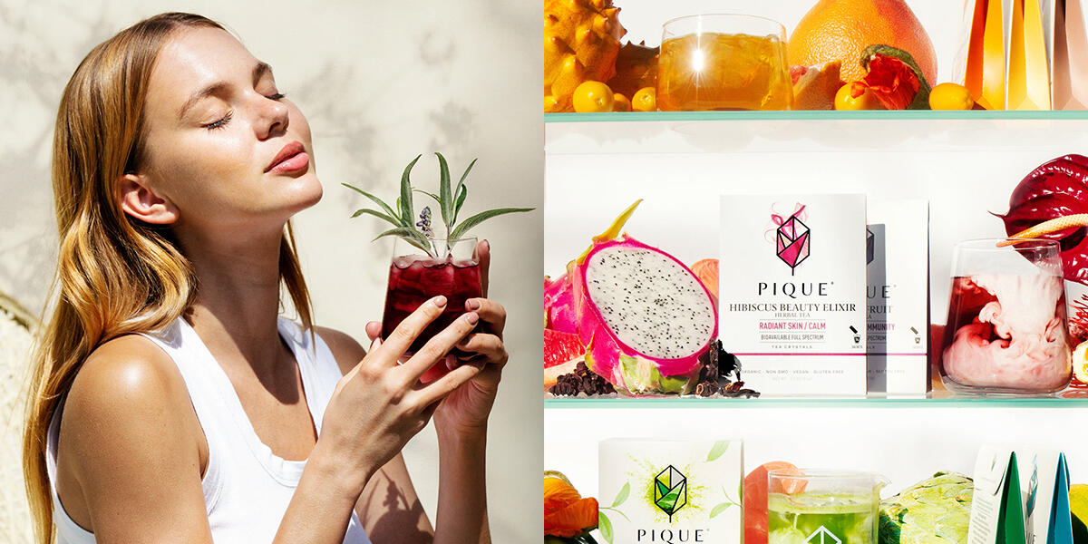
The typographic styling of PIQUE reflected the refined, scientific nature of the brand and secondary typefaces chosen allowed for clarity of messaging while feeling consciously considered. Finishes and textures where important to create an in-the-hand elegance. The icon and word mark were hot foiled in black to contrast with the clean, white satin stock of the box. Each pack, when opened, reveals a flood of colour or bright pattern. A surprising element that signalled vitality and communicated the belief of the brand that ‘Radiance comes from within’.
This successful redesign has elevated Pique and enabled the brand to extend its reach into new markets and gain a younger, more sophisticated wellness audience.