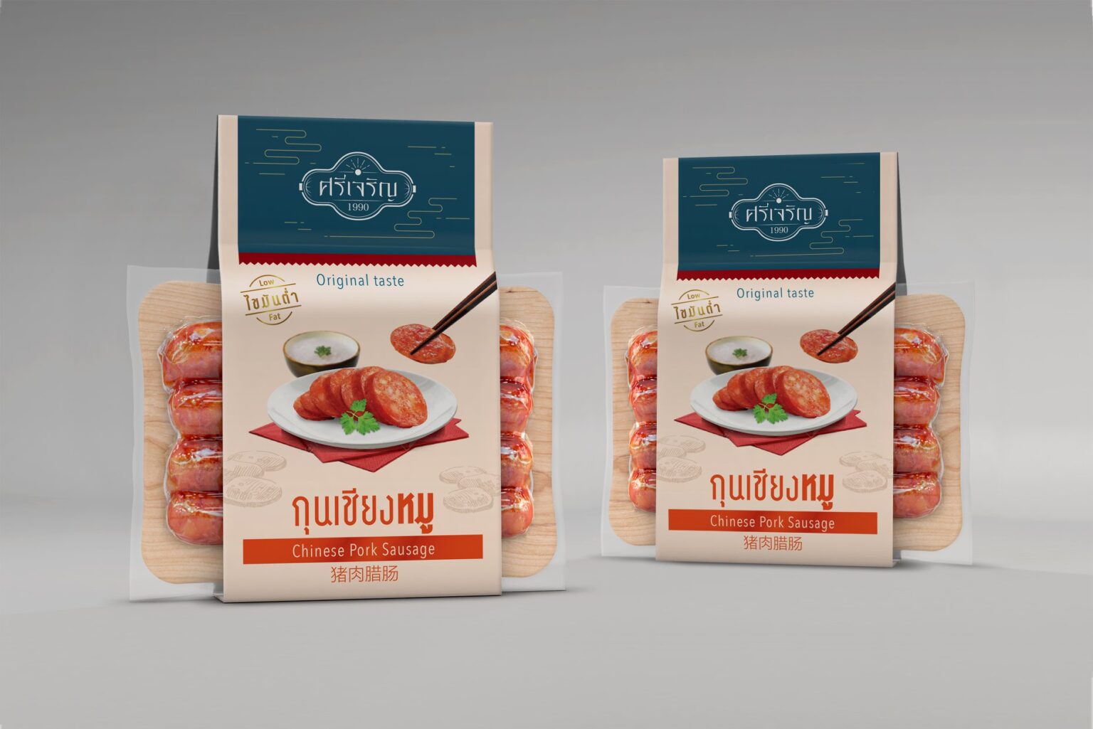
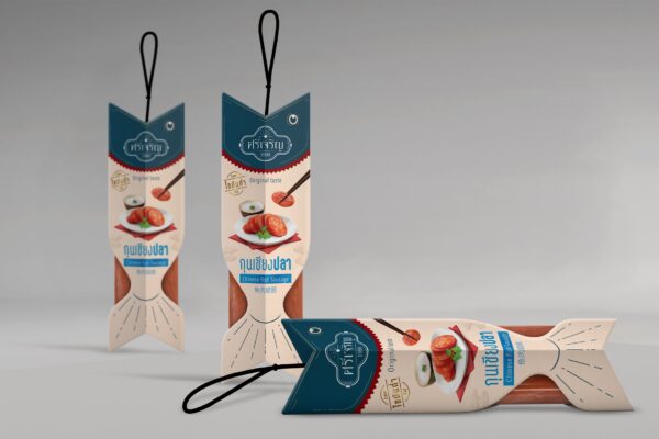
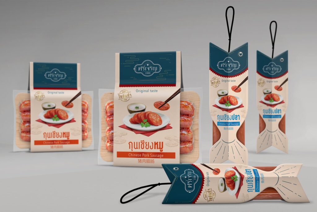
Sri Charoen-Chinese Sausage: Brand and Packaging Design concept
Challenge: Chinese sausages are usually packed in regular plastic bags, and red is widely used, so they look unimpressive as souvenirs. The image must be reinvented to look more attractive and premium as a souvenir.
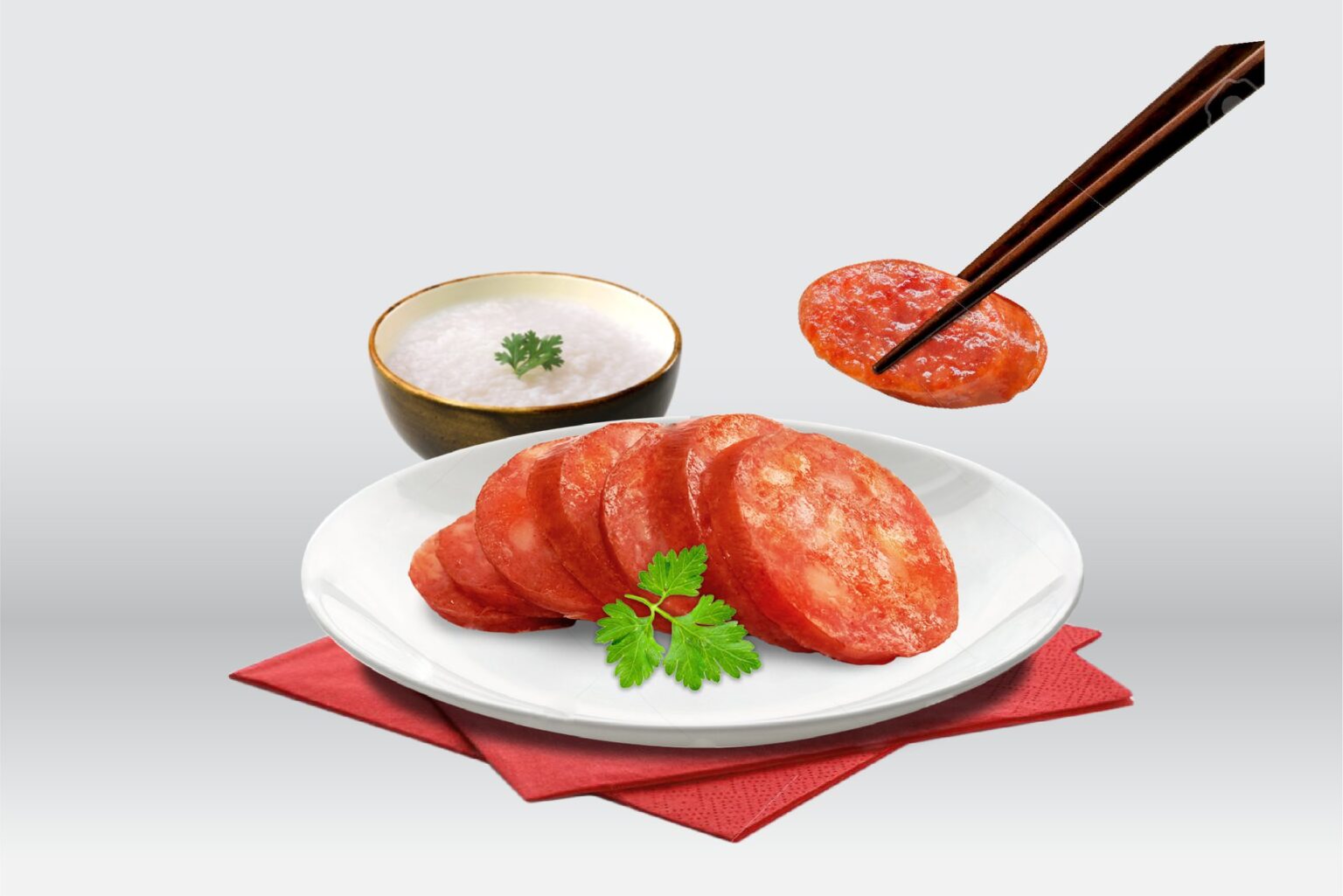
Idea: The logo is a Chinese pattern adjusted to be more contemporary. The graphic of the sausage tip is added to signify the product. The sausage is sealed, with a wooden pattern behind it to make them look like they are on the cutting board. The case is uniquely designed to show the main ingredient: fish-shape for fish sausage. An illustration is used to convey the appetizing appearance, with an icon for its selling point: being low fat.
