B care – Honey Soap: Packaging & Branding Design Concept
Challenge: Black herbal soap wrapped in plastic is hard to tell what it is made of, and does not match the value of the product that is made from herbs. This needs to be readjusted to better uplift the brand and attract buyers.
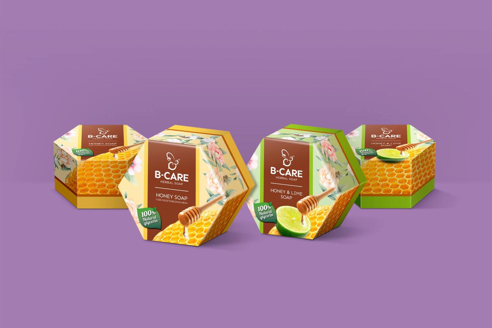
Idea: The logo is a bee to reflect the brand name and create recognizable character. The hexagonal packaging resembles a bee hive, can be displayed and stacked together to look even more like a bee hive, which is outstanding and unique. The main ingredients, like honey and lime are incorporated in the key visual, with drawing of flowers, topped off with a leaf to show the all-natural components.