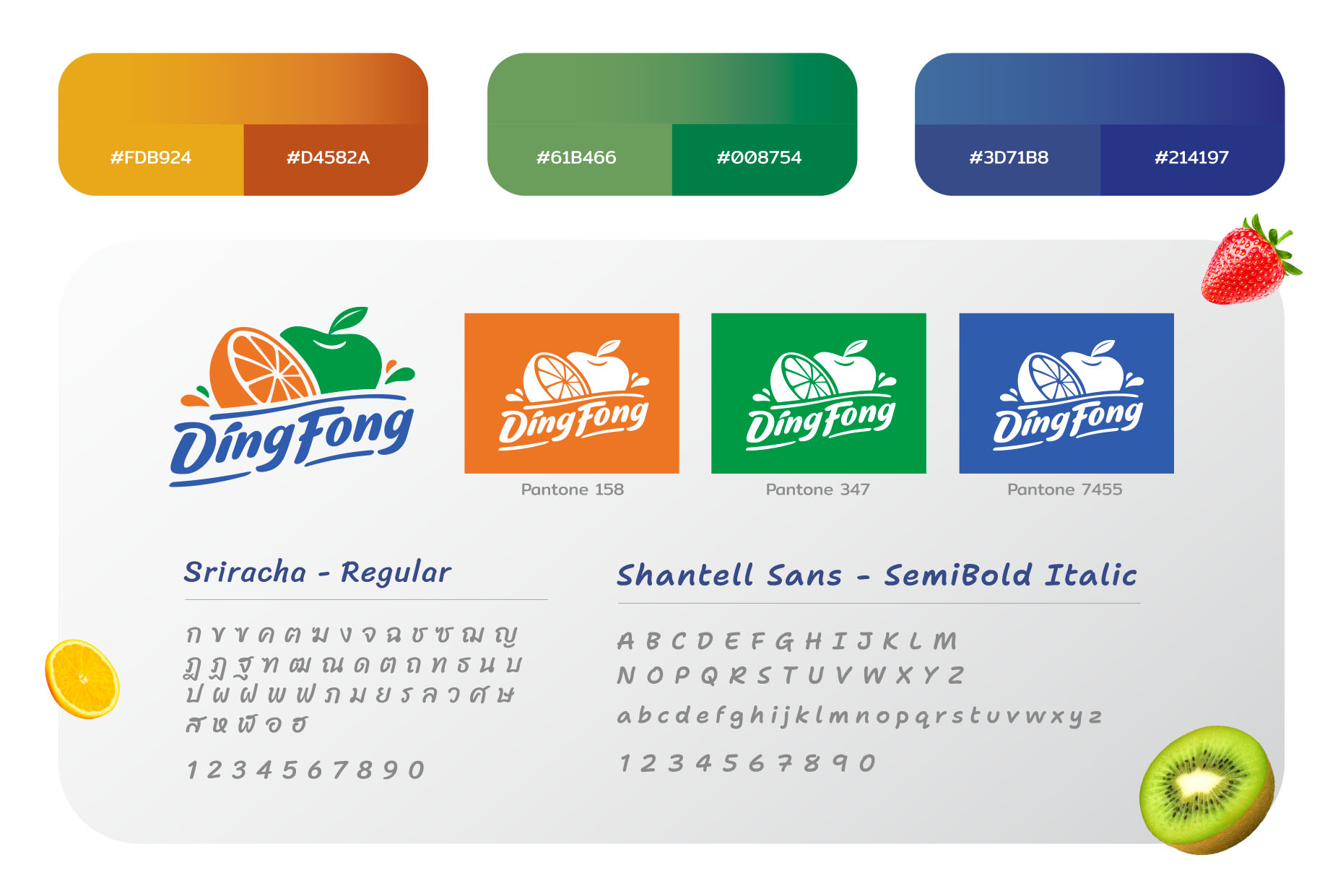
Ding Fong : Packaging Design / Syrup
Challenge: The existing packaging had been used for many years, with only minor updates that went mostly unnoticed. The client wanted a refreshed look—brighter, more modern—but still recognizable. Key visual elements, such as the vintage-style flavor ribbon, needed to be retained as they had become part of the brand’s identity.
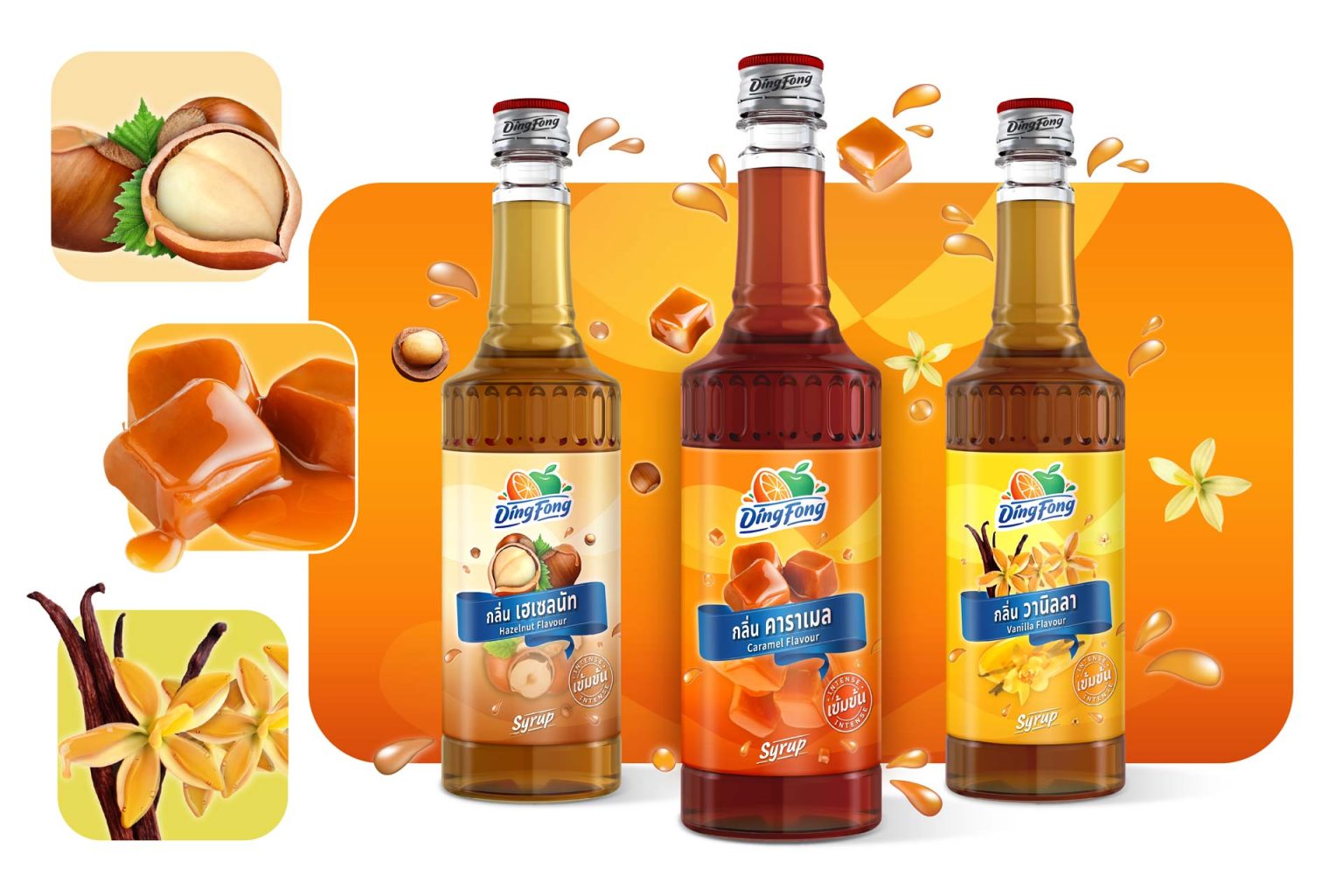
Idea: We redesigned the background to evoke real liquid, adding water splashes and droplets to enhance the sense of natural freshness.
Syrup: Uses flavor ingredients as the key visual at the top and mirrored below—suggesting it’s melting deliciously into a refreshing drink.
The new packaging brings a fresher, more modern look—clearer differentiation across products, while maintaining familiar visual cues. It’s ready for consistent communication across all channels.