“The project that never came to be.”
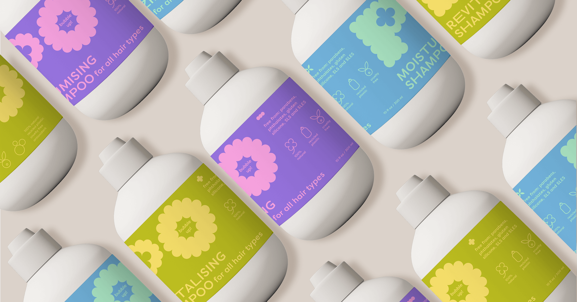
How many projects that I work on do not happen? Thankfully not many. But this is one of them – the PO shampoo brand. The idea for the design answers the question, how to capture environmental consciousness in a young, bold, girly and playful design. Recycled plastic bottles with a simple 2-colour label and a minimal, yet vibrant visual identity.
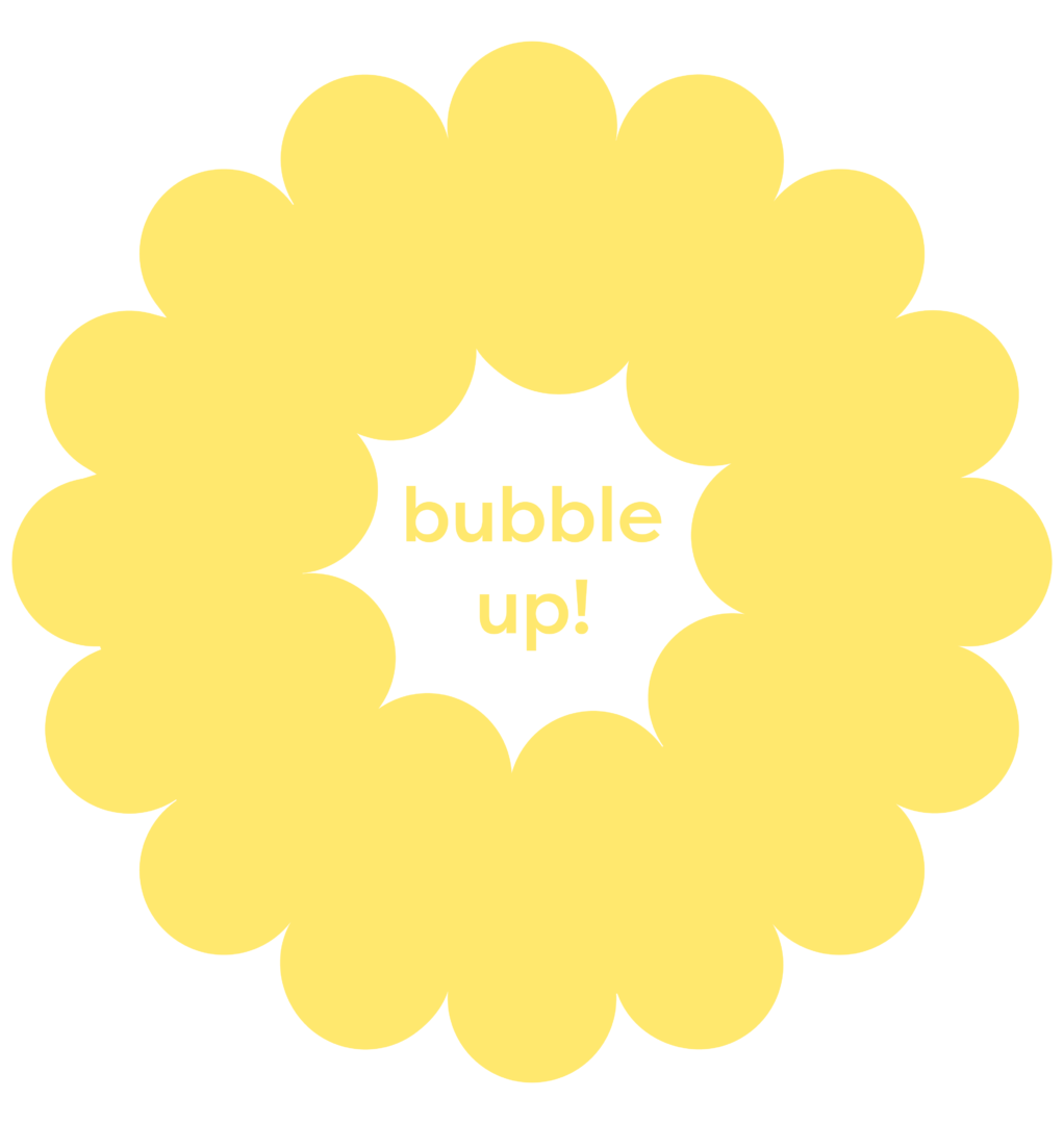
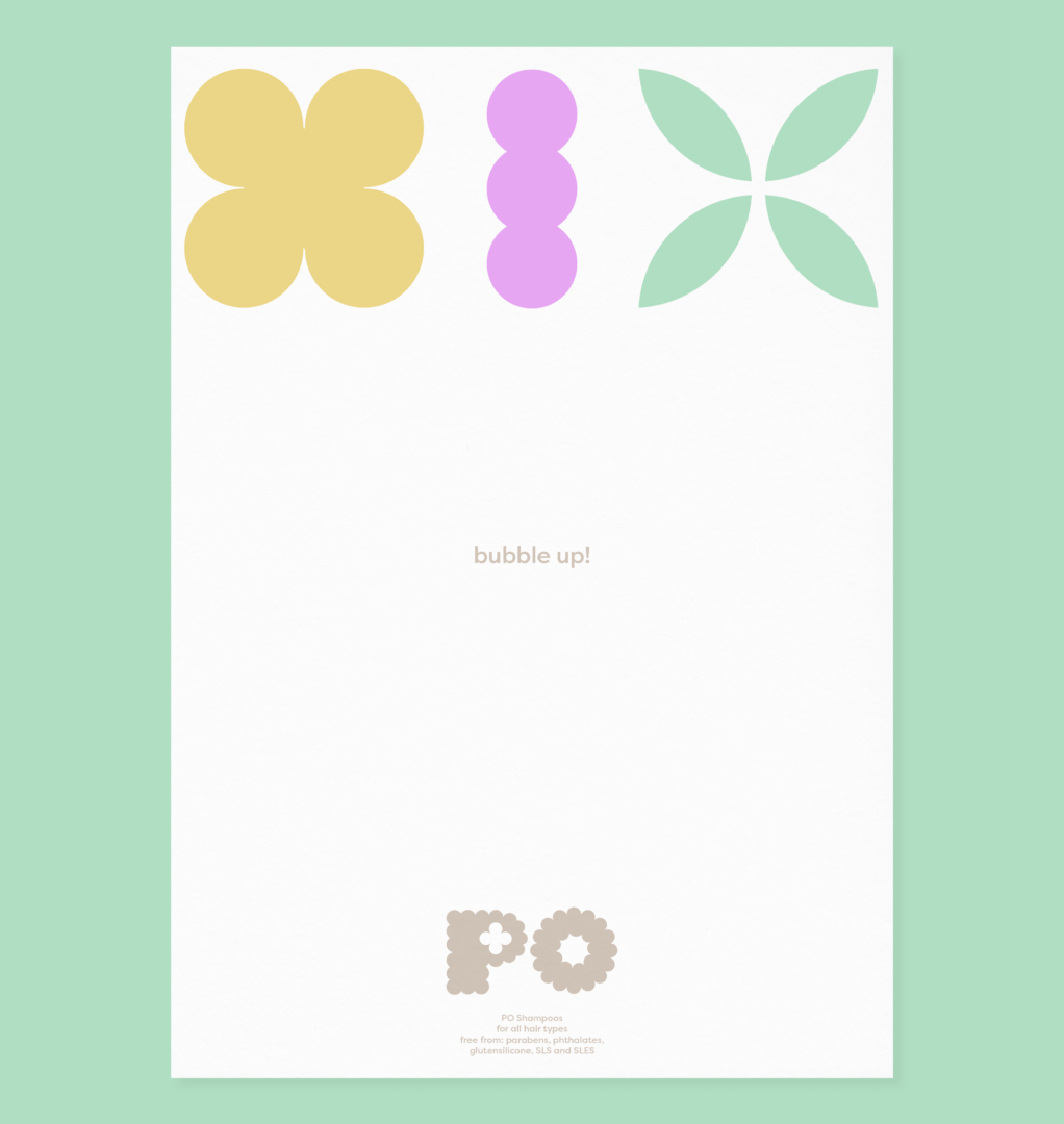
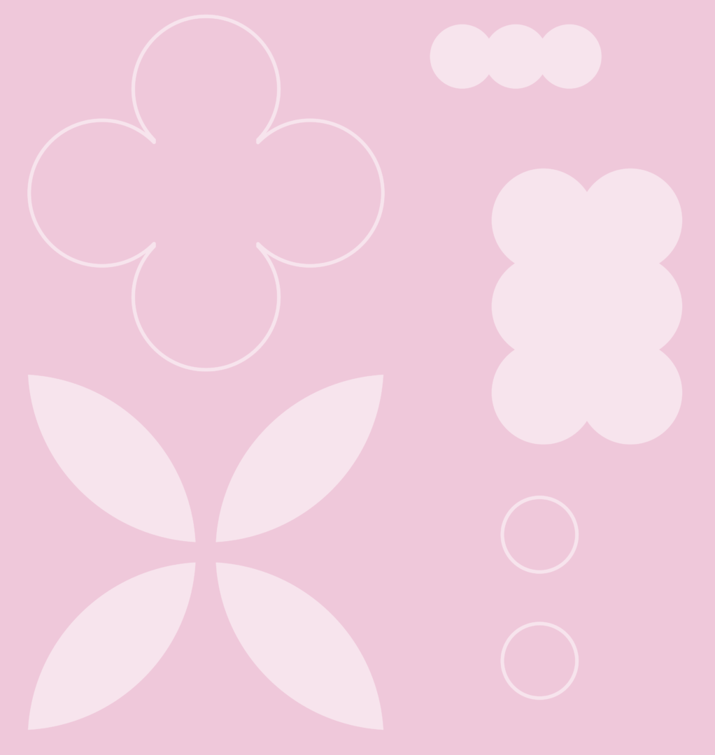
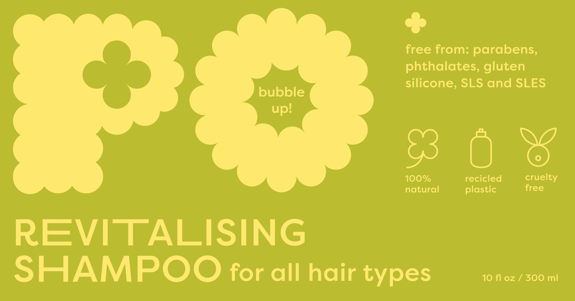
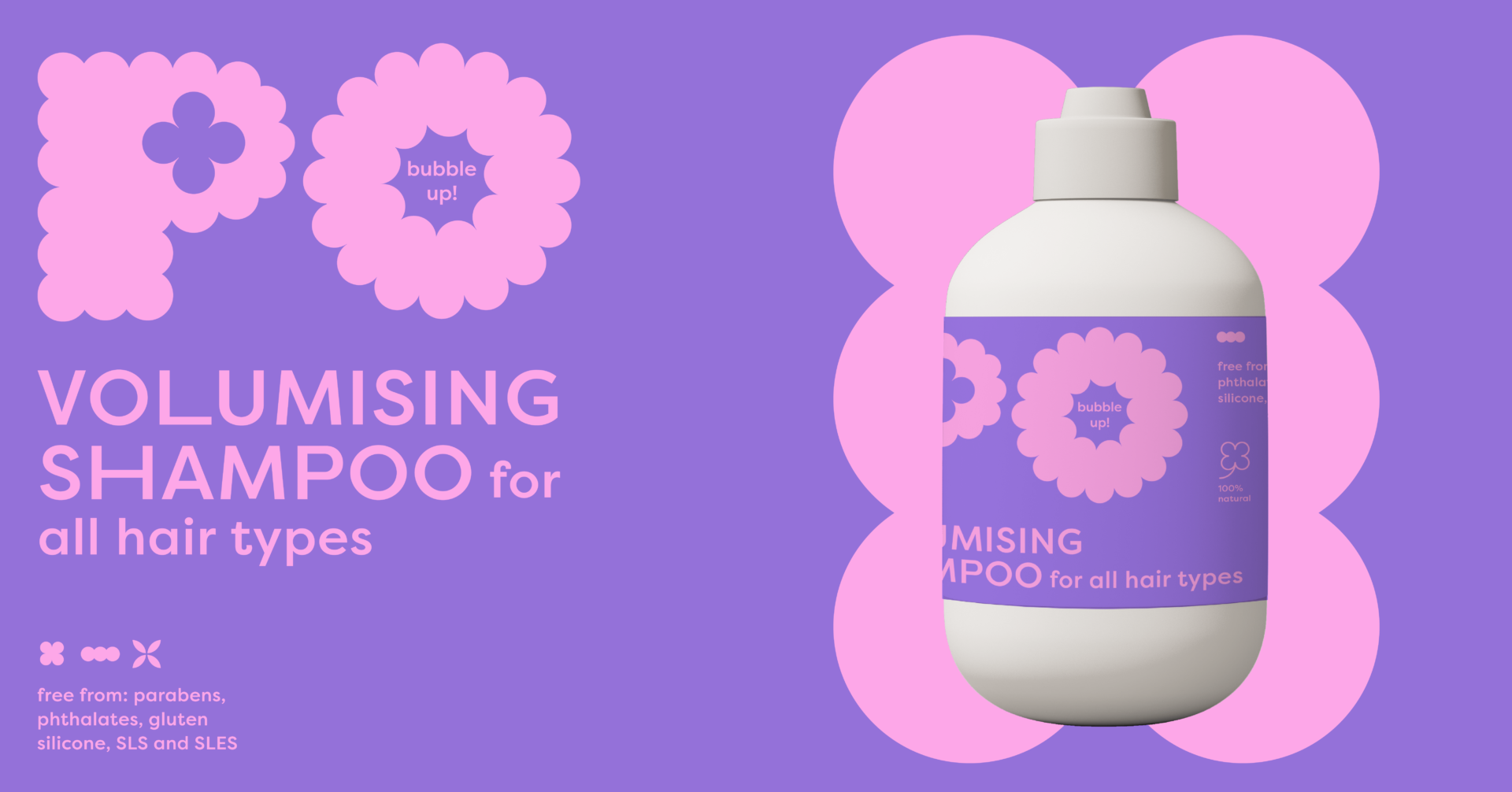
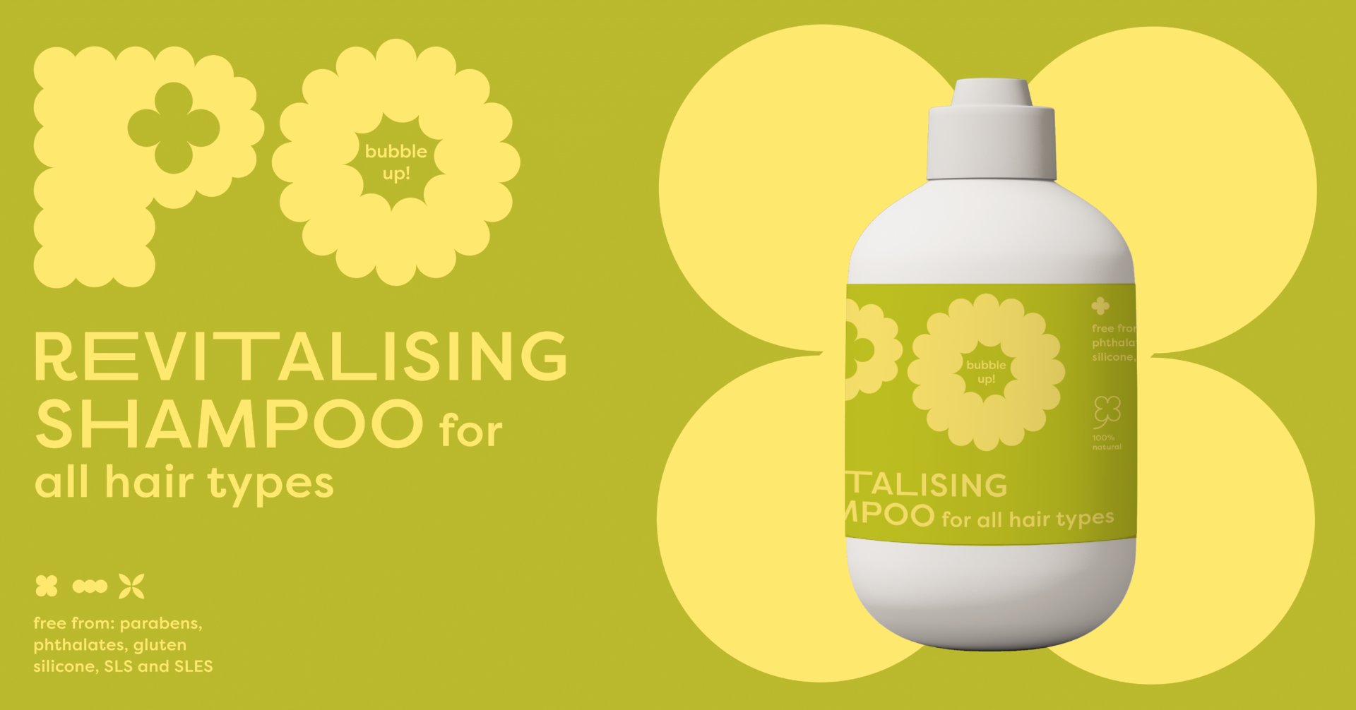
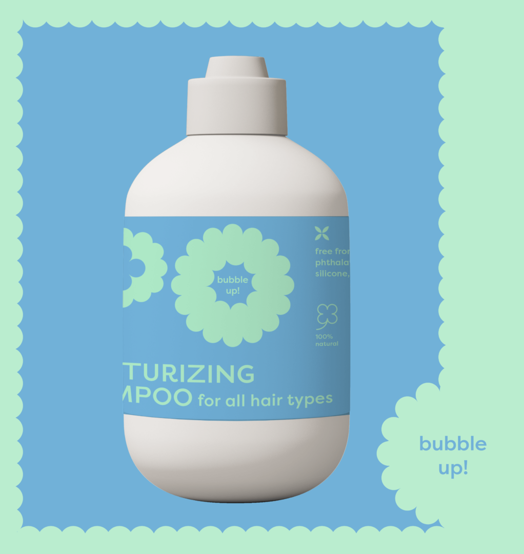
The PO logo is a playful and fresh design that captures the softness of bubbles in its bold shapes. The ‘O’ letter envelops the brand’s claim, ’bubble up!’ — thus bringing more joy into the design. Deriving from the logo, there are 3 main shapes used throughout the visual identity. They are used as patterns, inspiration for the icon design and as the representative shapes of each product: revitalising, volumising and moisturising shampoos.
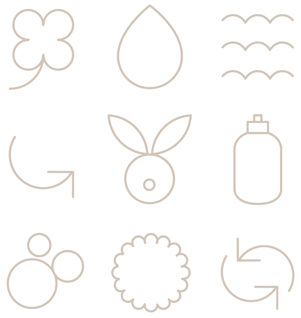
The iconography design is simple, but has a playful, bubbly flair to it. All shapes are based on the round, full bodied characteristics. The linear execution lends a soft touch to the rather bold visual identity.
The label design brings the core of the brand to life – a combination of bold and soft elements, with the simplicity of two colours and its contrasting playfulness. There are three products, each based on a different colour palette and shape that in the print materials brings both packaging and branding together. Green for revitalisation, blue for moisture and an energetic purple for the volume.