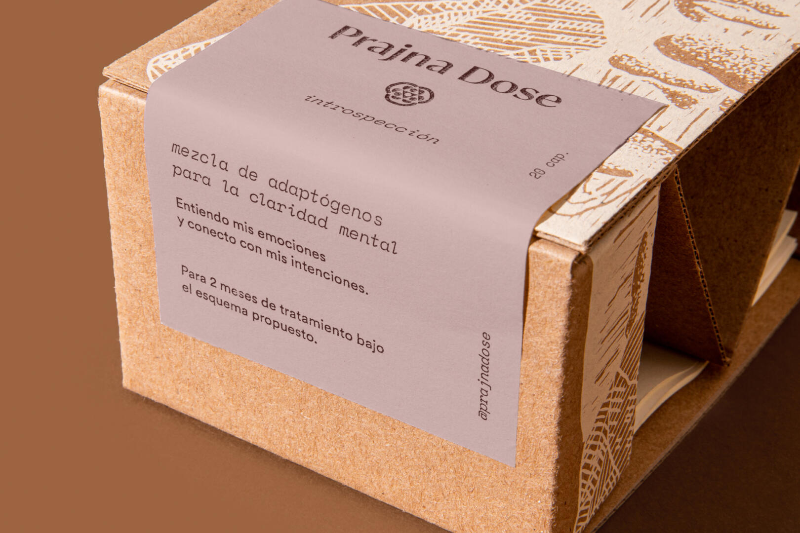
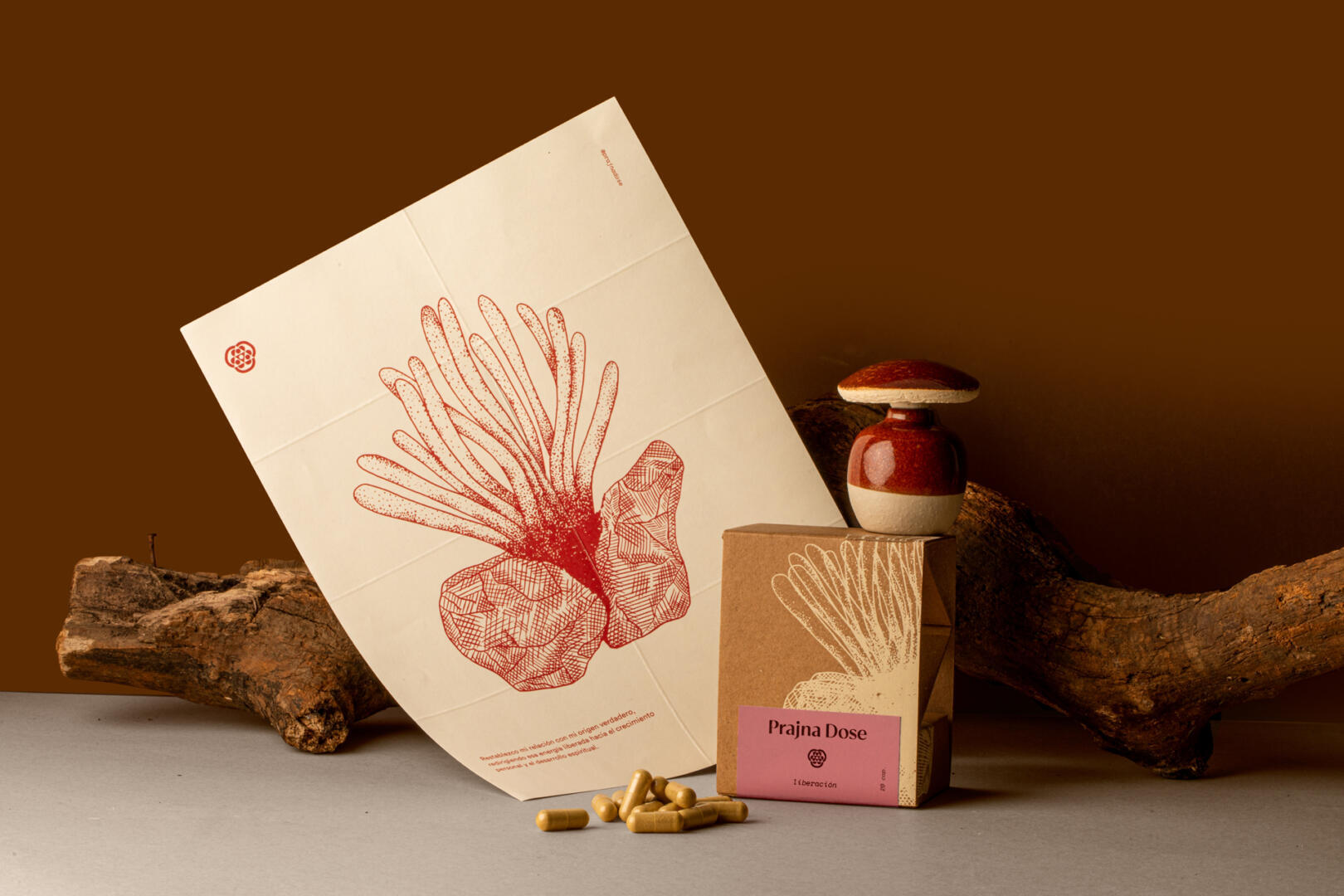
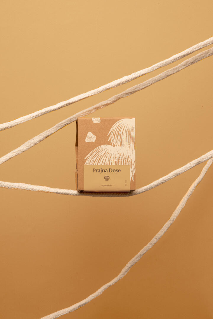
Prajna Dose are supplements made with a mix of adaptogen mushrooms to achieve a clear mental state while managing both mental and physical stressors. It has the goal to help bring back a peaceful and happy existence to anyone that takes them. We were commissioned to make the branding and packaging.
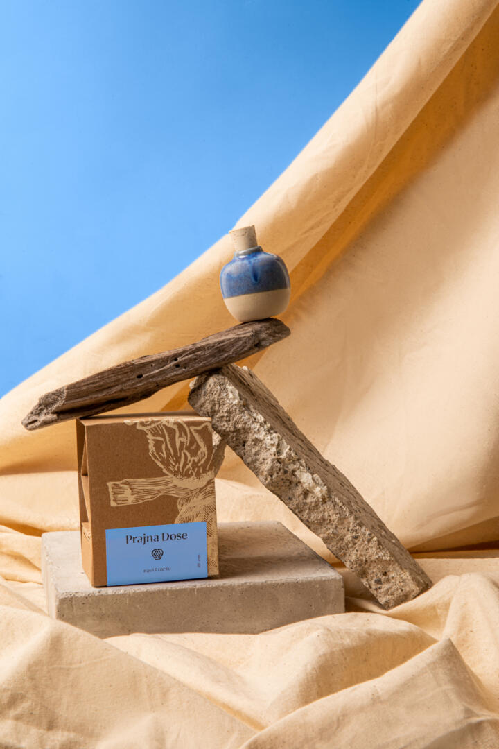
For the logotype we designed a sans serif typeface that looks both structured and reliable while also has a lightweight spirit. The icon was inspired in an ancient mayan symbol used for mushroom healing ceremonies. These elements, as well as the natural but vibrating color palette and the selection of materials, make the main elements of the brand.
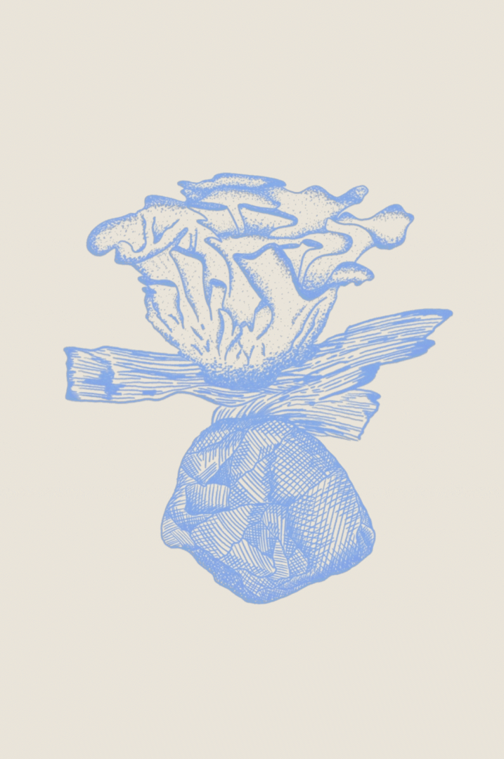
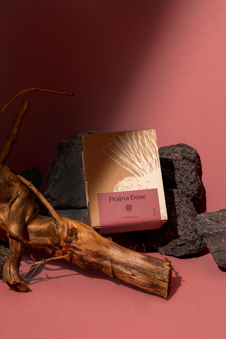
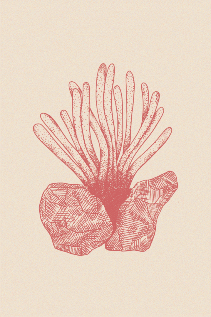
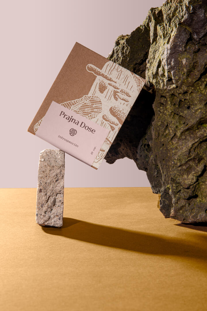
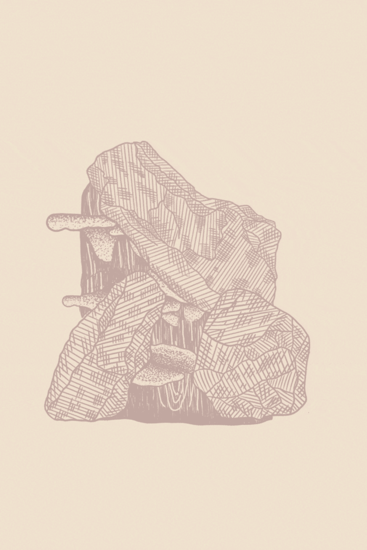
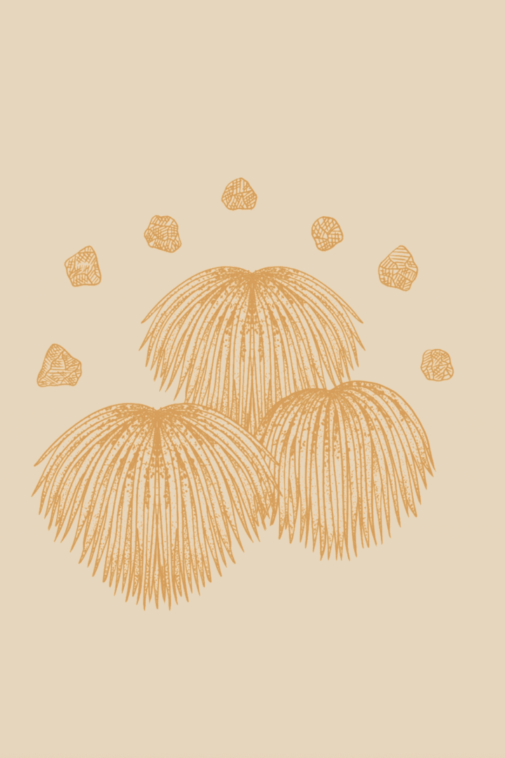
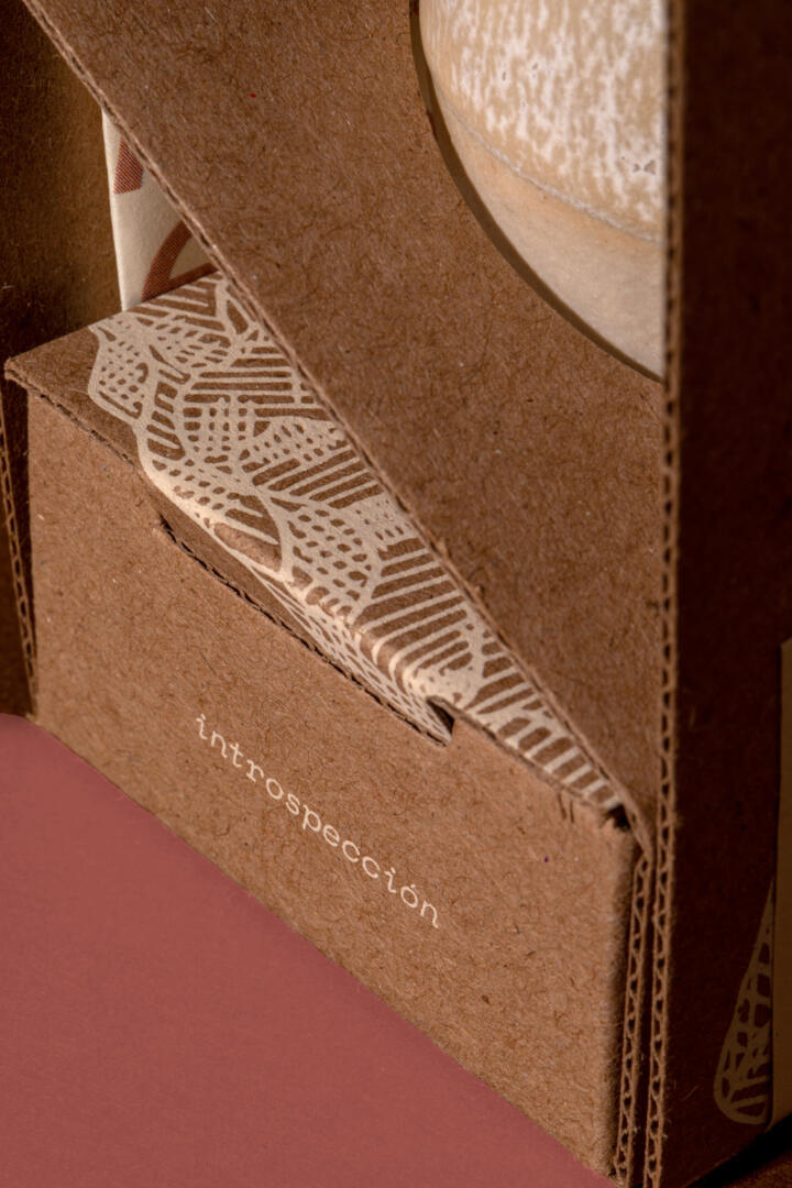
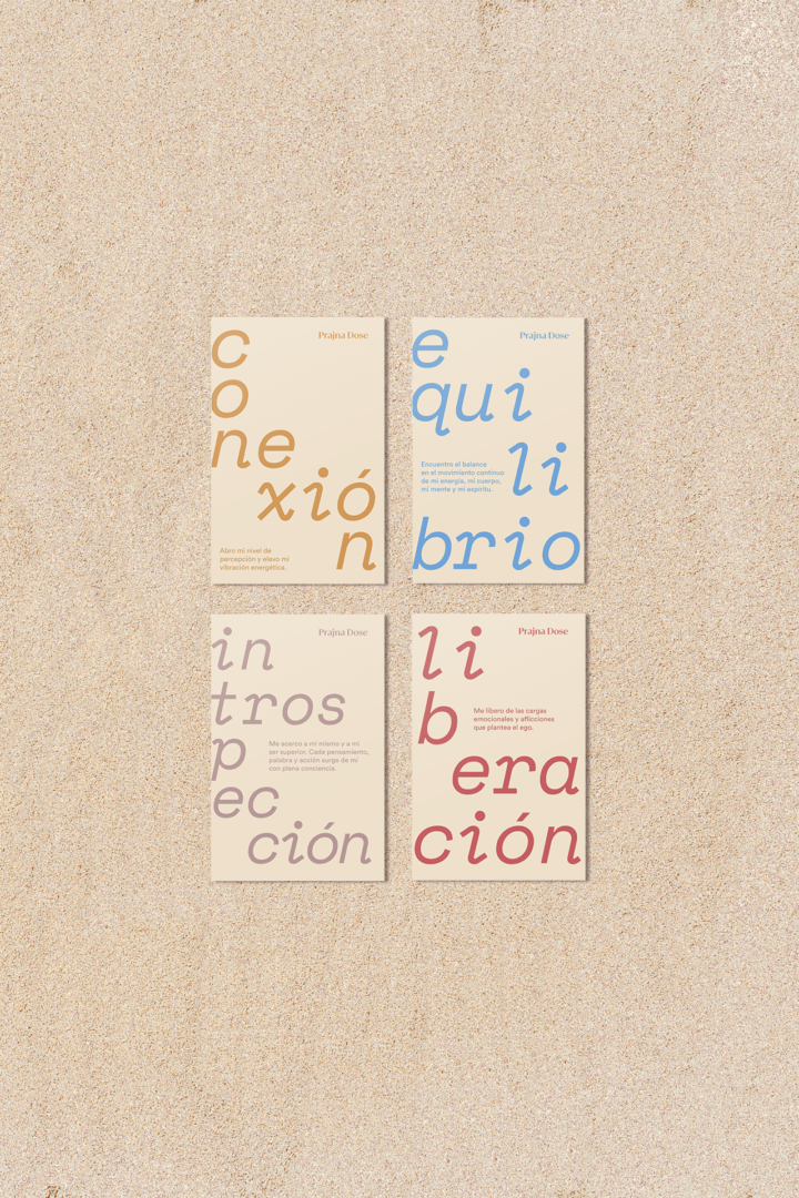
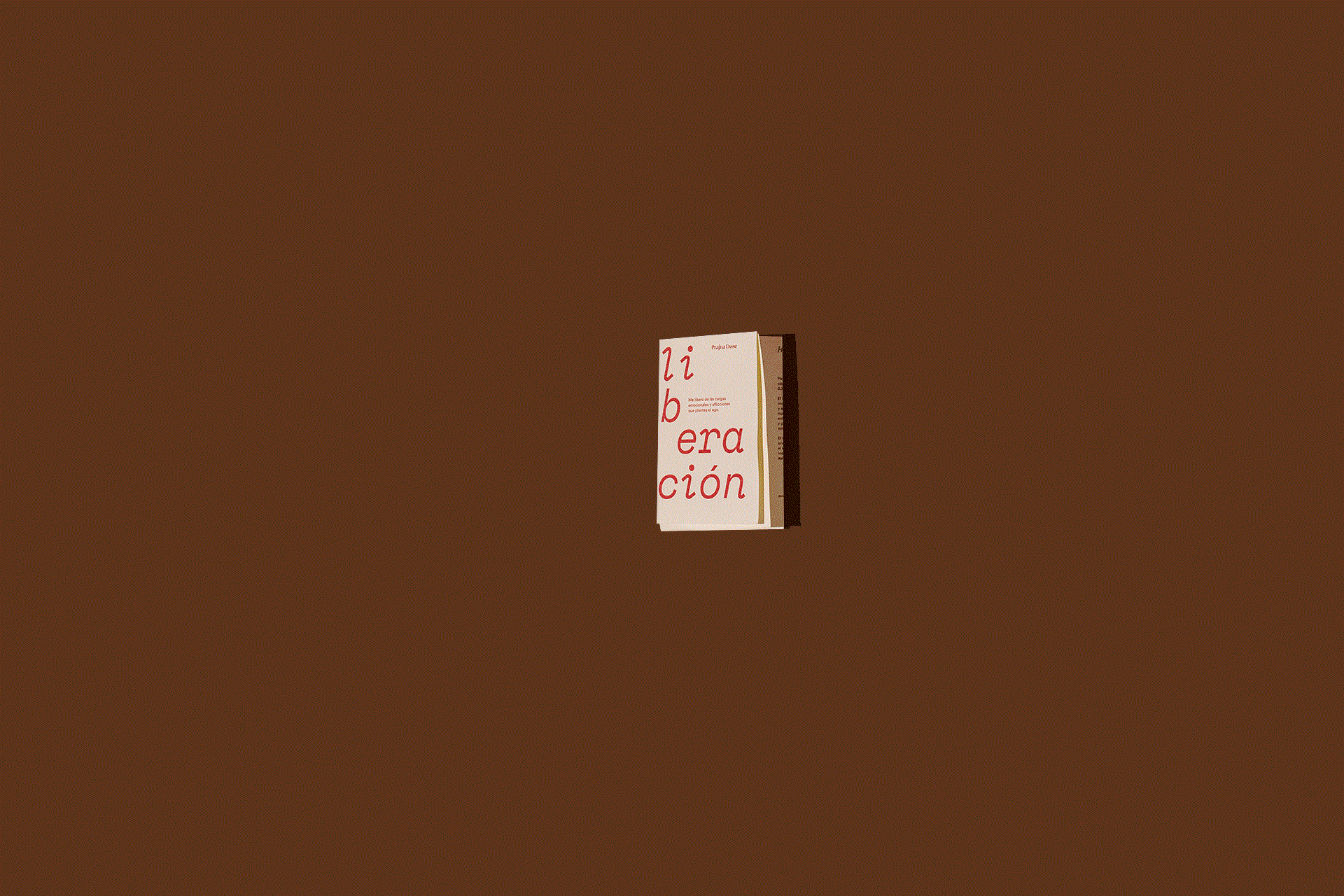
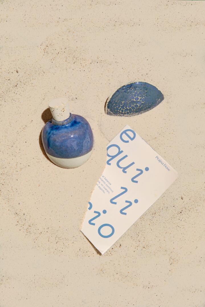
Each supplement type was named after a different intention: “connection”, “balance”, “freedom” and “introspection”, so we created an illustration for each one of them. In the illustrations we showcase the mushroom used as the main ingredient in a thoughtful composition that includes other nature elements such as wood and stone to represent the corresponding intention.
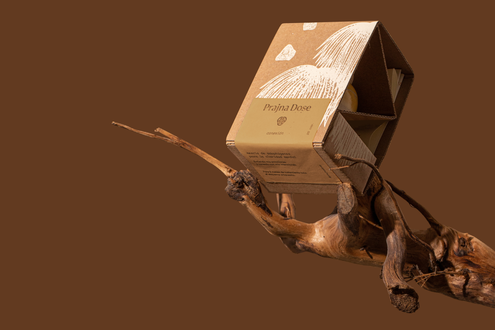
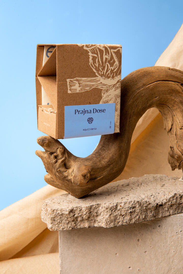
The packaging dieline was without doubt the most challenging aspect of the project. We wanted the beautiful clay jar to be visible but protected for shipping. The packaging also needed to have a closed section to store complementary items included in the purchase such as the booklet and the clay tray for incense. We took inspiration from traditional lightbulb packagings and designed a structural cardboard box with exposed laterals and a tiny compartment on the bottom.
Credits: Art Direction: Mariela Mezquita // Graphic Design: Valentina Villa // Illustration: Harumi Tanimoto // Photography: Ximena Ft. // Motion: Luis Romero // Client: Prajna Dose //
Thanks for Watching!