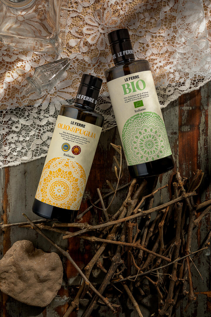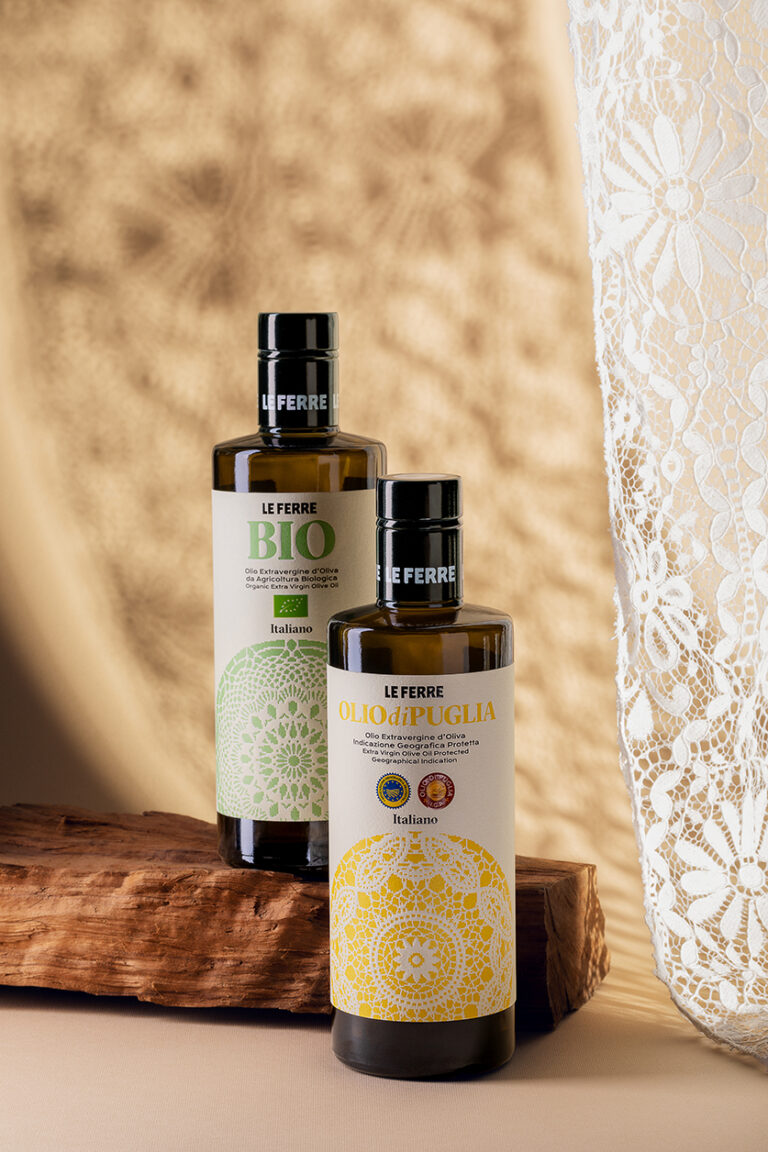
For the packaging of two extra virgin olive oils that identify two productions and regulations, representative both of a territory (Apulia, southern Italy) and a certified supply chain (organic), has been created a label that express the common identity of the two olive oils: respect for the authenticity of product and its production.
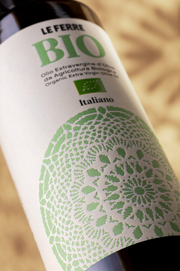
Combining the traditional matrix of the olive oil sector in Italy and the strong modernity drive of the Apulian client company, the designed decoration recalls the Romanesque rosettes in the Apulian style version and the lacy ‘doilies’ from textile embroidery tradition; but the graphic line becomes rhythmic, to the limit of hatching and is filled with colour, yellow or green.
The debossing, in a natural paper, gives unexpected volume to the decoration as well as a pleasant tactile perception.