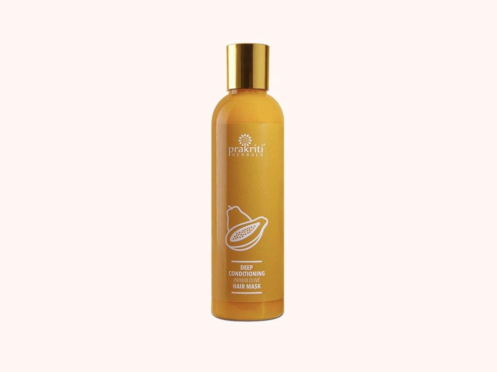
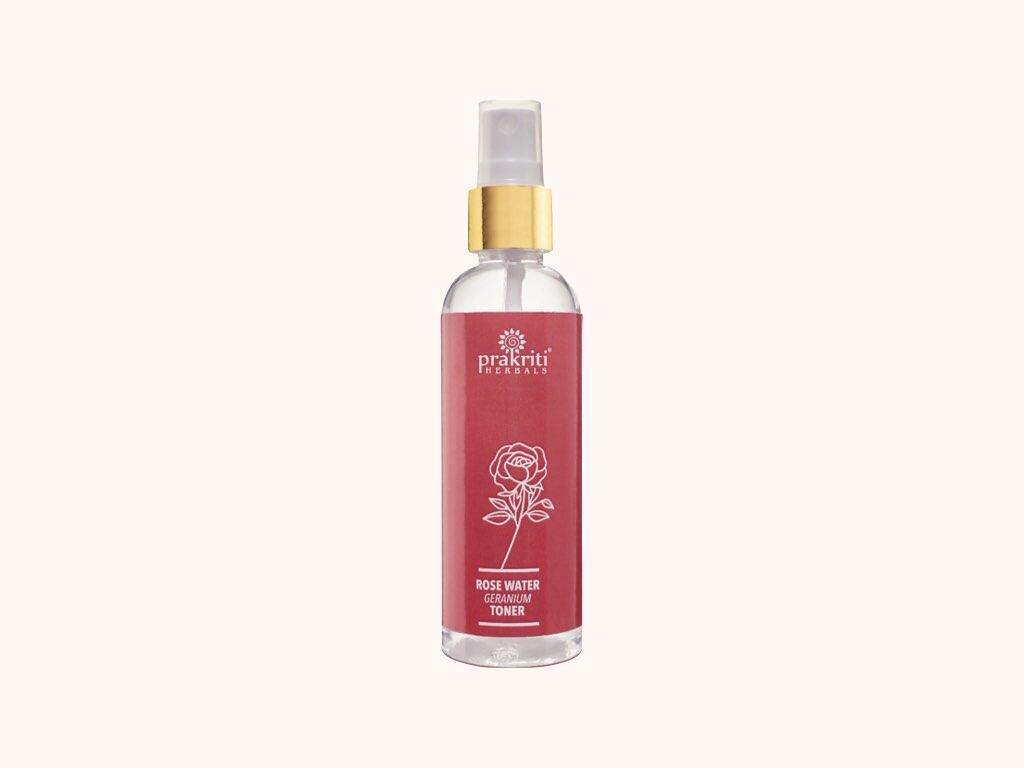
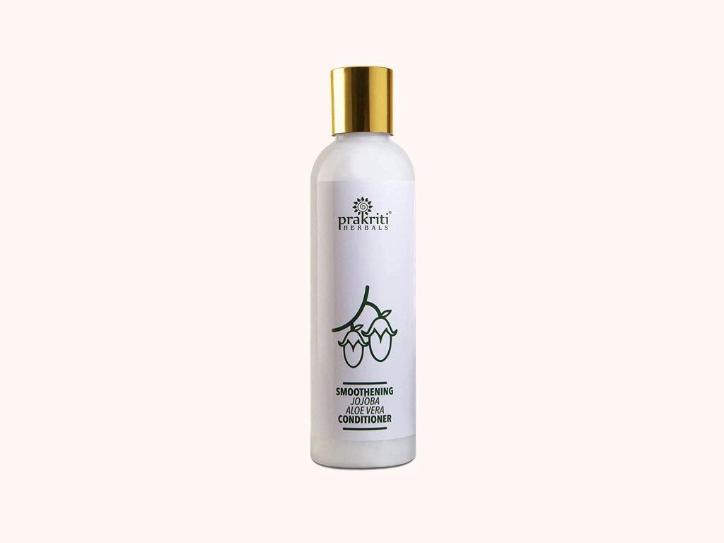
PROBLEM: The cosmetic market is overcrowded with Big players and small. Same with the category of Herbal cosmetic products. The packaging was also treated as ingredient-specific extremely crowded and many elements shouting for attention in each and every brand. Our task was to create herbal cosmetic packaging that will stand out from the crowd of other designs and create a niche is terms of design.
SOLUTION: We came up with the concept of minimalism in design in terms of using simple clean minimal vector of the ingredient and using the product colours itself as our inspiration to stand out. We took the single important hero ingredient for each herbal product and created a minimalistic design that went hand in hand with each herbal product colour. We ended up having a bright colourful simple clean and minimalistic design that did the job of standing our from the crowd.
Courtesy: Prakriti herbals