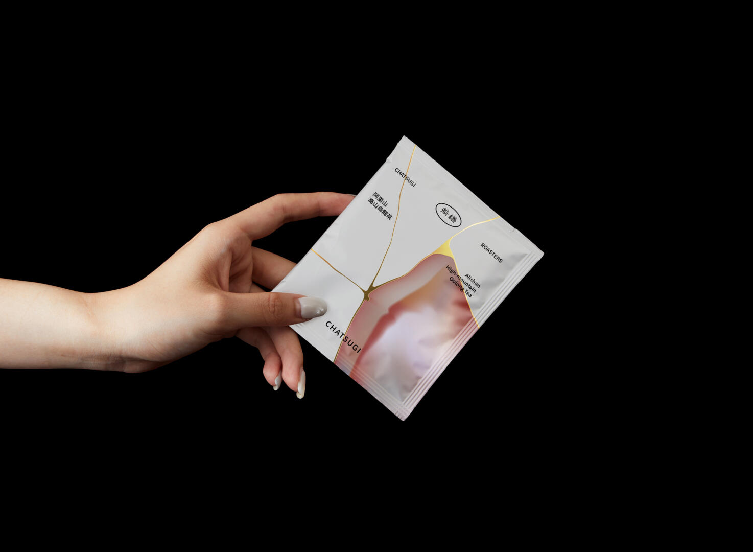
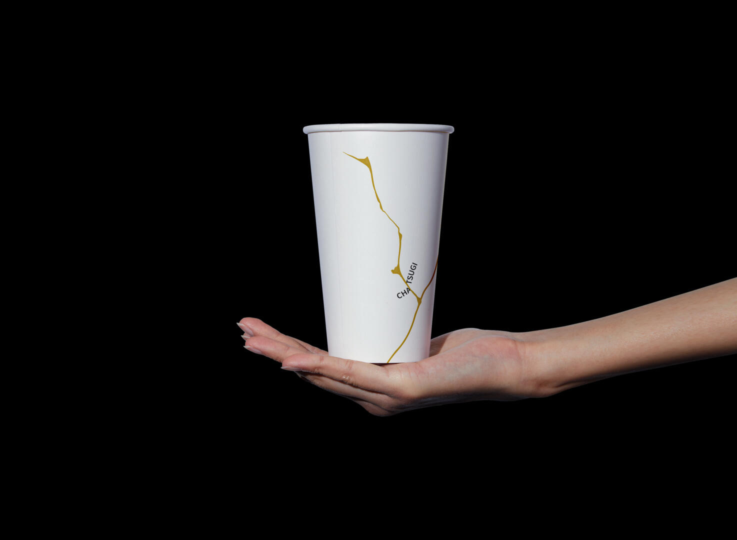
The naming of the brand name is inspired by the Japanese words for “Tea (Cha)” and “Kintsugi”. Kintsugi is a process of repairing broken porcelain or artwork, and it is also a philosophy that regards damage and repair as part of the history of the object , rather than cover up, giving new life to porcelain but preserving the past.
We combine the concept of Kintsugi fix porcelain with tea, integrate the concept of “Fix me Please” into tea and life, and provide a cup of product and brand design that makes people calm and take a breath. Just like an injured wound will heal, broken porcelain can be repaired through Kintsugi, a person’s heart needs to rest and need a cup of tea to calm down and relax, and then continue to have a good day after cheering up.
In the visual totem of the packaging design, we used the image of Kintsugi to be expressed by hot stamping, and combined with different product flavors to present the image of porcelain and gemstones of different materials. In the visual presentation, we retained the appearance and cultural respect of Kintsugi as a traditional craft, and then in the packaging In terms of copywriting, we try our best to reduce the professional copywriting in terms of flavor, and use storytelling to describe our imagination of flavor. Every tea has a story about tea. We hope that this way can enhance consumers’ imagination of tea flavor.
About Kintsugi:Kintsugi, also known as kintsukuroi ( “golden repair”),is the Japanese art of repairing broken pottery by mending the areas of breakage with lacquer dusted or mixed with powdered gold, silver, or platinum; the method is similar to the maki-e technique.As a philosophy, it treats breakage and repair as part of the history of an object, rather than something to disguise.